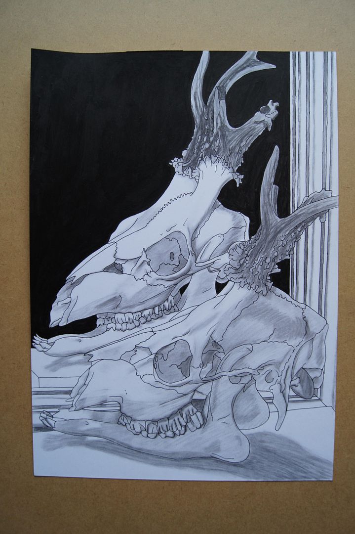
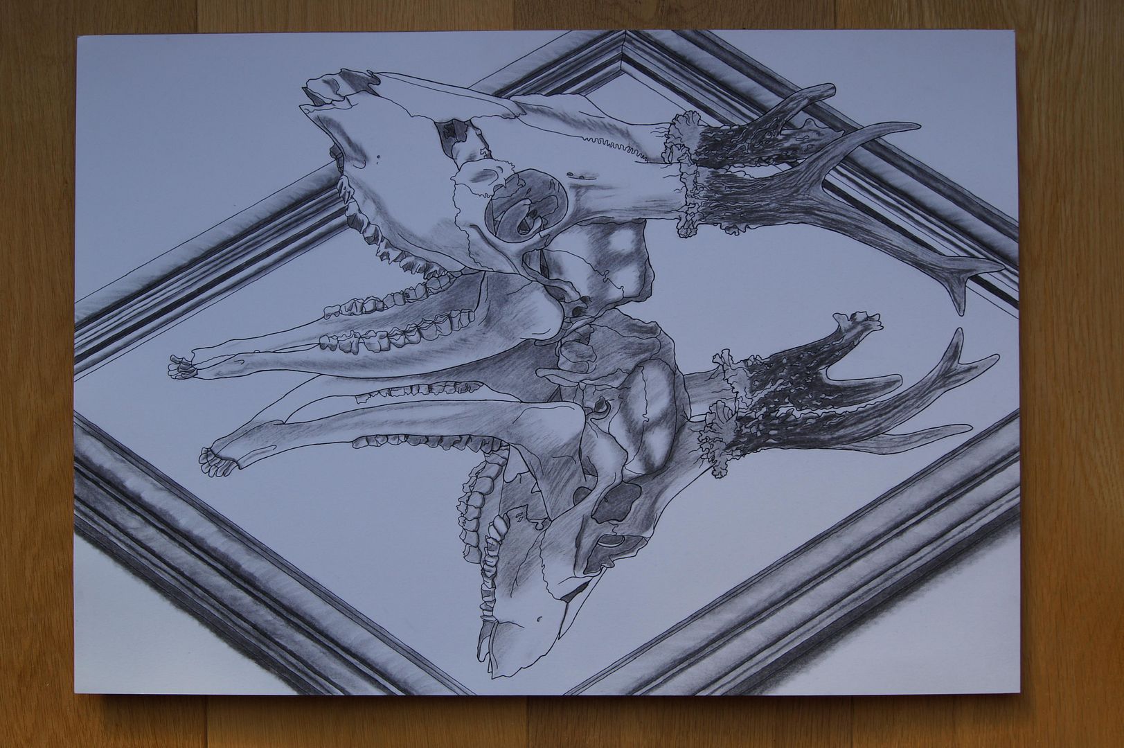
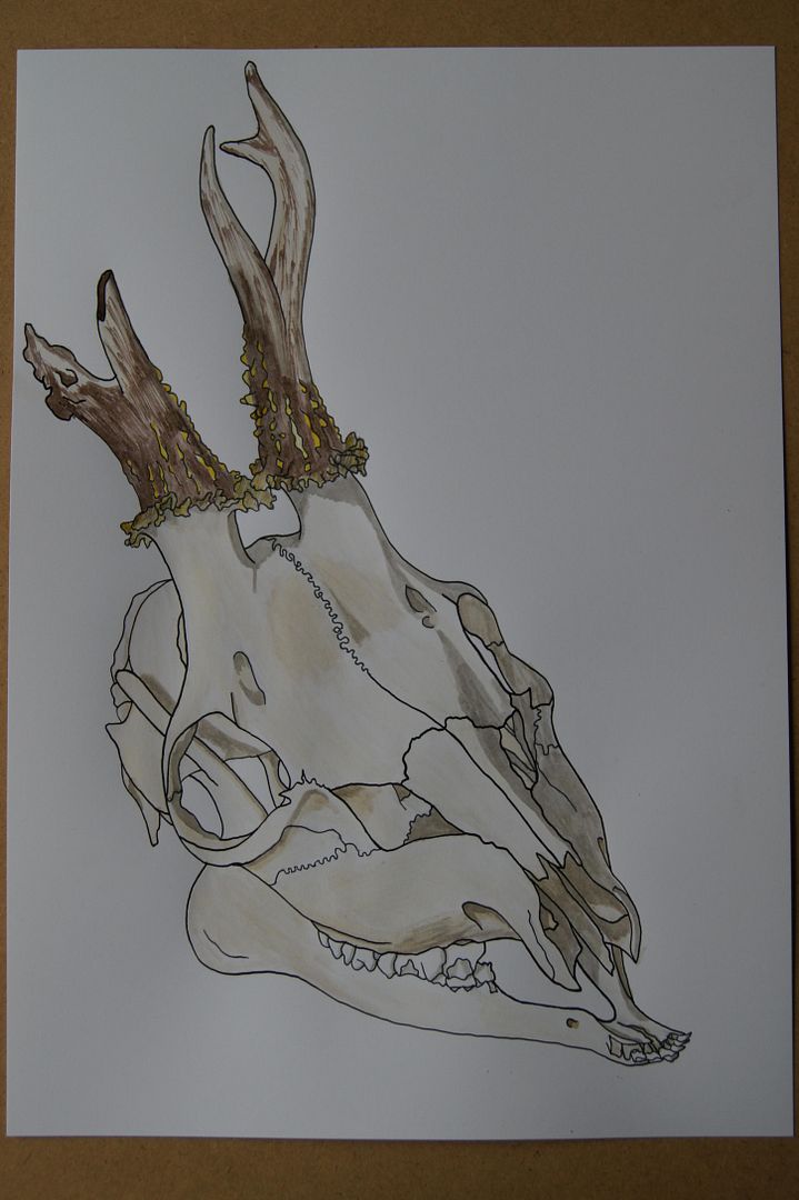
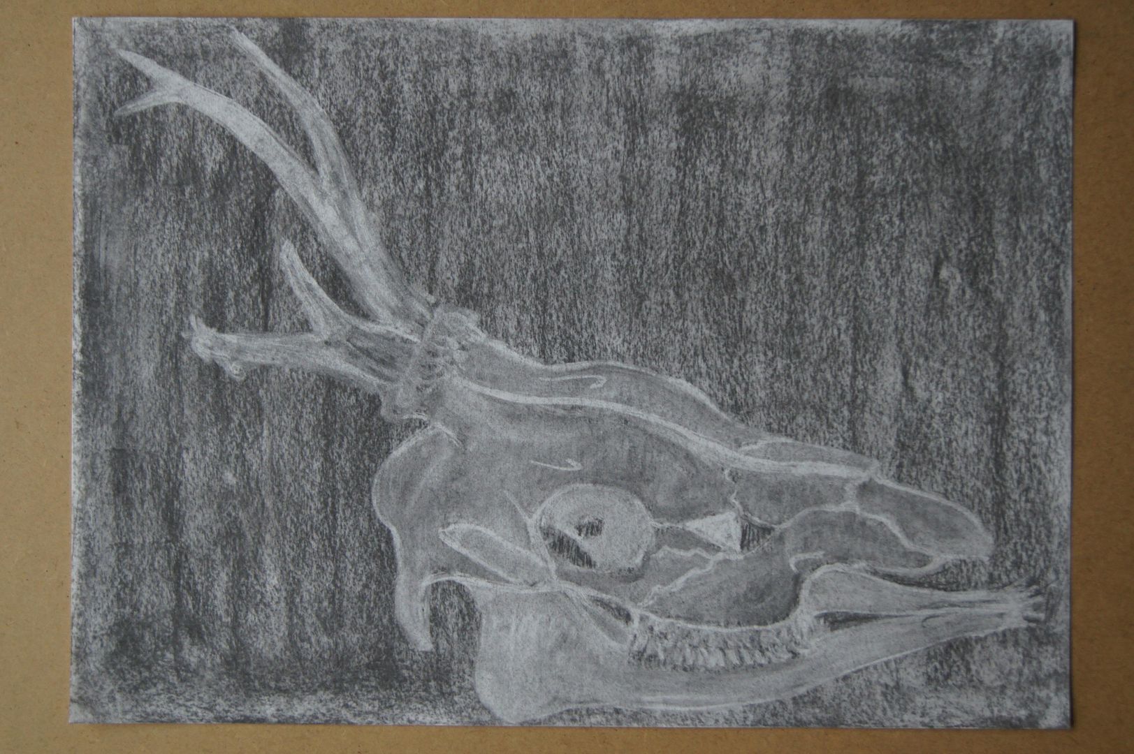
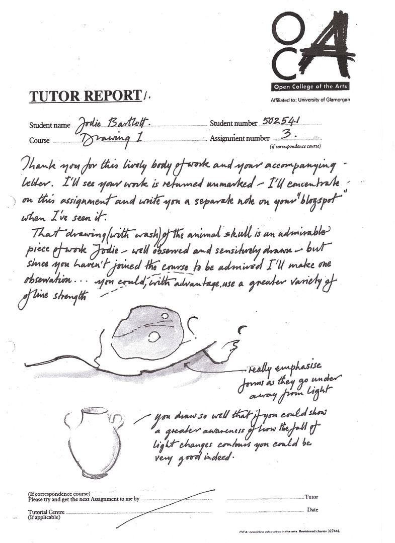
Here's a drawing I did at the suggestion of my tutor, who thought that my final drawing would have looked better with a black background to bring out the skull. It's with matt black acryllic paint, as he specified. I like this one too, although what I would have done if I'd got paint all over my real final drawing, I don't know.
What I like about this drawing is the sense of depth you get from it. The black background really makes you believe you're seeing into the far distance, and the angle of the skull shows you the foreground. It was very good advice!
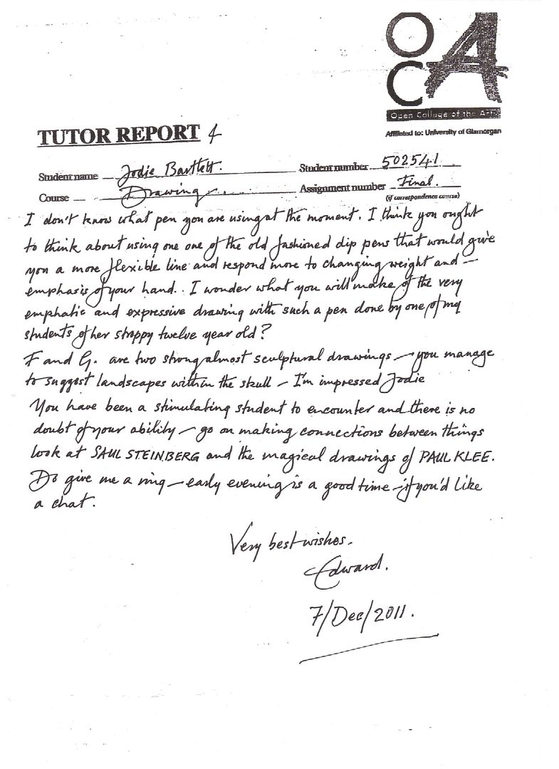
Thursday, 15 December 2011
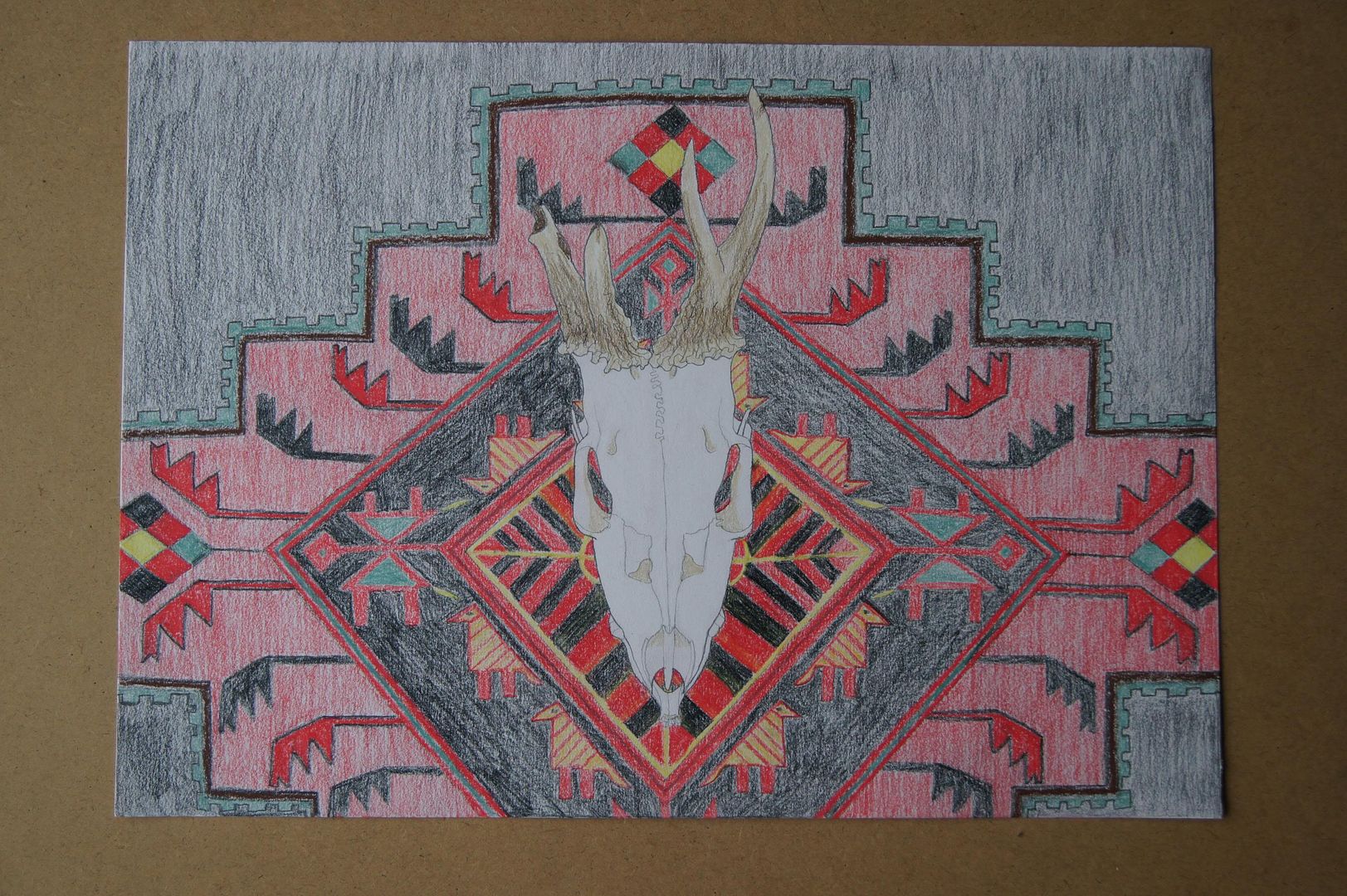
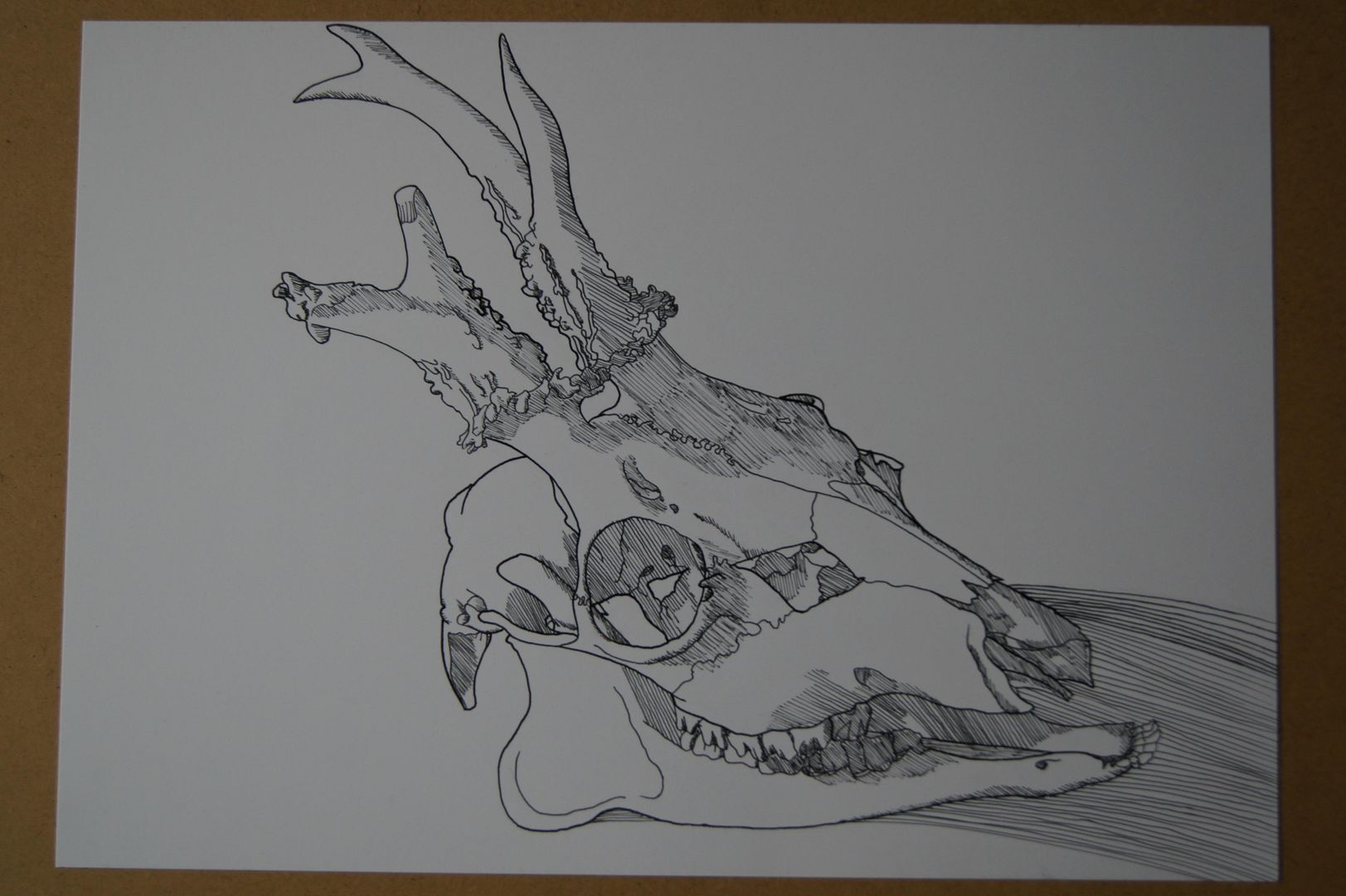
Unusual Deer Skull - An Extra at Edward's Suggestion
Assignment Five Feedback Sections
Just a quick note here before I begin, to say that this post is going up a little late, owing to some computer troubles.
Draw and Select
Ok, so firstly, this exercise is about choosing a subject to focus on throughout this section, and this bit took an age! I've rarely been so indecisive! I spent many days doing ink line drawings in my sketchbooks, trying to decide on something that would be - interesting, visually striking, have plenty of potential for different views, and wouldn't wilt before I'd finished with it...
It was to that end that after days and days of pictures, I gave in - and I bought a skull from eBay. Well, a couple of rather gruesome bits, but I thought maybe I could combine them somewhere along the line - and they were a bargin! Although there was a lot of choice, I eventually plumped for a deer skull with a 'deformed' antler. It was a combination of factors that made me buy it and after drawing it, choose it to go ahead with. One, that I felt frankly a bit sorry for it, up online being described as a 'freak' deer! Two, that it was so difficult, I knew that if I tried anything else and found it easier, I'd think of myself as a coward; and three, that with so many quirks, even if my drawing wasn't great, at least my subject would be very memorable (and if you'll excuse the cliché, have real personality!).
Different Angles
This exercise made me think. It made me realise a couple of almost conflicting things - one, that lots of practice at drawing one similar thing physically doesn't mean it's not a completely different subject when everything's reduced to lines (if you see what I mean - I drew another, different deer skull before, but this was still tough). And that oddly, that idea doesn't really seem to apply to angles - I drew the skulll properly in pencil a few times, and it started getting easier, although there was even more detail than I thought originally! I'm not too sure what I can say about the "decision making process", but I did discover that, and I hope this isn't too gory and flippant, somehow, it still has a sense of piercing eyes about it! I think that they will have to be involved. Like any portrait, this is a picture of a face. Not a human face, but still one that anyone seeing a picture of will recognise without meaning to, and interact subconsciously with the feeling of the picture. It'll be hard to make it look happy, although it's always grinning, but I think there might be a little sympathy involved. I don't know if I can make it look scary exactly, but I think that being able to add a kind of emotional level to a picture will just give you more possibilities - if that doesn't sound too pretentious! I think I'm making sense!
Line Drawing
As usual, I don't really appreciate line drawing, but I think now I might've cracked it. I think that they're best used as a way to keep you on your toes. They stop you from thinking you know your subject well enough to get comfortable, and keep drawing it the same way. The fact that I had to do some without looking at the paper was a little challenging, and certainly makes a nice change! For me as well, I found that they made a nice change from drawing so slowly and deliberately, and although it's still a depiction of an object, they feel much freer, and are actually... a little bit... fun? Am I approving of non-serious art? Maybe I've learnt more than I thought!
Tonal Study
Still a little worried by my challenging subject, I decided to do a picture with a mix of thick outlines and thin hatched shadows. (You can see this particular one on the blog under "The Unusual Deer Skull - Monochrome") I wouldn't say this was the drawing I've done that most matched the brief, but baring in mind that this was the first drawing of it I'd done in ink, I still like it. I thought at first I'd try and make the shadows darker with cross-hatching, then hatching with lines closer together, then upon attempting it, found that the idea was harder and more confusing than I'd expected. I backed down time and time again, it sounds like! But as I say, of this particular picture, I'm still proud (and people I showed it to liked it as well!). I did another picture to go with it, as I was doing monochrome, which was attempted in a way I hadn't tried before - a base of charcoal, the contrast provided by liberal use of putty rubber. Of course, as charcoal isn't consistent (or maybe, as my mum'd say, it's "operator trouble"), some of the picture is naturally darker than other areas, meaning it creates it's own interesting contrast - it's almost more tonal than my deliberately tonal picture. Still, some days are successes...
Introducing Colour
I've done a wide variety of colourful pictures for this exercise, and there's one of which I'm especially proud (This one is also on the blog, under "The Unusual Deer Skull - In Dramatic Coloured Pencil") that I think really worked well because of it's use of lighting and interesting palette of colours. You wouldn't have thought that so many colours existed in the different layers of bone. Of course, and it's a little bit nostalgic, my experiments with coloured pencil were still the classic when it comes to my drawings, although ink is still edging it's way ever closer to being all I work with! I suppose the greatest difference when drawing this subject, the skull, in colour and monochrome, is that extra thought you have to give to the lightest colours - that is, I think I'm saying this right, the highest values? When you're doing monochrome, white is your highest colour - when you're drawing in colour, you have to show the real colour of the skull, and mix up your own light yellow-biege mixture in ink or pencil, and hope for the best!
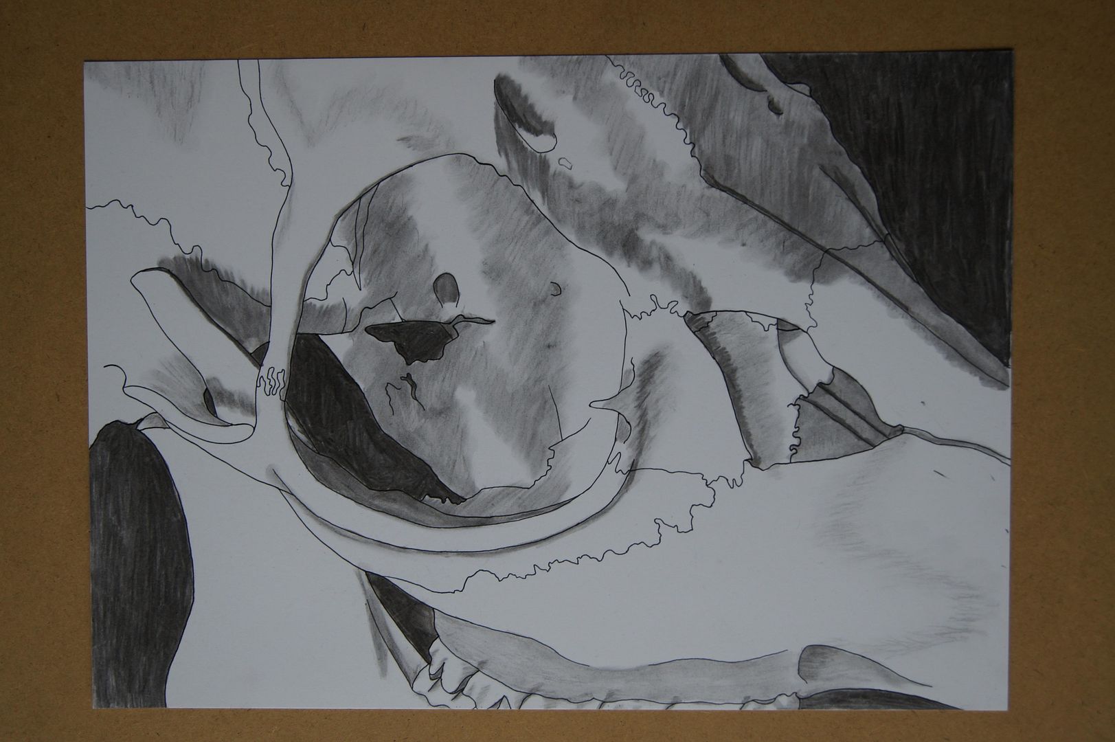
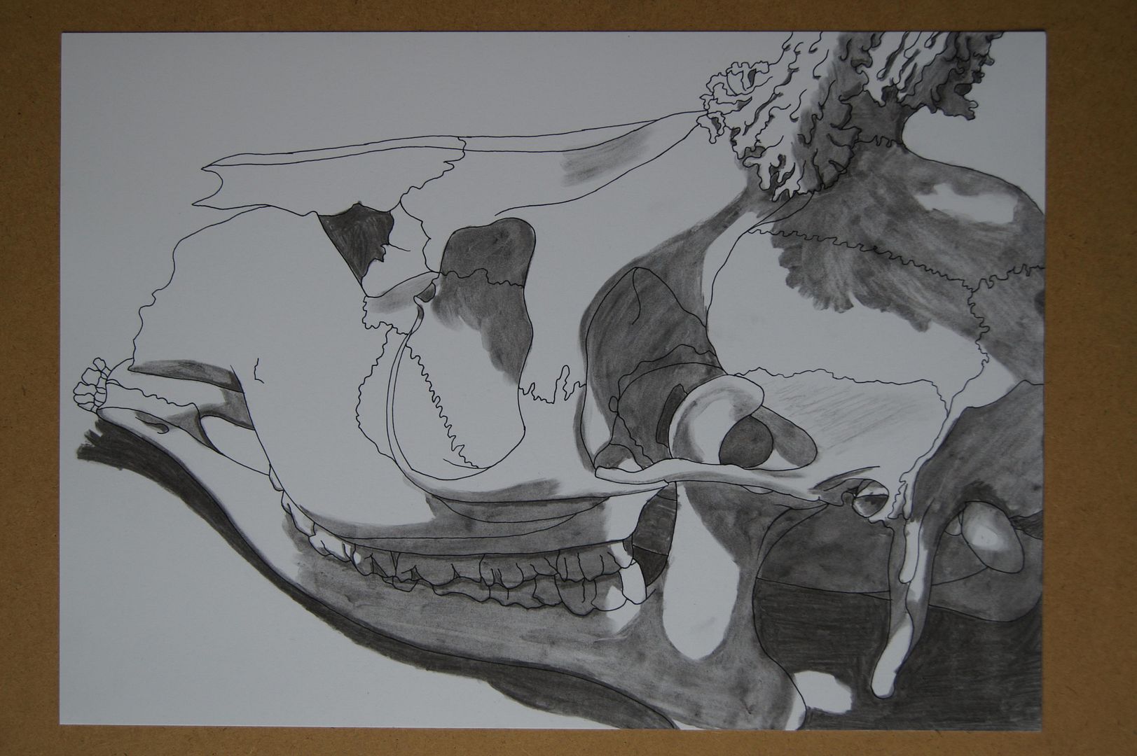
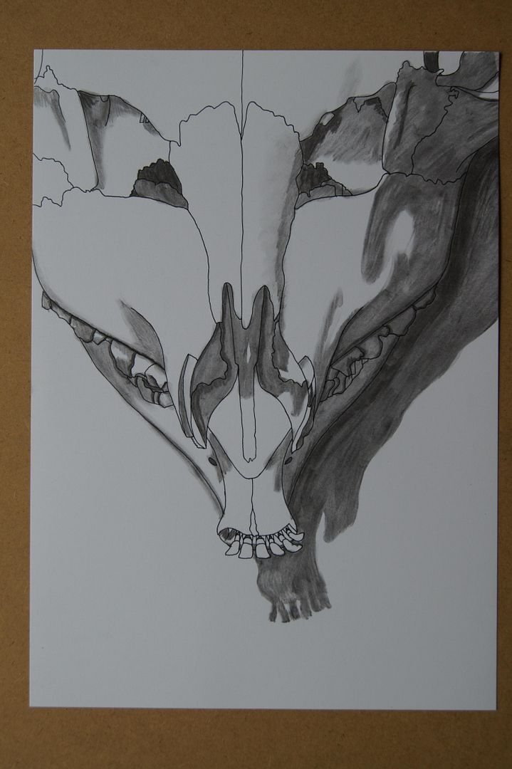
Looking Closer
I thought that this exercise yielded some very nice pictures. I did mine in ink with charcoal shading. That kind of smooth, blended black and white approach combined with creative cropping of a profile worked very well - looking at them again now, I'd like to think that I was subconsiously thinking of old hollywood portraits. I did one, the one I carried forwards into collage, with black behind it... it has a nice contrast in that one, but I thought for the others, I'd need to show their shadows on the ground, so I couldn't make the rest black - however, I compensated by making the dark shadows on the skull itself even darker. I'm pleased with the way they somehow came out simple, but with depth.
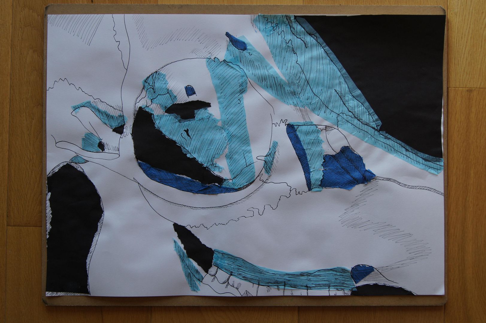
Collage
I have to say, I thought this'd be another fun exercise like the line drawing, to just help me to loosen up a bit and think outside the box for my final piece of work. It wasn't! It was actually a little bit... hard! I thought that I'd do something a bit different and keep to a palette (of different shades of blue tissue paper) and draw an outline over it. Roughly, it did work, but there's still that little niggling feeling at the back of my mind that it could be neater! It did make me think more about the areas of contrast though, and not get bogged down in planning out the details and proportion and I think that was the idea.
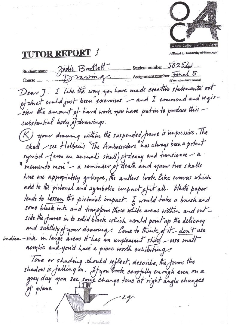
Well, as usual, below I'm posting my letter back from my tutor, and the pictures he recommended I look at. He suggested I should have done my final mirror drawing with a black background, ideally in matt acryllic paint, and so I drew another similar one which will follow this post to give myself an idea of what I should be trying for.
Friday, 2 December 2011
Assignment Five - Final Drawing
In the end, I went for a simple composition here, with the skull I'd done most of my work on reflected in a mirror. For this picture, what I'd really wanted was to combine all the elements - how much I've learnt about drawing in the tough outlines of the skull, the fact I now dare to combine different materials in the charcoal shadows, and that it's often better to have a daring composition than finding a way to fit everything on the paper.
One thing that did go a little bit wrong though is that I wanted to draw on similar smooth 'Bristol Board' ink and watercolour paper, but you can't buy it in A2! So I substituted some flexible card/mounting board that was also very smooth, and drew directly onto that!
I do think that everything I was trying to include went very well though - apart from the snout being at slightly the wrong angle. But I doubt that when you have the whole picture in front of you, you'd notice it. Still, that mirror looks nice and shiny, and the way I changed the postition of the skull's jawbone (into an impossible place, I know) to give it a more fearsome look makes it all the more exciting a picture.
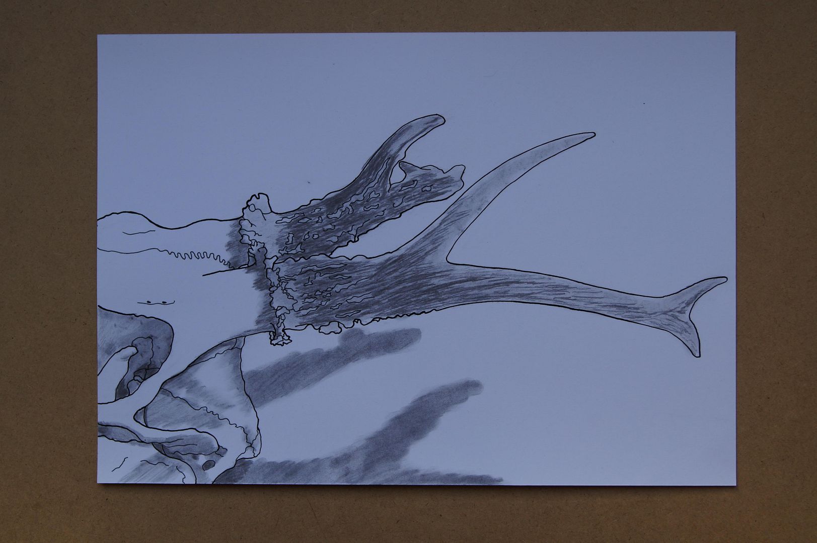
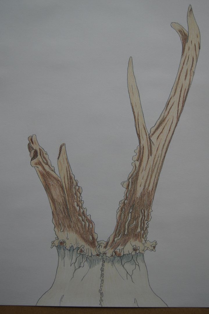
Preparatory Extra Drawings - Charcoal and Ink Antler close-up
Tuesday, 8 November 2011
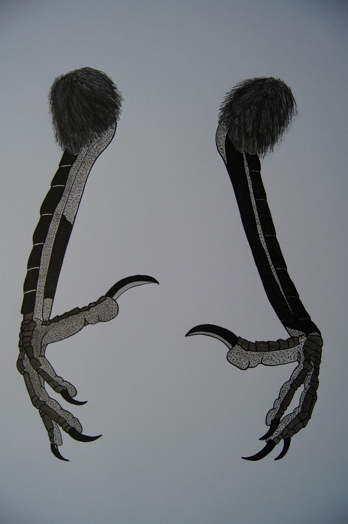
Preparatory Extra Drawings - Coloured Ink Crow's Feet
And to finish on for today, a plot of the colours on the feet too! One is actually more scaly than the other, it's not me running out of ink!
Preparatory Extra Drawings - A Coloured Ink Crow's Skull
Just a quick plan of colours for reference, as well as a different angle.

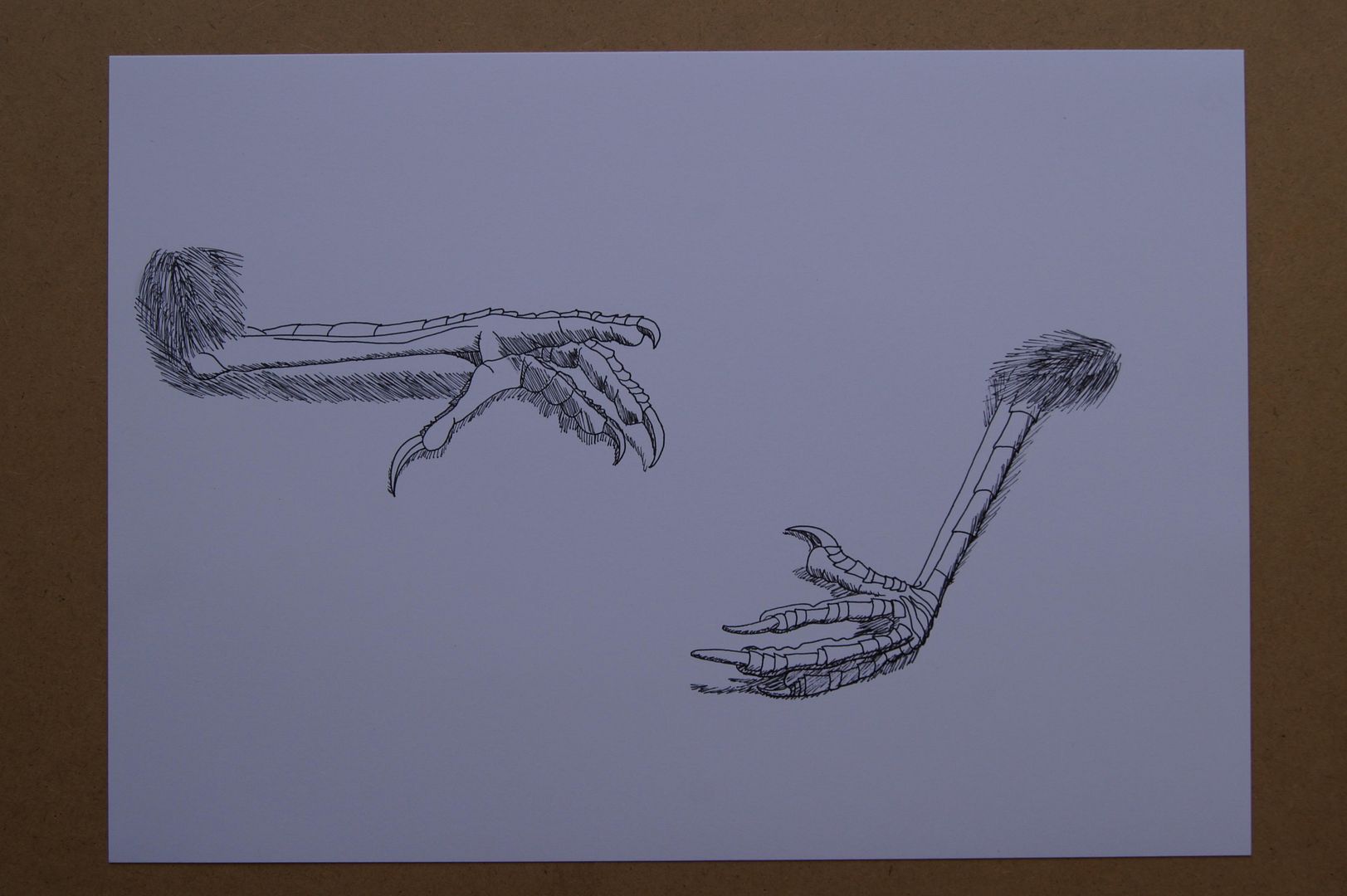
Preparatory Extra Drawings - A Pair of Crow's Feet!
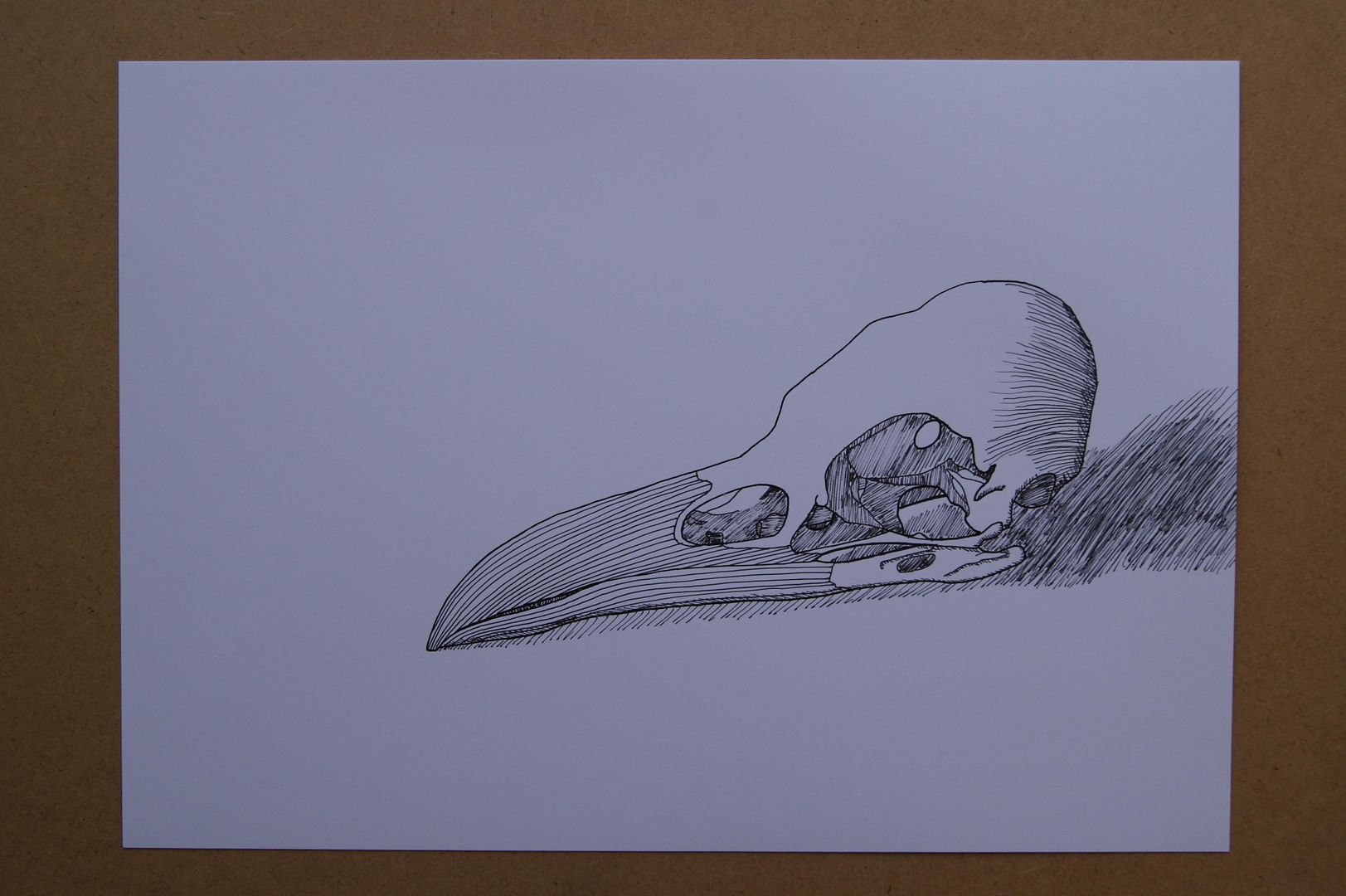
Preparatory Extra Drawings - A Crow Skull
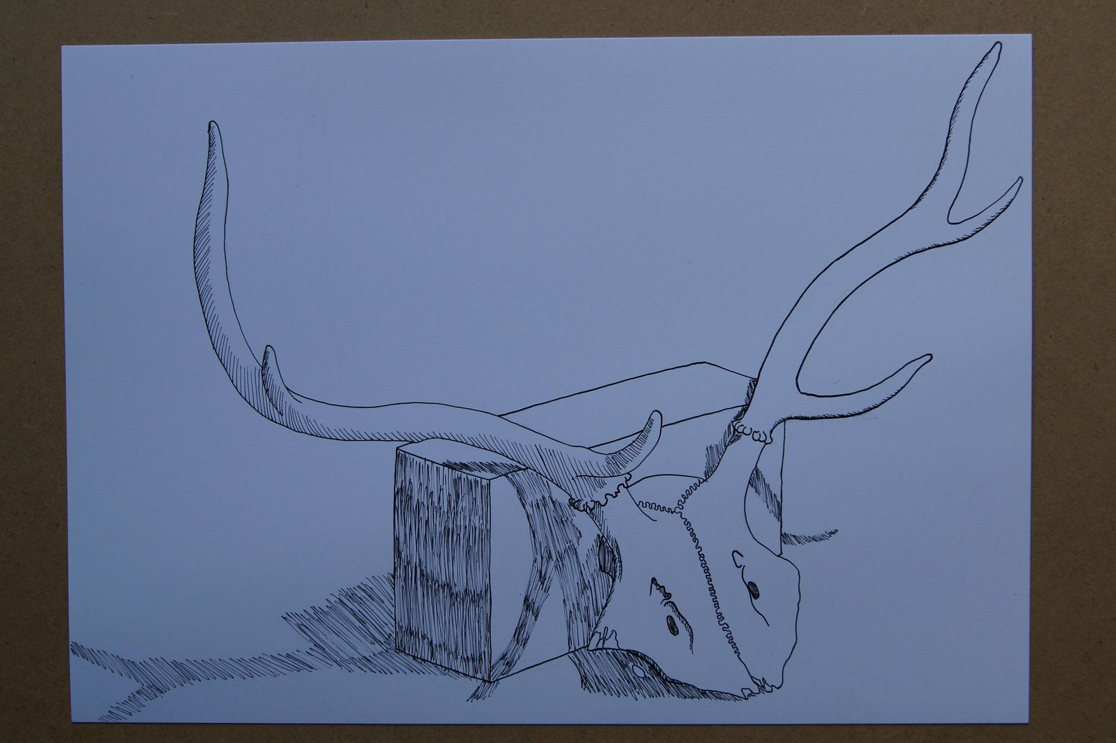
Preparatory Extra Drawings - Another Deer Skull
The Unusual Deer Skull - in Torn Paper and Ink
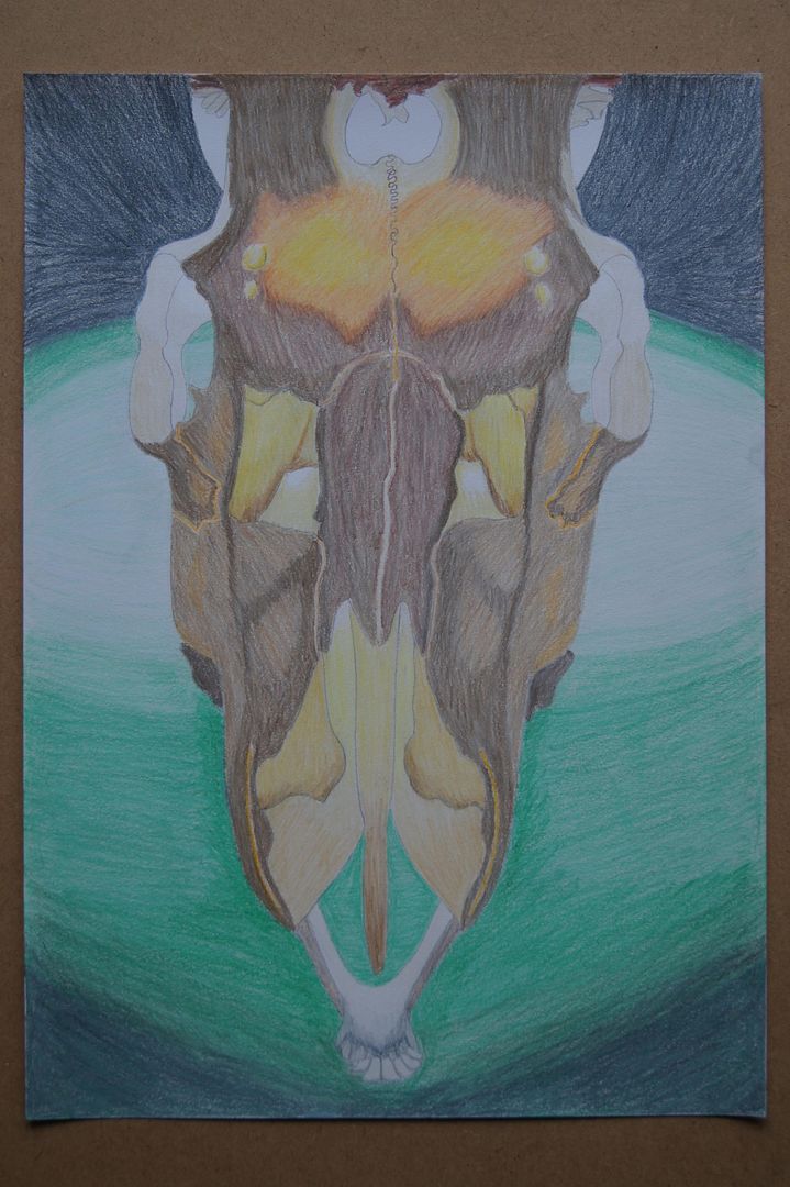
The Unusual Deer Skull - The Close-ups Part Three
The Unusual Deer Skull - The Close-ups Part Two
The Unusual Deer Skull - The Close-ups Part One
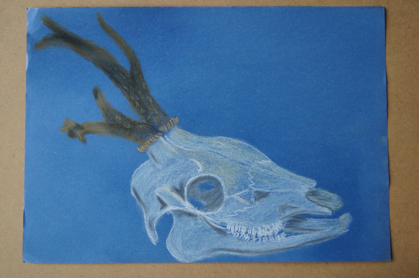
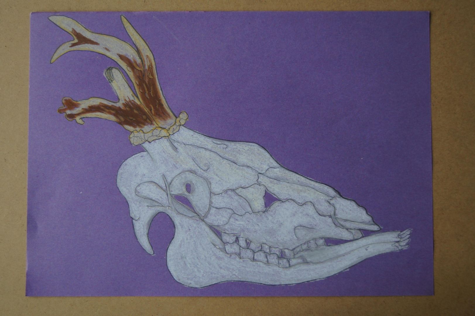
The Unusual Deer Skull - in Coloured Ink
The Unusual Deer Skull - in Dramatic Coloured Pencil
The Unusual Deer Skull - in Chalk Pastels
The Unusual Deer Skull - in Oil Pastels
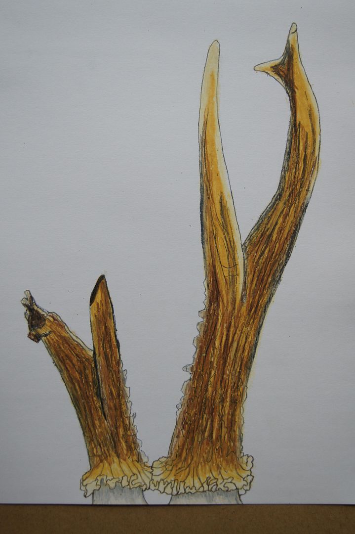
The Unusual Deer Skull - the Antlers in Coloured Pencil
The Unusual Deer Skull - the Antlers in Oil Pastels
The Unusual Deer Skull - on the Carpet
The Unusual Deer Skull - Charcoal
The Unusual Deer Skull - Monochrome
The comeback - the Beginning of Ink Hatching
Wednesday, 31 August 2011
Assignment Four Feedback Sections
Landscape drawing
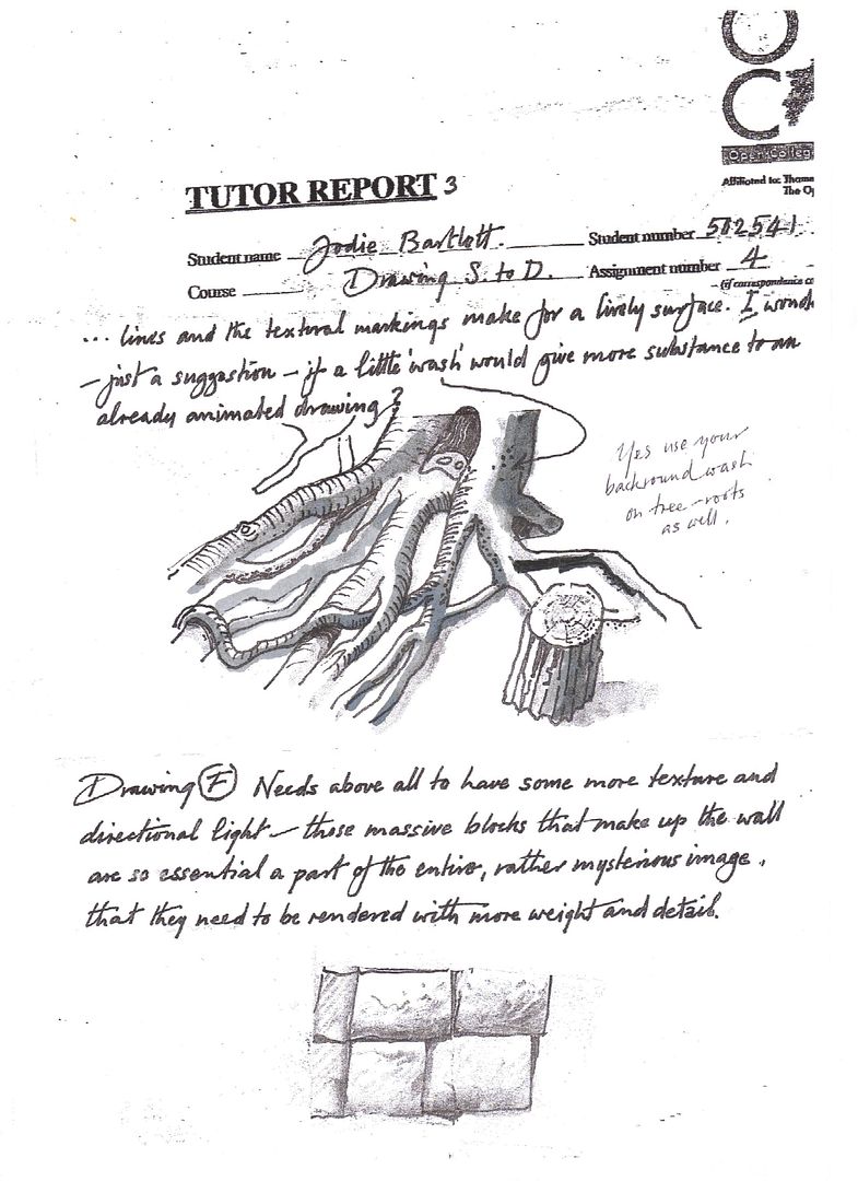
Drawing landscapes makes a nice change for me, as I know for a fact that I am not expected to finish a drawing of a place with every single item and texture. For instance, in the first drawings I did for this section, just before the cloud drawing exercises, I had a rather novel way of drawing clouds. In the constantly overcast skies of England, and I think you can see this best in a drawing I have here on my blog, “Charcoal Garden – Shrubs and a Dramatic Sky”, rather than outlining the clouds’ shapes, I simplified them to shadowy undersides, in a sky with no gaps of blue! But regarding what I ‘simplified and selected’ - of course, it’s easy to draw a brick wall or some fencing, but (and especially if you live out in the country as I do) what really becomes a problem is how to address every different kind of shrub, tree and flower, and make them all look – well – different. I found the best way to get through it was to give a plant a particular leaf shape and try and approximate the size and shape of the object to be ‘filled in’ with the shapes. But I agree that it’s tricky to try and create a good likeness without being bogged down ‘amid all the visual information’. You ask how I created a sense of distance and form in my sketches, and all I can really say is that on the distance side of things, I tried to get a composition that flowed from foreground to background well. For instance, in my ‘charcoal panorama’ series up on this blog, I had good sweeping roads and rows of houses curving away from me, dwindling towards the horizon. Is that cheating? Well, even if on the distance and texture side of things I did ok, I can’t exactly say the same for ‘light and shade’. As I say, when most days are overcast, you don’t get dark shadows stretching across the lawn from the house. So I feel I neglected my use of light and shade on this part of the assignment. Although, I didn’t forget about them in the air – by way of shadows on clouds, that is. I’m particularly proud of two very bold conté cloud drawings in my sketchbook that came out rather well – I drew in the clouds and their dark, dark shadows by drawing them in as black as I dared, then smudging them out toward the edges. When that was done, I didn’t think it looked as 3D as it probably should and tried to come up with a way to make it stand out from the background. So I took the blue parts of the sky and turned them cross-hatched. When you ask “What additional preliminary work would have been helpful towards the larger study?” I assume you mean ‘what kind of drawings might I have tried out more in my book before the last drawing’ (the one which considers loss of detail in regard to distance). My major problem with it (and it’s listed here on my blog as ‘Different Layers in Landscape’), was an interesting way to do the grassy lawn nearest me. I also would have tried to find a failsafe way to do ‘sketchy’ clouds, rather than the ones I did get to practice in my sketchbook - that I could lavish a whole page on!
Perspective
I thought in this exercise (which is entirely in sketchbooks, unfortunately) that I’d do something smart and draw a doorway through a doorway. Don’t worry; I practiced with just one to start with! Unfortunately this doesn’t always work – even when the doors seemed like they might be lining up at about the right point, the rectangular rugs I’d put down seemed to meet at two different horizons, which can’t be right! Of course, personally, my biggest problem was that I would worry away until I thought it looked right, and then when I was happy with it, I tested it and found I was wrong by miles! How demoralising! Anyway, I’m pretty ok with using rulers for the sake of accuracy, so this wasn’t too much of a shock – but the trouble with drawing over a picture when it’s finished is that you’re left with a dissected view of a doorway or street that self-evidently doesn’t quite match up! There’s not even a nice keepsake of your time spent drawing! Still, it’s a necessary evil, I’m sure.
Townscapes
The first question that you ask in this section is “How did you use the limited colour palette to create a sense of depth?” But I’m not sure that was the idea I had in mind when I attempted the exercise… Certainly, the way I attempted it I assumed that by choosing two or three colours, it was challenging me to pick what I could get most use of, and be more conservative with the colours – if something stood out but wasn’t a colour I was allowed to use, I could fill it in darker with another colour, and lighter in other spots, if you see what I mean! Again, I chose a subject that (although I thought on this occasion that I couldn’t develop it from my previous sketches of the house I drew earlier in the section) made it very easy to achieve a sense of depth – a narrow corridor of a road that’s walled on both sides. Although I didn’t use my first building’s sketches in the limited palette exercise, that’s not to say they weren’t useful – in the folder it only said to do quick sketches and eventually commit yourself to a colour picture. I wasn’t too sure how to interpret that, so I did a nice big colour picture of the building as well before moving on to find a good place for the limited palette exercise. I suppose that really, my sketches helped me to find the best view and realise that I could crop the view so it didn’t include all of the difficult foliage off to the side of the house. I suppose I also felt a bit guilty at first that the house stood on its own and wasn’t part of a street, but as I drew the building from different viewpoints, I could see that it was a composition that worked in its own right. When you ask, “In what ways is the drawing from this project better than the last?” I assume you mean from the perspective drawing. Obviously, in this one I don’t have to check my angles are exactly right – although I do feel somewhat obliged now. I can put in as much detail as I want and feel freer in the ways I can put my impression of a place on the paper without feeling that the focus must be on how straight my lines are! I think that I missed out a bit on making the majority of these exercises about the one lonely house, and not being able to judge the scale and angle of the roof against the other buildings, basically. Finally, the atmosphere I tried to capture in this section – it wasn’t the best time of year to do ‘atmosphere’ because the weather is so in-between seasons. It’s not snowing or in bright sunshine. Still, as I’m writing up the end of this section, I would like to mention how proud I am of a particular statue that I drew and isn’t really mentioned in the official questions here – a great way to get instant gothic atmosphere is to draw something as dark as church memorials!
Drawing Trees
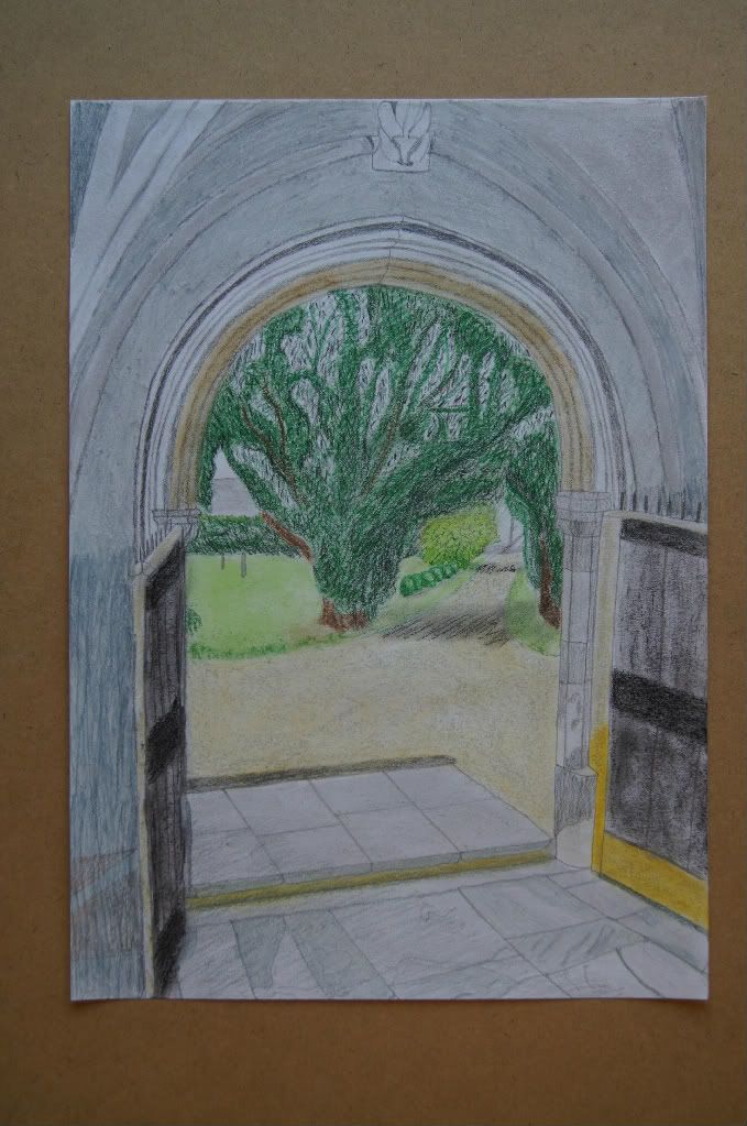
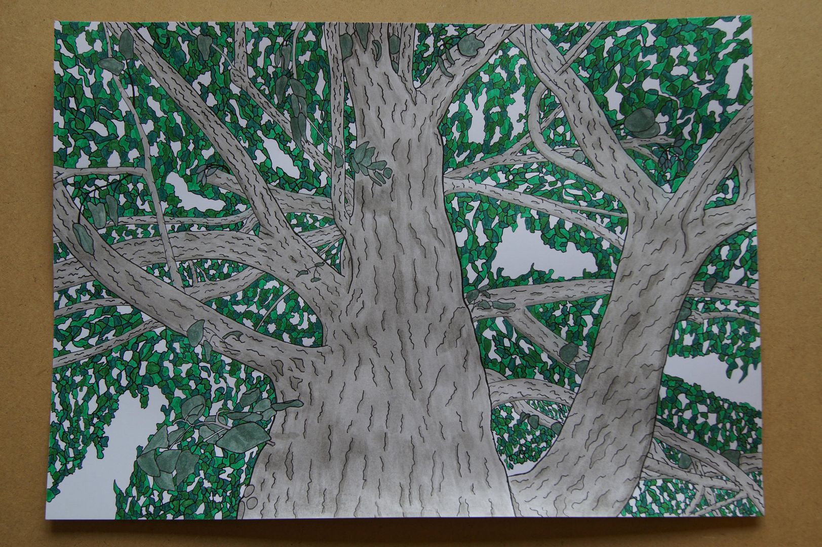
I think I’ve drawn about ten different types, but far more trees – I did quite a bit of the trees in the garden, at the churchyard, etc. One of the most challenging things about this section was trying to distinguish each type – for instance, there’s nothing particularly different from your average, basic, 'cartoon' tree and a Lime. I didn’t want anyone to think I was being lazy! But to give you another example, working down the churchyard gave me a lot of practice with Yews, which were quite difficult to start out with. They differ in shape so much that there’s no foolproof technique to use with them. What really sets them apart from other trees and that is most often useful is the colour of their bark – such a brilliant reddish-brown that combined with it’s clumps of needles, defines it. I tried a few different techniques to show the mass of leaves, but one of the more successful (if most time consuming) approaches I took was in my drawing which I have listed on this blog as “Dip Pen and Ink Wash – Tree branches” where my basic idea was to create interest in a believable way – where the biggest spaces were in the canopy, I left the sky, and covered the rest of the paper in small shapes that were as random as I could manage. Then I coloured them all in, in different colours so as to show the shadowy undersides of the leaves lower down around the branch and the lighter, more transparent colour of the leaves the sun shone through. It's so complicated to even attempt to show shadows falling from one infinitely complex shape (the leaves and branches) onto another (the trunk and the grass), when I simplified it, I was so pleased with the way it came out I forgot the shading, which I think was a mistake. On the other hand, it was really quite simple to treat them as one large irregular shadow in the sketchier pictures! See “View from a Church porch” here.
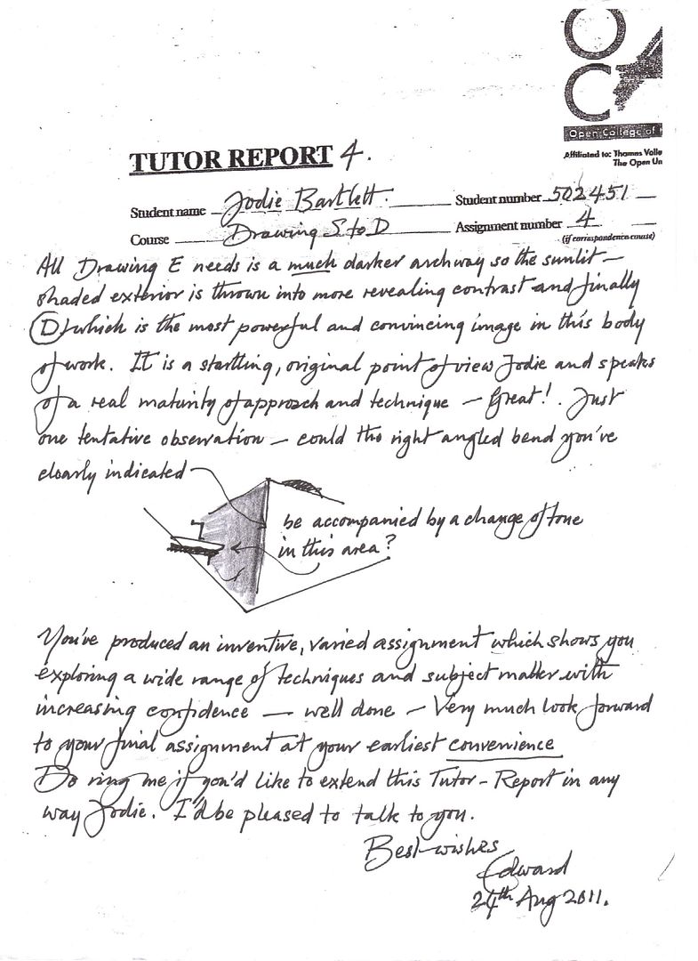
I think to finish, as it often says in my folder, one of the most important things to learn about landscape drawing is knowing when to leave things out, and that’s what I have to try and remember – my personal battle is going to be to know when a detailed texture might be too much and that even when it isn’t, it never compensates for lack of shadow! Anyway, as usual, I'm posting up my tutor's reports and reference pictures to end on. Here you go!
Monday, 15 August 2011
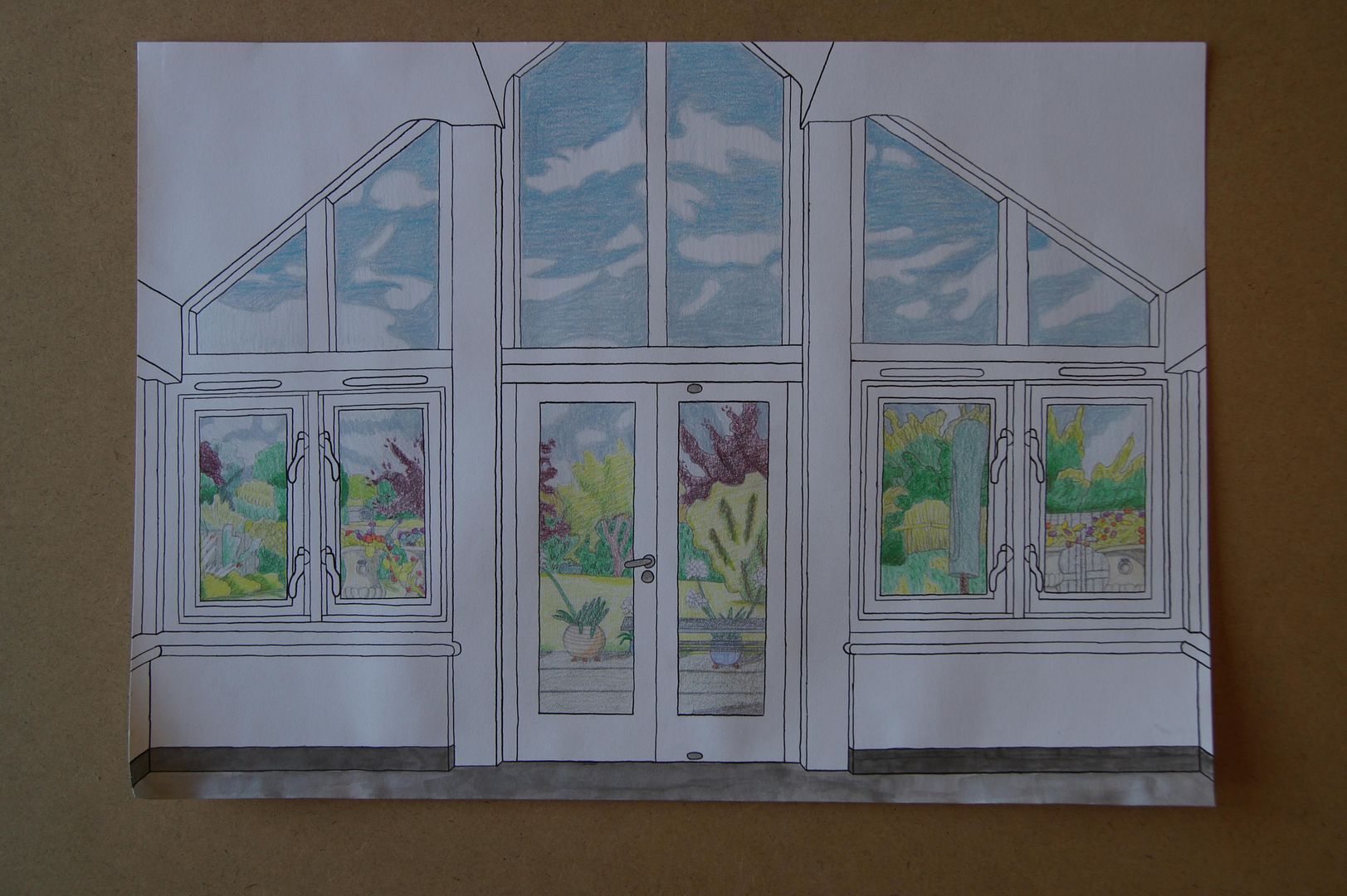
Assignment Four Finished Picture - View from the Garden Room
View from a church porch
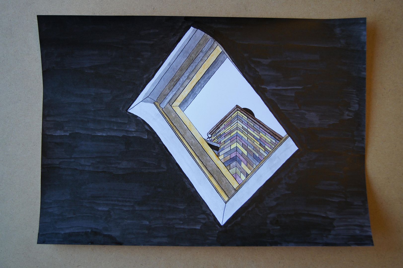
View through a skylight in ink
Thursday, 14 July 2011
Dip Pen and Ink Wash - Tree Branches
Dip Pen and Ink Wash - Tree Roots
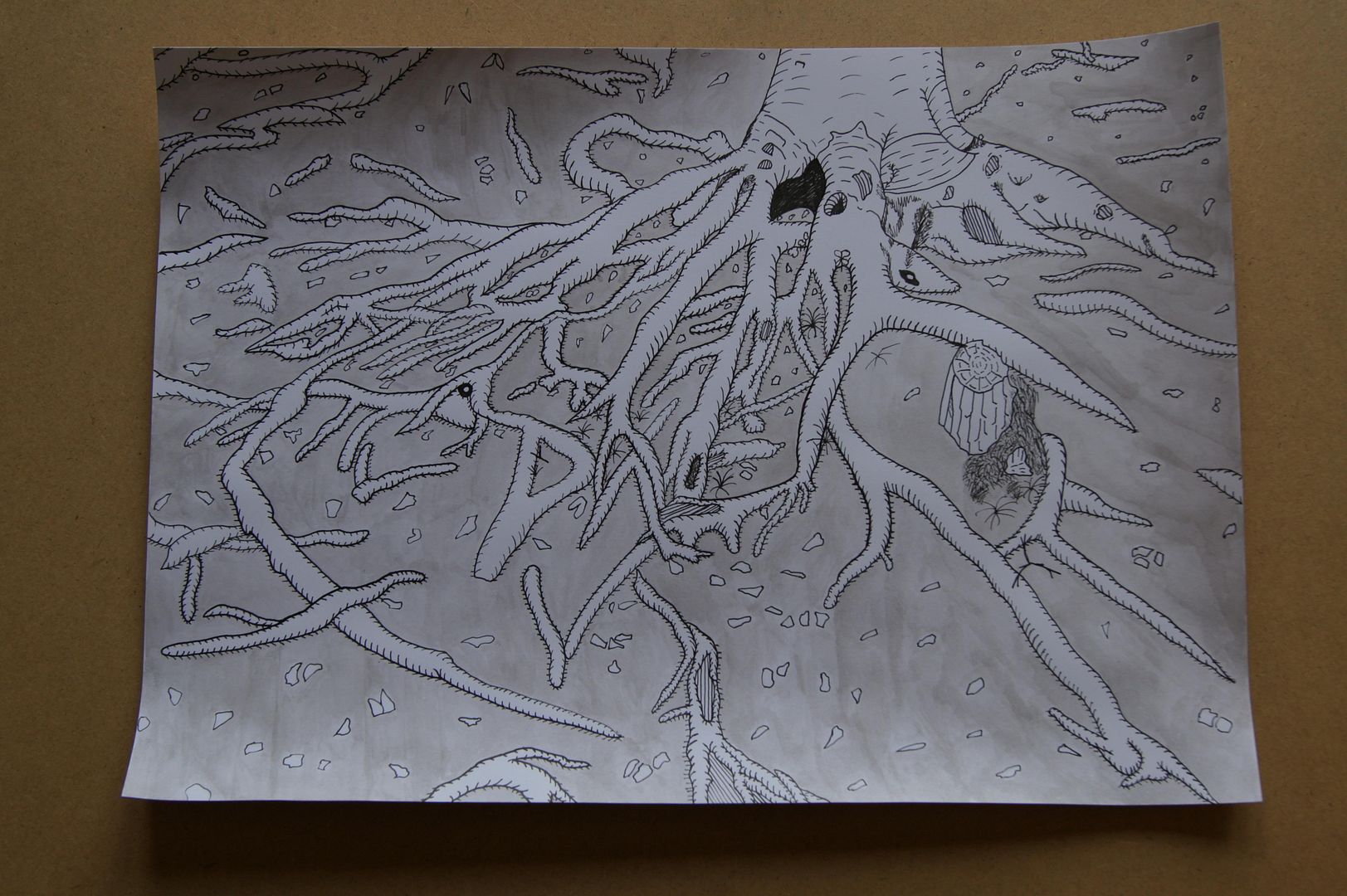
This picture has lots of interesting little details that you'll have to zoom to see, like the clumps of moss round the stump on the right, and the leaves floating in a little pool of water at the bottom of the trunk. By the way, I thought that because I was going for an 'engraving' look, the most I could do besides covering the ground in hatching was to colour it grey. I'm very happy with this picture myself.
Tuesday, 31 May 2011
Looking up at the church
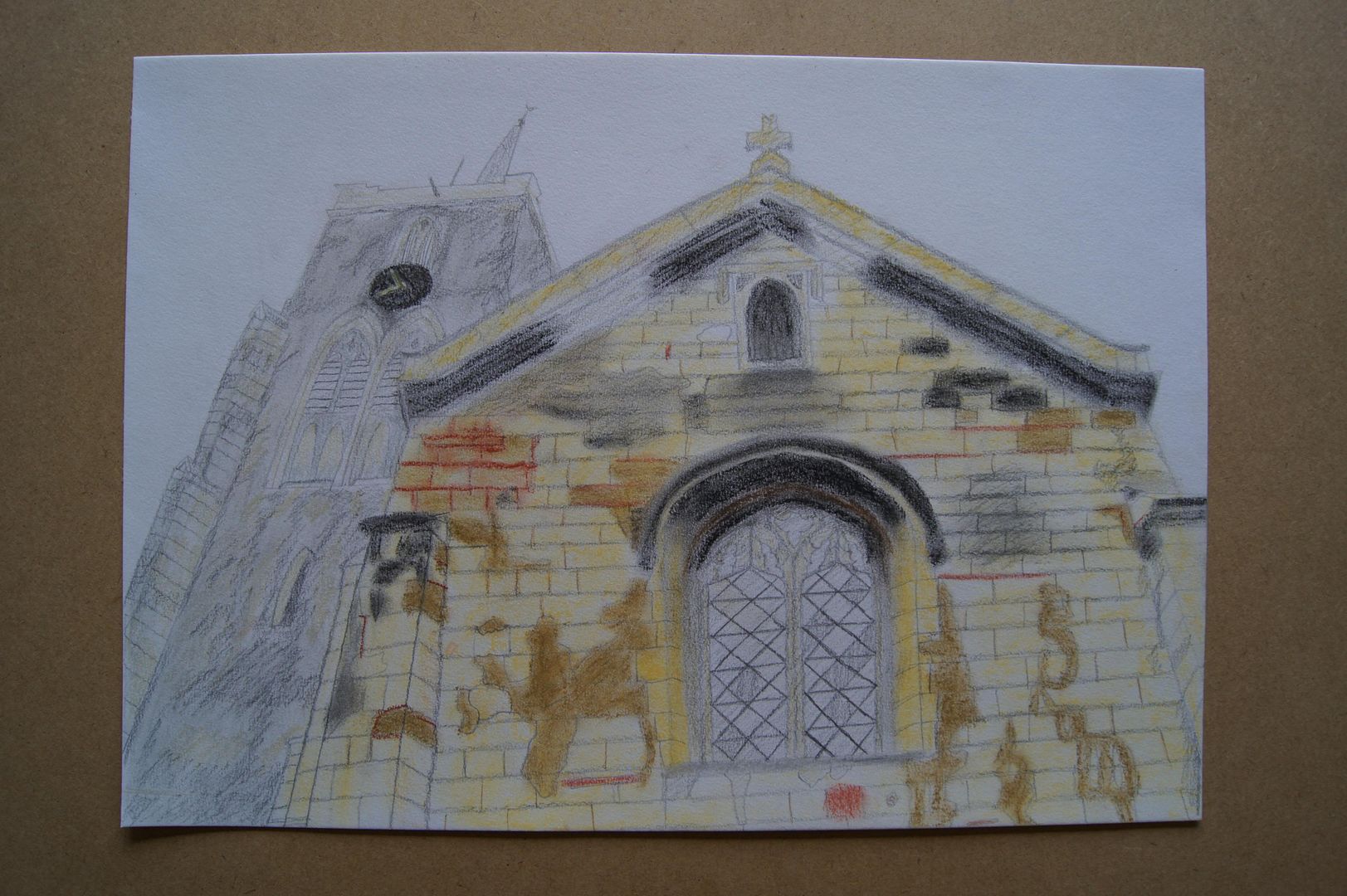 I did this in a similar style to my other church picture, but maybe a little sketchier. I loved the dramatic angle I could get here, and although it was a very overcast day (the sky was literally white) with no patches of blue sky to provide (probably much-needed) contrast, I still enjoyed doing the picture. I particularly like the chipped and repaired brickwork that lends it detail - to be honest, the whole building is a bit of an architectural patchwork quilt!
Oil Pastel Street
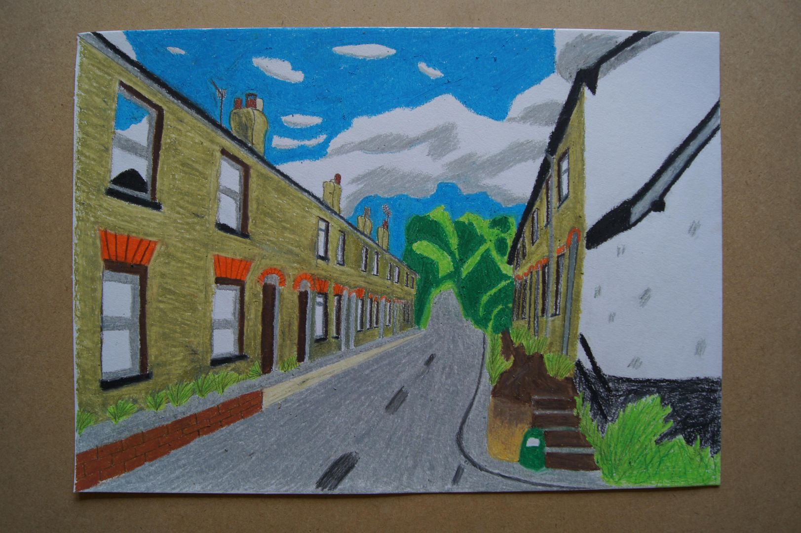 Here's a street at the other end of the village that has always interested me. It's always had quite a sad air about it - it's one of those streets where everyone's blinds are always drawn, and you never see anyone going in or out. At the end you can just about see (where the trees begin), the road goes up a very steep hill. In this drawing I kept some realistic details (the reflection of the sky on the closest window, the proportions and perspective) and left some out (emphasis on shadows, muted colours) making for what I hope is an interesting and cheery drawing. I suppose I made it so bright because it's coming up to summer and things are looking up in the sun.
Rubble at the Church
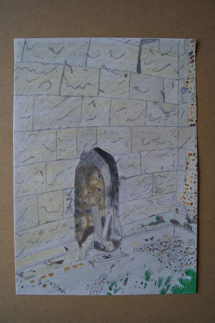 Here's a picture I just felt like doing - without sticking to a particular material or style, not thinking about anyone else's instructions or work, what happens when I try and capture all the detail of a scene just by instinct? This odd picture... It's pencil, pastel, coloured pencil, and more pencil on top. All the gravel kicked into this corner, mingling with the chips falling from the church masonry was an interesting opportunity for detail. I'm not so happy with the way the stone blocks in the wall look, but how can you capture that texture without a proper close-up? They're so pale, sandy, and flaky. Anyway, I tried to get in all the colour and texture I could on a sheet of A3 - in the end, I think it was a good learning process, and has an individual look. It took a surprisingly long time to do as well, so it was a relief I liked it in the end!
Different Layers in Landscape
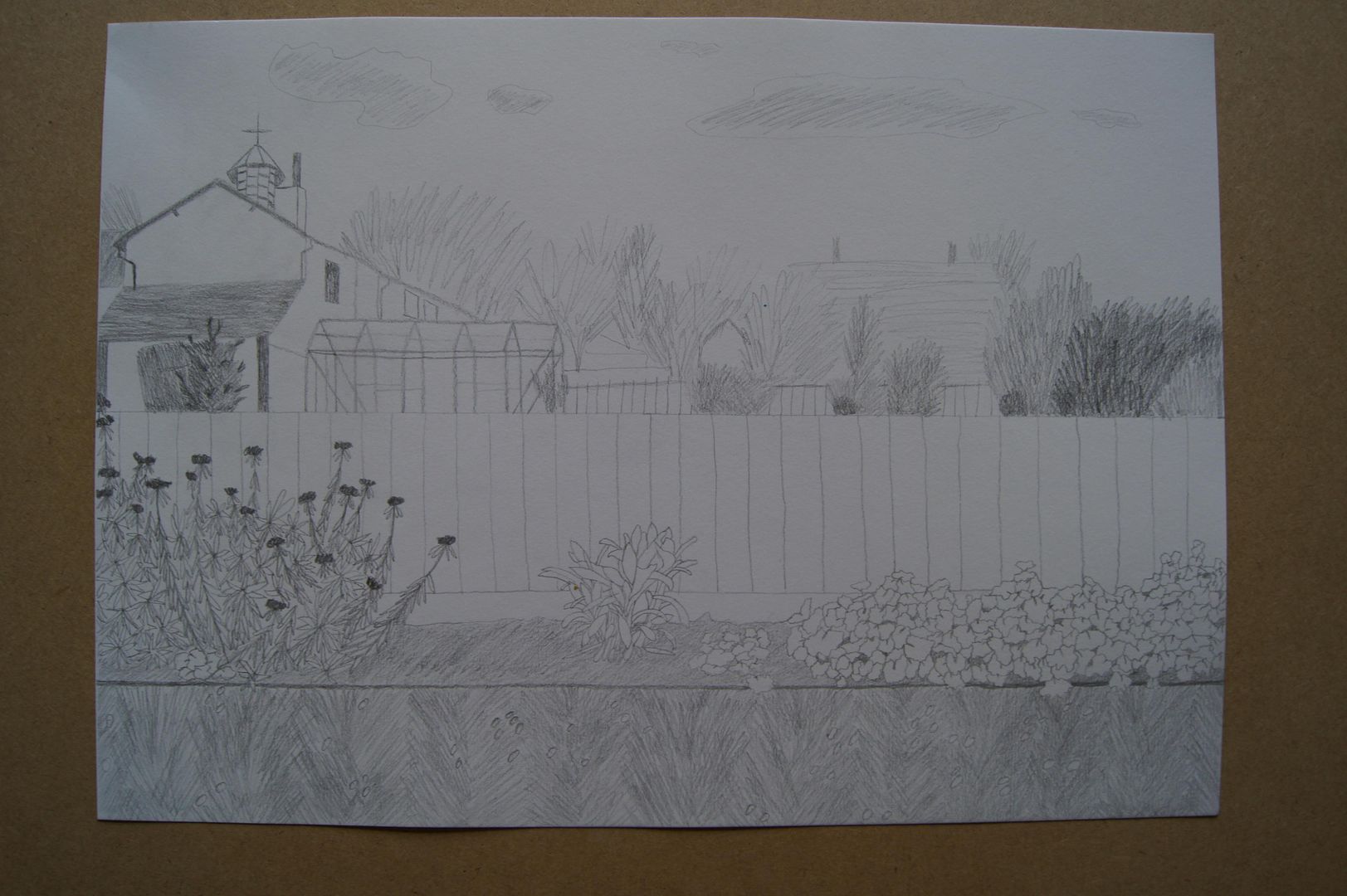 I've been very busy this month, still doing a lot of work in my sketchbooks (started a new one about analysing different artist's styles), so the blog is looking a little neglected... But I hope it'll pick up next month. So anyway, here's a picture I did looking over the fence in the back garden, across the neighbour's garden, and to the village hall. It's a nice familiar sight for me. The idea with this one was to do a drawing that had a very detailed foreground, less so middle ground, and sketchy background. Despite it being detailed toward the bottom of the picture, I didn't know how to tackle the grass, which is my main issue with the drawing. I didn't want to do a load of untidy stems all at random, but felt that vertical lines would just be boring. So I set to work on something that might not be true to life exactly, but was more lively. A few leaning one way, then the other - like this: ///\\\///\\\
I'm pretty happy with it. The greenhouse was a little difficult to tackle, sure, but I think you can see what it is just fine.
Monday, 25 April 2011
Charcoal Panorama Series Part Four
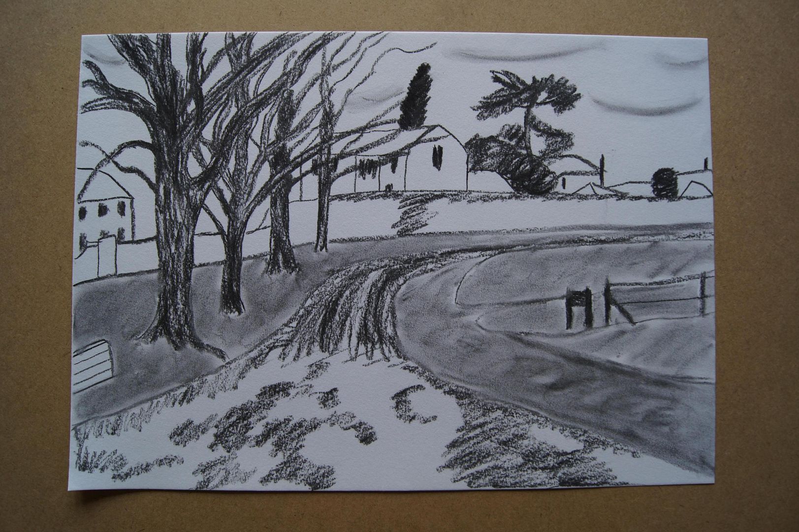
Charcoal Panorama Series Part Three
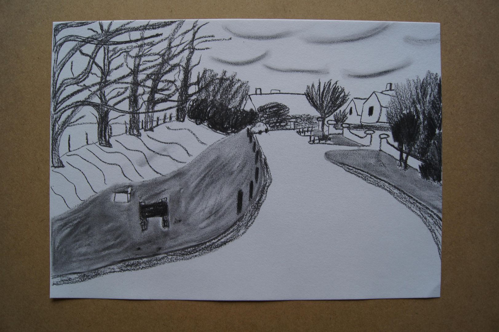
Charcoal Panorama Series Part Two
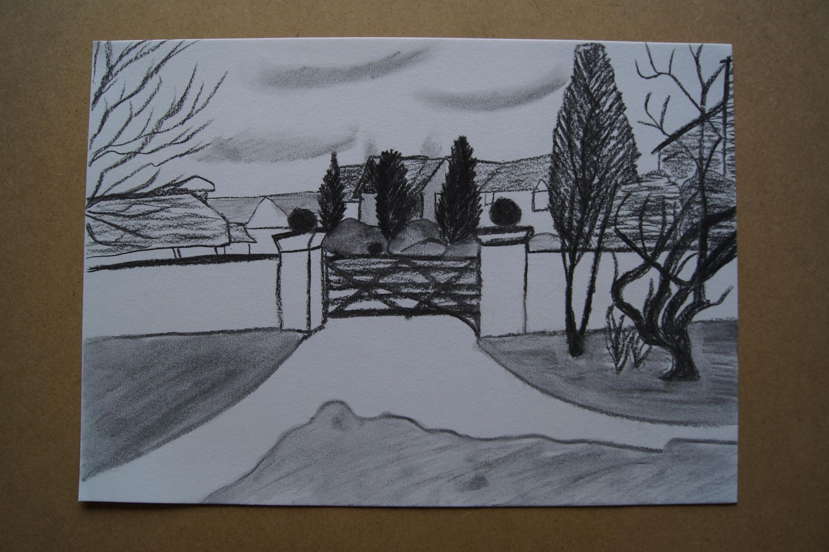
Charcoal Panorama Series Part One
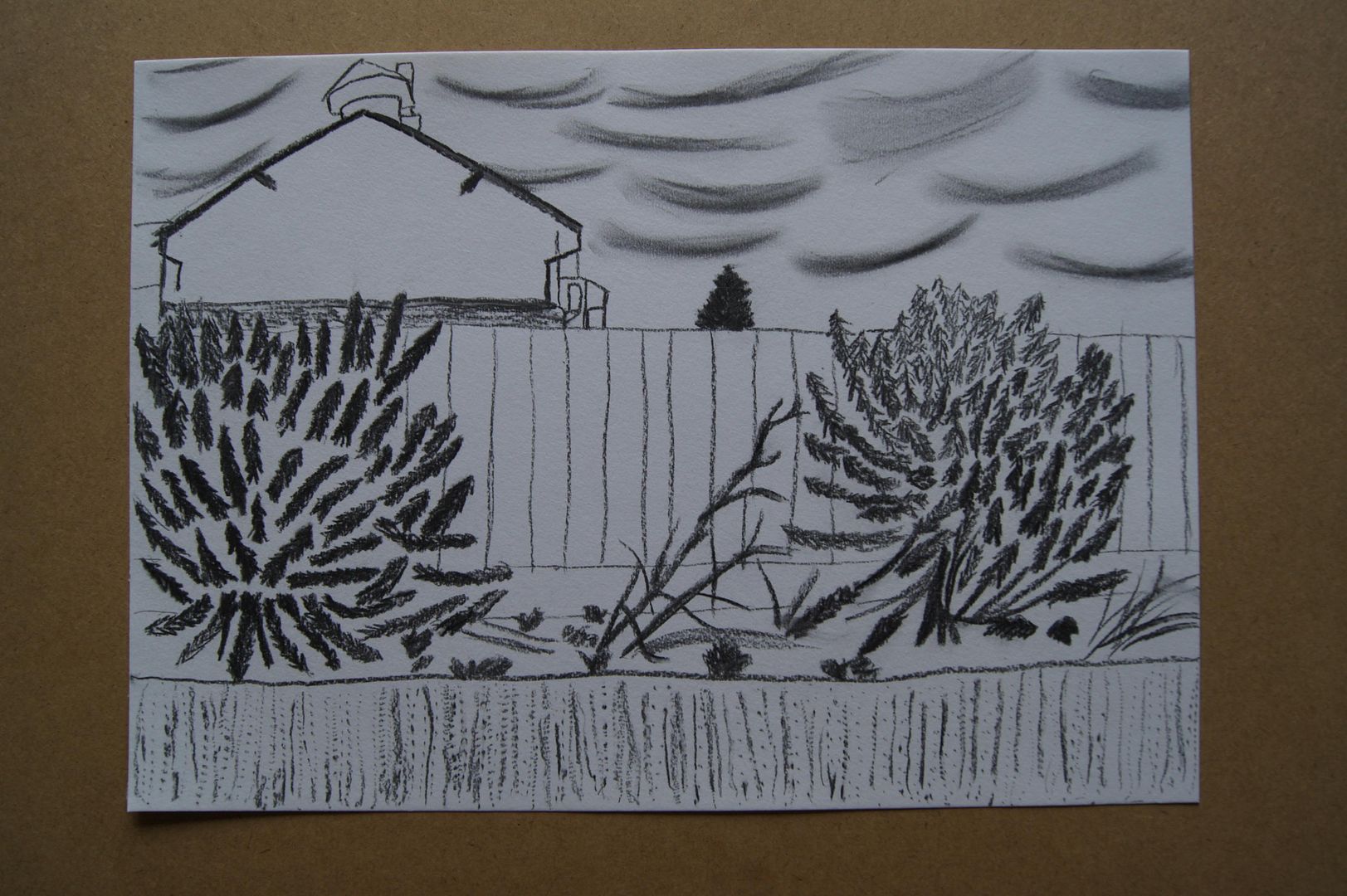
Charcoal Garden - Shrubs and a Dramatic Sky
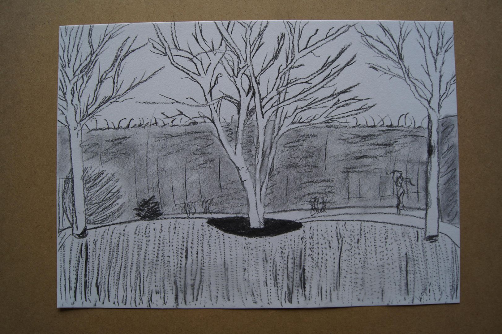
Charcoal Garden - Trees and Hedge
Tuesday, 29 March 2011
Assignment Three Feedback Sections
To begin with, in this section I've discovered something very important - dip pens! Pretty expensive to keep up, but I've got a good set now, and I focused on them most for this part of the course.
Exploring coloured media
This little exercise was a bit like going back to the start of the course! Very refreshing to doodle away. The oil pastel and ink dip pens I think I liked best of these bits. What a turn around! The coloured pencil (I may be biased) seems a bit 'samey' now. It's either very flat or, if you're trying to create tone with it, distracting. Let me explain that one - you're not seeing the colour, you're seeing the marks made by the pencil. I hope that makes sense! I tried some plain pastel next, and it's fine - nice and smudged. I tried to do a curved highlight in one of my pastel boxes, and it didn't come out all that well. I would have made it lighter in the middle with my eraser, but that felt like cheating here, when it should really be the pure medium. The oil pastel was a bit dull at first, until I tried the same highlight as the other pastel - it came out really well here! It's quite hard to explain why, but it faded at just the right moment to give an impression of a curve. I'll have to try it out again later, and hope this wasn't just a fluke! I did some felt tips after that, and tried combining them at a couple of points. The trouble with them is that if you choose colours that are slightly too different, it can look disastrous! As for the last boxes, I used some dip pens and the ink I had (Sorry, there were only two colours that hadn't separated into water and solid blocks of coloured...pigment? Would you say that for ink?) from an old calligraphy set. They came out very well. I thought they were striking as there was no possibility of the marks being random in a false way - it blobs by itself, so you can't subconsciously organise it (that's ok here, but I'll see how it pans out - I might not be so happy about it dripping in a detailed drawing!). At the same time, while gel pens are preferable to dip pens, being more predictable, I'm intrigued by the variety of vivid colours. While my gel pens are still looking good in the blue and red experiment, I think that the ink could also lend itself to detail well. I think I get a kind of thrill from using the dip pens because it feels so... historic? Very cheesy, I know, but it does make you feel a bit like some kind of scholar or poet. Oh, and the cross-hatching with different colours looks great!
Detailed observation of nature
The feedback questions for this section are a bit awkward to do online, so I'll give an overview. I thought that my pencil drawing (that you can look up, it's the one with the avocado) worked very well, and the texture on the avocado itself was particularly good. It was more... knobbly(?) On one side and smoother on the other, so to bring that out, I used little groups of ovals for the rougher side and wobbly lines that curled up where it was smoother. This is more difficult to describe than I thought! After I'd done them, I shaded under them and across the parts that were in shadow. Then I had to go over the line work with a darker pencil and build up the layers. Normally my drawings are too light, so I hope you'll forgive the slightly underwhelming contrast. I think it looks fairly real though, and I'm happy with it. The line and ink drawings I did in this section weren't as good, but I'm not as practiced with them, so I suppose I have a bit of an excuse. In one of the ink drawings I did - 'Dip pen experiment', some dripped from the pen onto the paper where it shouldn't be - I know I shouldn't be, but after getting on ok with the pens in the first two drawings (of twigs) I did, I wasn't really expecting it, and got quite upset about it blobbing. I tried to paint over it... Didn't really work. Ink is good for spindly twigs and little withered leaves, but not for shadows I find! I think I can work out a way around this though - maybe do drawings in ink, but do their shadows in felt tip or with a brush in grey ink? They do look a bit silly when the subject is a similar colour to the shadow. My pink and blue leaves (that I did when I only had a couple of different colour inks) were a little plain - I should do them again but adding more detail (and/or texture) next time. I thought the best part of that drawing was the twig with the pine needles on I'd accidentally brought back from the woods (it was attached to something else and went in the bag with it), to be honest! The shadow for the needles wasn't the best in the drawing, but I thought it was the most eye-catching piece. I thought my composition for these bits was mostly alright, save the ink line drawing of the lettuce leaf earlier (just 'Ink lettuce'), which I started in the middle and went left, thinking it'd end up bigger than it did. I don't know if doing line drawings helped me see the space bigger for a couple of reasons. One - that the actual composition of the line drawings wasn't too brilliant; two - that I did them on A4, which may be easier to visualise filling up to the edges (in my mind anyway) and three - that I have a bit of a problem drawing objects anything but 'sight-size' if you know what I mean. I don't know if I can 'zoom in' on a couple of different things or a very complicated or awkwardly shaped solo object and have all the different areas in proportion at the end. I need to work on this. Oh, and to wrap up this section, I'll just mention that I've always been a real devotee to detail, unless, as I've discovered, I get halfway through an ink drawing and think "what I've done so far is good... I don't want to drip ink on it!" and get stuck. Not a good place to be! I would never have thought that (aside from perseverance) I would need such willpower!
Still life
Note to self. Must think more about backgrounds. That's what I didn't think worked. That, and I need to work more on the texture of wood. I've got to crack it to make more interesting set-ups. I think I'm getting to like linear drawing more now - although I'm tempted to go over everything with pencil to give it a shadow, when the picture's finished, it's normally...passable. Now, I normally discuss what I think worked and what didn't under each picture I post, but I'll talk a little bit about it here. The coloured pencil drawing 'Coloured pencil still life with peppers' (me being a stickler for detail again) I felt worked better than the pastel one 'Pastel still life setup with peppers'. As always, I'm trying to improve my pencil drawings by making them darker. I thought I did well in this drawing - but doing a pastel drawing on the same scale (too small) as a working pencil one was never going to yield the appropriate amount of descriptive detail. The more linear one 'Ink still life setup' was... ok. I resented not being able to use more defined outlines with the pastel and pencil drawings and not properly including shadows in the ink picture. But that's me, trying to be a perfectionist. I thought the pen picture had a kind of naive charm to it, especially with the little trail of snail shells, so I got over it not looking true to life depth-wise. I should also say I liked the twig covered in pine needles in that drawing the best - it's a good detail that lends the whole picture more credit. I suppose it didn't require as much detail as the log in the background (which I failed at, I feel), so it was easy to make it look more realistic. I may be rambling here! I felt that some aspects of the more tonal drawings (especially the grapes in the pastel drawing) needed more definition to make them stand out, basically, but that's not the idea! After I'd finished them, I realised that a sketchy contrasting background would've been nice... Well, I'll remember for next time. I was trying to do the shadows right, so I put them (the real life objects) down on some plain paper and it didn't occur to me until they were done that they were... floating. I do come off as forgetful here... I suppose something I can give myself credit for is that I wasn't tempted to put everything out in a line or on a grid pattern, and overlapped my objects for more depth. That's something!
Drawing fruit and vegetables in colour
(I did quite a few of the bits for this in my sketchbook, but the couple of examples I do have on this blog are pleasing.) Having done... well... next to no drawings with oil pastel before, I think I got on ok here - although the example in the folder of another student's drawing is really lovely, and, I think, much better than mine. As you can see though, I had a couple of tries, and I'm getting better. Practice practice! Anyway, in my dip pen drawing, 'Ink still life setup (with pineapple!)', I suppose I do have quite a bit of negative space. After I'd filled in the fruit, it looked so nice that I didn't want to risk a scribbly background that might blob. I know that I could do some deliberate blobs to add interest, but I'm just learning about it, and that idea scares me! In my oil pastel drawings, I have very little negative space (excepting the 'Bowl of oil pastel fruit', which I was going to put a plant behind, but didn't in the end, because I loved the colours all together and didn't want to add green!) I filled in the background of my first attempt 'Oil pastel fruit and veg.' part-way with some black for the edge of the desk. This drawing has four different sections of negative space to my eye. Layer one, fruit; two, plate; three, desk; four, pale yellow background. It depends what you count! Another thing about this section is that I didn't realise how colours completely opposite or far too bright or dark work well layered over others. In my bowl of fruit, for example, the shadows on the oranges I used purple for! That's not right! Surely a dark red / grey combination would be better! And yet, it looks great! Getting in some practice with these new materials has been good, and learning to draw the detail in anything will improve your next attempt! You ask what I found most challenging... I suppose the worst bit of these drawings was the plate in the first oil pastel one here. I suppose I should have had a trial run with them and got used to where the colour would appear... Um, let me expand on that! With oil pastels, as they don't run straight into a point like a convenient pencil, when you draw with them, the line that you (or maybe just 'I') want to appear in a certain place will be higher or lower than you were expecting. Pathetic, I know! But unlike pencil, it can't be erased, and unlike chalk pastel, it can't be smudged back into place. Takes a little getting used to.
Drawing plants and flowers
Doing the negative space exercises for this bit, I had to leave out almost all detail, something that I'm fiercely against doing! However, I did a couple of them, and I think my composition (dare I say composition, what I really mean is 'fitting all the leaves on this side of the plant on this piece of paper and hopefully leaving enough room to fit in the rest'!), were I to work out the negative space for a drawing with this method before launching into the real picture, would be improved. I mean, like I say, if I have to fit a tricky subject onto paper that looks a little too small for 'sight size' then at least if I can't get the hang of fitting it into the space properly, I can get a sense of what would look good cropped creatively. They do look quite unique - a white abstract shape in a sea of charcoal (The pot plant with one leaf I did looks a little sorry, but it does in real life too) and I'm sure that a series of objects overlapped would look interesting - I'm thinking the legs of thin chairs and tables and the like - if I got in some interesting angles, it could look like a web... How did I judge proportions... well, I don't recall doing a lot of explaining for this before. I hope I'm not going to sound mad, but ever since I was small, I've imagined things as LEGO bricks. By that I mean I can remember how big things are by thinking about how wide an object is, then thinking about how long it is, and imagining if you scaled it down, what dimensions the LEGO brick is. Some people think in inches, some in centimetres... What else can I say about it? That's how I've always imagined things! Anyway, the ways I think these worked in a three dimensional way are that I tried my best when I had the subject lit from the side to include the light from different stems falling onto the other parts of the plant and how they bend around the form. I think that, and how they related to the vase itself, gave the pictures a more 3D feel. In the pencil one - 'pencil vase with tulips' I tried to put more into the background to show space. The stripes on the flat (black and white) material I tried to make progressively thinner while keeping in the pattern and the slight rise and fall of the cloth.
Drawing animals
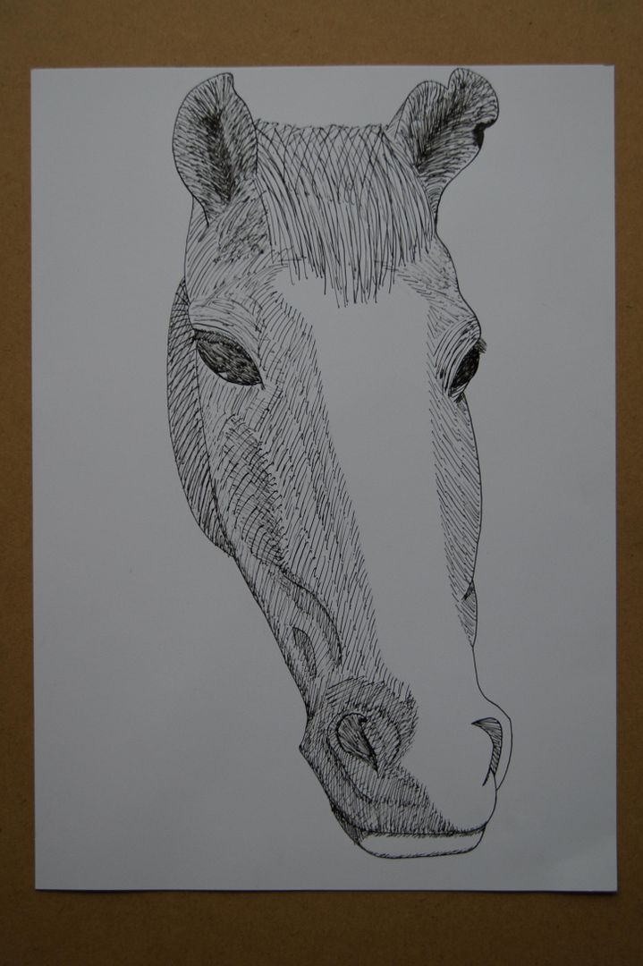
For me, the main challenge of drawing animals was not that there was a particular aspect I couldn't draw, it was that I'm so allergic to anything with fur, we can't keep pets. I have one friend with pets - he has a cat and a lizard - now, when I went over to his house to draw them, I thought maybe I'd be easy on myself (drawing-wise, not allergy-wise!) and try the cat. But it kept leaving the house or going and hiding under furniture... What could I do? So I tried the lizard. Unfortunately, it was in a dark tank in a dark part of the house and you could only see it when the heat lamp was on! I gave it a go, but I definitely need more practice. Another thing is that I'm vegan, so buying in a fish was really out of the question. I'm sorry, but I think I'll have to do something else to make up for this. I thought that for the lizard, sketchy pastel and charcoal showed off it's markings well, while pen worked fine for scales, but not sketching the subject out. One odd thing was that although she didn't move much, she'd turn her head to look at things quite often, and I ended up drawing her head too large in a few sketches. I sort of despaired of this for a while, and tried to draw birds out of the kitchen window, which went... Alright. I tried drawing horses in a field, but that didn't really work either, as they were either too far away or moving about so much I couldn't get them down properly... We might have to go to a wildlife park or zoo I suppose, but I'm not so keen on that ethically. I might be able to visit a friend we have with chickens... I'll work on it!
So, to summarise. I've learnt about two new materials this time (I'm finally branching out!), dip pens and oil pastels. One's good for detail while staying bold, one's good for sketchy but bright colours in interesting combinations. I'm pretty happy with all my plants, but when good opportunities arise, I'll have to go and find more animals. My tutor Edward sent me some nice feedback and a couple of pictures to look at, one of which (the rose) I think he did himself - I'll post them down here. Just to be clear, I'm not trying to claim any of these are my own work! (Oh, and I think he got my name a little bit wrong on a few pages, but you can see it's meant for me as he refers to drawings I have up here on the blog)


Drawing animals
For me, the main challenge of drawing animals was not that there was a particular aspect I couldn't draw, it was that I'm so allergic to anything with fur, we can't keep pets. I have one friend with pets - he has a cat and a lizard - now, when I went over to his house to draw them, I thought maybe I'd be easy on myself (drawing-wise, not allergy-wise!) and try the cat. But it kept leaving the house or going and hiding under furniture... What could I do? So I tried the lizard. Unfortunately, it was in a dark tank in a dark part of the house and you could only see it when the heat lamp was on! I gave it a go, but I definitely need more practice. Another thing is that I'm vegan, so buying in a fish was really out of the question. I'm sorry, but I think I'll have to do something else to make up for this. I thought that for the lizard, sketchy pastel and charcoal showed off it's markings well, while pen worked fine for scales, but not sketching the subject out. One odd thing was that although she didn't move much, she'd turn her head to look at things quite often, and I ended up drawing her head too large in a few sketches. I sort of despaired of this for a while, and tried to draw birds out of the kitchen window, which went... Alright. I tried drawing horses in a field, but that didn't really work either, as they were either too far away or moving about so much I couldn't get them down properly... We might have to go to a wildlife park or zoo I suppose, but I'm not so keen on that ethically. I might be able to visit a friend we have with chickens... I'll work on it!
So, to summarise. I've learnt about two new materials this time (I'm finally branching out!), dip pens and oil pastels. One's good for detail while staying bold, one's good for sketchy but bright colours in interesting combinations. I'm pretty happy with all my plants, but when good opportunities arise, I'll have to go and find more animals. My tutor Edward sent me some nice feedback and a couple of pictures to look at, one of which (the rose) I think he did himself - I'll post them down here. Just to be clear, I'm not trying to claim any of these are my own work! (Oh, and I think he got my name a little bit wrong on a few pages, but you can see it's meant for me as he refers to drawings I have up here on the blog)
Subscribe to:
Comments (Atom)