Landscape drawing
Drawing landscapes makes a nice change for me, as I know for a fact that I am not expected to finish a drawing of a place with every single item and texture. For instance, in the first drawings I did for this section, just before the cloud drawing exercises, I had a rather novel way of drawing clouds. In the constantly overcast skies of England, and I think you can see this best in a drawing I have here on my blog, “Charcoal Garden – Shrubs and a Dramatic Sky”, rather than outlining the clouds’ shapes, I simplified them to shadowy undersides, in a sky with no gaps of blue! But regarding what I ‘simplified and selected’ - of course, it’s easy to draw a brick wall or some fencing, but (and especially if you live out in the country as I do) what really becomes a problem is how to address every different kind of shrub, tree and flower, and make them all look – well – different. I found the best way to get through it was to give a plant a particular leaf shape and try and approximate the size and shape of the object to be ‘filled in’ with the shapes. But I agree that it’s tricky to try and create a good likeness without being bogged down ‘amid all the visual information’. You ask how I created a sense of distance and form in my sketches, and all I can really say is that on the distance side of things, I tried to get a composition that flowed from foreground to background well. For instance, in my ‘charcoal panorama’ series up on this blog, I had good sweeping roads and rows of houses curving away from me, dwindling towards the horizon. Is that cheating? Well, even if on the distance and texture side of things I did ok, I can’t exactly say the same for ‘light and shade’. As I say, when most days are overcast, you don’t get dark shadows stretching across the lawn from the house. So I feel I neglected my use of light and shade on this part of the assignment. Although, I didn’t forget about them in the air – by way of shadows on clouds, that is. I’m particularly proud of two very bold conté cloud drawings in my sketchbook that came out rather well – I drew in the clouds and their dark, dark shadows by drawing them in as black as I dared, then smudging them out toward the edges. When that was done, I didn’t think it looked as 3D as it probably should and tried to come up with a way to make it stand out from the background. So I took the blue parts of the sky and turned them cross-hatched. When you ask “What additional preliminary work would have been helpful towards the larger study?” I assume you mean ‘what kind of drawings might I have tried out more in my book before the last drawing’ (the one which considers loss of detail in regard to distance). My major problem with it (and it’s listed here on my blog as ‘Different Layers in Landscape’), was an interesting way to do the grassy lawn nearest me. I also would have tried to find a failsafe way to do ‘sketchy’ clouds, rather than the ones I did get to practice in my sketchbook - that I could lavish a whole page on!
Perspective
I thought in this exercise (which is entirely in sketchbooks, unfortunately) that I’d do something smart and draw a doorway through a doorway. Don’t worry; I practiced with just one to start with! Unfortunately this doesn’t always work – even when the doors seemed like they might be lining up at about the right point, the rectangular rugs I’d put down seemed to meet at two different horizons, which can’t be right! Of course, personally, my biggest problem was that I would worry away until I thought it looked right, and then when I was happy with it, I tested it and found I was wrong by miles! How demoralising! Anyway, I’m pretty ok with using rulers for the sake of accuracy, so this wasn’t too much of a shock – but the trouble with drawing over a picture when it’s finished is that you’re left with a dissected view of a doorway or street that self-evidently doesn’t quite match up! There’s not even a nice keepsake of your time spent drawing! Still, it’s a necessary evil, I’m sure.
Townscapes
The first question that you ask in this section is “How did you use the limited colour palette to create a sense of depth?” But I’m not sure that was the idea I had in mind when I attempted the exercise… Certainly, the way I attempted it I assumed that by choosing two or three colours, it was challenging me to pick what I could get most use of, and be more conservative with the colours – if something stood out but wasn’t a colour I was allowed to use, I could fill it in darker with another colour, and lighter in other spots, if you see what I mean! Again, I chose a subject that (although I thought on this occasion that I couldn’t develop it from my previous sketches of the house I drew earlier in the section) made it very easy to achieve a sense of depth – a narrow corridor of a road that’s walled on both sides. Although I didn’t use my first building’s sketches in the limited palette exercise, that’s not to say they weren’t useful – in the folder it only said to do quick sketches and eventually commit yourself to a colour picture. I wasn’t too sure how to interpret that, so I did a nice big colour picture of the building as well before moving on to find a good place for the limited palette exercise. I suppose that really, my sketches helped me to find the best view and realise that I could crop the view so it didn’t include all of the difficult foliage off to the side of the house. I suppose I also felt a bit guilty at first that the house stood on its own and wasn’t part of a street, but as I drew the building from different viewpoints, I could see that it was a composition that worked in its own right. When you ask, “In what ways is the drawing from this project better than the last?” I assume you mean from the perspective drawing. Obviously, in this one I don’t have to check my angles are exactly right – although I do feel somewhat obliged now. I can put in as much detail as I want and feel freer in the ways I can put my impression of a place on the paper without feeling that the focus must be on how straight my lines are! I think that I missed out a bit on making the majority of these exercises about the one lonely house, and not being able to judge the scale and angle of the roof against the other buildings, basically. Finally, the atmosphere I tried to capture in this section – it wasn’t the best time of year to do ‘atmosphere’ because the weather is so in-between seasons. It’s not snowing or in bright sunshine. Still, as I’m writing up the end of this section, I would like to mention how proud I am of a particular statue that I drew and isn’t really mentioned in the official questions here – a great way to get instant gothic atmosphere is to draw something as dark as church memorials!
Drawing Trees
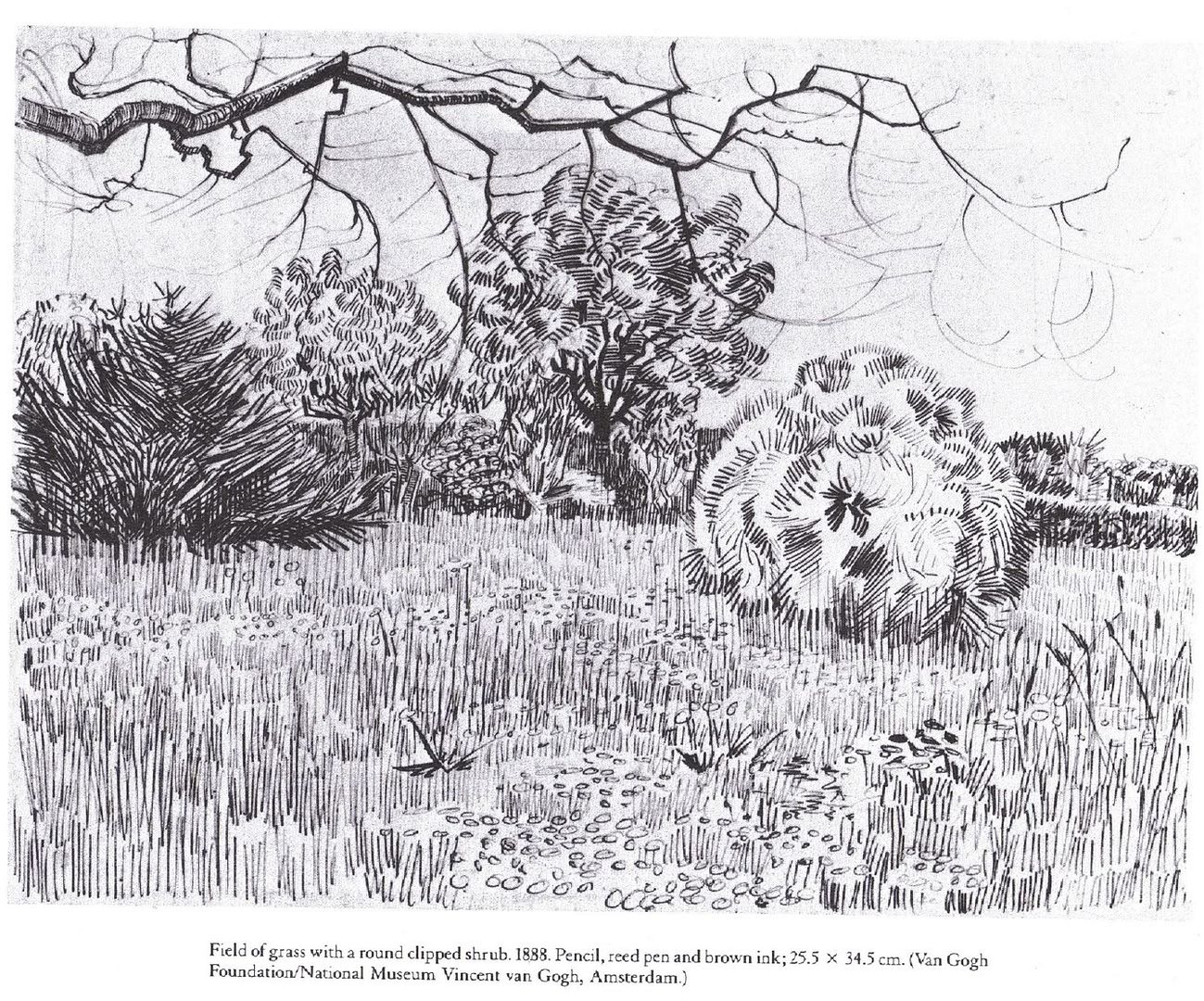
I think I’ve drawn about ten different types, but far more trees – I did quite a bit of the trees in the garden, at the churchyard, etc. One of the most challenging things about this section was trying to distinguish each type – for instance, there’s nothing particularly different from your average, basic, 'cartoon' tree and a Lime. I didn’t want anyone to think I was being lazy! But to give you another example, working down the churchyard gave me a lot of practice with Yews, which were quite difficult to start out with. They differ in shape so much that there’s no foolproof technique to use with them. What really sets them apart from other trees and that is most often useful is the colour of their bark – such a brilliant reddish-brown that combined with it’s clumps of needles, defines it. I tried a few different techniques to show the mass of leaves, but one of the more successful (if most time consuming) approaches I took was in my drawing which I have listed on this blog as “Dip Pen and Ink Wash – Tree branches” where my basic idea was to create interest in a believable way – where the biggest spaces were in the canopy, I left the sky, and covered the rest of the paper in small shapes that were as random as I could manage. Then I coloured them all in, in different colours so as to show the shadowy undersides of the leaves lower down around the branch and the lighter, more transparent colour of the leaves the sun shone through. It's so complicated to even attempt to show shadows falling from one infinitely complex shape (the leaves and branches) onto another (the trunk and the grass), when I simplified it, I was so pleased with the way it came out I forgot the shading, which I think was a mistake. On the other hand, it was really quite simple to treat them as one large irregular shadow in the sketchier pictures! See “View from a Church porch” here.
I think to finish, as it often says in my folder, one of the most important things to learn about landscape drawing is knowing when to leave things out, and that’s what I have to try and remember – my personal battle is going to be to know when a detailed texture might be too much and that even when it isn’t, it never compensates for lack of shadow! Anyway, as usual, I'm posting up my tutor's reports and reference pictures to end on. Here you go!
0 comments:
Post a Comment