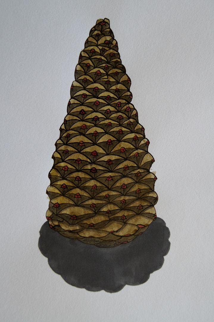
 After I did pinecones as part of my first assignment, and got some feedback telling me that they weren't defined enough, I thought what better than a really bright ink drawing? I used some grey markers for the shading, which gave it an overall darker look. Using a colour for the tips that wasn't quite true to life - the pink rather than slightly redder brown - added a bit of interest, and I doubt anyone would feel cheated!
0 comments:
Post a Comment