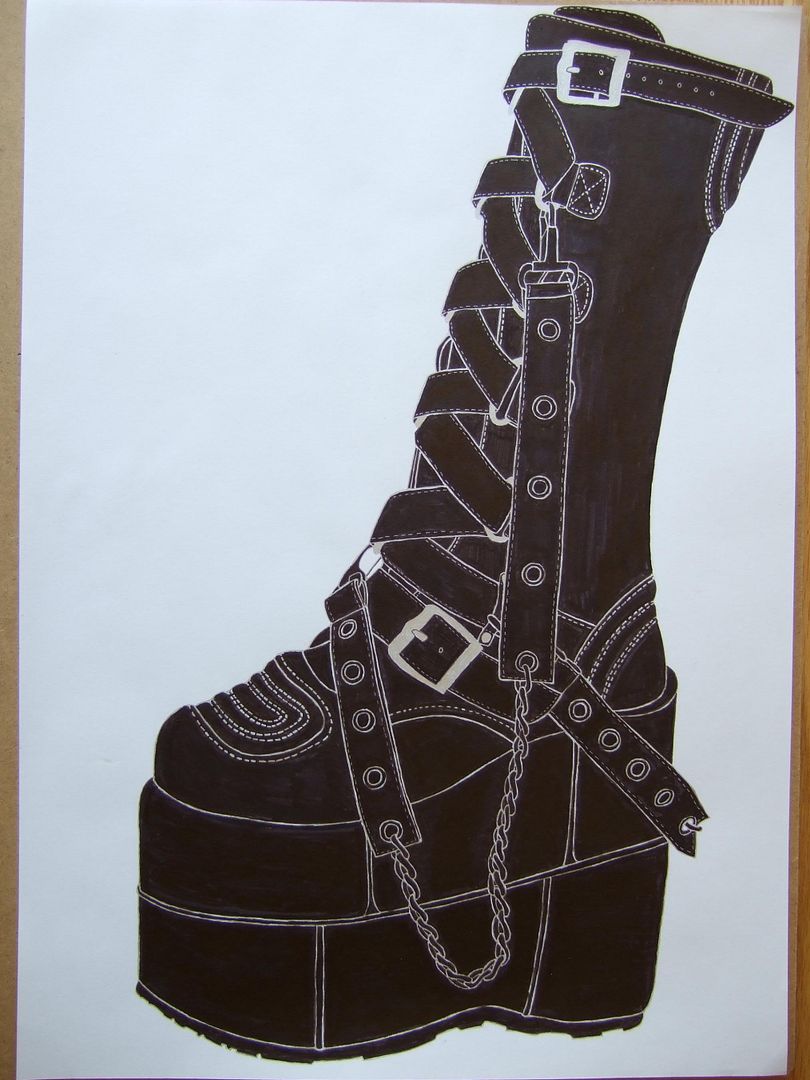
I'm espeically pleased with the chain, but the angle at the back of the shoe's platform isn't quite right - I might try and fix it later if I pluck up the courage.
Thursday, 17 June 2010
Another of my platform boots in ink
Black and white rainbow shoe
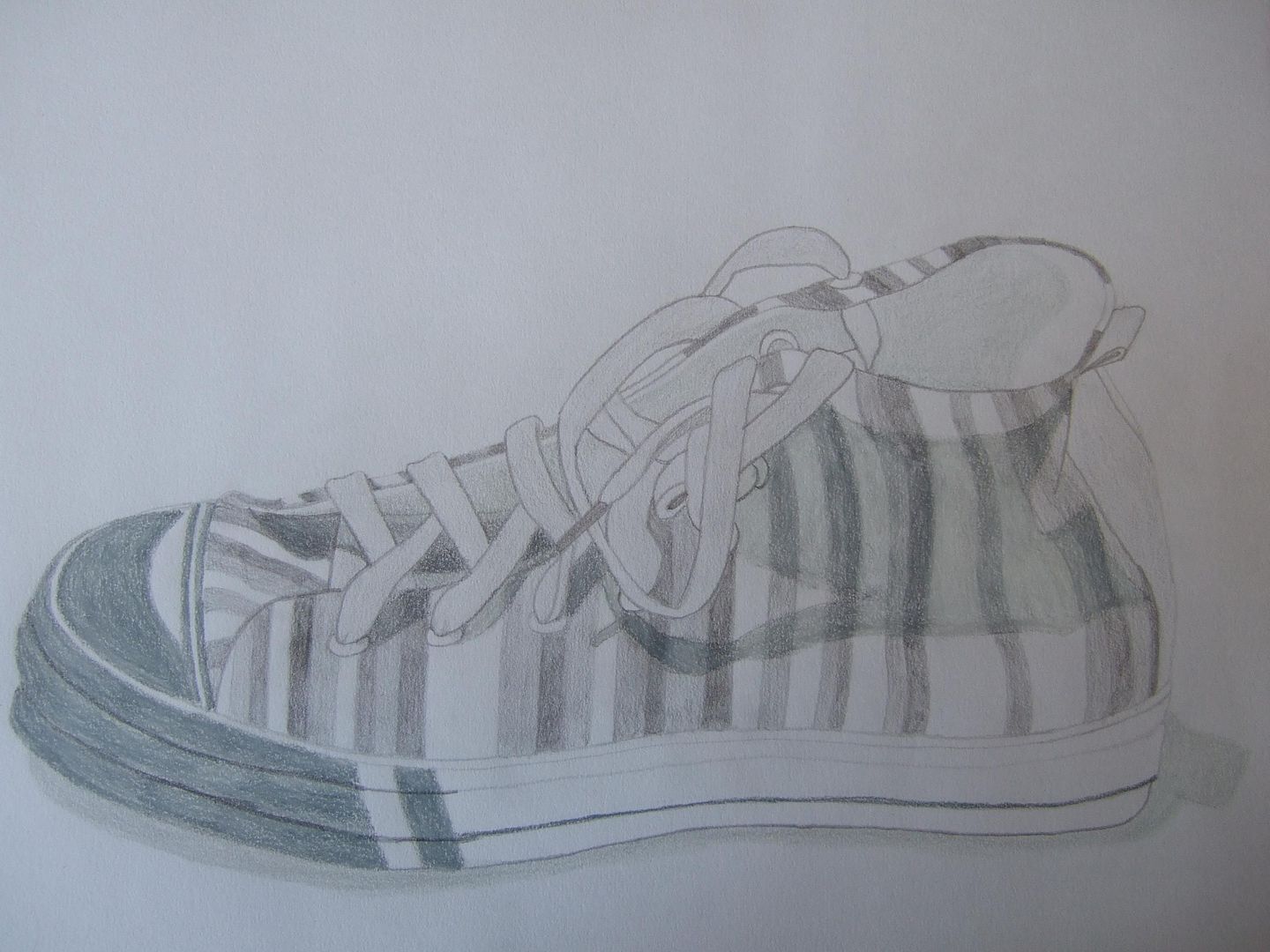
Now the camera's been fixed, I'm back with this black and white version of the rainbow shoe -I didn't do so well with the shadows on the sides, but the laces are alright.
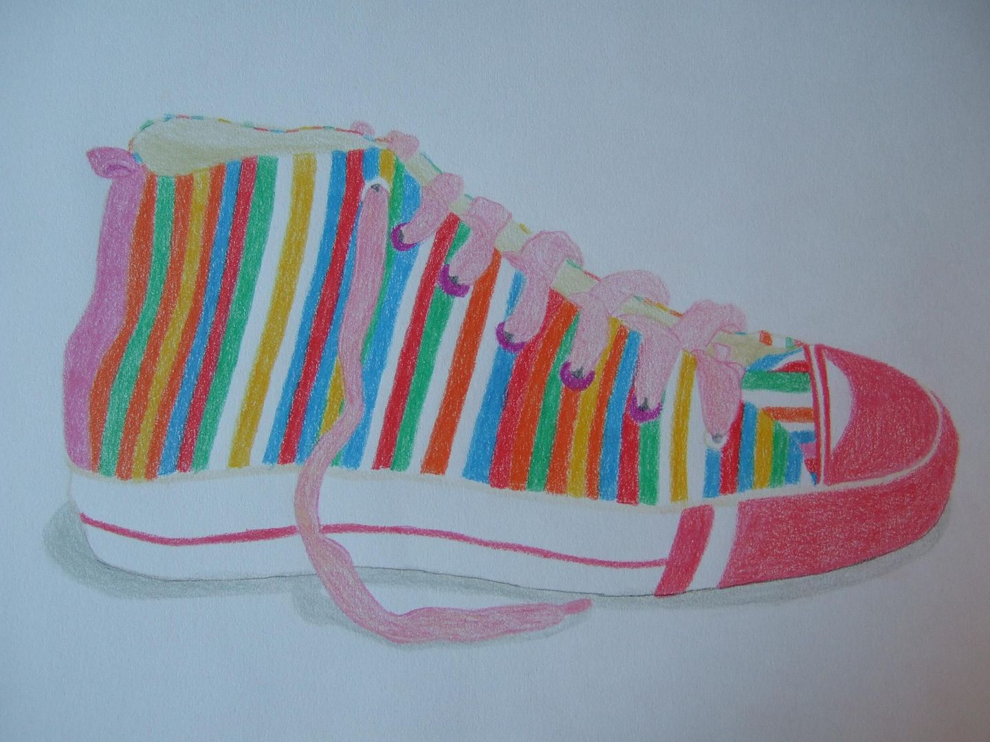
Friday, 4 June 2010
New Rainbow Shoe
My first post redone today! I tried to make the colours as strong as possible to get it closer to the spectrum of the real shoe and it came out ok. I think I'm going to do a black and white pencil drawing next to try and get a more crumpled look from it.
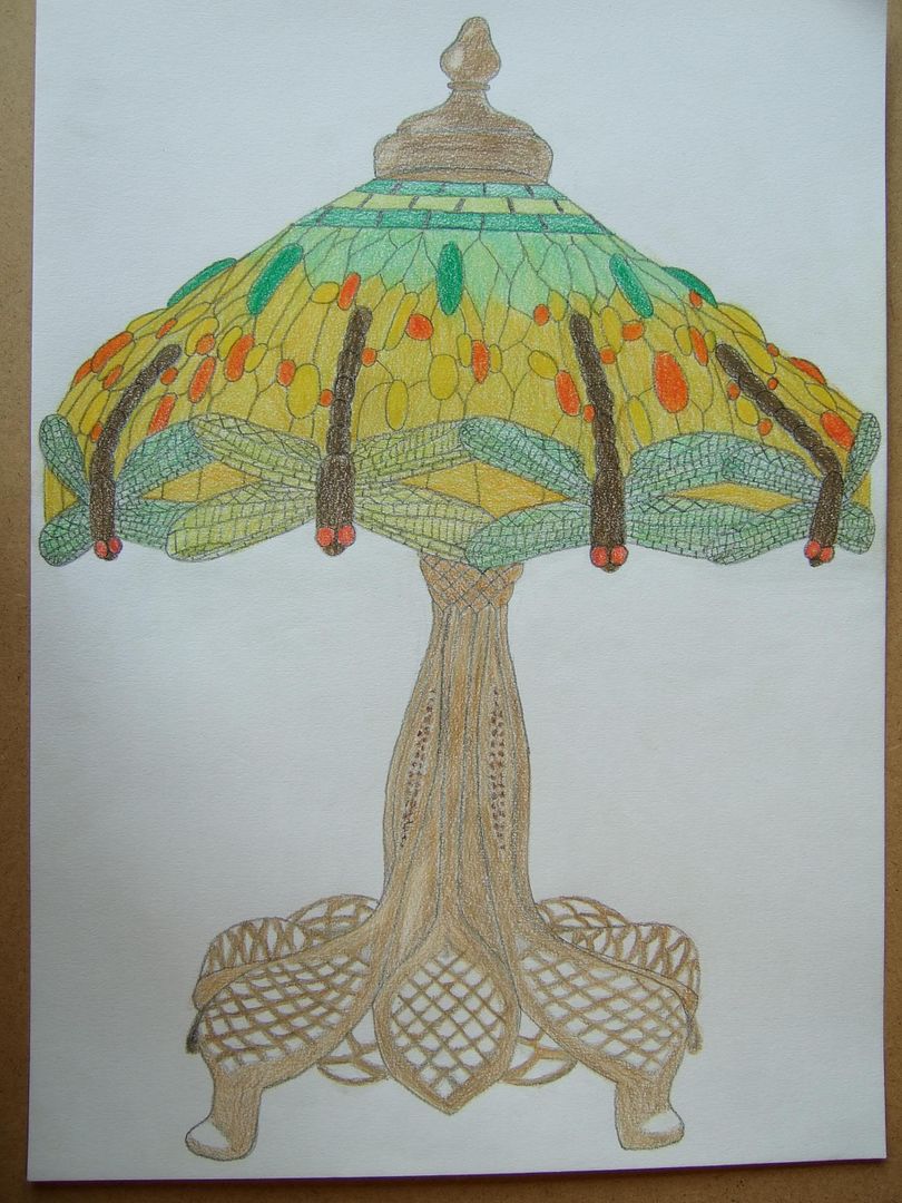
Wednesday, 2 June 2010
Tiffany dragonfly lamp
The stand for this one and the dragonfly's wings weren't a lot of fun! I think it went quite well though - although doing the lamps was fun, I feel it's missing some of the realism, these two being from photos (which is the only time I've done that), and I'll try not to do it again. I don't like the feeling of them being floating without a shadow, even if the subject is more interesting.
Blue tiffany lamp
This was a lamp I did from a photo - it's not very good - my purpose for drawing this was to make my colours brighter and try and match the shades, which I think I gave a fair impression of.
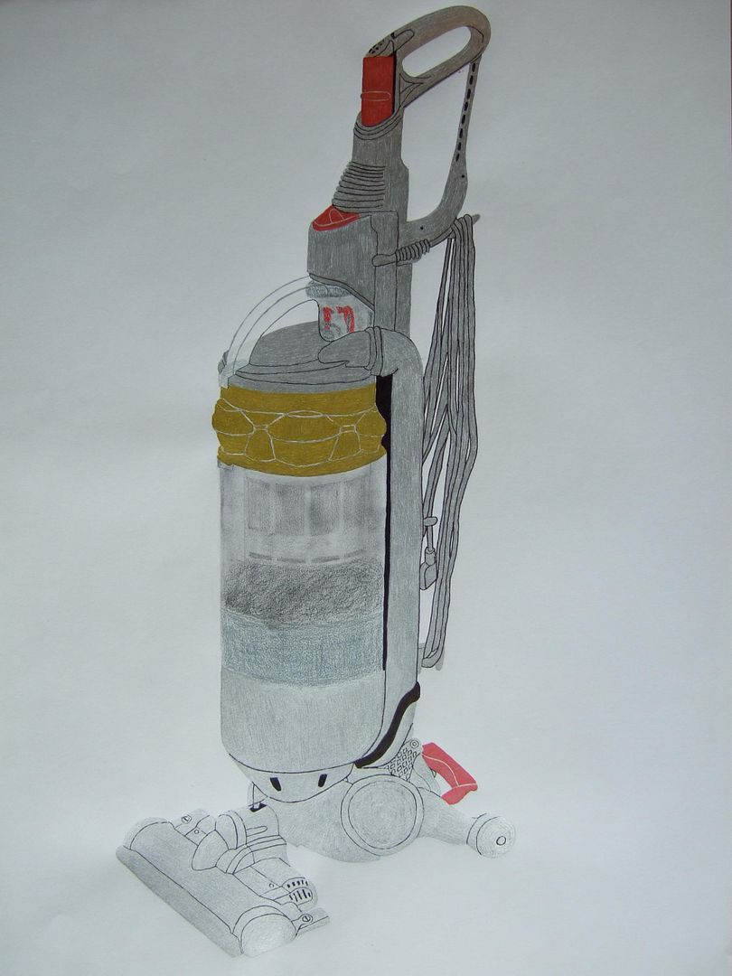
Silver hoover
Slightly different colour scheme - this hoover isn't as shiny as the other one, but has interesting little splashes of colour, and I like it a lot as well (although I suppose it lacks the impact of the first one).
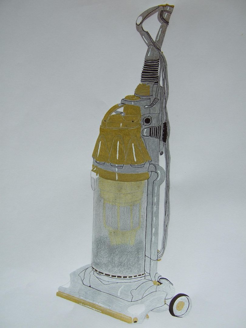
Yellow hoover
This is another A2 drawing that's mostly ink, but with charcoal to show where the dust is inside the case, and painted highlights. I'm really pleased with this picture - so much I did it a second time with the newer hoover.
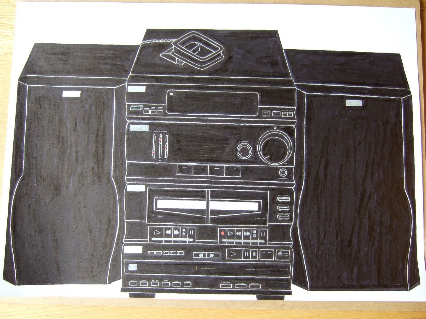
Stereo
A few of my really good ink drawings now. This is a full sheet of A2, and I used a load of whiteboard markers to colour it in on the large areas, as I usually use a fine felt tip. I love this picture - although I couldn't fit the text on under the buttons, I did as much of the detail as I could. I think you get a good idea of the bulk of the thing (the CD draw at the bottom will fit 5 discs at once) and the little touches of colour mean you still know where everything is without the text.
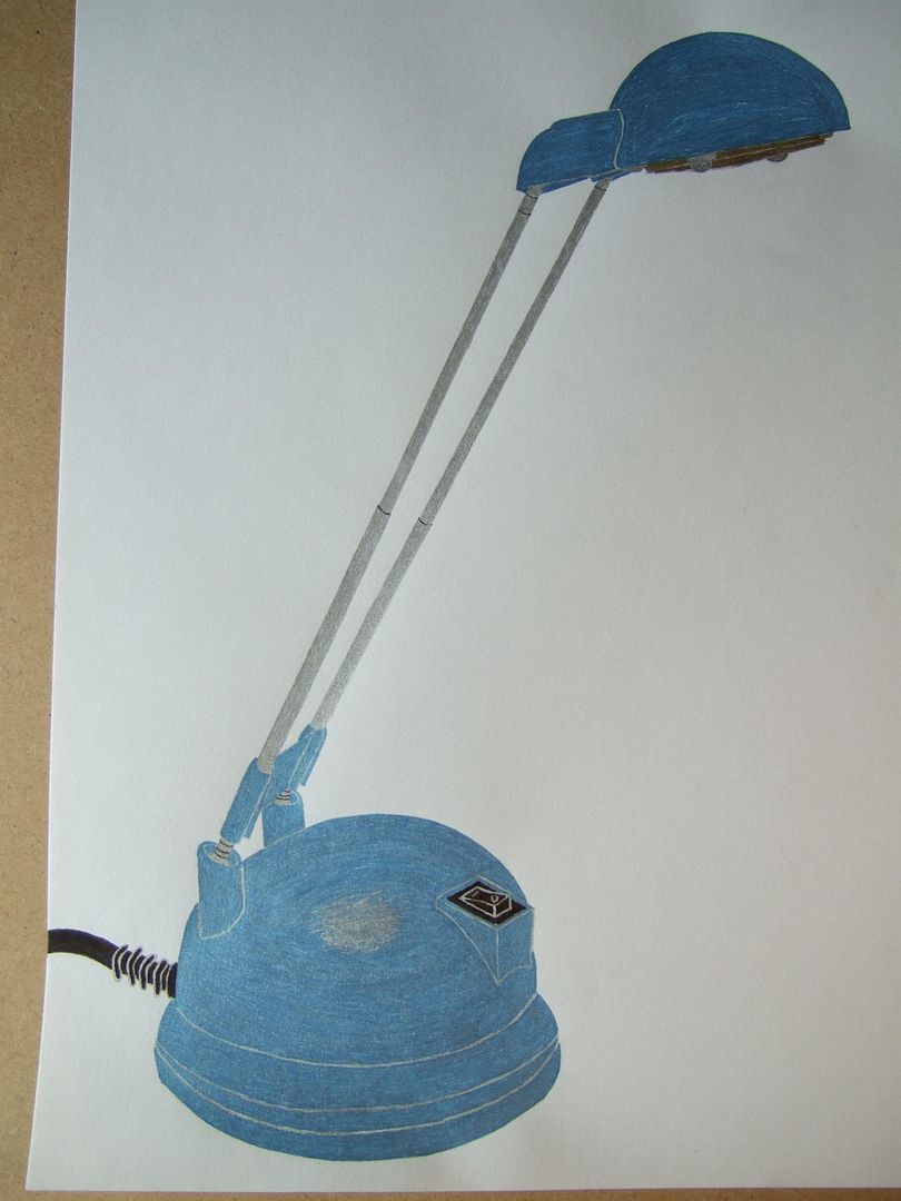
Bedside lamp
Quick ink drawing of my bedside lamp. Don't like this one very much - not enough detail to make it interesting. On the plus side, it does look just like it!
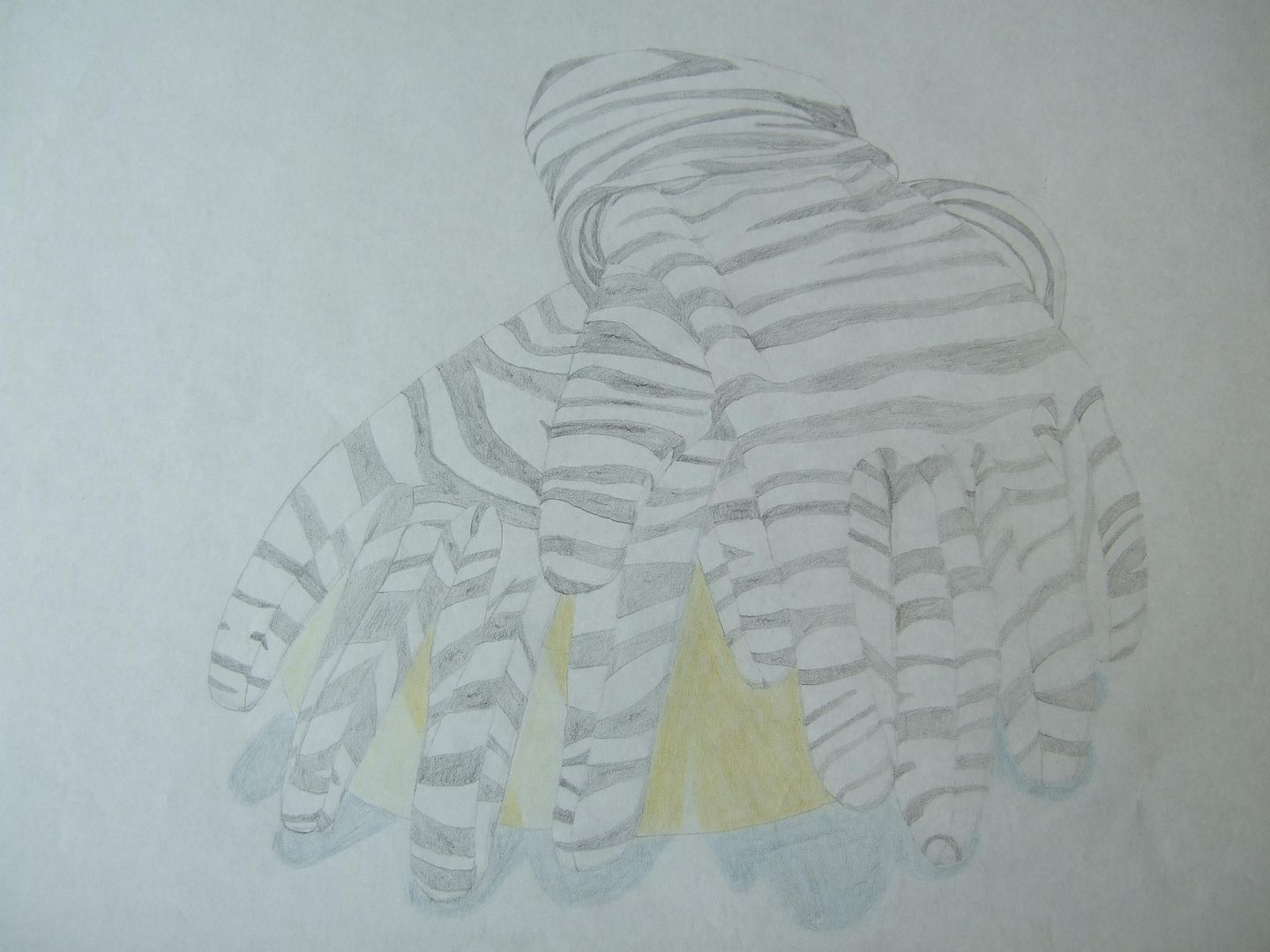
Old gloves
A drawing of my mum's zebra print gloves. Now, they're actually a bit furrier than they look in the picture, but it's pleasing to look at the lines - they could be better outlined though, as it's still a little confusing.
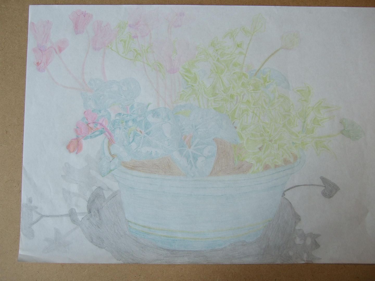
Old potplant
Now this, when it was finished, I absolutely loved. Looking at it now, it's a wreck of all kinds of colours seemingly on a flat plane! I'm quite sentimental about it though, it took hours! If I do something like it again, it'll be good for comparisons, so I put it up here anyway.
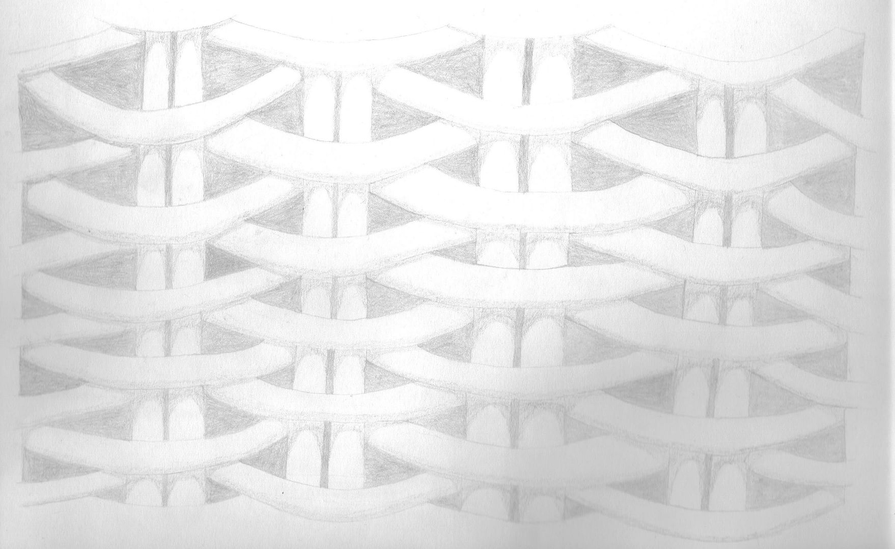
Old wicker sketch
This was so faint I had to scan it in rather than photograph it, and even then it didn't come out too well - I'll have to do it again sometime. This was part of the side of a cane sofa - maybe I can do the whole thing...
Old fish
This is a metal fish ornament with a collection of shells. It's still kinda faint, but the scales and the shadows aren't bad.

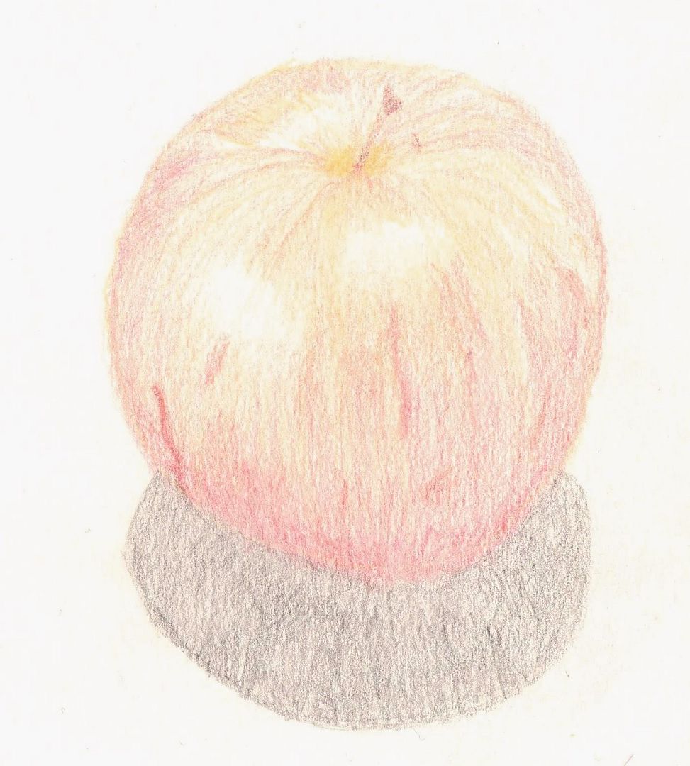
Old apple
I actually don't mind this apple too much - the lighting is good, and you can see the curves at the top well. Could be more defined from the shadow though.
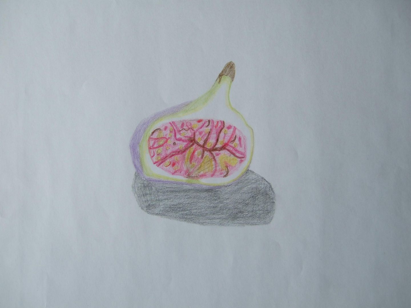
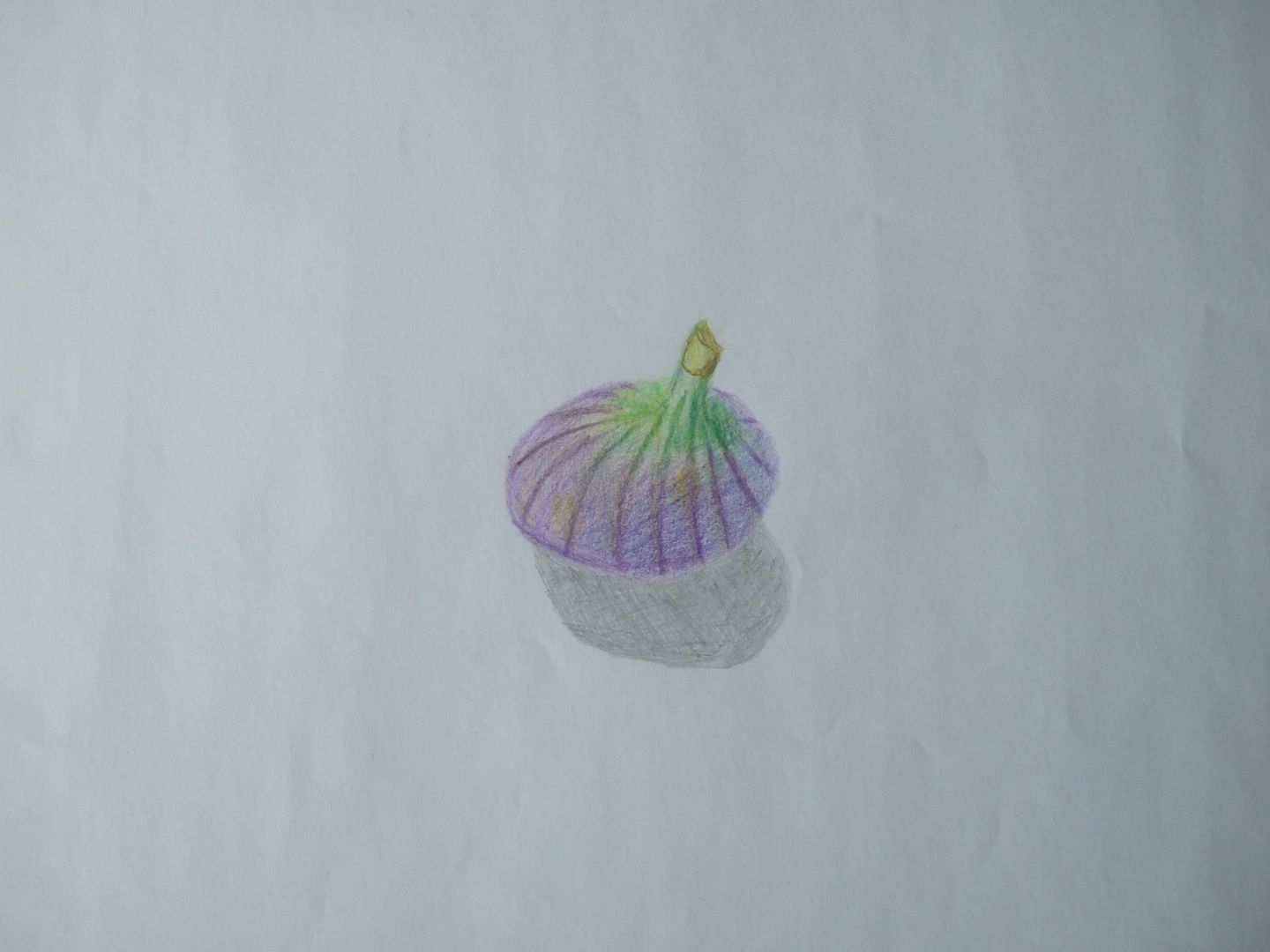
Old fig one
I thought I'd post some of my old drawings for a bit - this one is quite sketchy, but I love the colours, and it seems quite well lit.
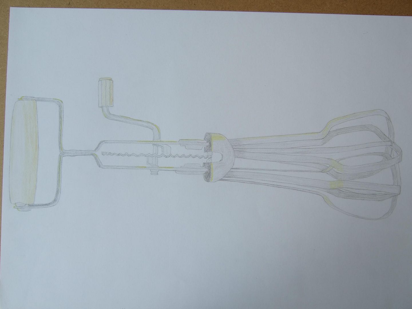
Whisk
This is a perspective nightmare. I think this was my third attempt, and it ended up quite stylized colour-wise, but at least it looks like the object!
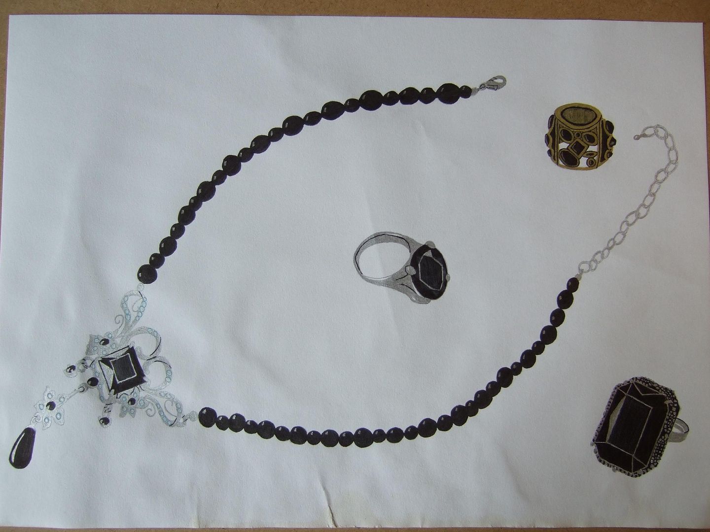
Damaged necklace
This unfortunate drawing was left in a pad that got tea spilt along one edge - I ironed it out later, and thought it was quite sweet even if I couldn't finish it, so relented and uploaded it too. The necklace took a long time, and it was a real shame. It was quite good.
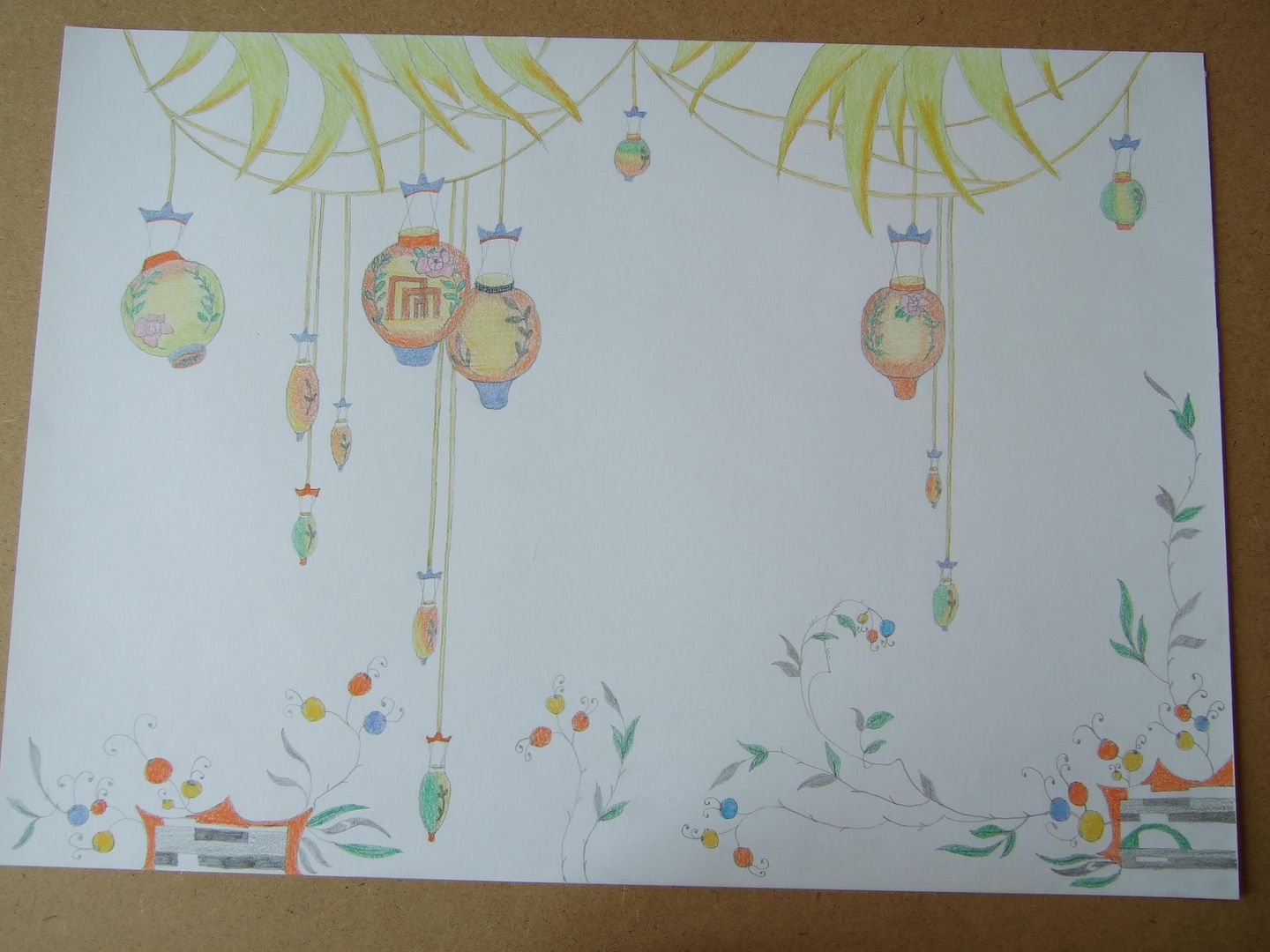
Vase transfers
This I like. Some of the transfers of lanterns off of a cheap vase and the decoration on a similar saucer along the bottom. The colours went together so well, I thought I'd put them together on a page, although you'll notice that the saucer's prints are more abstract.
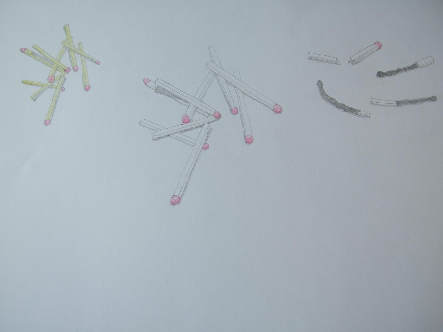
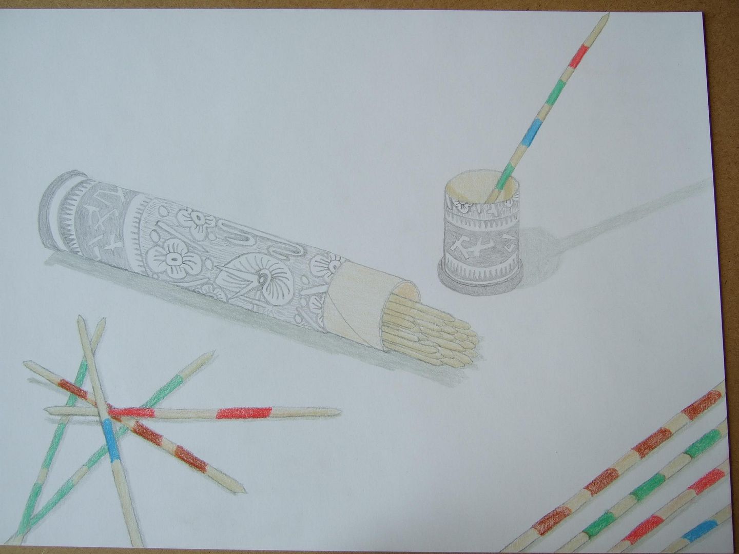
Different matches sketch
A page of assorted matches I doodled at around the same time. I found it again and thought it might be worth a look.
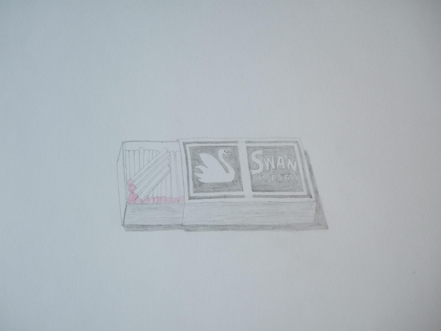
Matchbox
I did a little series on matches a while back, and this was one of the better defined ones that came out of it. The matches in the box are ok, but the box design not so much.
Mikado (pick up sticks game)
Here I was trying out my new bold style. I'm proud of this - I think it's much more realistic than the fainter drawings I did before, and I've been sticking with it for a while now.
Old parasol sketch
Stepping back in time a bit, this parasol was given to me as a gift, and was handmade, I understand. Not a great drawing! Learnt a few lessons in planning ahead from this.
Insects
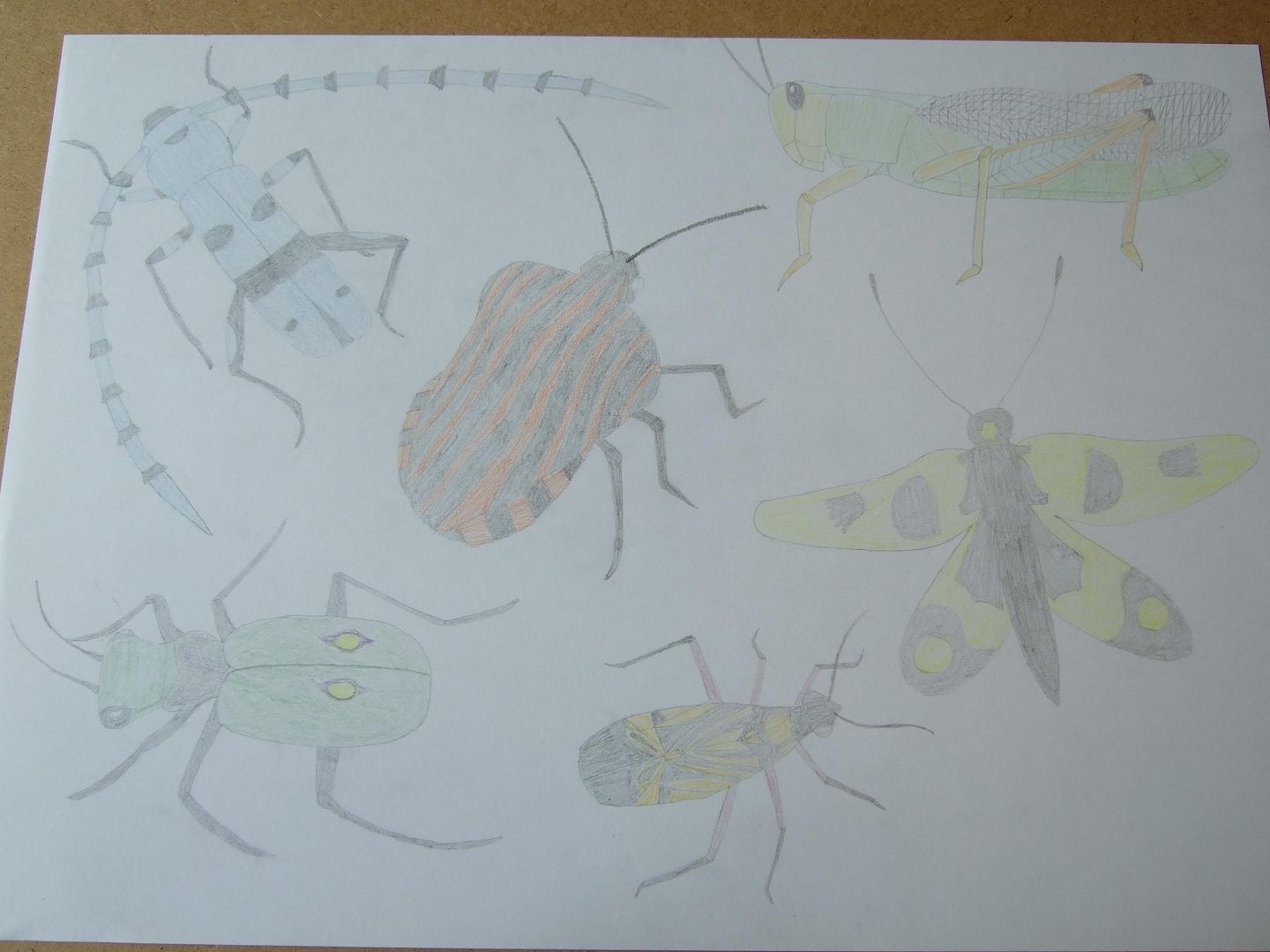
More insects - it took some courage to try and fit them all on here - what if the last one was rubbish? None of them are great, but I like the colours, and if I do them again bolder, they could really be something.
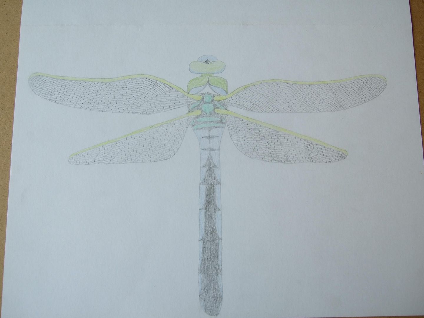
Dragonfly
I went through a phase of drawing insects (it was for another project) and draw this dragonfly - it's a bit boring from a distance, but the cells on the wings took ages, so it's worth a look.
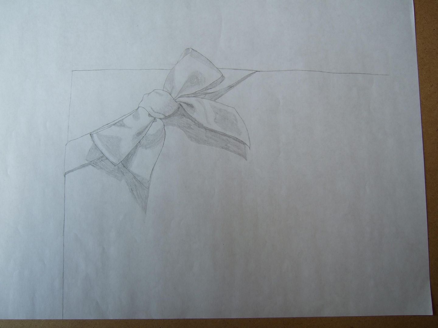
Bow sketch
After my ribbon shoes, I was trying to get the feel of the satin a bit better, and I thought this was quite a good effort at the shades.
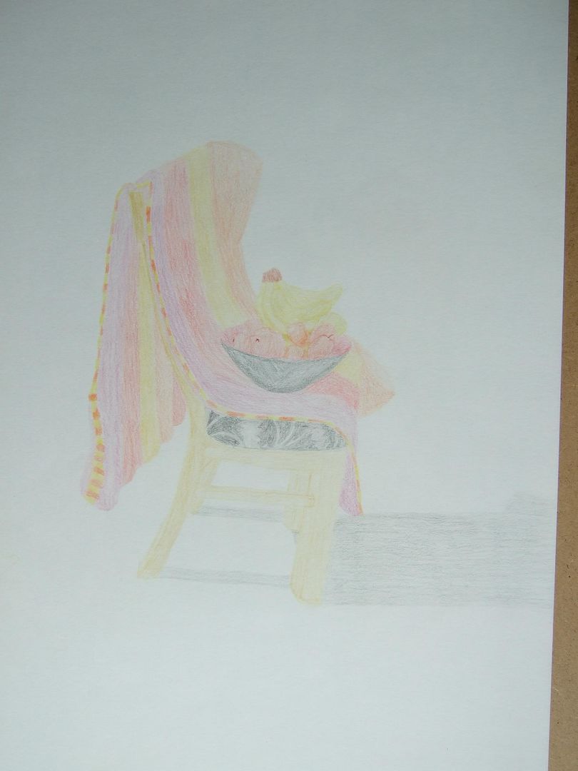
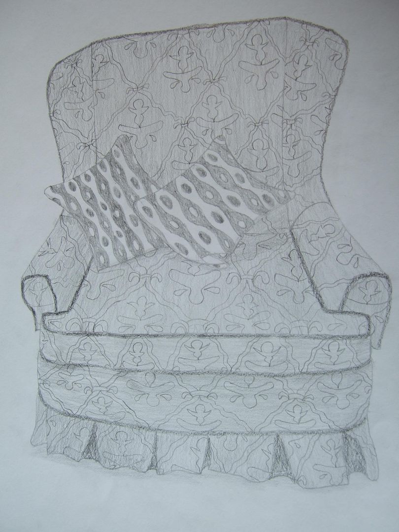
Armchair
This is appropriate to post after the book, because this chair is a good dishevelled accompaniment. Not a brilliant drawing, but you get the gist of its old lumpy feeling and the pattern of the fabric.
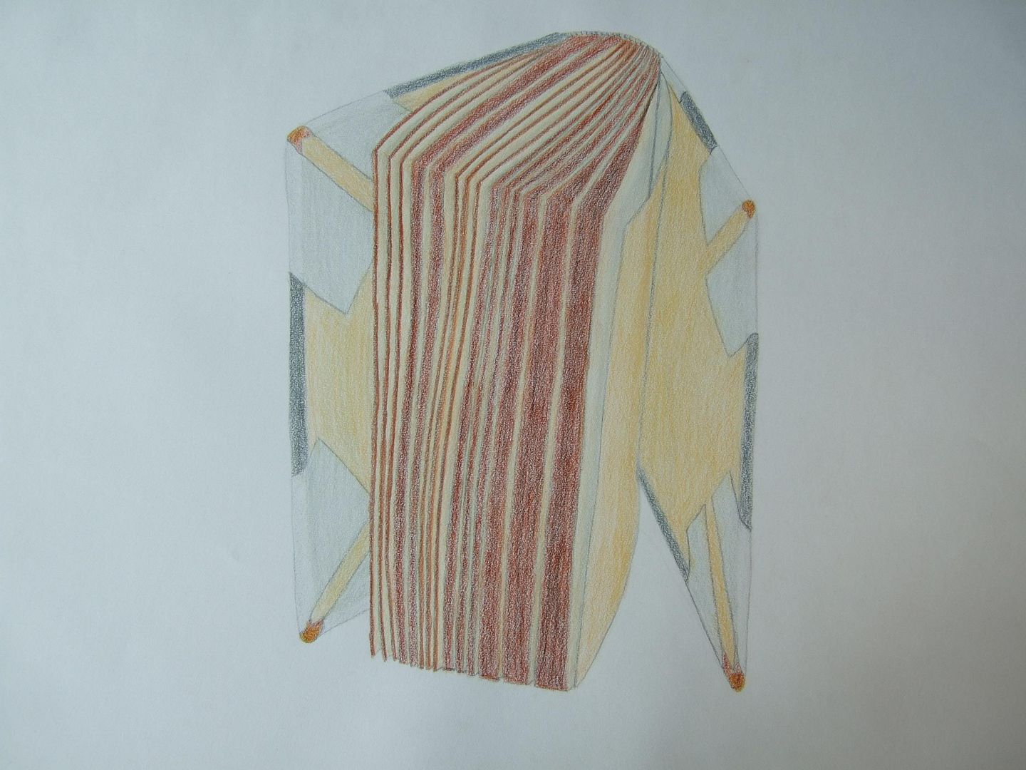
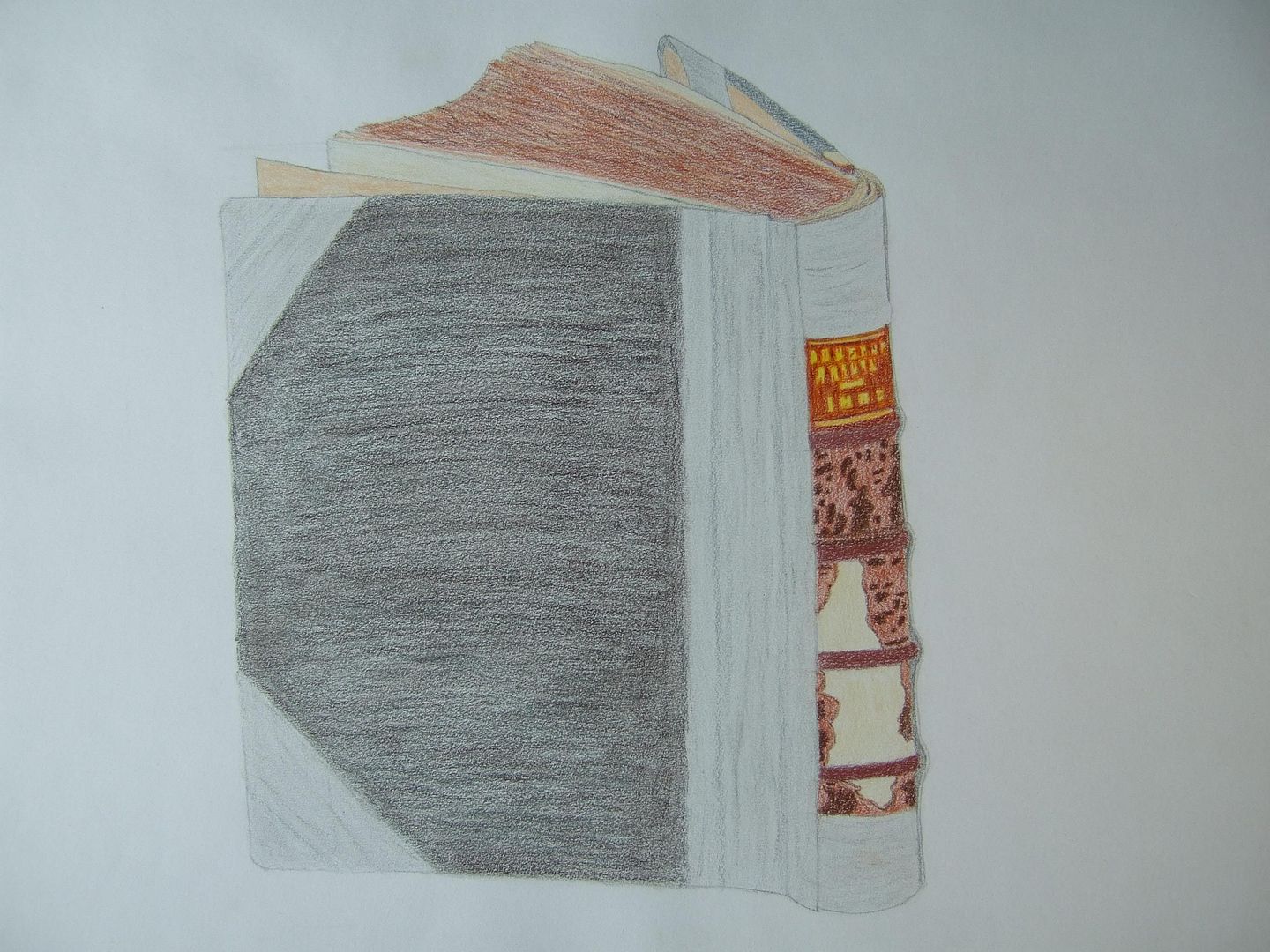
Big old book reversed
The inside of the same book - the pages are brown round the edges and kind of clumped together, so it's not as weird as it looks! The corners of the cover are turned in and discoloured as well. However, it being a hardback, I could balance it this way to make it more interesting. This was a good exercise in perspective and not too bad.
Big old book cover
This is a beaten up old book covered in gaffer tape - it's actually an annual from 1888, and it's really disintegrating now - this was one of the first drawings I did on A2, and although it's not really dark enough to be worthy of praise for looking finished... It's ok.
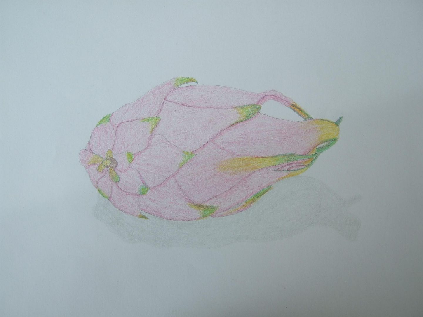
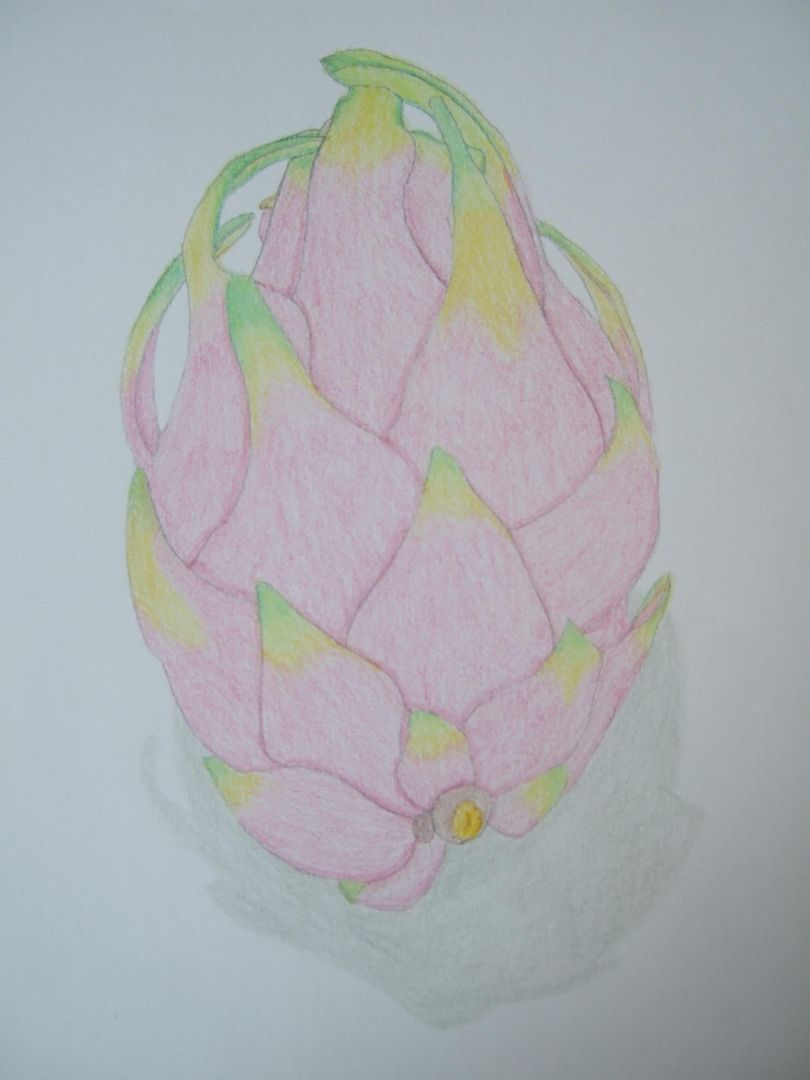
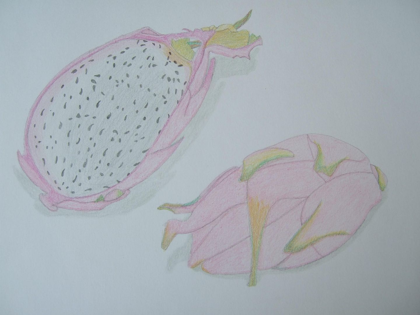
Dragonfruit number one
I came across this weird fruit and had to have a go at drawing it - I did it from several different angles, and though in retrospect they could have been darker, the colours compliment each other quite nicely.
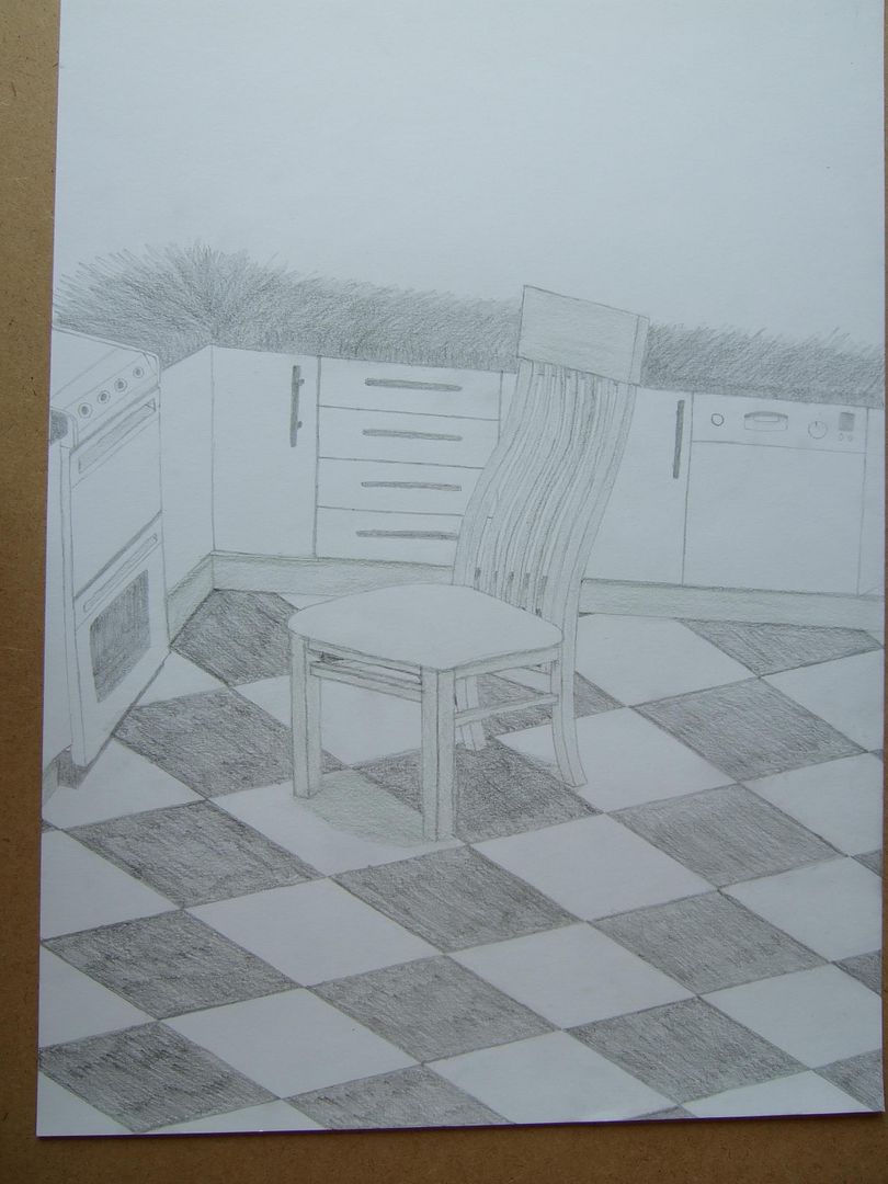
Chair in the kitchen
I started off here just drawing the chair and some of the floor, but when it was finished it didn't take up much of the paper, and I just carried on. I think it's particularly interesting how the floor warps some of the straight lines. It's not perfect, but at the time it was a bit of a breakthrough, and I still like it.
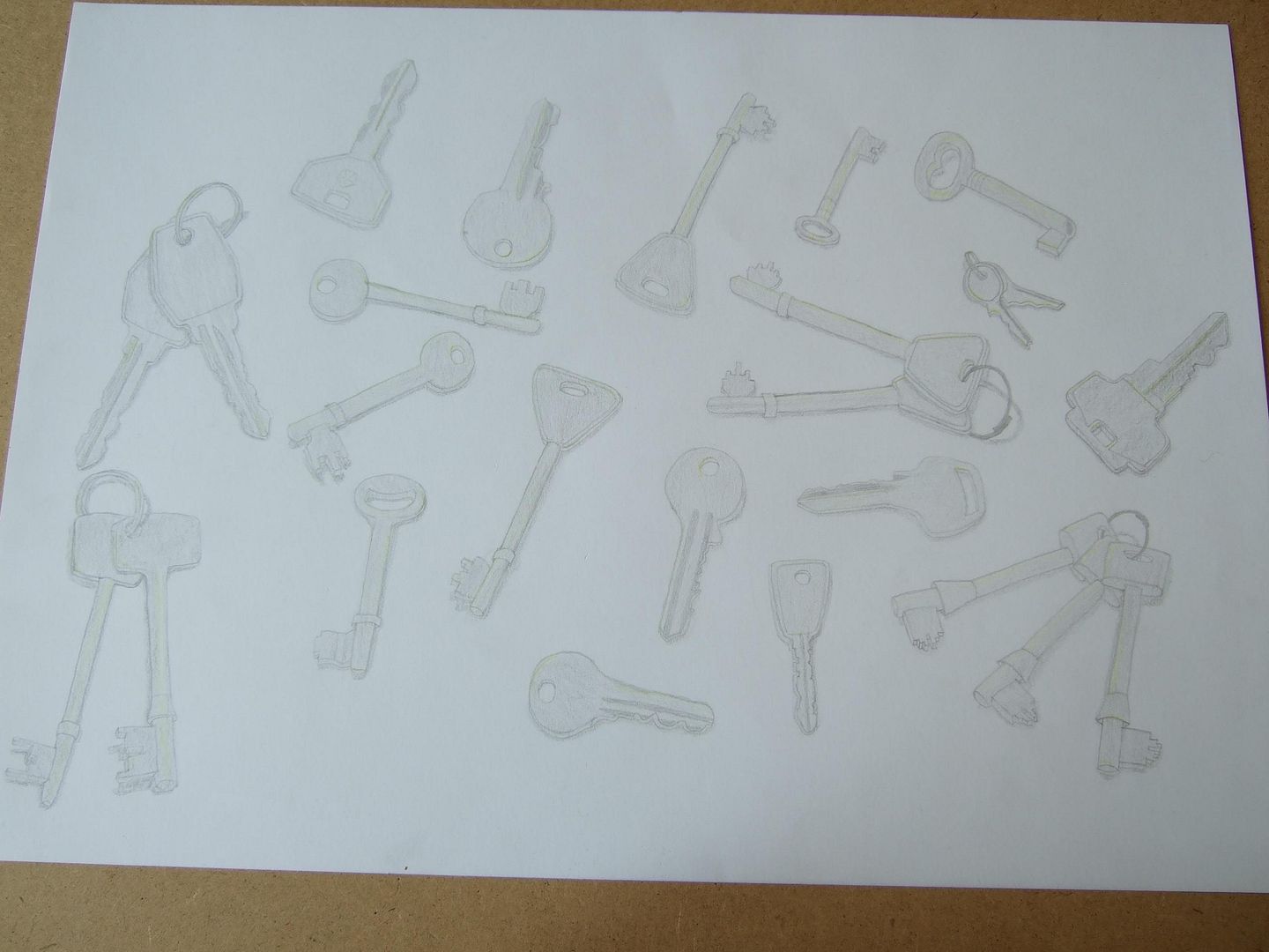
Keys
We have a draw of keys without uses, and I really liked the idea of a whole collection of them. Some came out better than the others here though - the rings some of them are on are pretty impossible. The flatter keys were easier to draw, but they lost some of their detail when I coloured them.
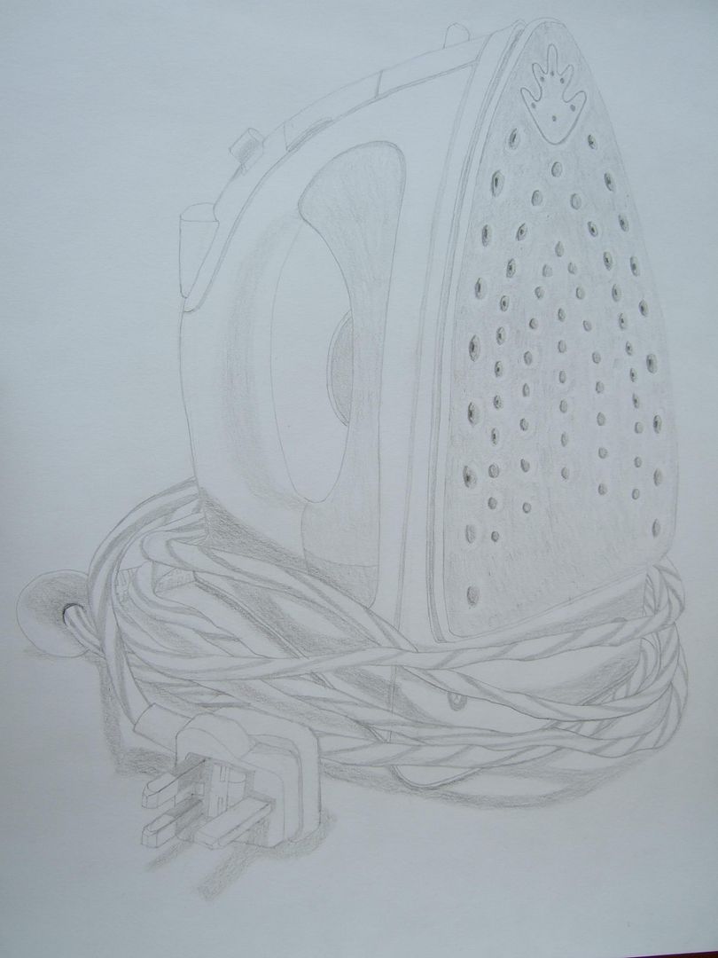
Iron
This doesn't come out as well as it could have done in a photo. I liked this drawing, but it was really difficult - I remember having real problems with the steam vents on the underneath - they're as close to regular gaps as I could do without starting over - and the angle of the prongs on the plug.
More glasses
Better than the last one! I like this one, although it does give the impression I used a ruler for the front... I don't think I did too badly with the straight lines on this one, but the shadows... I can't remember where I was going with them.
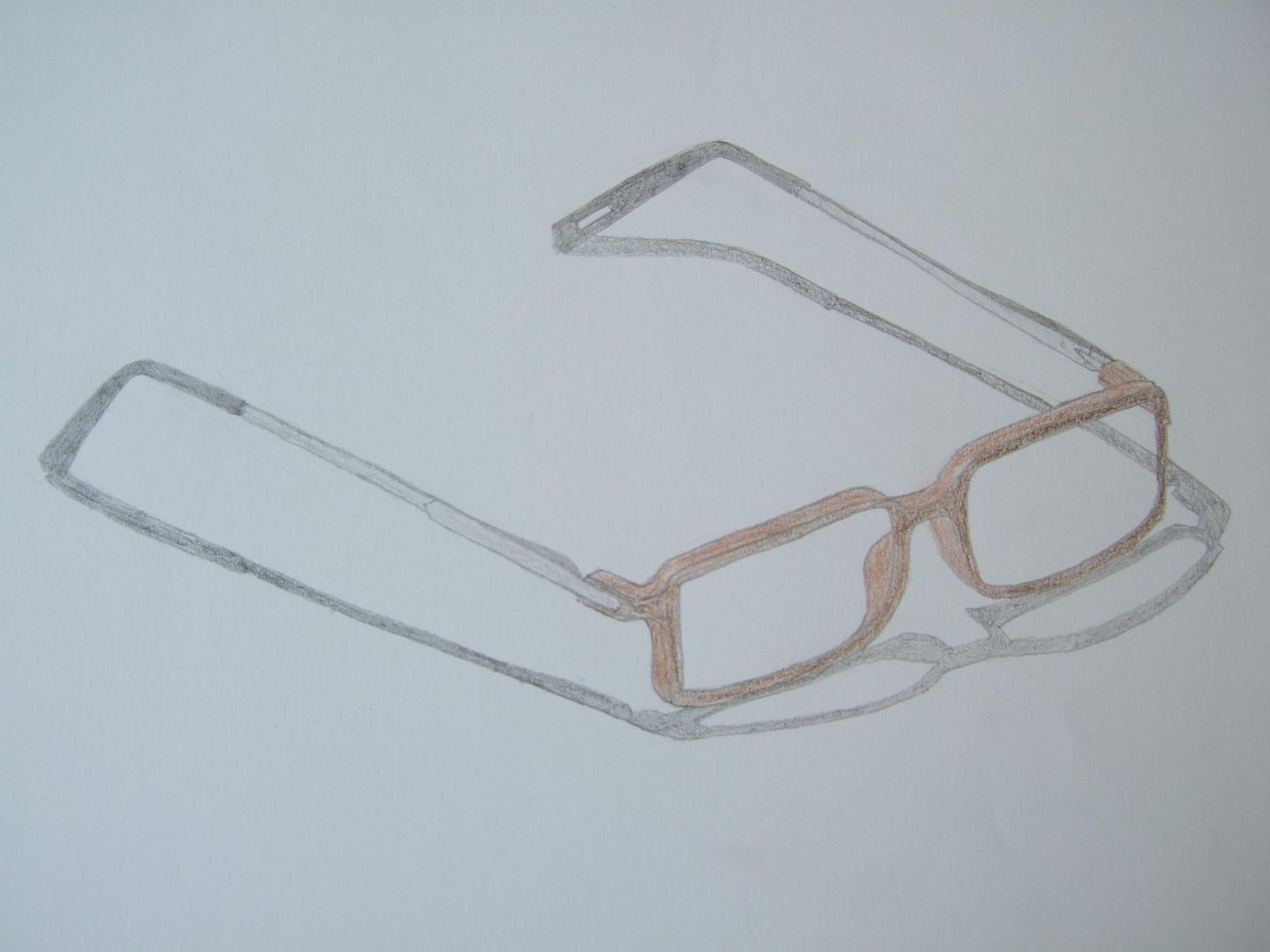
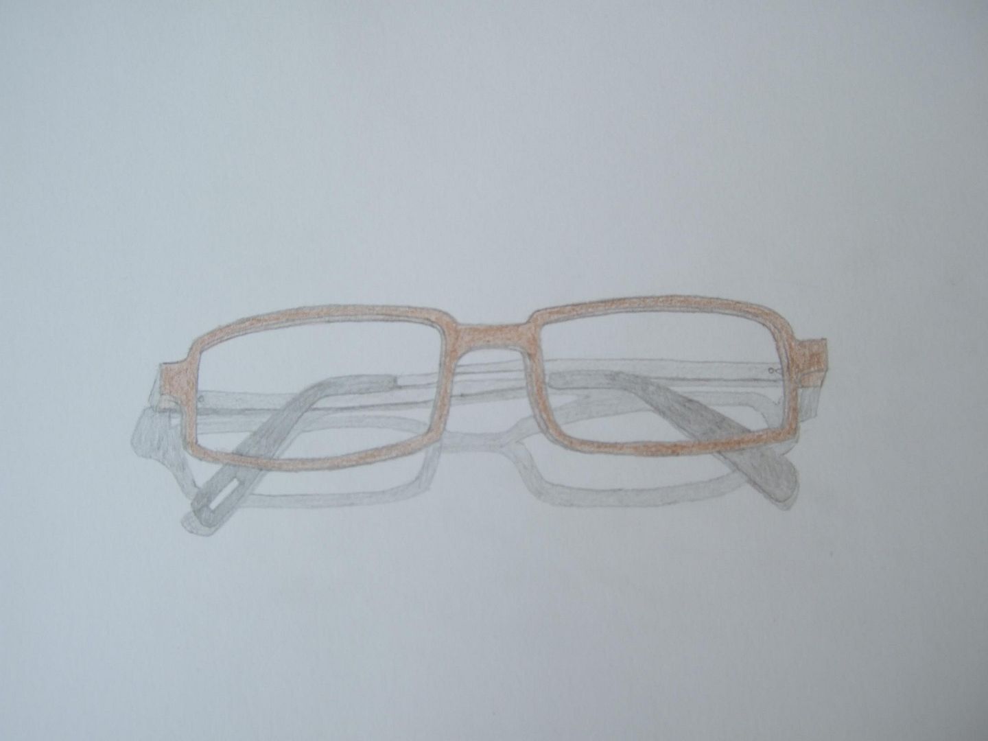
Coloured glasses
A drawing of one of the previous pairs folded. This is interesting for the illusion I seem to have given it of being slightly transparent! Could have done with some highlights, and the arms look wonky.
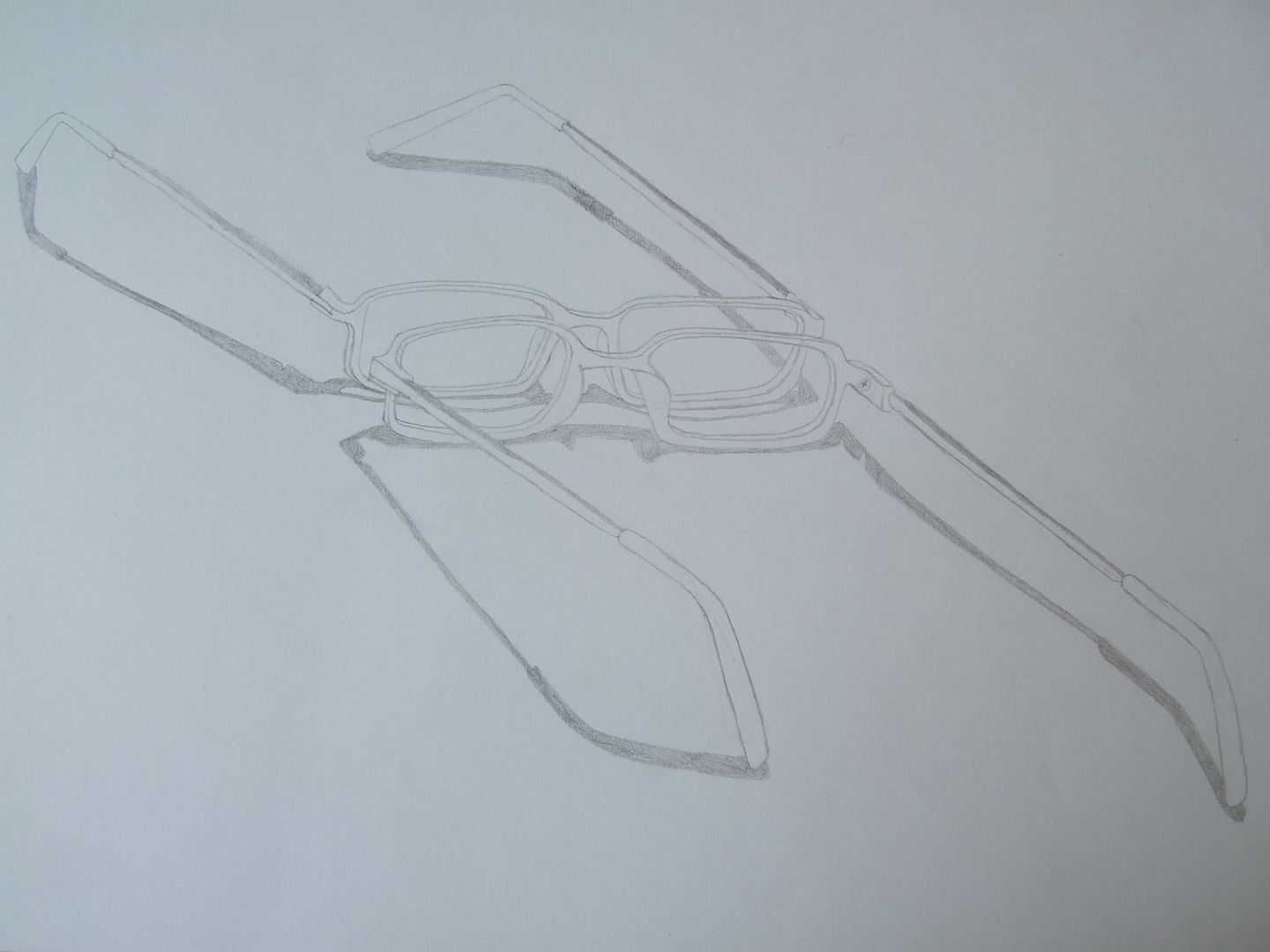
Two pairs of glasses
This was an interesting little pencil drawing - I say drawing because it's not really a sketch, I think it took too long to qualify; the actual shape of the moulded plastic was hard to convey and the arms are probably still not quite the right length - but it's how they looked! More practice on foreshortening, I think.
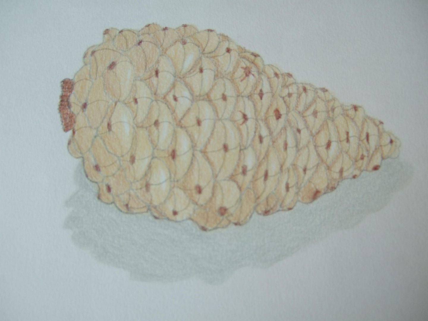
Coloured pencil pinecone
The photo I took of this one is a bit blurry, but it's a good drawing - I think I exaggerated the size of some of the scales to make it look a bit more even than the subject really was, but I think the highlights and perspective are good.
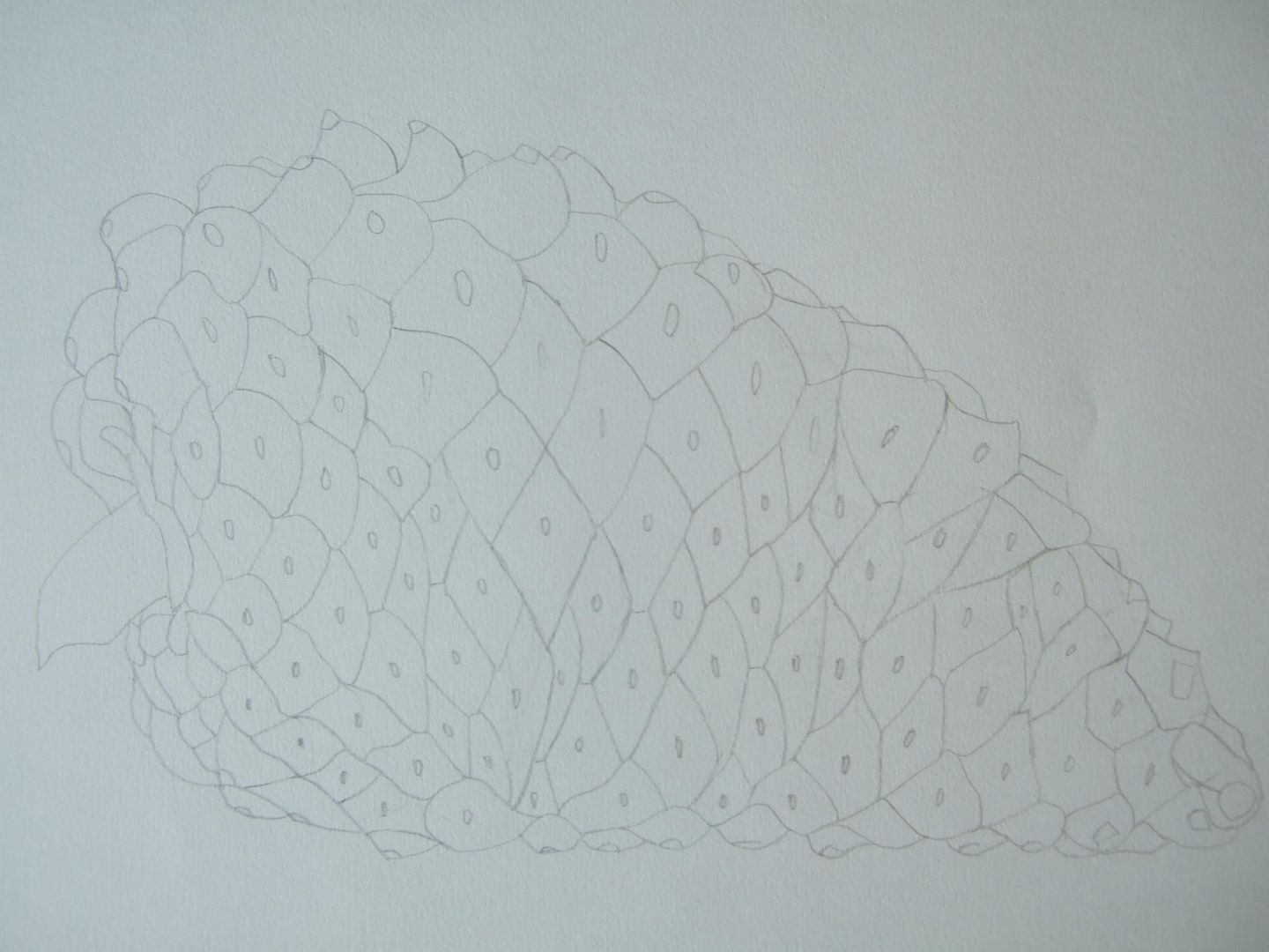
Pinecone line drawing
Another plan for a drawing, this time it's all the scales of a pinecone. it started off quite well, but didn't meet in the middle very successfully. The finished drawing came out much better, but I thought I should keep this one anyway.
Iris pencil drawing
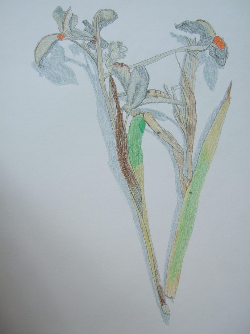
This was a drawing I did a while ago...That I don't have a lot to say about, actually! It's a bit average, and the outline blurs with the shadows... I suppose you can see what it is though.
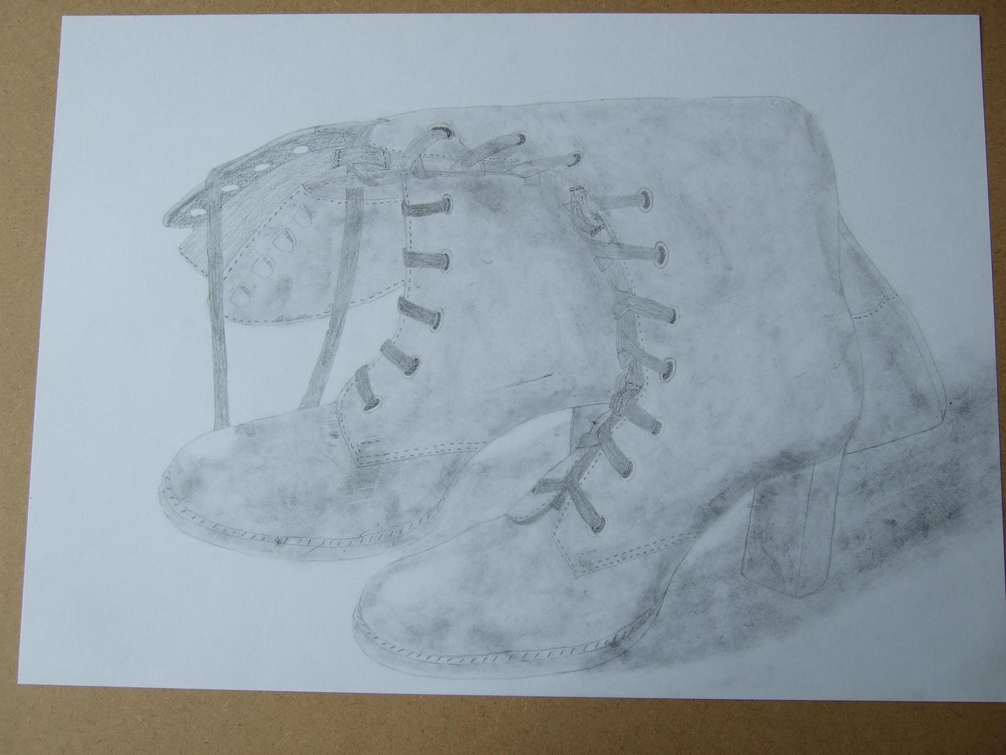
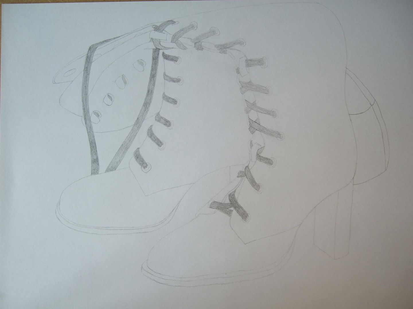
Victorian boots pencil drawing
This drawing seemed a bit boring as a copy from the outline one, and I thought I'd do something different with it, because it wasn't glossy like the high heels or graphic like the boots, but kind of old and grubby - so I got a tiny soft paintbrush and went over it with charcoal, dabbing it on and spreading it in flares - I rubbed some out for highlights. It gives an interesting and different impression of the material of the boots, but some of the detail gets a bit lost in the darker smudges.
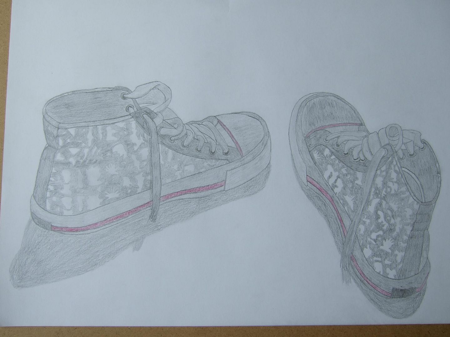
Converse pencil drawing
I love this drawing. I was so happy with it when I'd finished, and I'm still pleased with it today. They're not as dark as they perhaps could be, and their shadows aren't fantastic, but the perspective and realism are still good.
Ribbon shoes redone
My newer effort at the ribbon shoes - they still came out pink, but they look a lot finer, and if you look very closely, you can see the stitching. The holes the ribbons thread through aren't too great, but it's getting better!

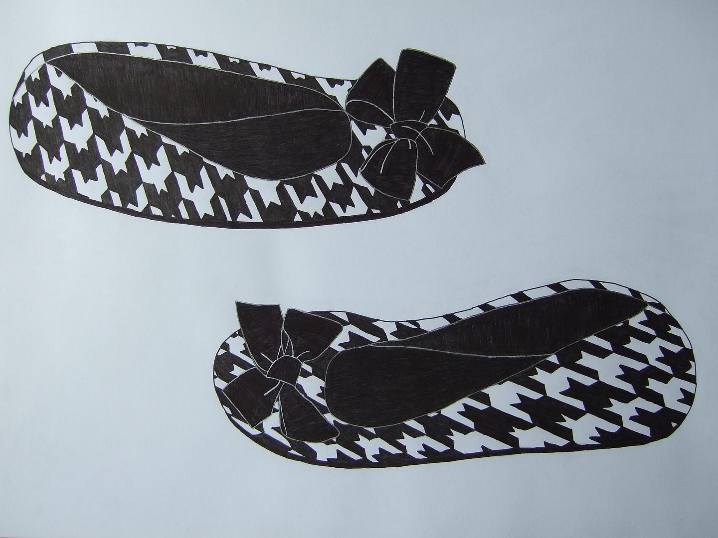
Slippers in ink
The stripes that are meant to be on the bows in this one are only noticeable very close to - I drew straight across to give the impression of them, but thought it would be too much or the stripes would come out too thick if I did them in silver ink. Still, it's quite a pleasing picture.
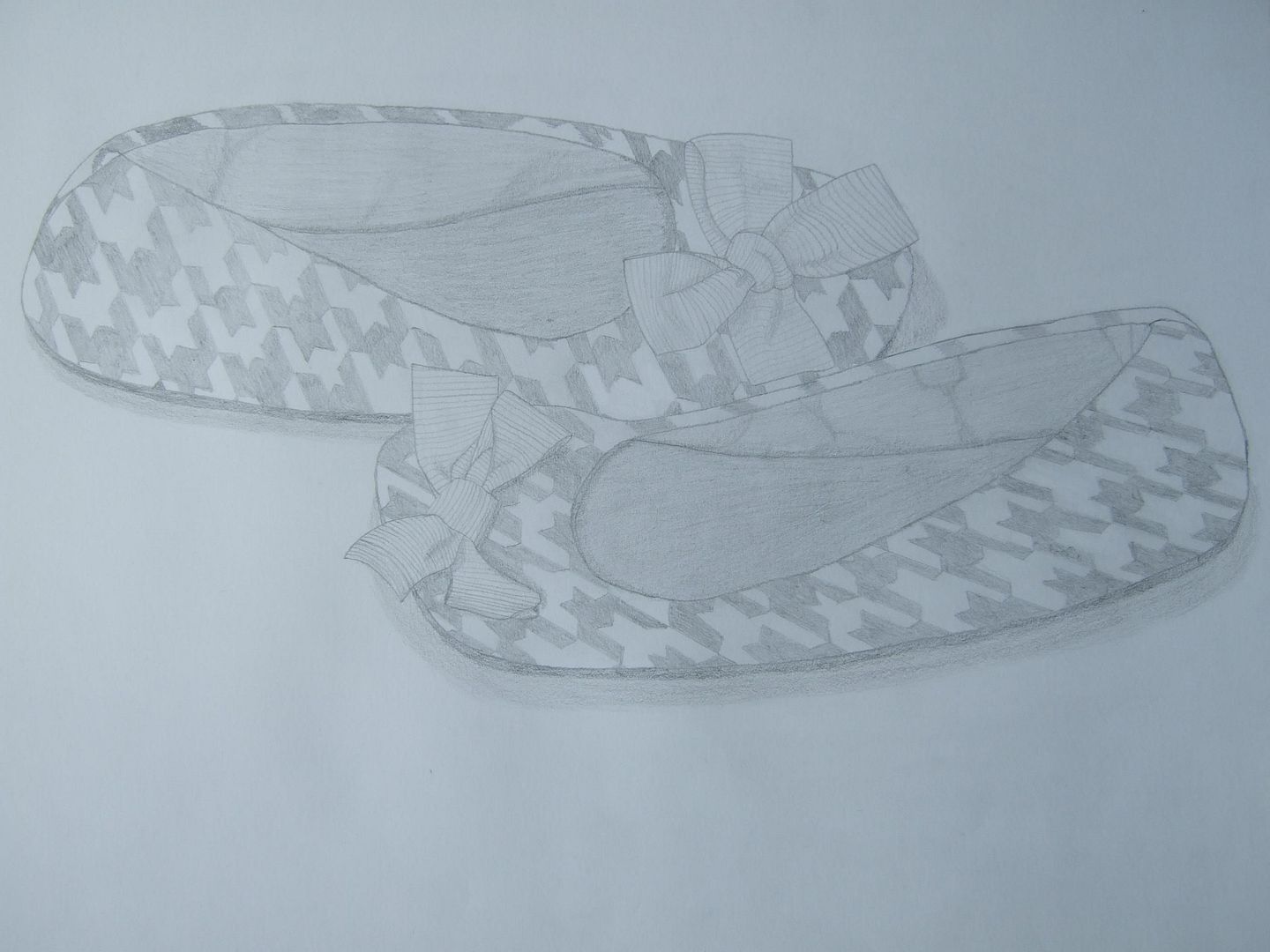
Slippers in pencil
My old slippers - you can't see, but they were really worn underneath - they just look a bit warped in this drawing. The pattern on the sides took ages, but I think they came out ok, unlike the creases inside! The plus of this picture over the ink one is the stripes on the bows, which came out well in pencil.
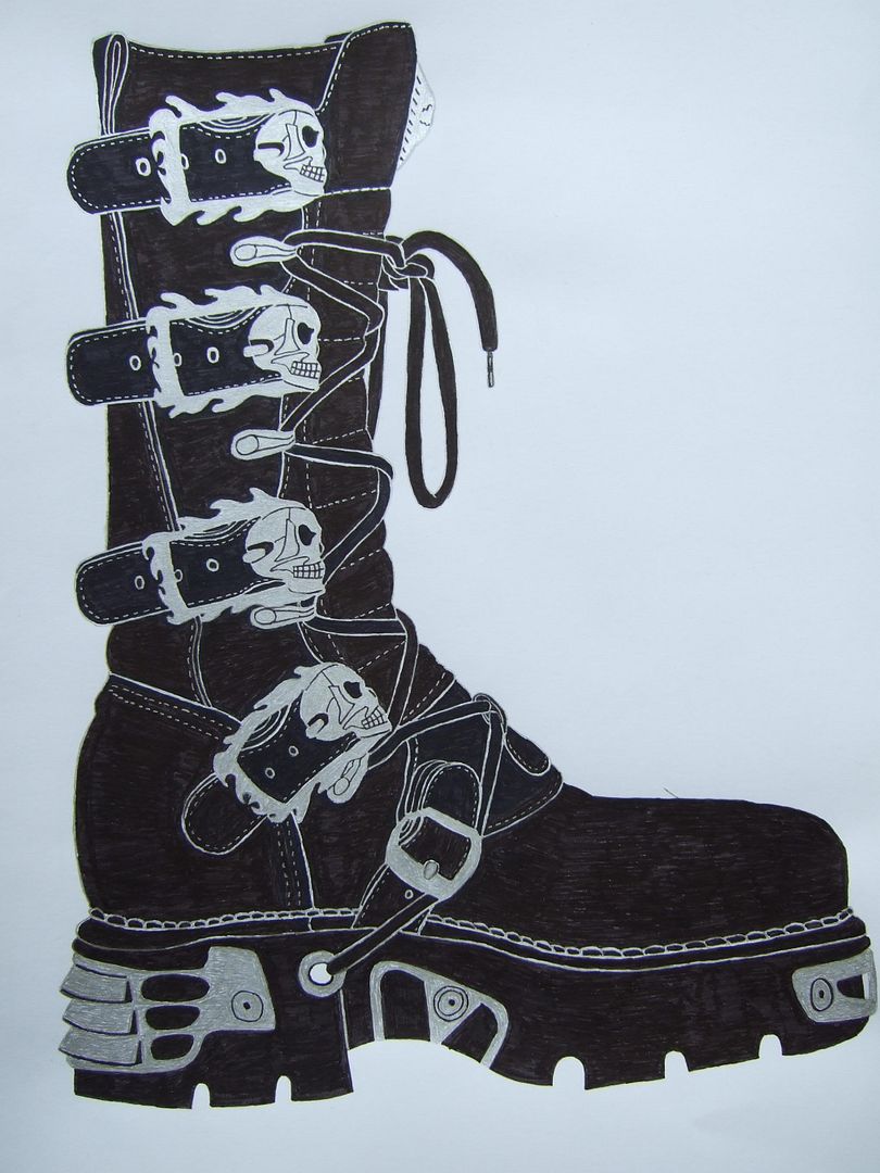
New Rock boots in ink
I'm very proud of this picture - I think it's one of the best I've done - although some of the details on the platform should be more circular and the straps up the sides are a little lop-sided, a lot of work went into this and I think it shows.
New Rock boots line drawing
One of my favourite pairs of boots, I had learnt my lesson from the last shoe, and did this sketch of the main lines first as a guide to copy in case I went wrong.

Subscribe to:
Comments (Atom)