Thursday, 14 July 2011
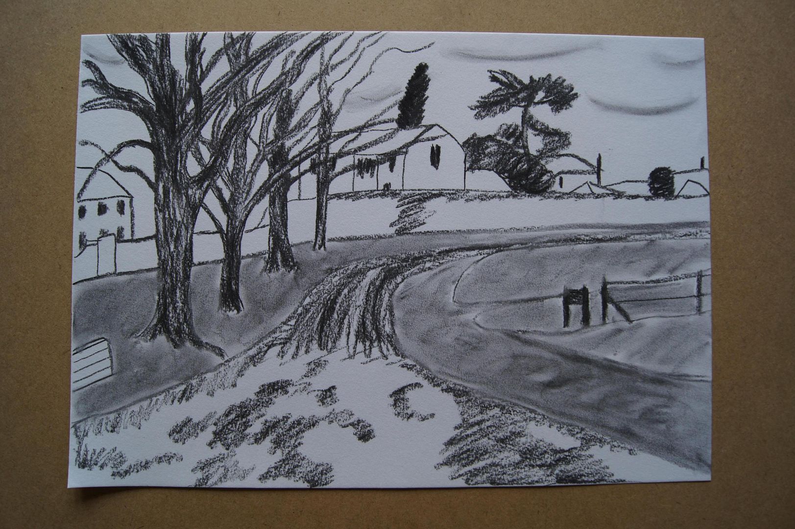
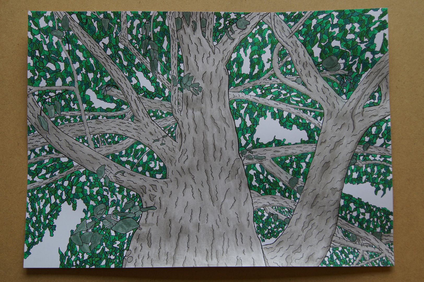
Dip Pen and Ink Wash - Tree Branches
Dip Pen and Ink Wash - Tree Roots
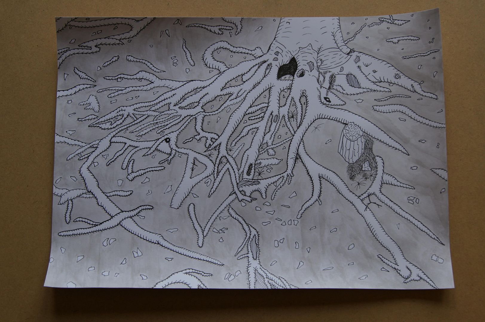
This picture has lots of interesting little details that you'll have to zoom to see, like the clumps of moss round the stump on the right, and the leaves floating in a little pool of water at the bottom of the trunk. By the way, I thought that because I was going for an 'engraving' look, the most I could do besides covering the ground in hatching was to colour it grey. I'm very happy with this picture myself.
Tuesday, 31 May 2011
Looking up at the church
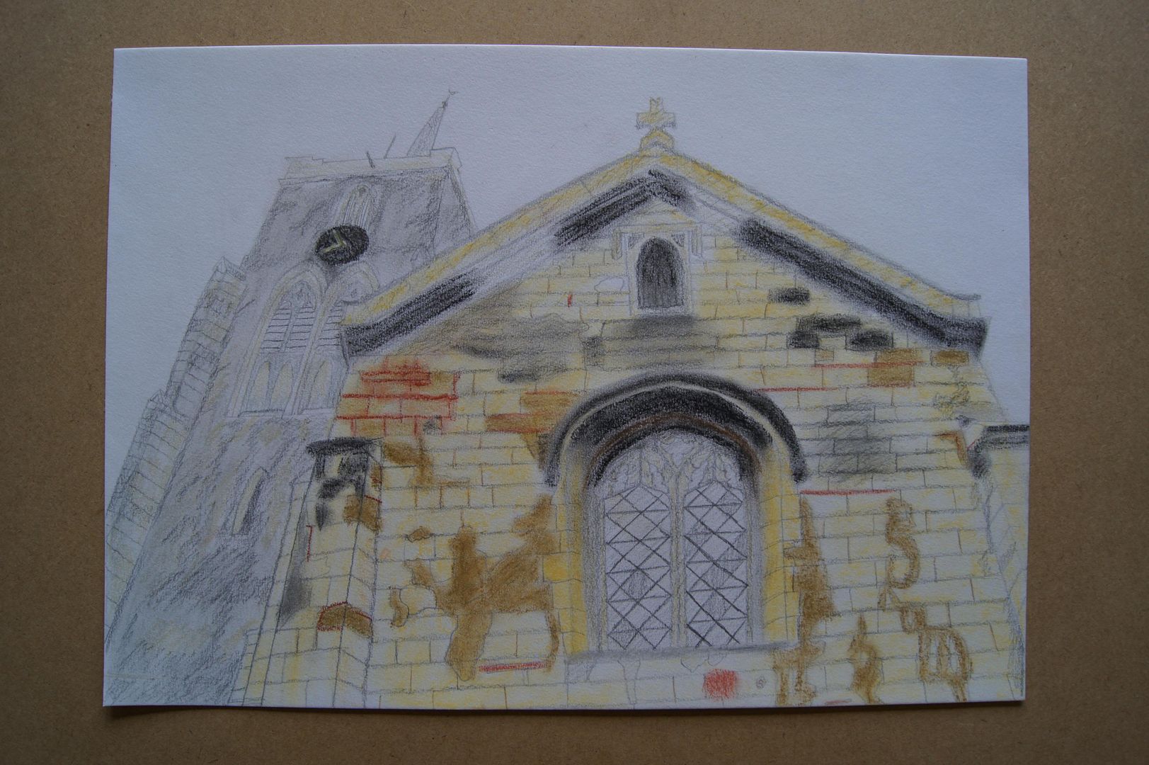 I did this in a similar style to my other church picture, but maybe a little sketchier. I loved the dramatic angle I could get here, and although it was a very overcast day (the sky was literally white) with no patches of blue sky to provide (probably much-needed) contrast, I still enjoyed doing the picture. I particularly like the chipped and repaired brickwork that lends it detail - to be honest, the whole building is a bit of an architectural patchwork quilt!
Oil Pastel Street
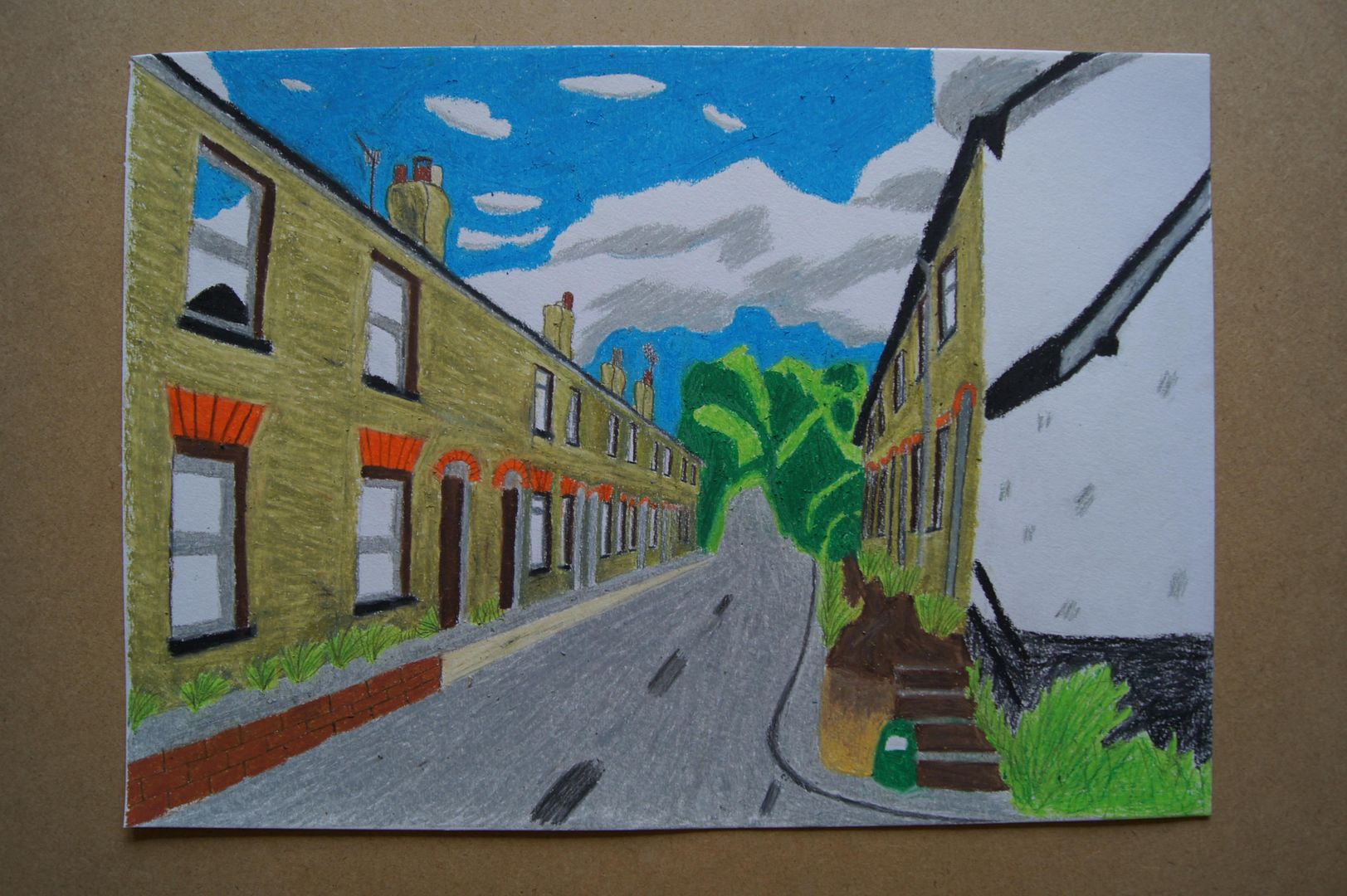 Here's a street at the other end of the village that has always interested me. It's always had quite a sad air about it - it's one of those streets where everyone's blinds are always drawn, and you never see anyone going in or out. At the end you can just about see (where the trees begin), the road goes up a very steep hill. In this drawing I kept some realistic details (the reflection of the sky on the closest window, the proportions and perspective) and left some out (emphasis on shadows, muted colours) making for what I hope is an interesting and cheery drawing. I suppose I made it so bright because it's coming up to summer and things are looking up in the sun.
Rubble at the Church
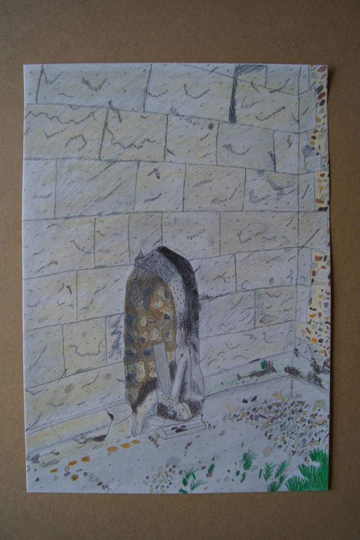 Here's a picture I just felt like doing - without sticking to a particular material or style, not thinking about anyone else's instructions or work, what happens when I try and capture all the detail of a scene just by instinct? This odd picture... It's pencil, pastel, coloured pencil, and more pencil on top. All the gravel kicked into this corner, mingling with the chips falling from the church masonry was an interesting opportunity for detail. I'm not so happy with the way the stone blocks in the wall look, but how can you capture that texture without a proper close-up? They're so pale, sandy, and flaky. Anyway, I tried to get in all the colour and texture I could on a sheet of A3 - in the end, I think it was a good learning process, and has an individual look. It took a surprisingly long time to do as well, so it was a relief I liked it in the end!
Different Layers in Landscape
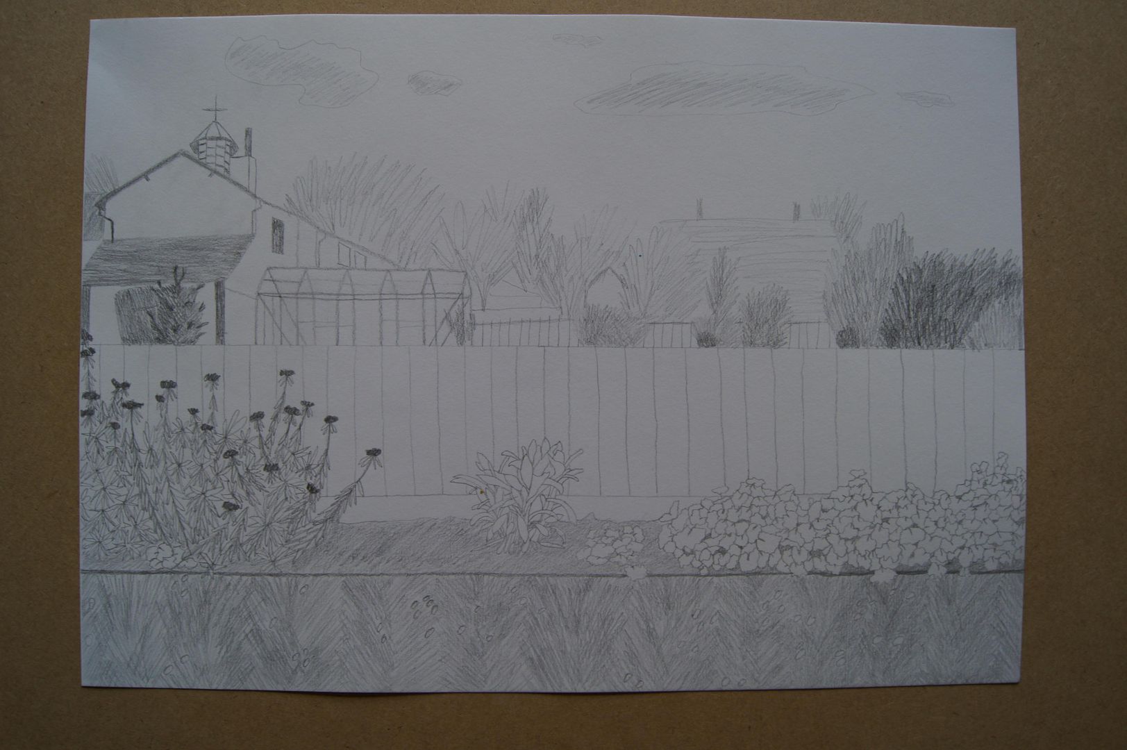 I've been very busy this month, still doing a lot of work in my sketchbooks (started a new one about analysing different artist's styles), so the blog is looking a little neglected... But I hope it'll pick up next month. So anyway, here's a picture I did looking over the fence in the back garden, across the neighbour's garden, and to the village hall. It's a nice familiar sight for me. The idea with this one was to do a drawing that had a very detailed foreground, less so middle ground, and sketchy background. Despite it being detailed toward the bottom of the picture, I didn't know how to tackle the grass, which is my main issue with the drawing. I didn't want to do a load of untidy stems all at random, but felt that vertical lines would just be boring. So I set to work on something that might not be true to life exactly, but was more lively. A few leaning one way, then the other - like this: ///\\\///\\\
I'm pretty happy with it. The greenhouse was a little difficult to tackle, sure, but I think you can see what it is just fine.
Monday, 25 April 2011
Charcoal Panorama Series Part Four