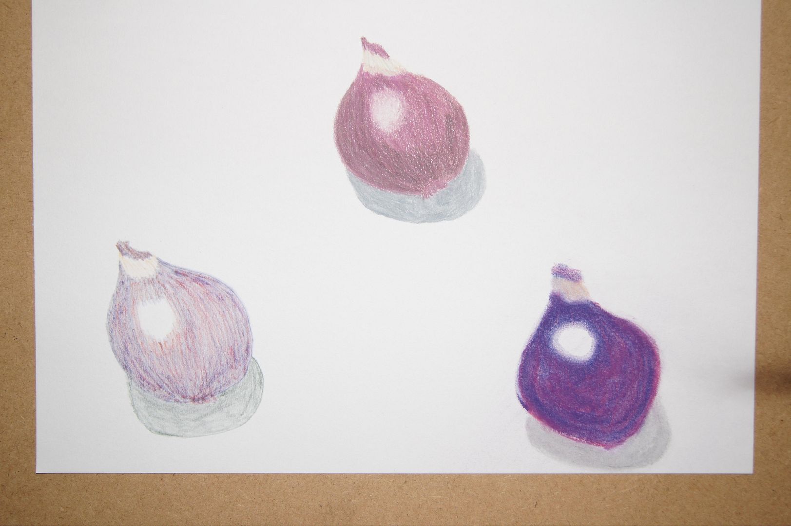
 The pencil onion at the top here is much better than the other drawings in this series in my opinion - much closer to the object itself and much more rounded. The hightlight showed up really well on the skin of the onion, so I made it as white as I could. The pen one on the left is too pale, and the pastel too bright - but great colour, all the same! You might get away with the pastel in context, but here it looks a little flat and I don't think you can see what it is very well.
0 comments:
Post a Comment