As you read blogs in descending order, it can be a bit confusing to look through everything and find out what it's referring to. So here's my check and log feedback, my tutor feedback, etc, in one handy post. Now, I'm a little unsure which way round to do this - latest stuff first and work back format to mimic the blog (oldest stuff last) or oldest first because it might make more sense... Well, bear with me! I think I'd better start with oldest stuff first.
Making Marks
I quite enjoyed the doodling part of this exercise - who wouldn't? Although I felt a little foolish at first, doodling in a special book, I soon got into it and used lots of different materials. The mark making techniques were also quite interesting, with plenty of different things to practice. I quite enjoyed the pastels, and once I got into it, was quite bold with charcoal. I fail to see how you can make nice accurate drawings with them and not pencil, but maybe that's not the point... I also think that ink is quite scary because you can't erase it... and that really doesn't make me feel bolder. But to answer the questions - I tried my best to make a variety of marks, and I learnt that doodling is a good warm up rather than something to do when you're feeling idle! I thought that charcoal wasn't as versatile as I expected - whatever way you shade, you'll always get a shadow of the technique, rather than strokes like using a pen. Charcoal will always smudge and blend a little more than you intended it to. I didn't think that any particular tool expressed an emotion, but I understand the question - for instance, you could argue that ink is more aggressive than charcoal because it's bolder, more defined, and charcoal is (mostly) lighter and fades out at the edges. What would be better with the introduction of colour? Well, I used quite a bit of colour - I saw the colour examples in the folder, and assumed that was ok - I hope it is. I can't really say what would be, because I think I went a bit overboard with colours - I suppose that depending on what you're doing (what emotion you want to convey, etc) using red pen for really jagged shading might've been good!
What did I find most interesting and rewarding... I think it was good to set up with the doodles, even if at times I did feel a little foolish and wondered if anyone was going to read into what I drew, I think it helped me relax a little bit. I hope that's not a really lame answer!
Tone and form
I thought it was interesting after all the line drawing to do such plainly tonal drawings, and I thought I'd try and be bold, so I did a fairly dark pencil drawing first, then straight in with the pastel. After that I did a nice big charcoal drawing. I still think these things are less accurate than pure pencil, and when I lose a bit of detail, it is kind of upsetting. However, onto the questions: I think I've given my objects a sense of tone, although the drawing the four balls exercise I didn't really get. I tried some different hatching and everything... I might have done them too small. I did have a go at observing the light pattern before I started drawing, but I thought 'I can't tell whether I can do all these different things until I start...' although it's good to have an idea of what you want to have done when you've finished, personally I thought that thinking too much about it before I started put me off a little bit. I don't think I did too well at the reflected light stage of the shadows, but I think that the objects I draw are as 3D as I can make them, and that's a good start.
Reflected light
As usual, I started off with a pencil drawing, then went on to a big charcoal one. (Edit. I have drawn a few shiny things that are on the blog, but I don't know if I've ever got the hang of it.) Maybe I should do this more sometime. I think I manged to capture the main shadows ok, yes.
I think that my reflective objects showed reflected light and shade better in the second sketchbook drawing with the charcoal than the first one I tried. I was more successful at the reflected shadows, I feel. In the first drawing, I had to try and show that the saucepan was curving away from the reflected mugs, which I think I got away with just about by elongating the mugs as I saw them. In the second, the objects were similar shapes but different dimensions. I think I need to look into this more. I did have a bit of a problem sorting out the differences in the shadows and reflections sometimes, but I probably just need more practice.
Still life
I LOVE still life drawings (Edit. As you can tell from my selection on the blog!)
I find man-made objects easier to draw realistically, and I've had a lot of fun coming up with compositions. I think of the still life drawings I'm doing, a few have been successes, but some fainter drawings (when I'm not so confident, I tend to draw lighter, and I used to be even worse) do tend to look flat. When they're just finished, they're great, but if you put them away and have another look, sometimes you can just about see them. I think I'm improving though.
Changing the arrangement of my compositions has been interesting, and I think that the way you approach things does change when you put one thing in front of another or put them in a line - at the moment I'm finding my way around scale still though, so it all depends - sometimes it seems like luck!
Using texture
I think I did ok describing different surfaces in my boxes. I chose some challenging things, so I did weaken and do them all in pencil. But it was interesting none the less. I hope I manage to convey a sense of different textures in all the drawings I do! I suppose that just doing these bits I can't say anything specific - I do so many drawings at the moment, I'm learning new ways to use drawing tools all the time. I could probably do more wide-ranging drawings material-wise, but pencil is still my favourite thing. It also kind of depends on whether you can trick yourself through familiarity or use of colour into recognising the different parts of a drawing and whether you get a sense of what the object must feel like just by knowing what it is... if that makes sense.
My drawings with an emphasis on unusual textures are quite often in colour - I have quite waxy pencils, so hatching doesn't show as well - I often blend with a white pencil as well. Oh! That's a new way to use my tools! I can't really answer the question about implying form with little hatching though, because I always look at a drawing and decide how much that particular subject needs. That's me sounding lame again!
Enlarging an image
I think I did quite well at this - I have quite a big sketchbook, so I did two nice examples of enlarging. I moved the drawing nicely, and it does look like a larger replica. However, I don't think I'll be doing it again, because drawing a grid over something (or even if I was using the acetate grid) I'd end up having to erase lines off of the larger drawing. Not very satisfying.
Assignment feedback
I'm very pleased with this assignment's last pictures. I think that what with all the drawings (particularly the truckloads of shoe studies) I already knew what I was going to do. The natural studies drawing was a little more difficult, but I think that the colours in the finished drawing compliment each other nicely - and cotton is a natural fabric! "Did you select what was significant or, in the end, did you try to include everything?" I think the drawings speak for themselves, but yep, I tried to go all out and include everything for a nicer composition. I think overall I'm pleased with how they fit on the page, and if I'd done the ink shoes any bigger, it would've taken an age! I think that my pencils aren't as good as they could be in the drawings of the pinecones - they don't have exactly the right depth. Maybe it's just operator trouble, but I found after a while I couldn't go over something to exactly the right extent without changing the colour - however, I did my best, and I think I should feel proud.
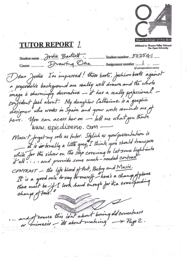
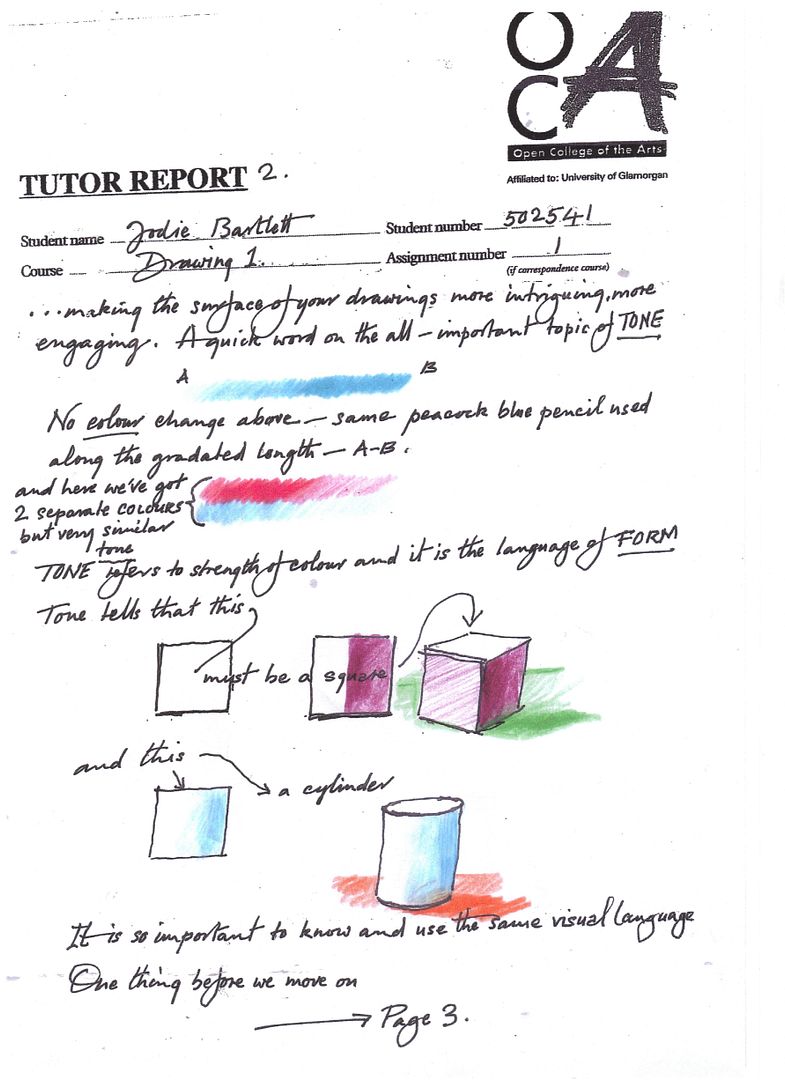
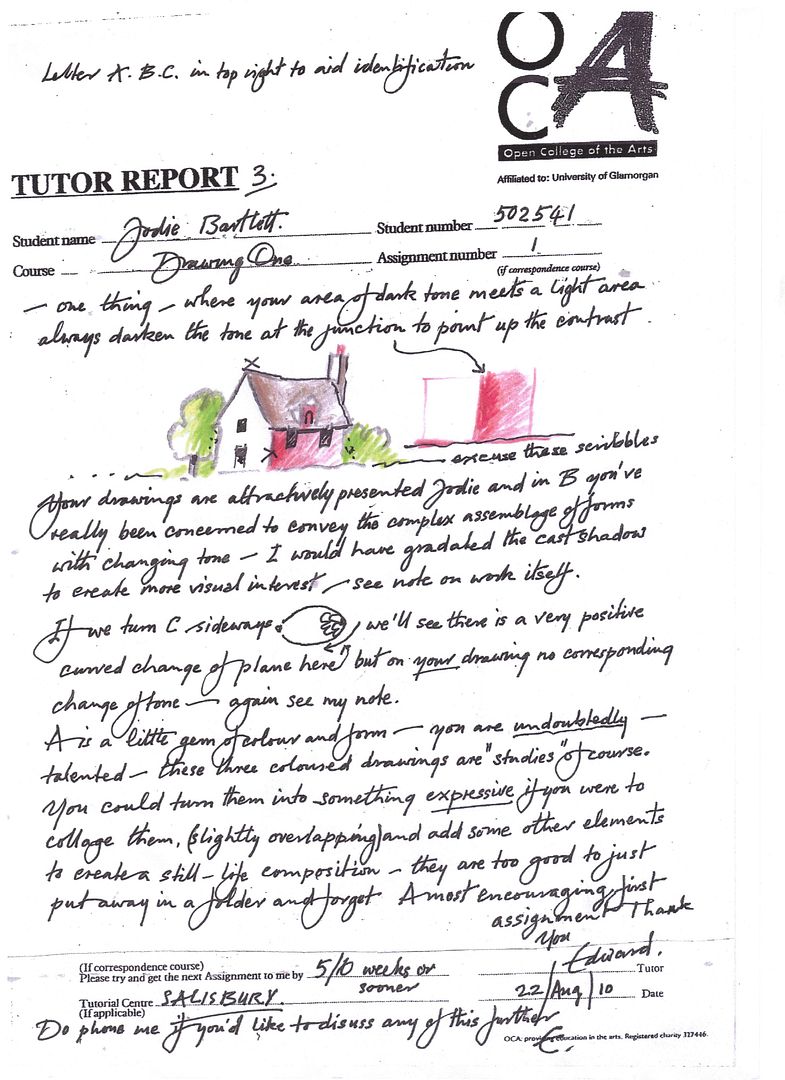
Here are my tutor reports (posted like a normal picture, so you can click and read)
Page 2:
Page 3:
Wednesday, 25 August 2010
Assignment 1 Feedback sections
Posted by Jodie Bartlett at 8/25/2010 12:51:00 pm
Subscribe to:
Post Comments (Atom)
0 comments:
Post a Comment