Monday, 24 January 2011
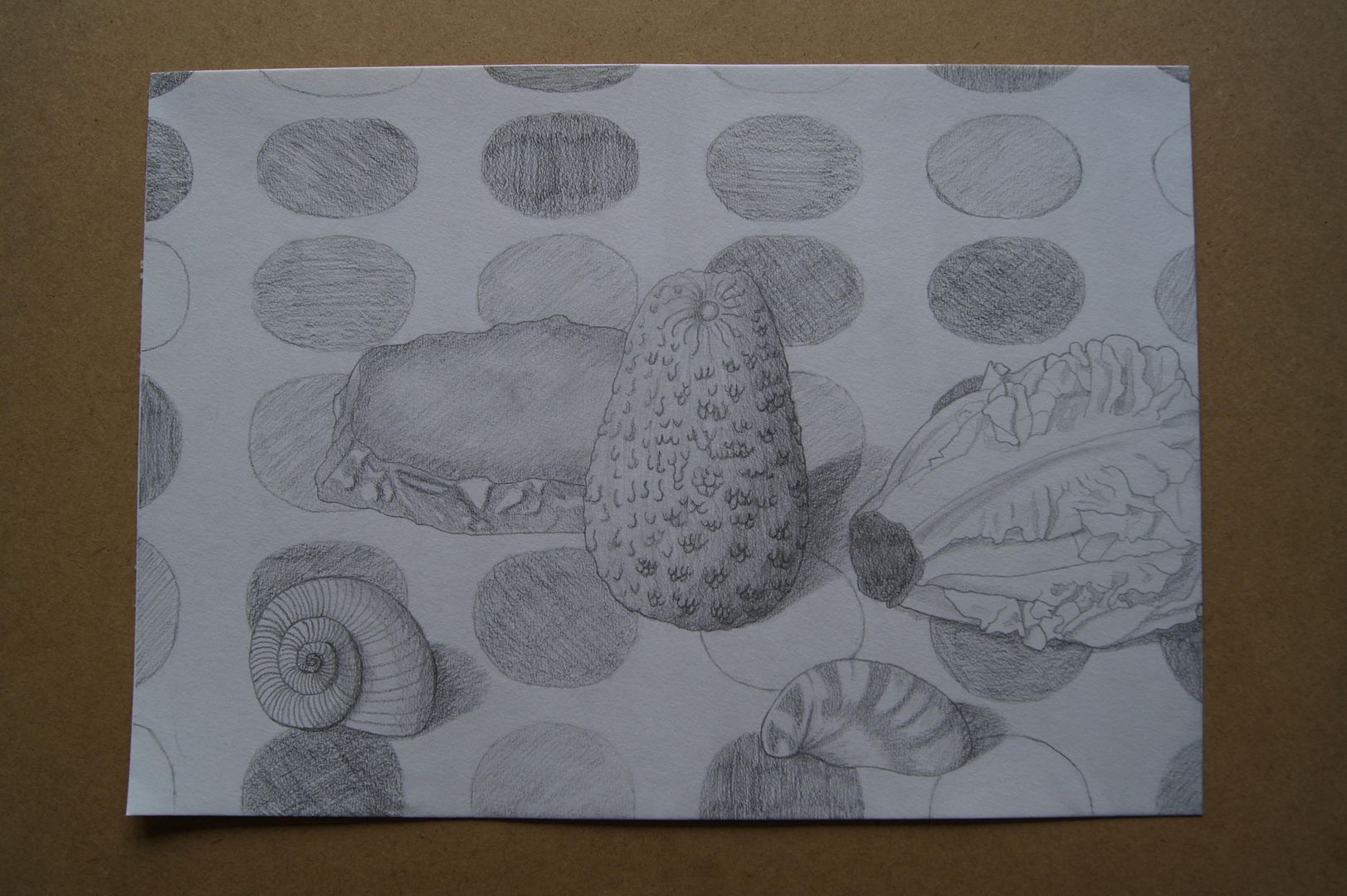
Yet Another Pencil Still Life (but with an avocado)
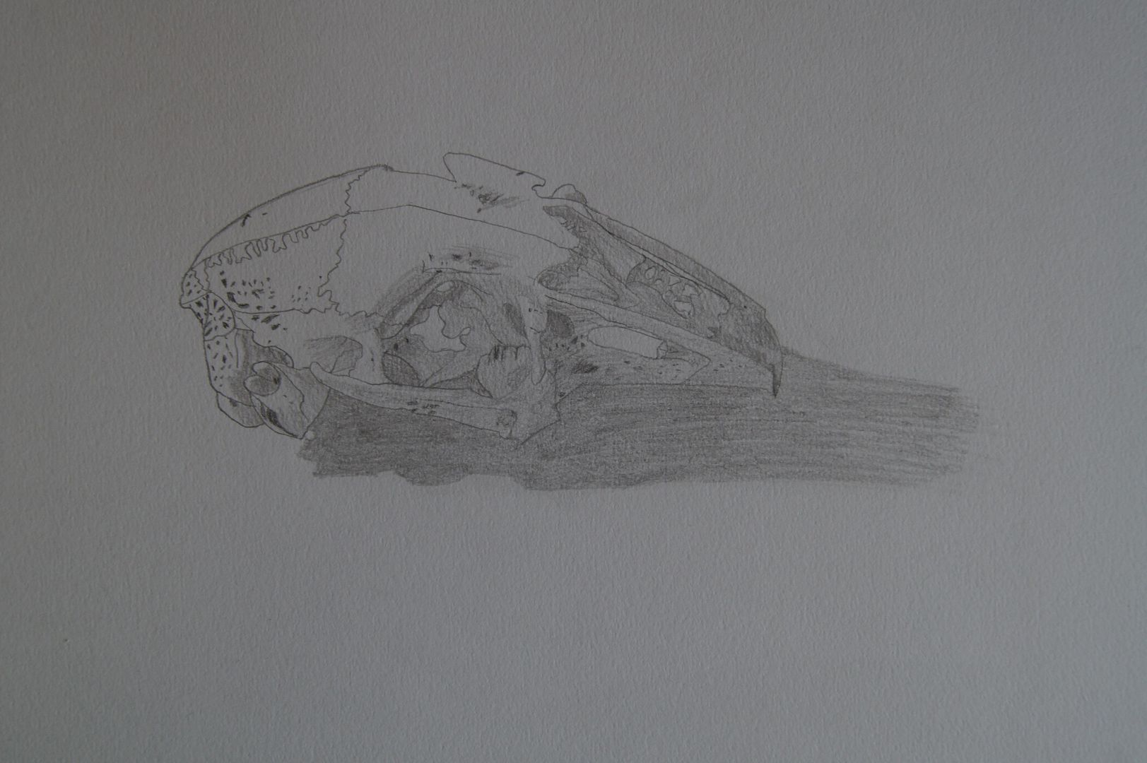
Pencil Skull
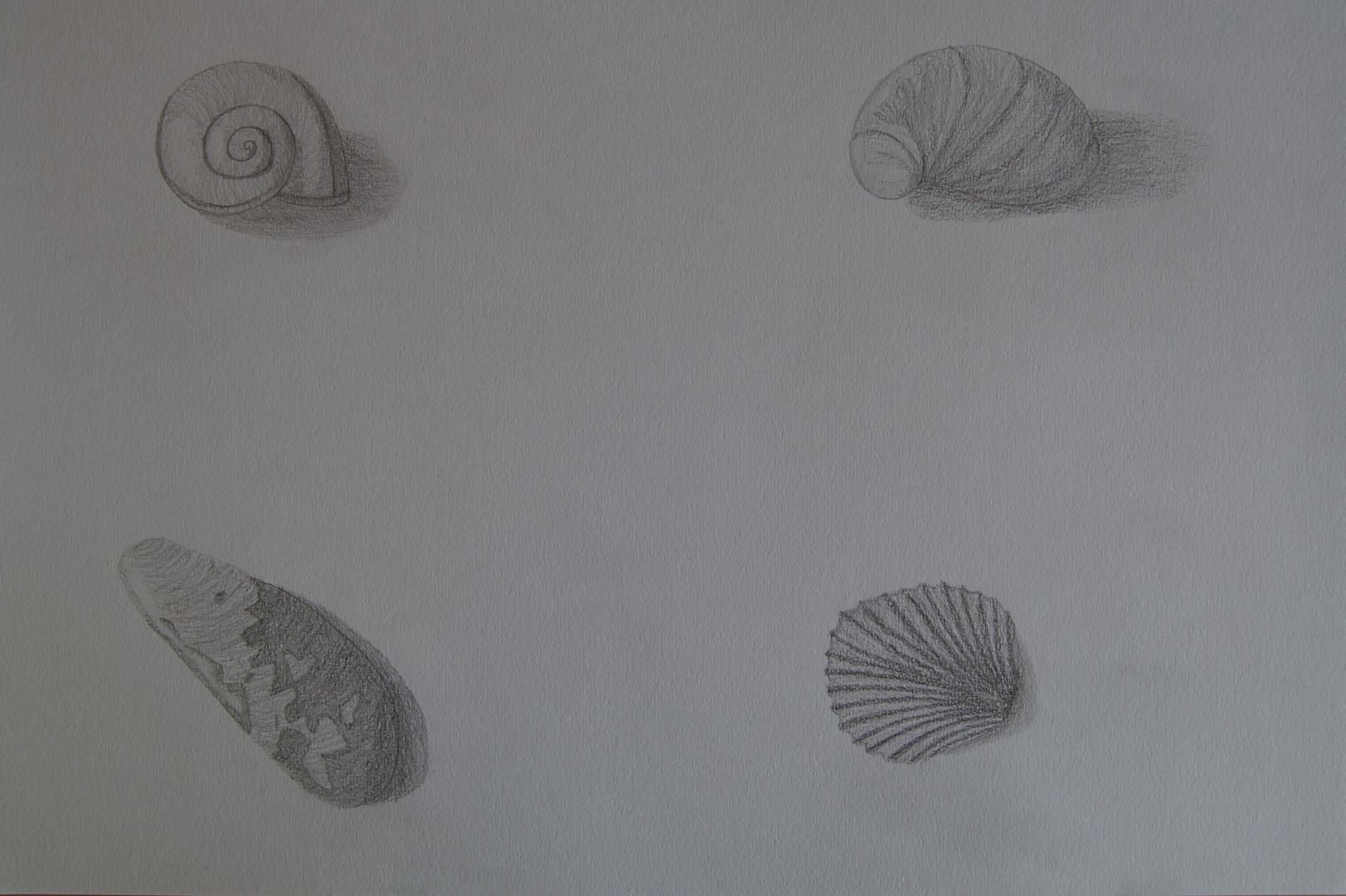
Pencil Shells
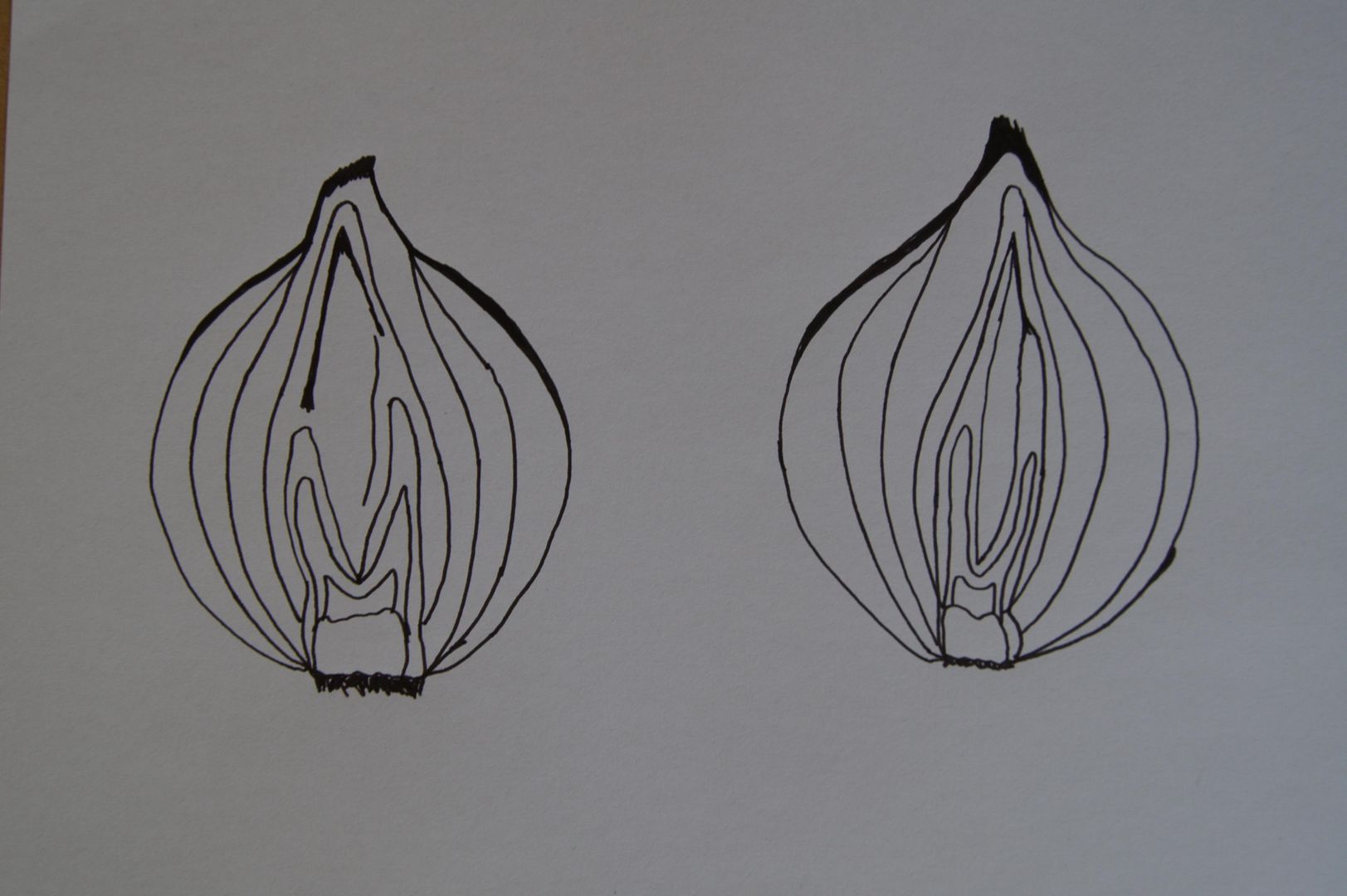
Ink Onions
 This one isn't as successful as the other two - I was just going to do an onion, but it didn't really look interesting enough, so I cut it in half and drew both sides. Why wasn't it as successful? Although you can see what it is, the halves don't correspond properly - obviously, they are quite different inside, but not to this extent - I think for the second one, I started with the outline without thinking, rather than building out from the middle.
 Ink Pepper
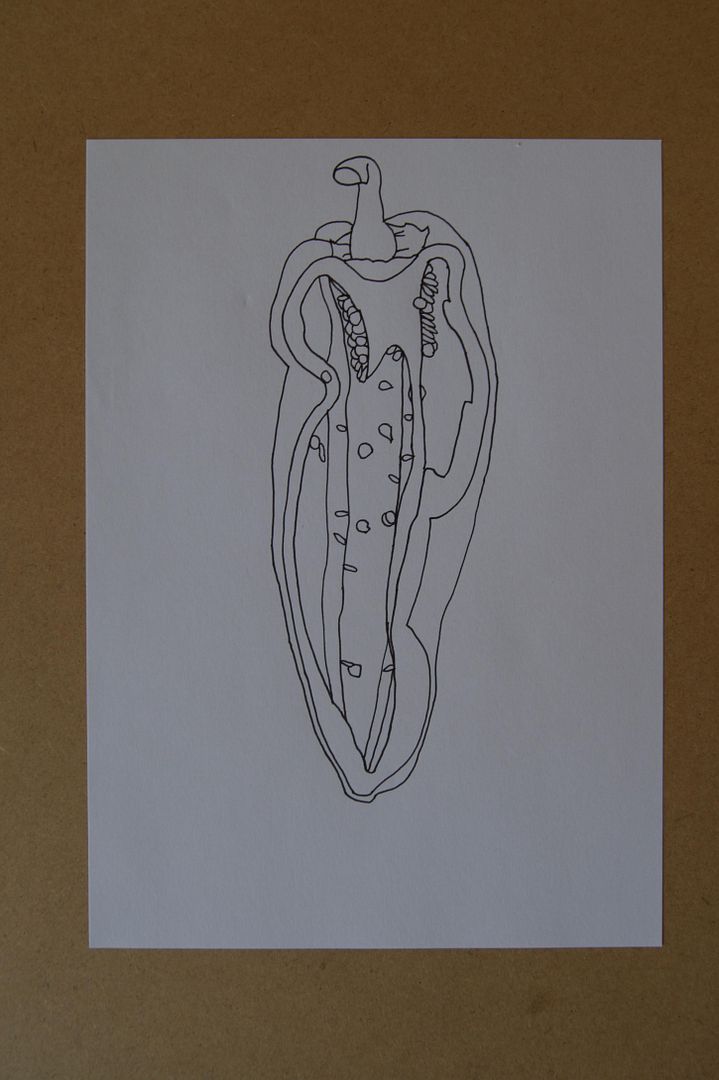 Slightly more interesting - this drawing has more depth to it than the last one; you can see the space inside the pepper. I feel a little clichéd drawing half a pepper, but after I did all those bright drawings of bell peppers, this one is a little more unsual.
 Ink Lettuce
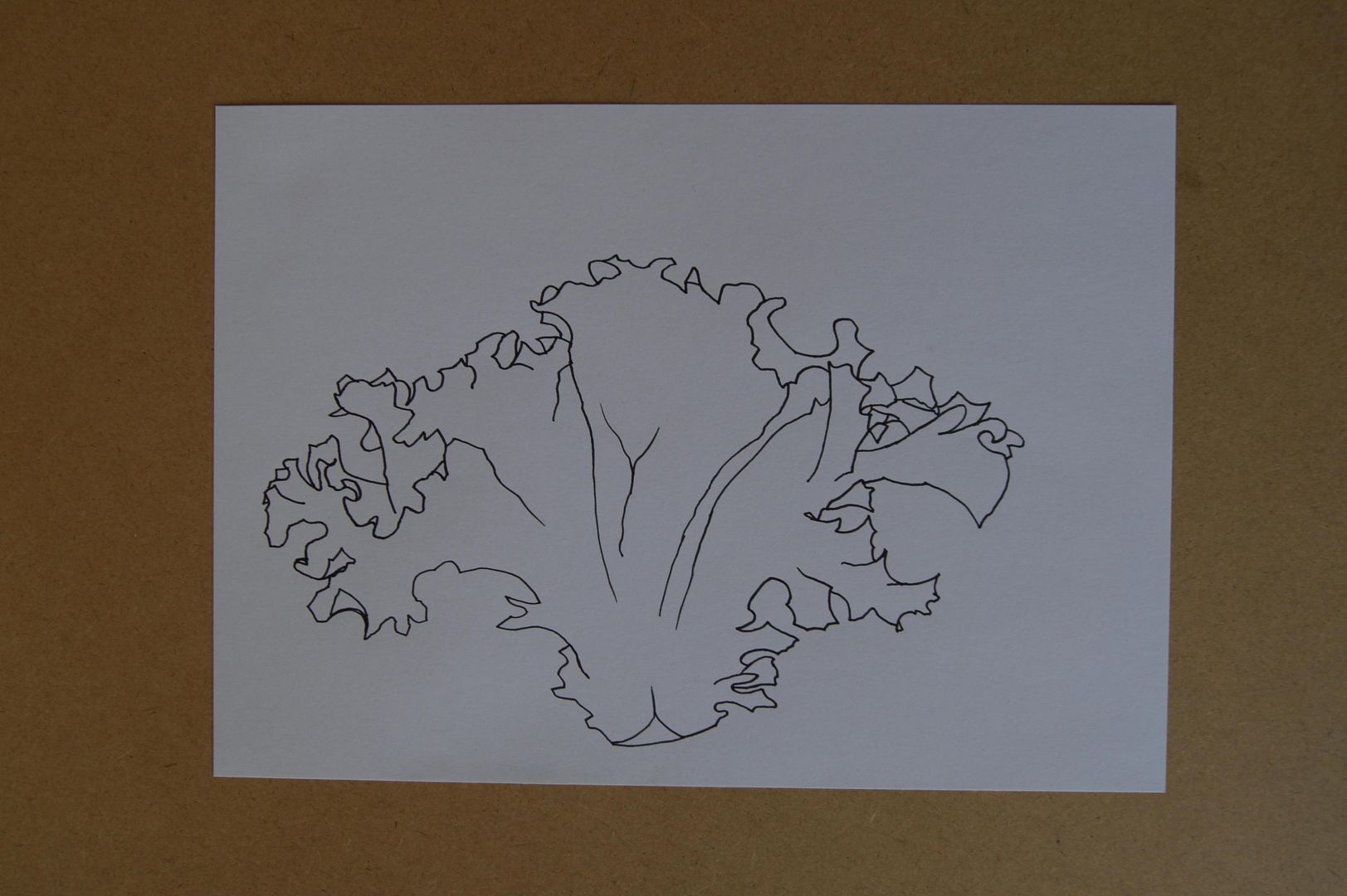 Quick ink drawing of a lettuce leaf. It's an alright picture - you can see what it is, and the ragged edges make for an interesting drawing. The positioning on the paper is no good though! I've never been a big fan of black and white drawing, as I don't think you can get a very realistic result - the lesson from these drawings is that something this simple (without even lifting the pen much) can still give you an idea of what the subject is. Pleasingly few lines describing a very complex form.
Thursday, 6 January 2011
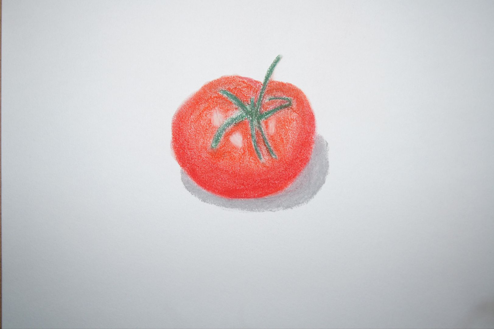
Pastel Tomato
Pen Tomato
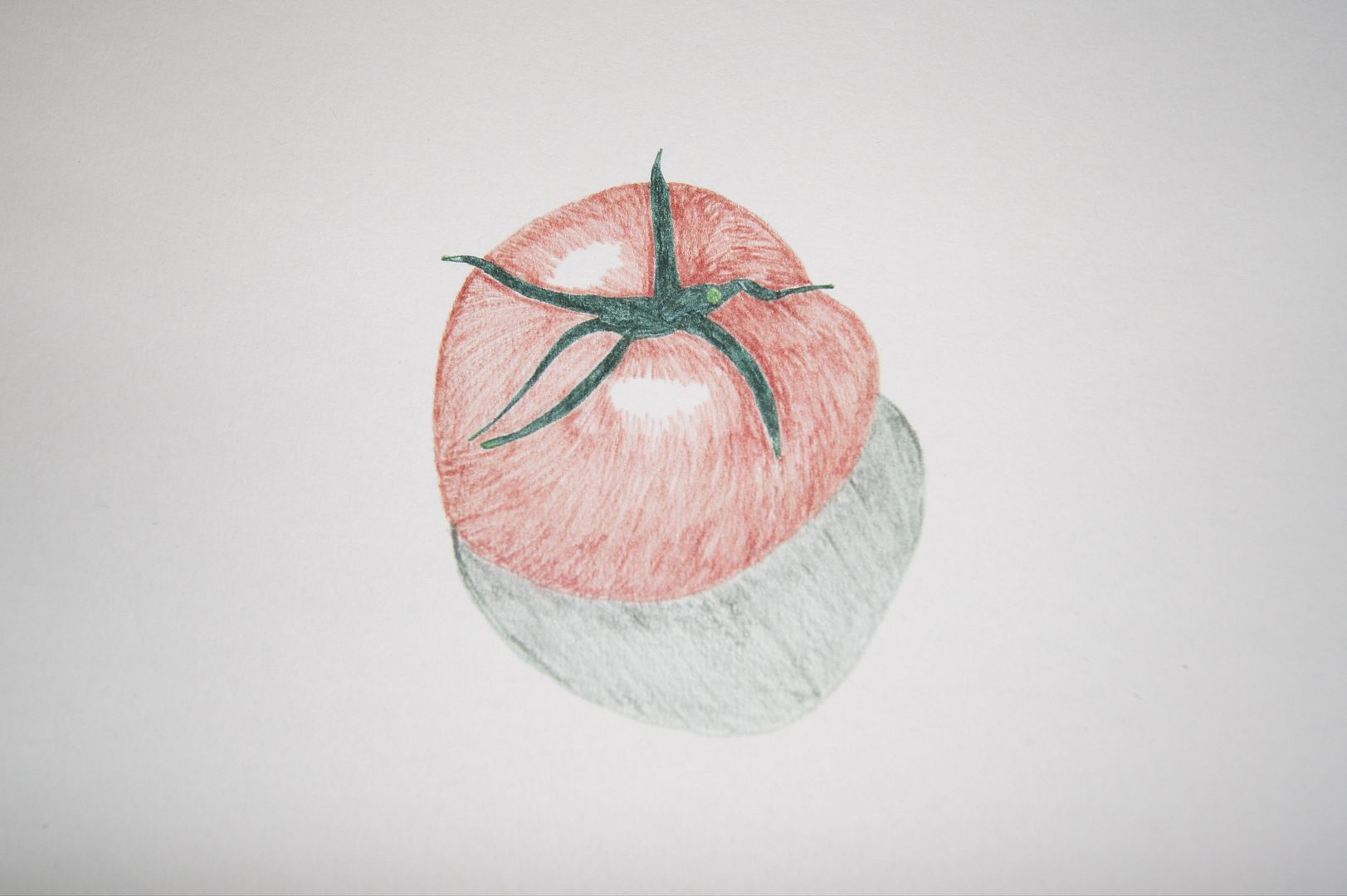
Pencil Tomato
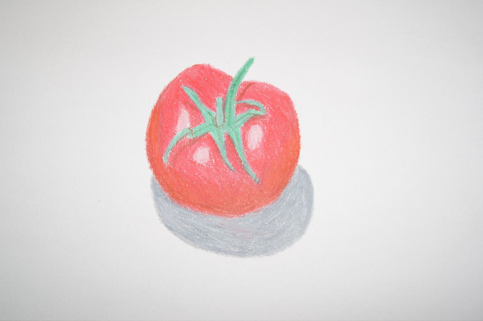
Here's a drawing with coloured pencil - it's not as nice in the photo, but I really went for it and drew as dark with the pencils as I could. I did the tomatoes separately because I was a little less sure it would work. I like this drawing a lot, however, and when it's a bit bigger you can see the shadows under the stalk. I think I like it so much because it's darker - it shows my progress from before the course (all my drawings on here marked with 'old') when all my drawings were so pale you could hardly see them!
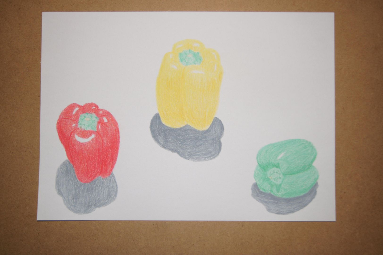
Pastel Peppers
Even in the last of the set, the red stands out. Maybe it's my own preference for the colour, but I think it's the most true to life. The light being almost directly above makes the highlights look a little awkward though. Take note of this for next time. I should also say that leaving the red highlights 'til last was a good move, as drawing peppers and then trying to use my putty rubber to put the highlights in was not a good move!
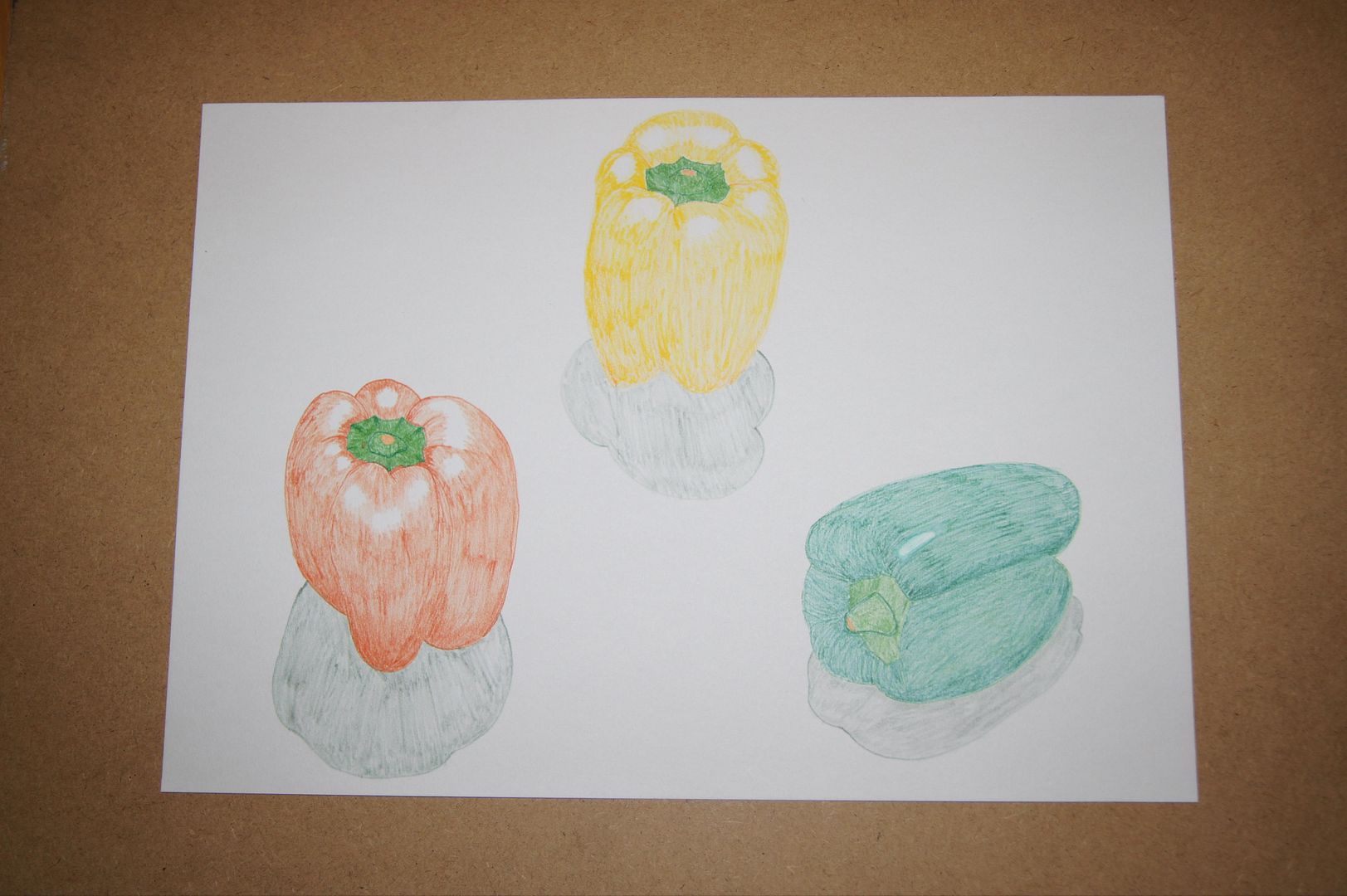
Pen Peppers
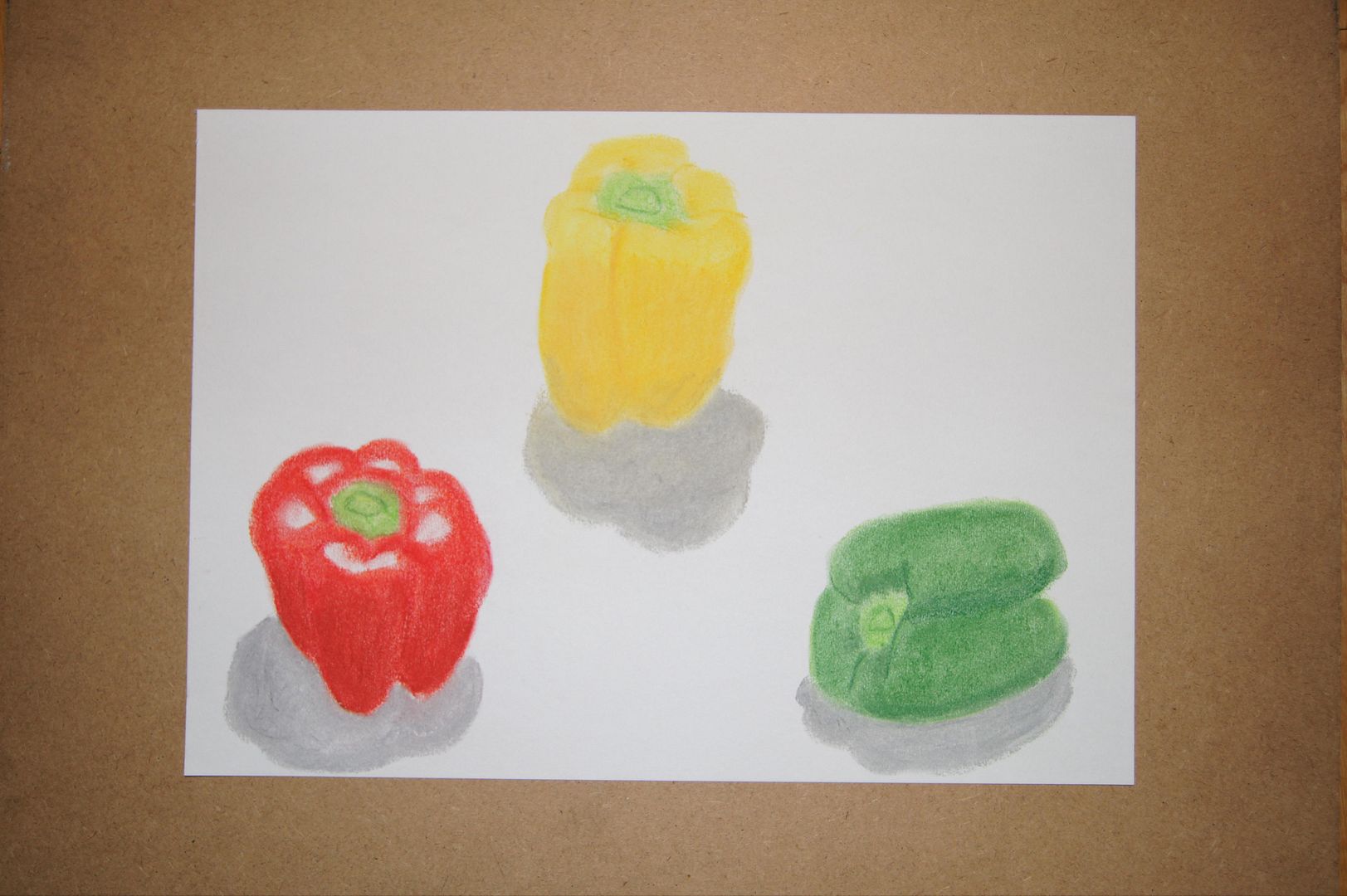
Pencil Peppers
Peppers are always a pleasingly graphic subject, and these ones are no exception - I liked them so much I thought I'd do three versions, and here's the first, in coloured pencil. The yellow one is quite flat, the green one is a bit better, but a glance are the red one and you get the shiny feel very well.
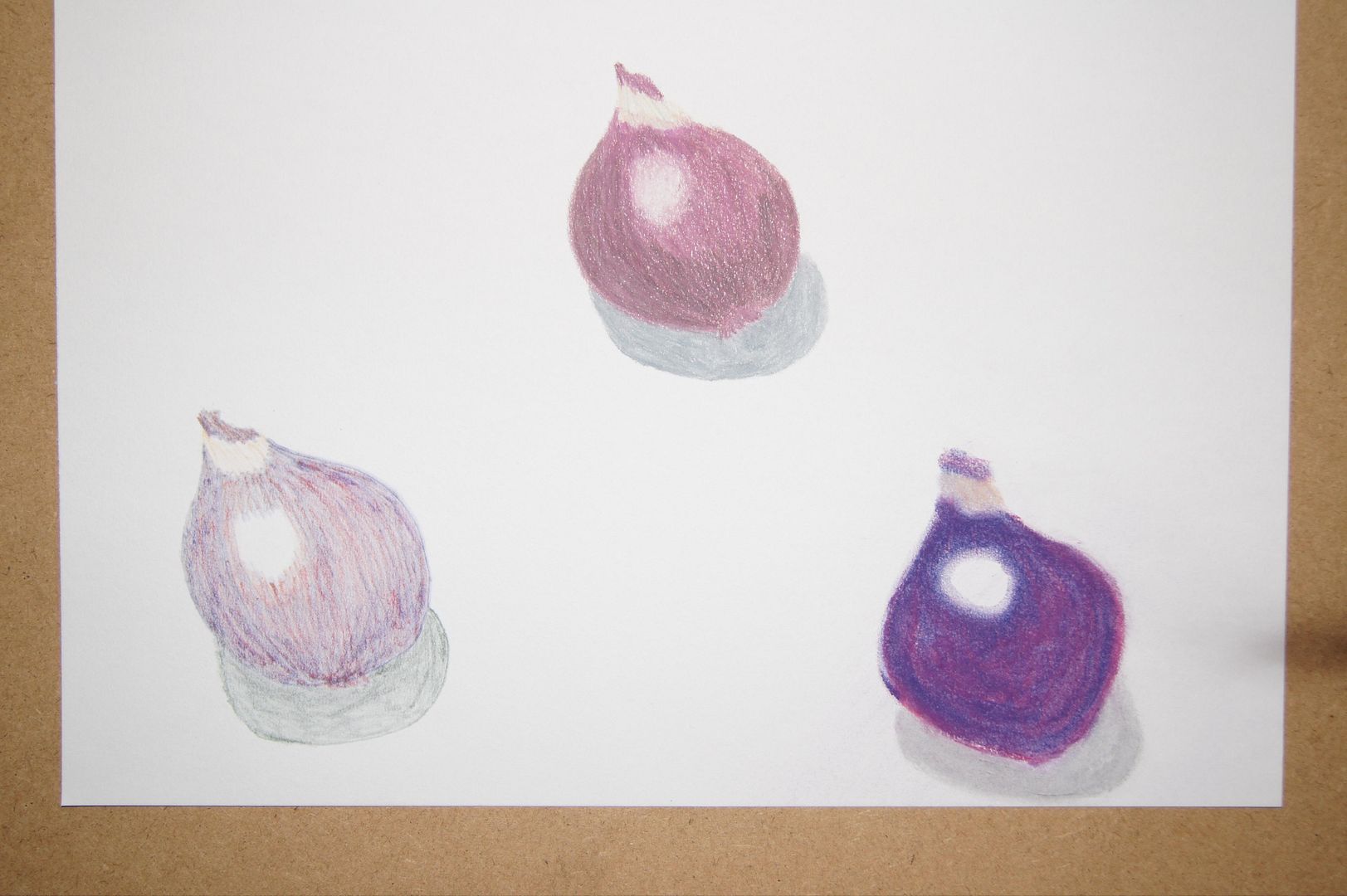
Red Onion
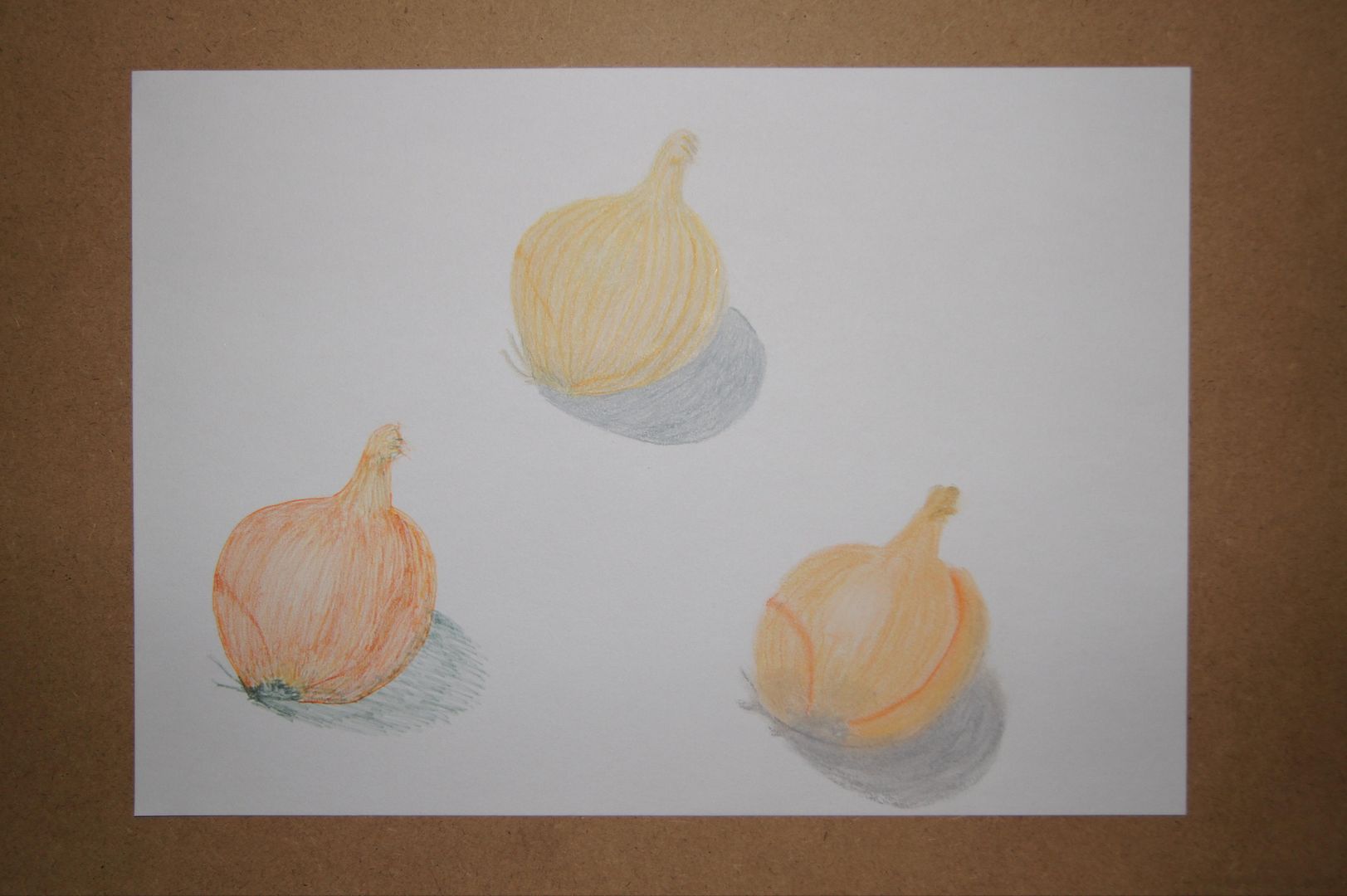
Three Onions
Shells
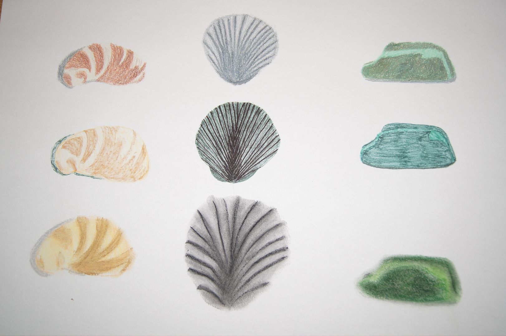
Here are some quick drawings of a green stone and some shells. The yellow/brown shells on the left are ok... but pastel is no good for small drawings of complex shell patterns - mark my words.
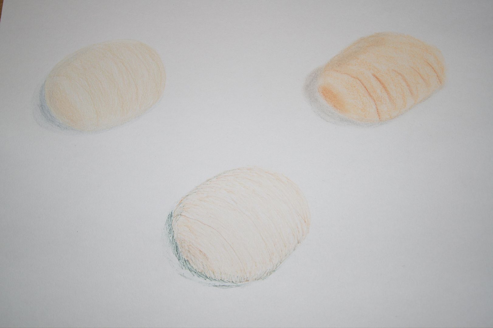
Pale stone
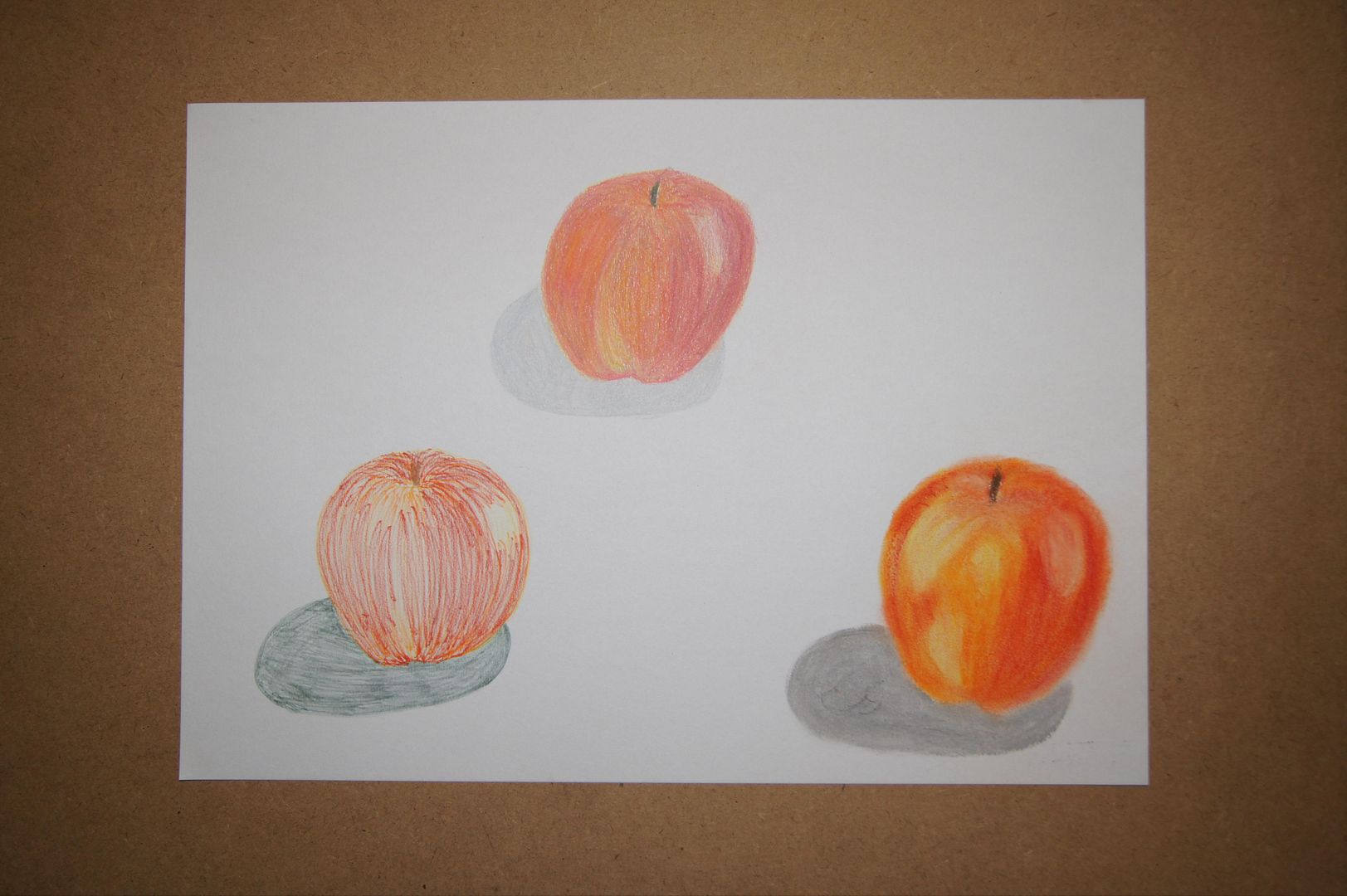
Three Apples
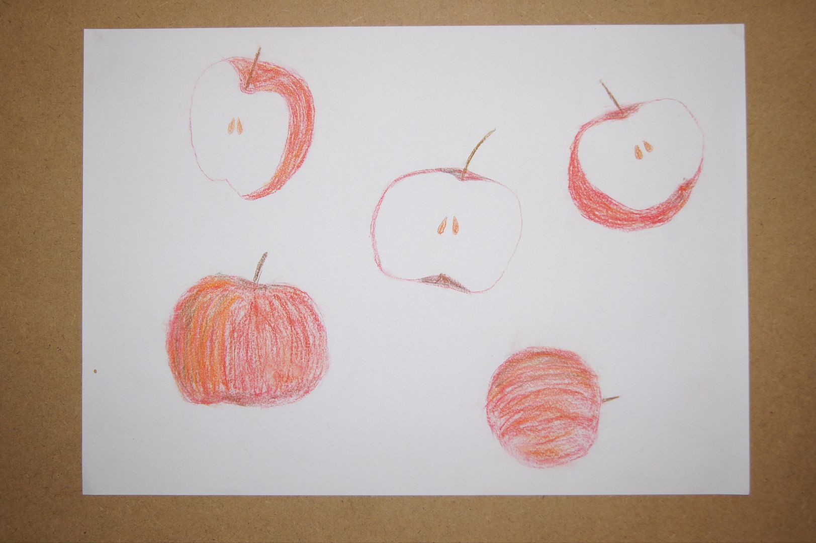
Old Apples
As I'm starting on natural subjects, I thought I'd do some nice, bright, graphic drawings of fruit and veg.
Subscribe to:
Comments (Atom)