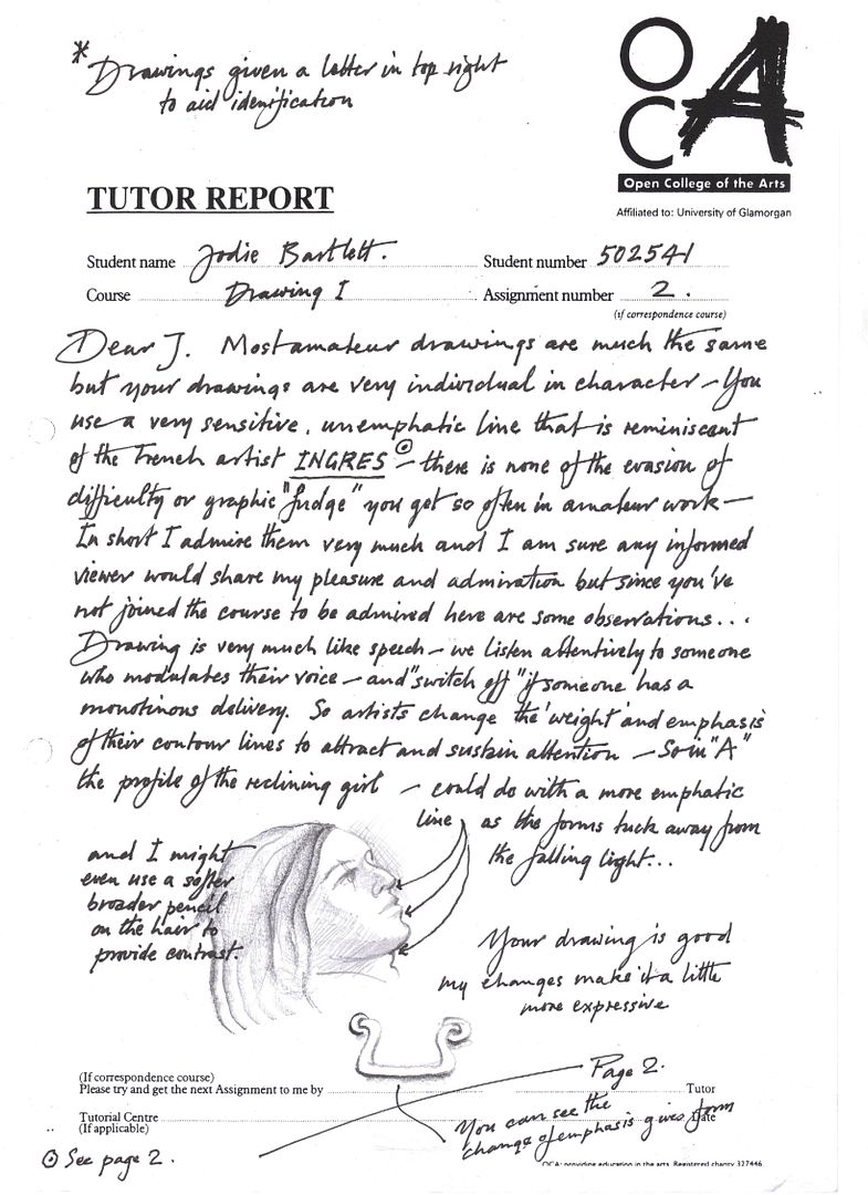
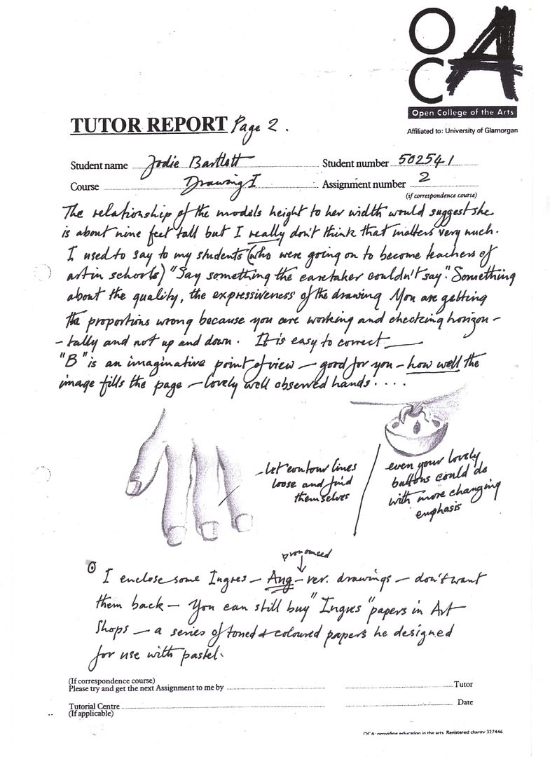
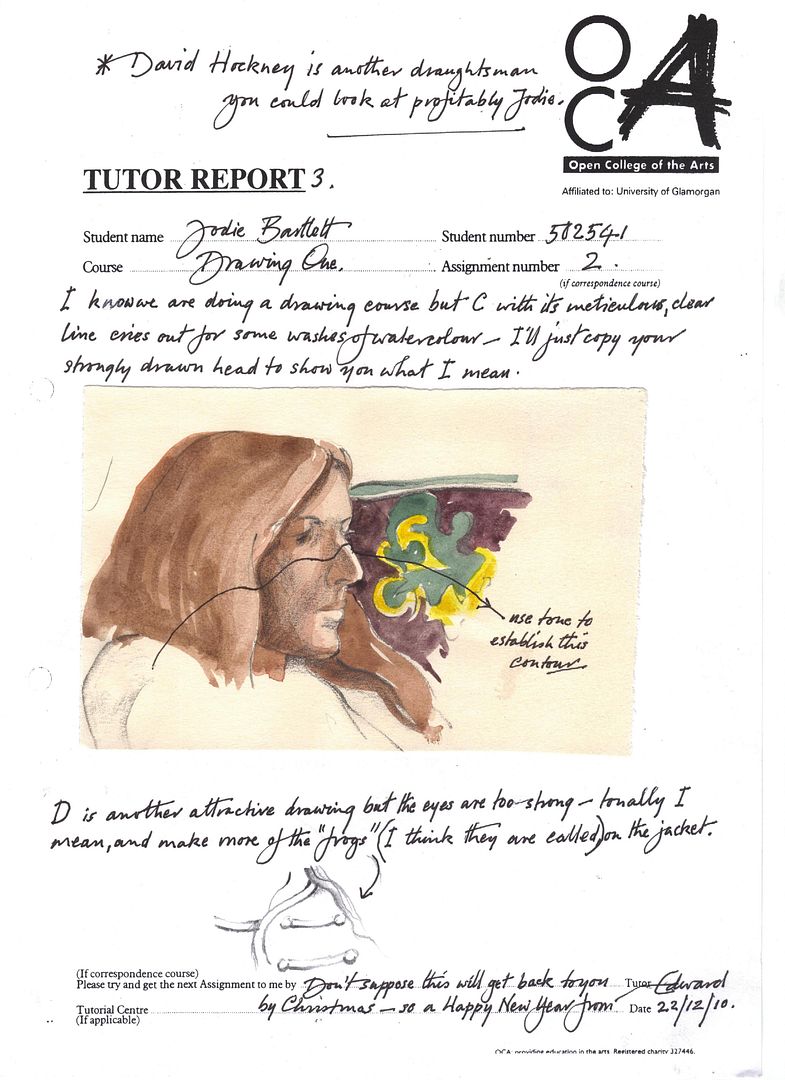
In assignment two, most of the work I did was in sketchbooks and so will not be posted here. I have life drawing class sketchbooks as well as a sketchbook for around the house and one for exercises that didn't fit in the other books - so a bit all over the place, but then - I am meant to be an artist. Most of the things here are close-ups or self portraits, and I hope you won't think I'm vain! I wanted to get the detail just right, and only I have the patience to sit for that long for myself!
Proportions
I did sketching of people around the house and at my class for different short periods of time - looking at them even a few days later, you can see improvement - that's not to say I think I'm some kind of genius picking things up so quickly, but having NEVER drawn people beyond a stick man before until I started my sketchbooks, I found it very difficult to pluck up the courage to draw so quickly for a while. Most of my early and short figure drawings don't look solid in the time period I gave myself. It depends on how difficult the pose is, but most of the time I think I can convey the gist decently. The proportions of the people are improving all the time, and the only problem I had, and I don't know if this is a really weird one, but I often start with the shoulders and draw them bigger than they should be in comparison with the rest of the drawing.
I tried starting at other points, but I seem to exaggerate where I start whatever I do right now.
Gesture
For this one I did some drawings of my little brother posing and a lot of dynamic poses at my life drawing class. I think I did ok - I thought I'd have a go with charcoal for the faster drawings, as I was still using pencil for most other things (I'm still on wobbly ground with figure drawing). I don't think that I could capture the whole of someone in any smaller space of time though, and that worries me slightly. I think they're balanced alright, and I hope any shading I've got in shows the weight of the figure and grounds it a little more. Conveying a sense of energy? I might have to practice that one... Then again, maybe I'm not being imaginative enough with it.
Form
I do so many of these drawings at my life drawing class, I hope I can answer these in an informed way. I think that my ten-minute drawings are improving no end - at the beginning I could just about sketch in an awkward outline or a properly correct arm and back or something - I think I'm capturing more of the spirit now and the figures look much more evenly balanced. I think that I need to focus more on shading and light and dark areas next. Mostly I'm alright on proportions, but I do need to try and draw bigger (without being forced to by my materials). There are more action-centred poses that I suppose could only be viewed one way, so probably come out best. That's not giving myself much credit, but I still don't think I'm all that good. I'm afraid that even after the gesture drawing exercise I still don't think too much in terms of a central axis. I don't see what people mean all that much when they talk in terms of identifying shapes either - I don't know if this is a problem, or just me being difficult, but I try to approach every drawing in a very practical way.
Structure
Slightly longer drawings that I can just do in pencil are much more my thing, and again, I do quite a few at my life drawing classes, but I also did some with myself in front of a mirror.
Again, the central axis isn't something I take into consideration on paper very much - sometimes if a drawing looks off, I hold something straight but thin against it or hold my pencil in front of my face and close one eye so I get a better idea. I think the drawings I did in the end for this, taking into account the foreshortening, were reasonably well proportioned and conveyed the forms well.
The clothed figure
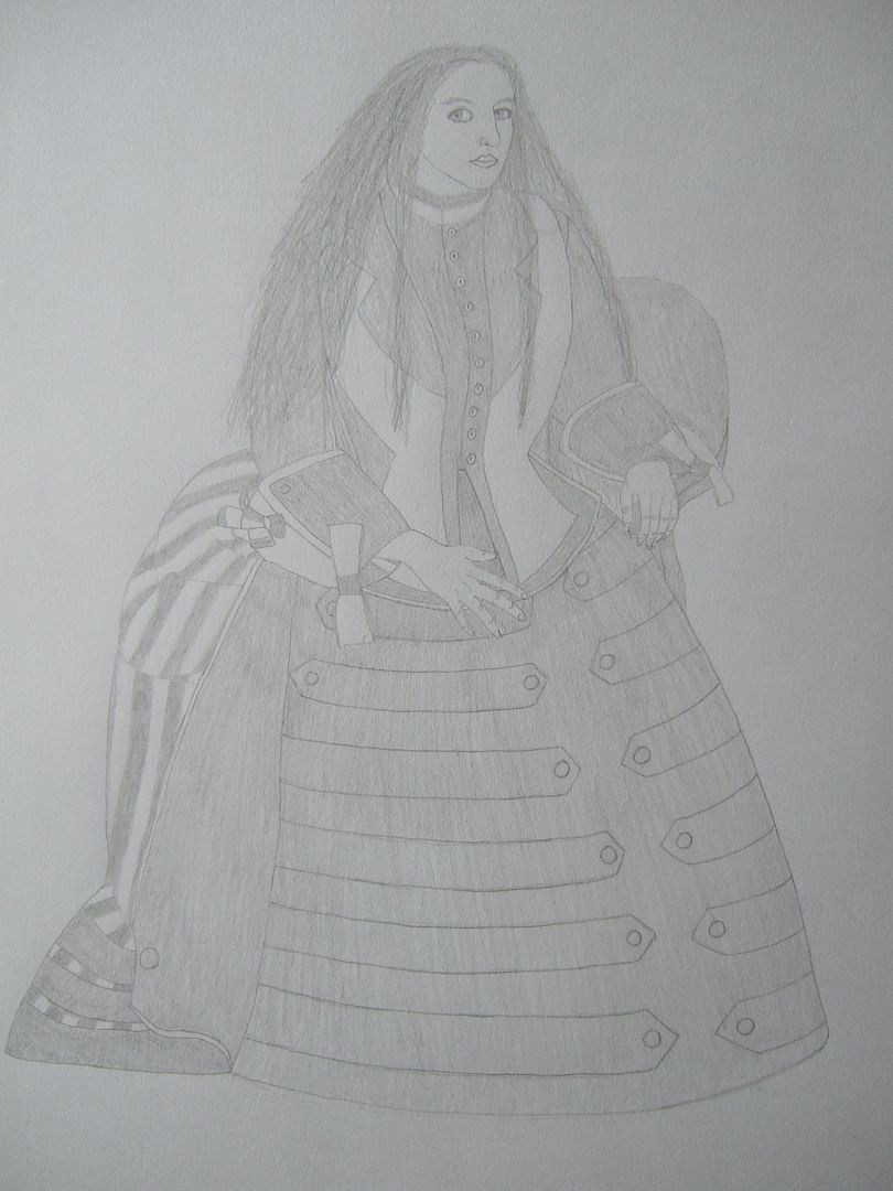
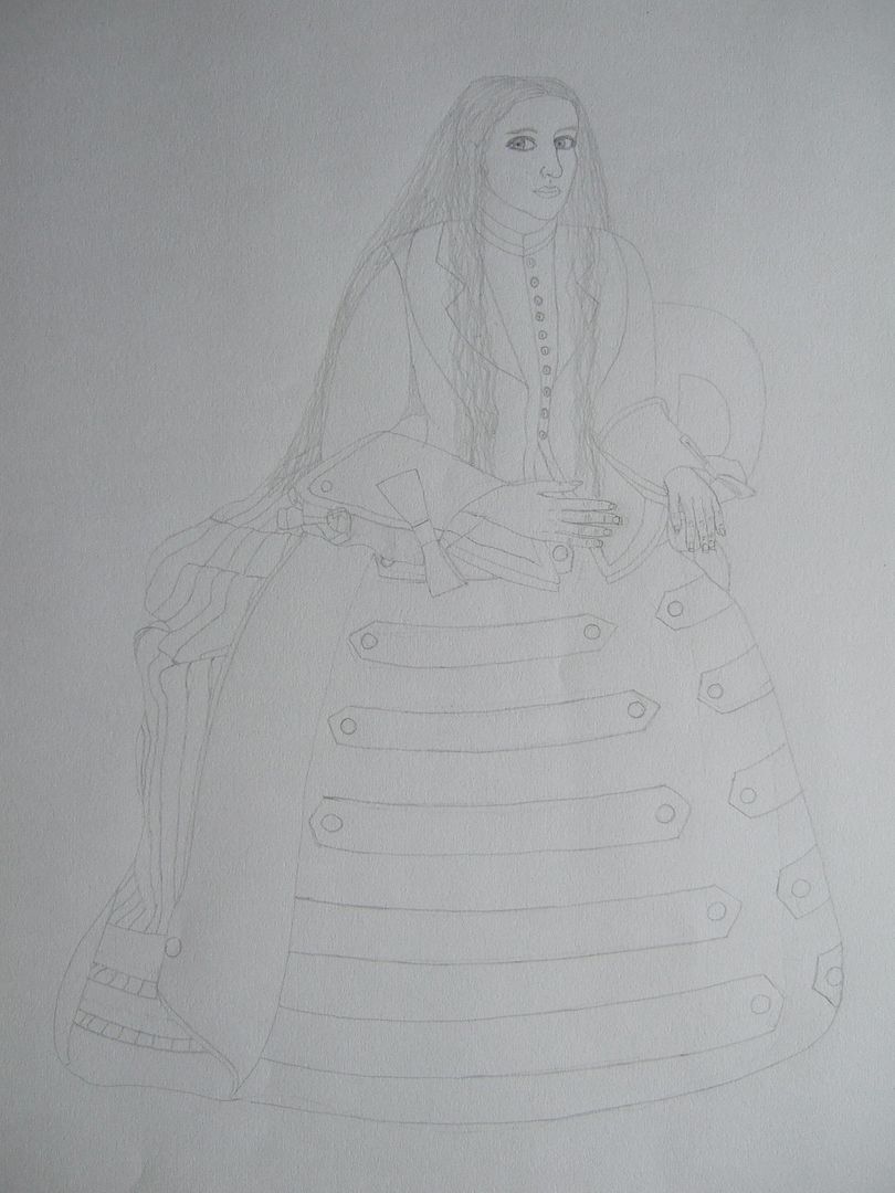
I've done quite a few drawings around the house and of myself for this - taking note especially the drawings of me in my Victorian dress. That series of drawings, although it took a long time, wasn't too hard technically - I began with the outline of the skirt and built up, (adding the hair over it when the rest of the drawing was done) - I think that's probably approaching it in sections. My sketches of people round the house are much shorter and I think I approach them more directly. I think I'm really quite good at creating volume in the material - the stripes and patterns on different material always helps, of course. Taking my Victorian drawing for an example, while the folds of the skirt are very full, the bodice of the dress is fitted, as in the style of the time. The rest of the time I wear fairly fitted clothes and it's easy to show the forms, but my sketches of my brother (who often wears baggy clothes) are slightly more difficult. However, on this part of the subject I'm doing quite well, if I do say so myself.
The moving figure
Argh! 'Fleeting moments' are all well and good - that's why I've been drawing everyone around the house without telling them! We're not the most action-packed of households, and we have no pets, but I can draw people cooking, reading, playing games, fine. I even went out to cafés and sketched people sitting around for the street scene exercise, fine. But moving figures from memory is one of the hardest things yet. I found it incredibly difficult... There's a few different movement exercises we do at life drawing, but nothing like this! I found it very difficult to remember any detail and ended up with the outline of clothes, mostly. I'm quite disappointed in myself.
Self portrait
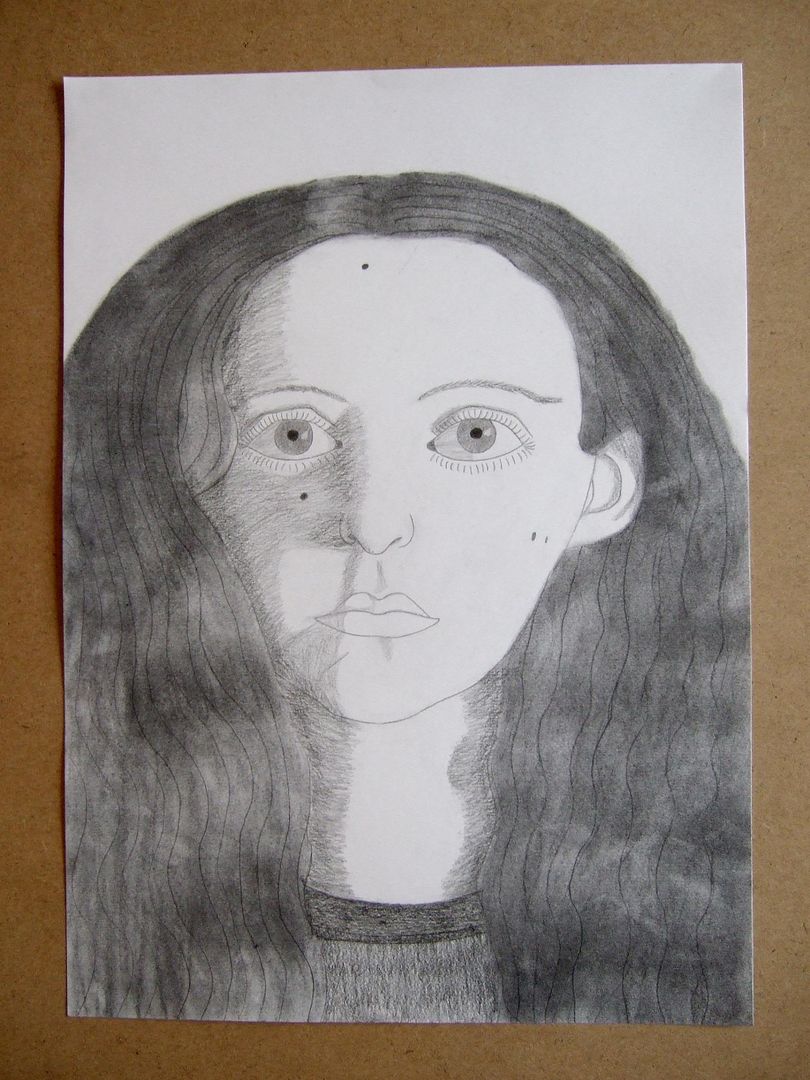
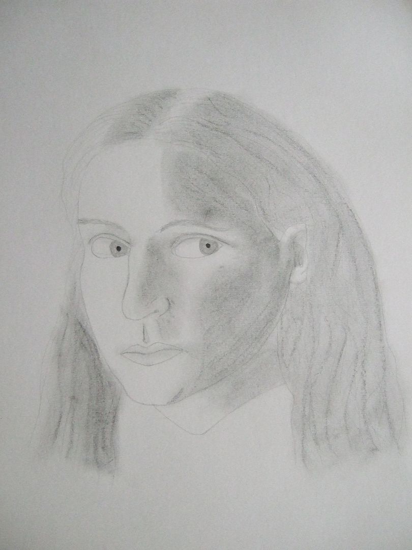
I've quite enjoyed this exercise as it gives me time to do all the detail I can't fit in with other people sitting for me. I've done lots of different ones with different hats, etc. I think that I did well capturing the detail as well as the basic shapes - one good idea was drawing each feature of the face separately before I really got into drawing a detailed picture - very interesting. In my opinion, they look convincing. I quite often lit my face from one side to get more interesting shadows - that sometimes makes them look asymmetrical. I wouldn't say that I have asymmetrical angles, but I have a few moles - two on the right side of my face (from my viewpoint), one at the top of my forehead, one under my left eye, and a little scar on my chin - do they count? I suppose they must do, as I almost always include them. I didn't find I had any particular difficulty with shadows - of course, not all patterns of shading are flattering - when you're lit from above and get a shadow under your nose and eyebrows - if you're not careful you end up a moustachioed (this is a real word!) panda! I don't think I adjusted the overall size very much - I think mostly I drew a little larger than sight-sized. When you're just drawing your face, and I don't know if this is 'cheating', if your face is a little too small for a good composition, you can always put on a hat or draw in shoulders, extending up or down... One of the tricks of the trade, perhaps?
Portrait from memory
This exercise was a little odd. I thought it'd be best to just do myself again, as I would have plenty of time for sketches and detail before I tried it, and besides, I probably know myself best - or at the very least, a caricature of myself. Now, the questions at the end of this section are mostly about converting sketches - I was unhappy with my sketches for this, but thought I'd better go for it (I might flatter myself unententionally and draw something nice) and the finished drawing was much nicer than any of the sketches! I think I might have warped the idea in my head for each of the sketches - So I think if anything, were I to use myself again, I'd probably spend less time on the beginning! Then again, maybe it's just luck!
Now, there isn't a round up of questions for the end of this section, and I wrote some notes on my assignment drawings, so before I post the letter that my tutor sent to me, I'd just like to round things off by saying that I've come from never having drawn a person before to something pretty great here - again, I'm proud of the work I've come out with.
An additional note - somewhere between my house and my tutor's (in the post) three of the end drawings for this section were lost. Part 1, my brother on the dining chair, and parts 5 and 6, the close-ups of the pattern on the sofa. It's certainly a shame, but you can still see the photos here, and they weren't the finished drawings.
So, Page 1:
Page 2:
Page 3:
Monday, 27 December 2010
Assignment 2 Feedback sections
Wednesday, 15 December 2010
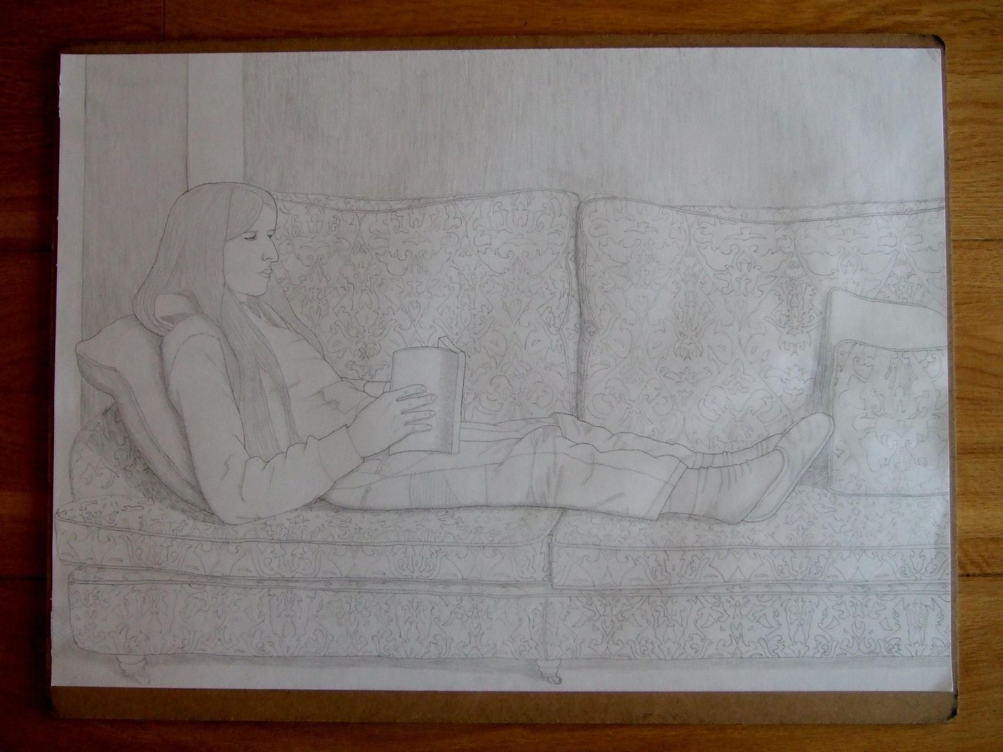
Assignment 2 - part 7 - Finished sofa drawing
Here's the finished drawing. My drawings of people are much better 'zoomed in' as it were, so I thought I needed to focus more on him. The pattern on the sofa took me far too long, and is mostly what delayed the assignment. I just hope my subject stands out enough! I'm proud of persevering with my idea, and I think you can see all the work that went into the picture.
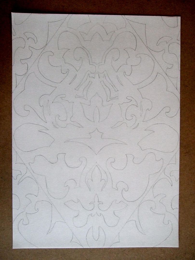
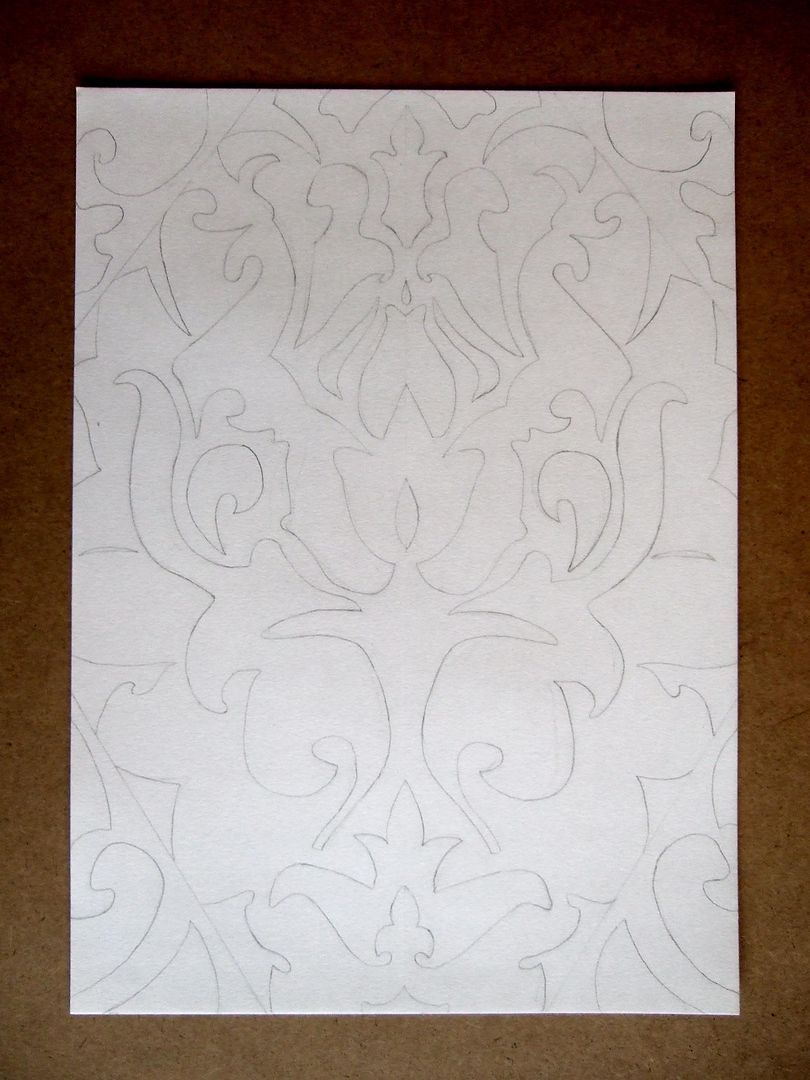
Assignment 2 - part 5 - Sofa pattern sketch 1
Here's a sketch of half the repeat of the pattern on the sofa.
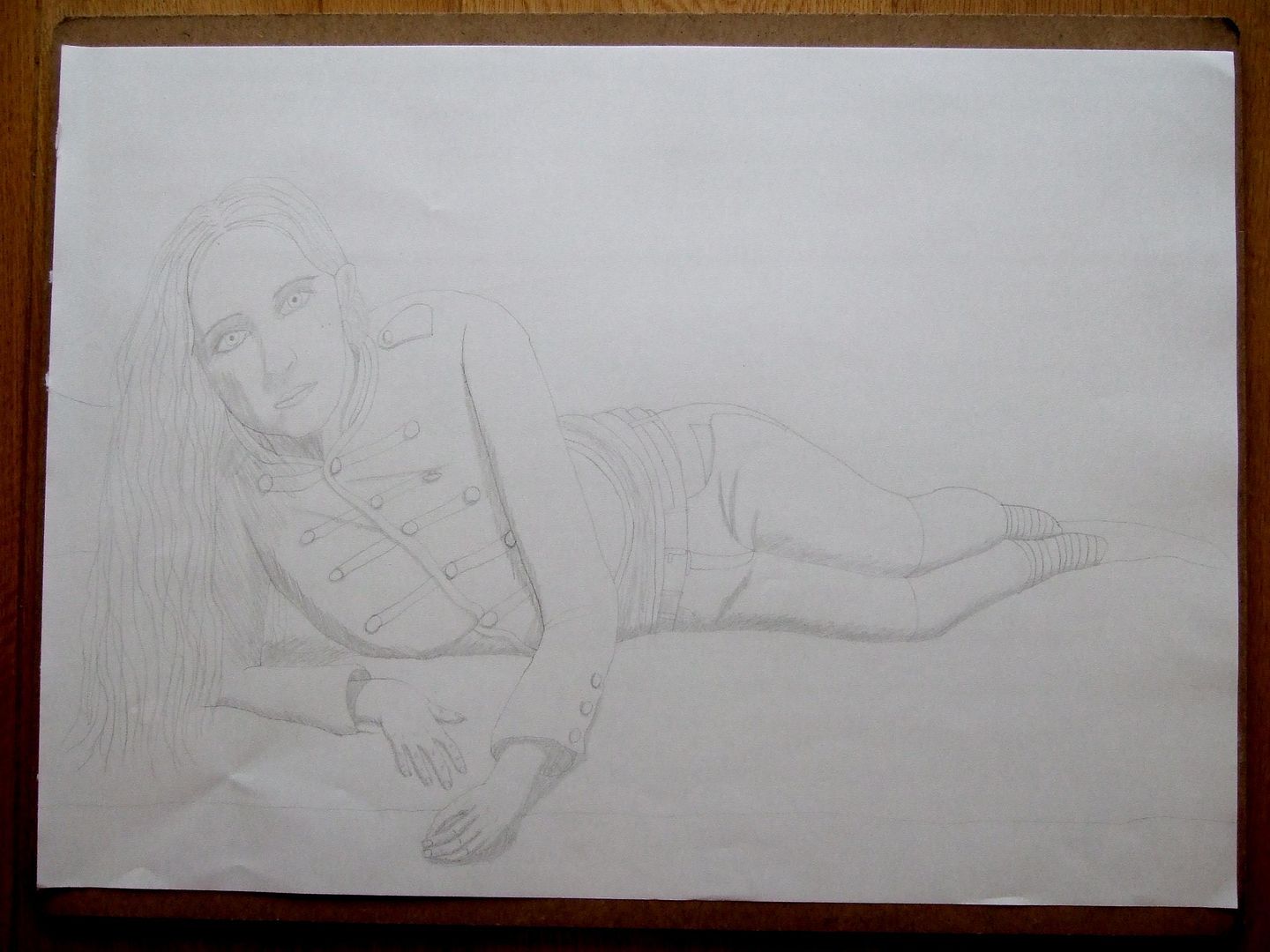
Assignment 2 - part 4 - 'Sofa' drawing sketch
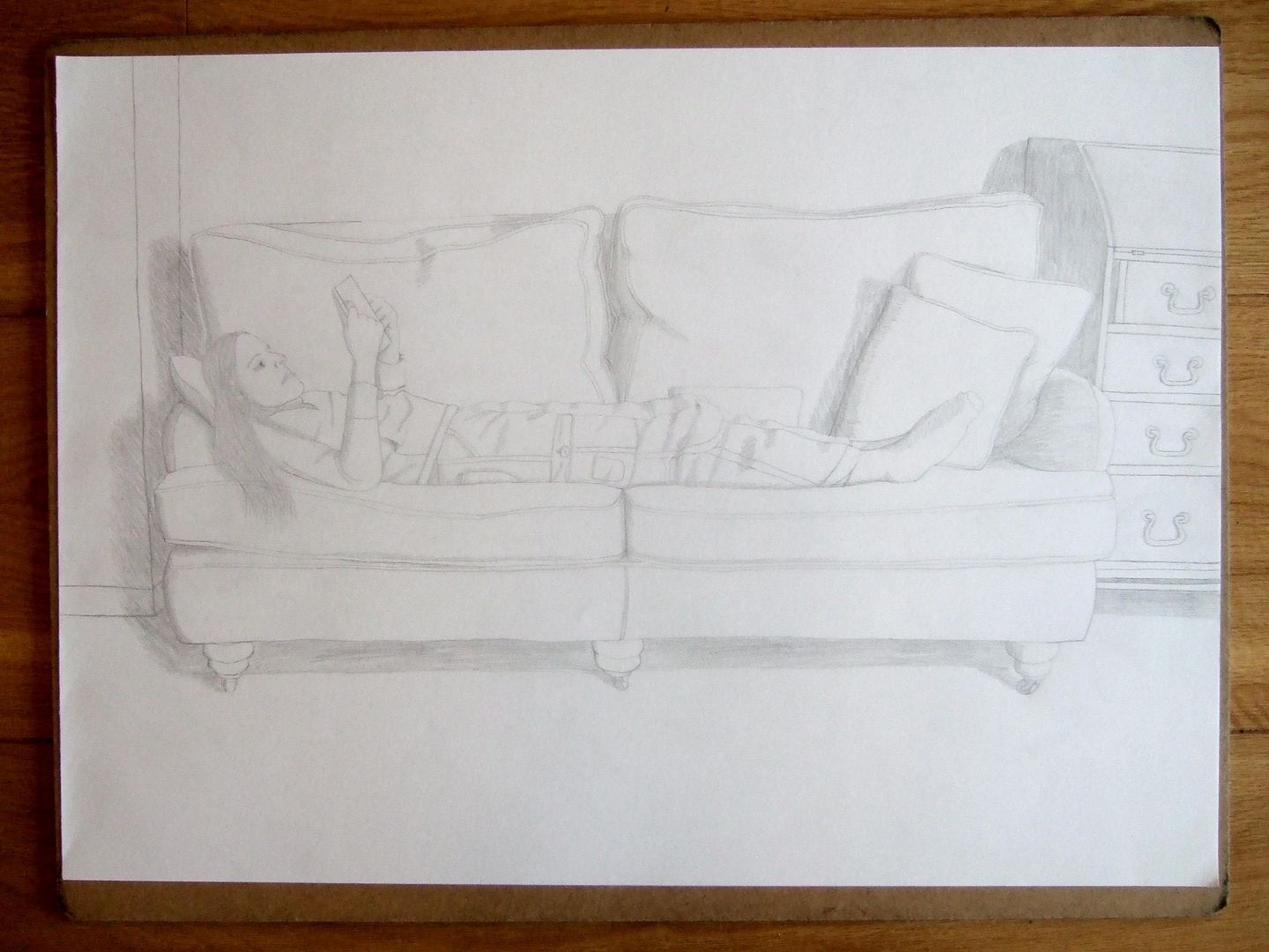
The second drawing is someone reclining on a sofa. Here was a quick drawing I did, leaving out the pattern on the sofa until I was happier with the composition. It's ok, but the figure - again, my little brother - wasn't great.
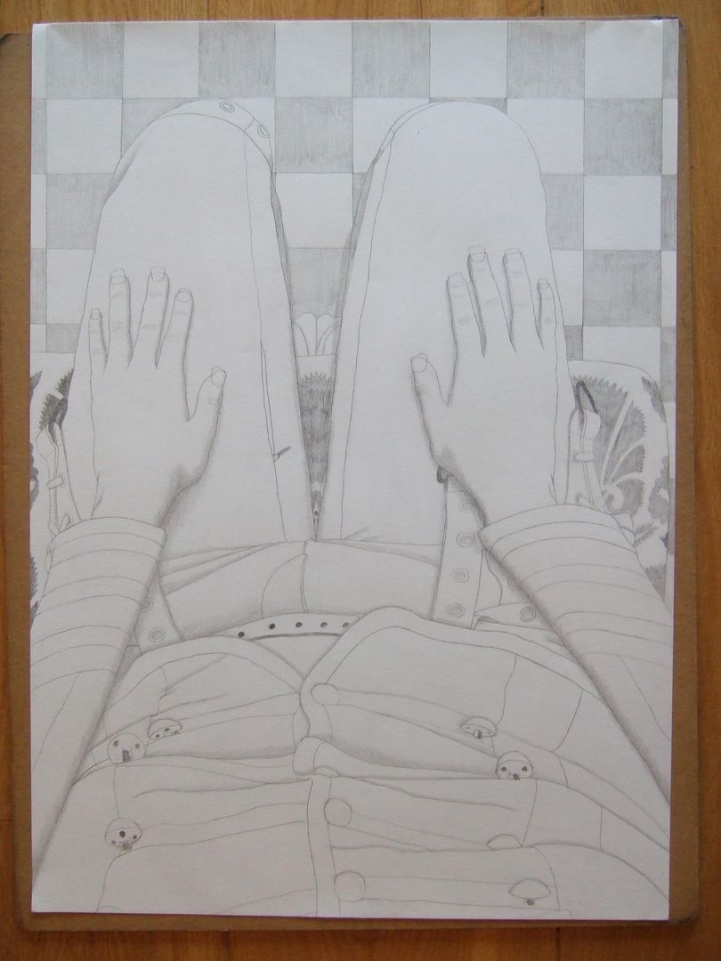
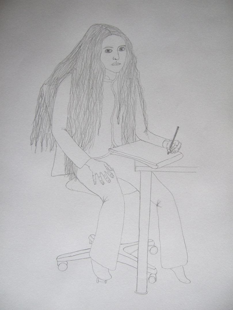
Assignment 2 - part 3 - Finished chair drawing
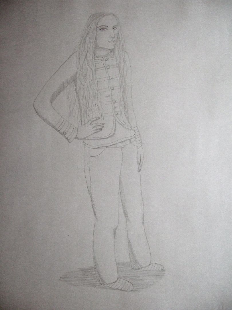
Here's me being a bit of a rebel - I was told to do a drawing of someone on an office or dining chair, and here's my view of it. I'm not sure how well this will go down, but I thought the perspective on the jacket and the buttons was interesting, and I'm putting equal effort into the background, creating interest and using the paper to its full potential. The pattern on the seat of the chair and the tiles on the floor came out quite well, and the way I was sitting I could only just see my toes, so you can see them peeping out there as well. It doesn't look quite as nice as a photo as on paper, I will add.
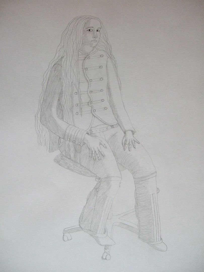
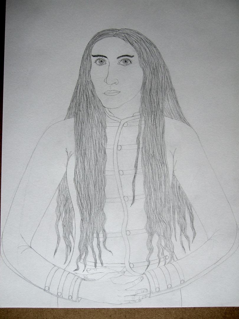
Assignment 2 - part 2 - More detailed chair drawing
Here's another chair drawing. It took longer than the first for this assignment, and was an exercise in trying to use the shading to get a rounded look to the limbs, and it's ok. My hair does really look like that. I think the arms are less of a success than the legs - they look a little flat. I was also trying to do a slightly more interesting pose, and using yourself means you know how you were sitting if you shift round without thinking!
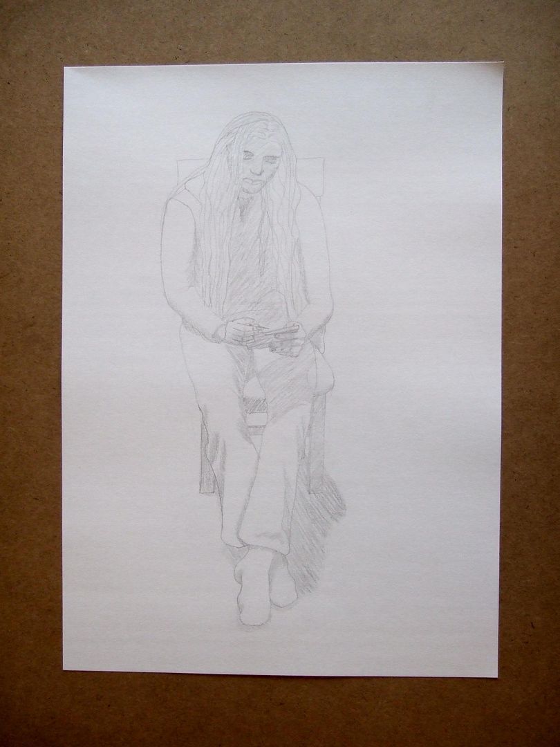
Assignment 2 - part 1 - Preparatory sketch
So, here's my second assignment. The first drawing is someone seated on an office or dining chair, and here's a quick sketch of my little brother (playing on his Nintendo DS). Wondering what angle to have him sitting at, I decided to draw him right from the front to start with, but with his hair falling over his face, he was mostly in shadow. I should explain at this point that I've had such a long gap between this and my last blog post because I've been working on these assignment drawings (which are a bit complex, as you'll see later), I've been a bit ill, and have been working on another course at the same time. You'll notice I haven't got as many pictures up as I did before my first assignment, but I've been keeping a sketchbook around the house and two others for my life drawing classes - so it doesn't look like much online, but I have three books too!
Wednesday, 10 November 2010
Lying Pose
Standing Pose
Friday, 5 November 2010
Pencil Face with Charcoal Hair
Shaded Ink Face
Sad Shaded Face
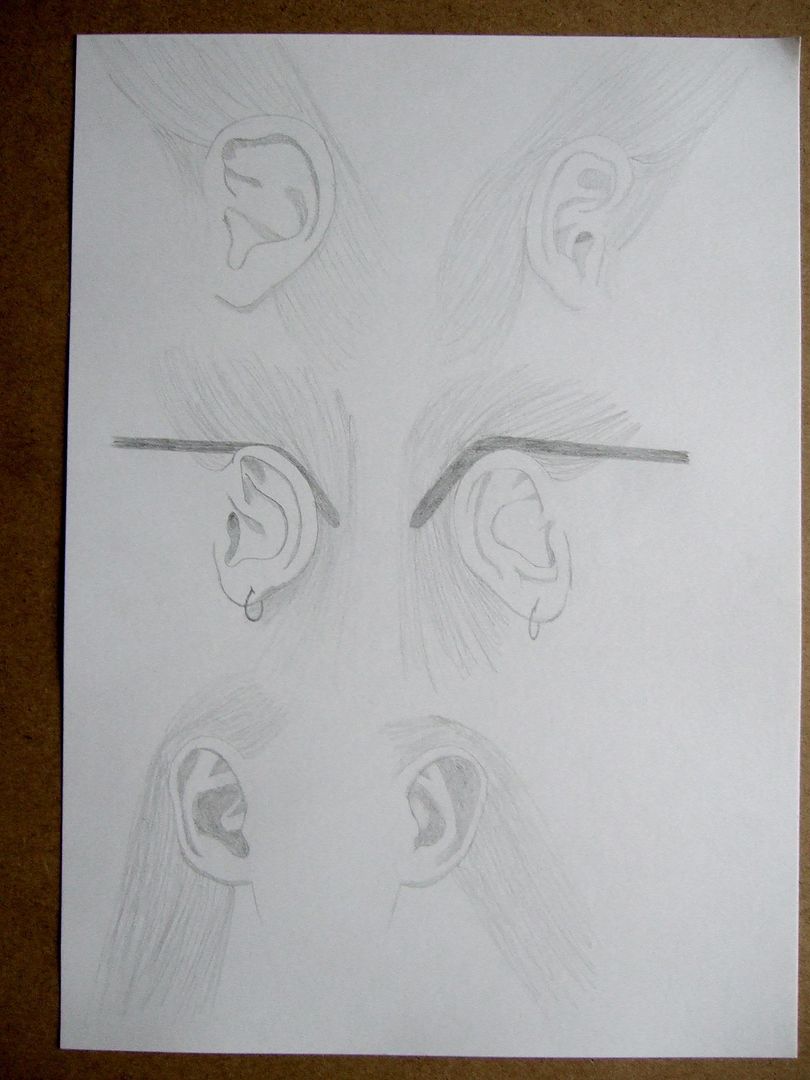
Three pairs of ears
A collection from around the house at different angles. Bit of an awkward experience, drawing other peoples' ears. A pretty good result though.
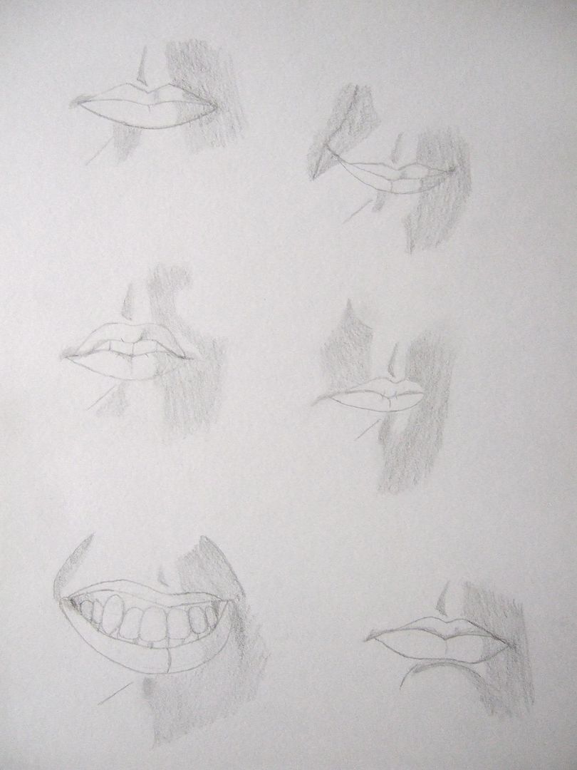
Six Pencil Mouths
Eight Pencil Eyes

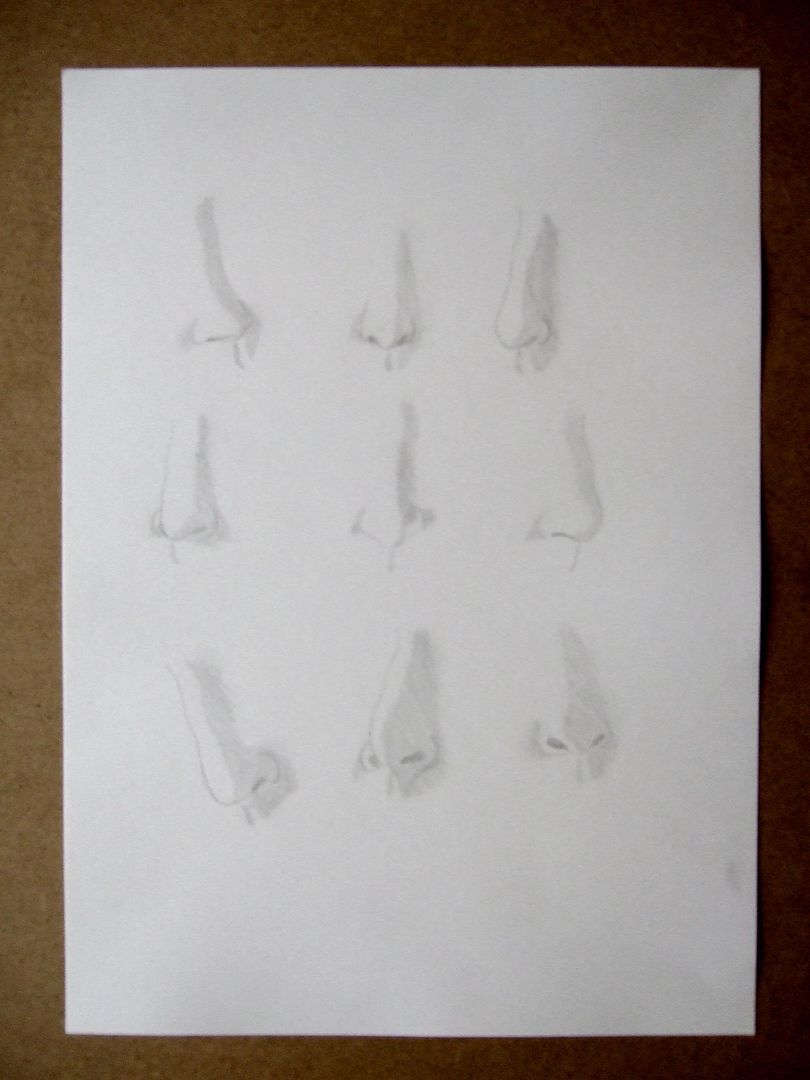
Nine Pencil Noses
Just a little exercise in getting shadows and angles right. Excuse the photo quality: they're all quite close together, and my camera has never liked close-ups - I might have said before, but a gap between the picture and the camera of less than about two feet makes it blur horribly!
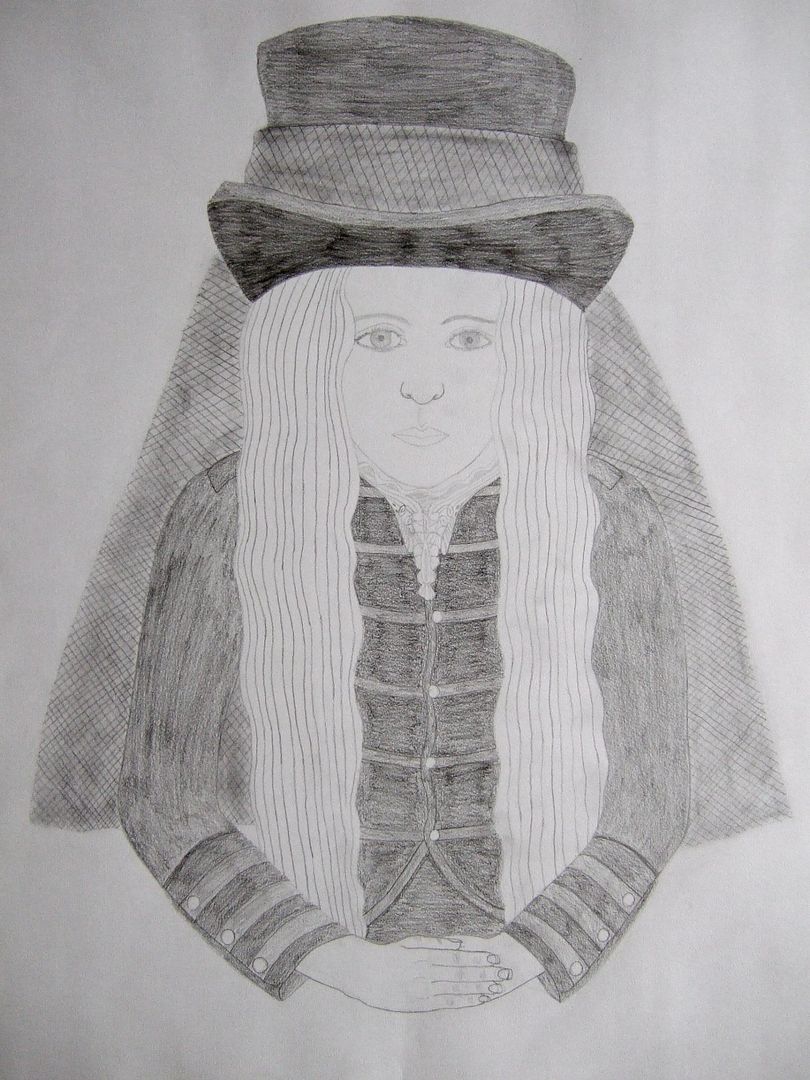
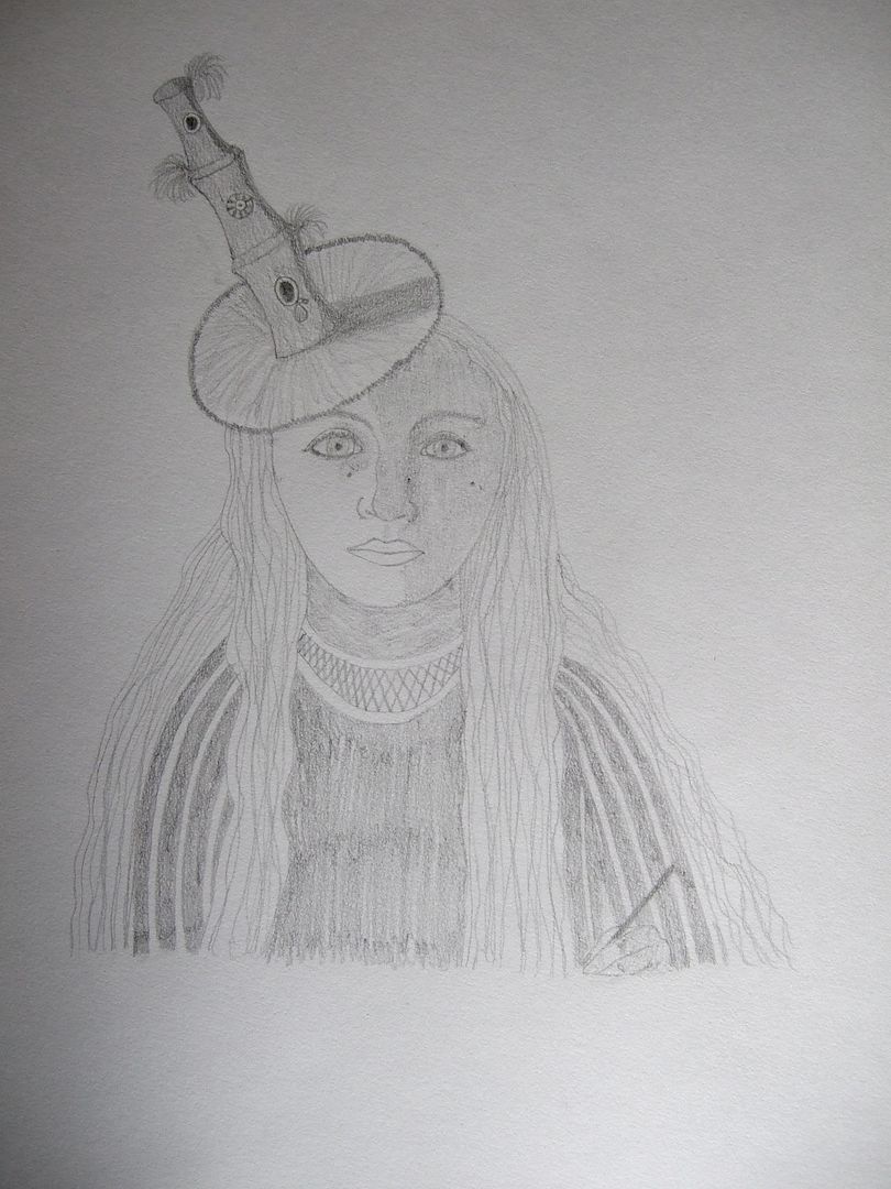
Top hat, small hands.
While not too bad if the components are taken separately, this drawing looks a bit unbelievable if you haven't seen the hat... It really does dwarf your head like that, honest! This drawing looked horribly out of proportion, especially the hands, so I thought I'd practice features on their own and see if getting the detail better would help with the overall effect and make it a bit easier to see where it was wrong before I finished it off, hence the next few exercises.
Wednesday, 13 October 2010
Quick charcoal face
A quick charcoal-shaded drawing in front of the mirror. Since I'm attending life drawing classes at the moment (the drawings from that are in another book), I'm trying to get in a little practice with charcoal.
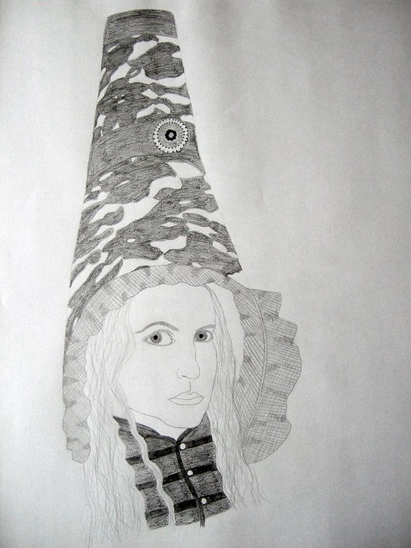
Pencil drawing in bonnet
I've done a few drawings of myself in different hats in my book, and this my medium-sized bonnet. I should have some pictures up of it on the sewing blog. The main lace pattern is quite nice, and the face isn't too bad, but the netting around the edge was a nightmare!
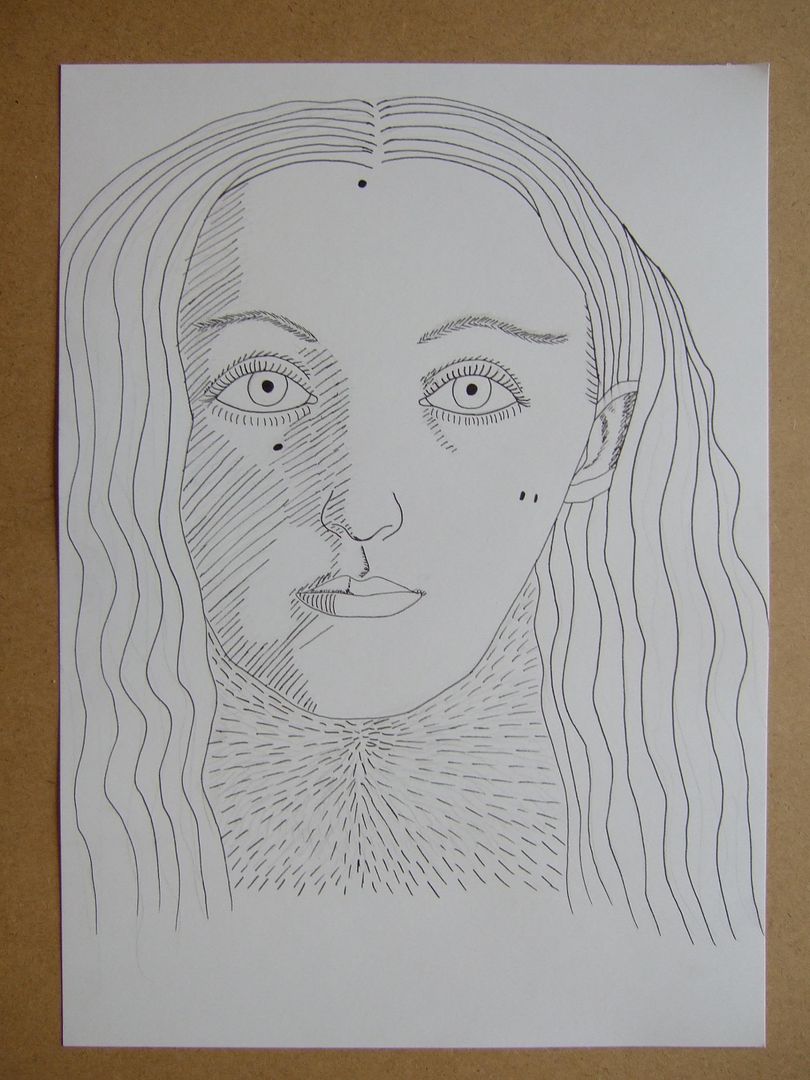
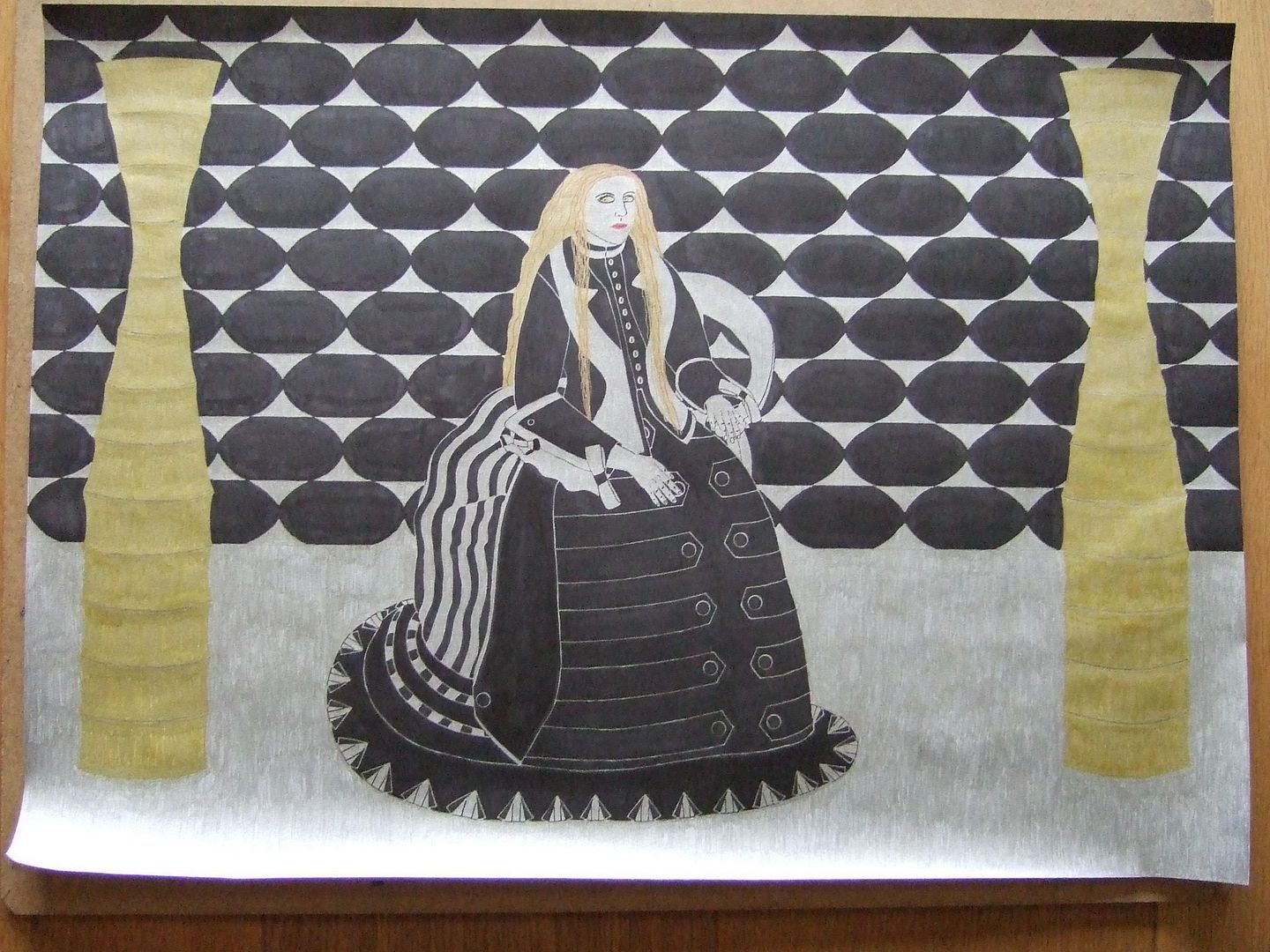
Ink portrait in Victorian gown
To follow up the previous two drawings (and I'm sorry there's been a bit of a gap, I've been doing most of my work in a book), I did another large drawing of the same subject to colour. This time I simplified the background a little so the detail on the dress was more important to the overall picture. I'd marked out all the wallpaper when I thought it could do with something extra, hence the perhaps-not-quite-appropriate lamps (IKEA). It's fun all the same, and nice to look at, except for the face, which was a little small to get the detail properly on in the end.
Monday, 13 September 2010
Shaded Victorian dress
I don't think this one is as good as the linear one, myself. The hands are a bit better, and my hair was really wild that day, but in my efforts to get the jacket the right size, I've exaggerated it. There's also something wrong with the face I can't quite get. I might try this again sometime.
In a Victorian dress
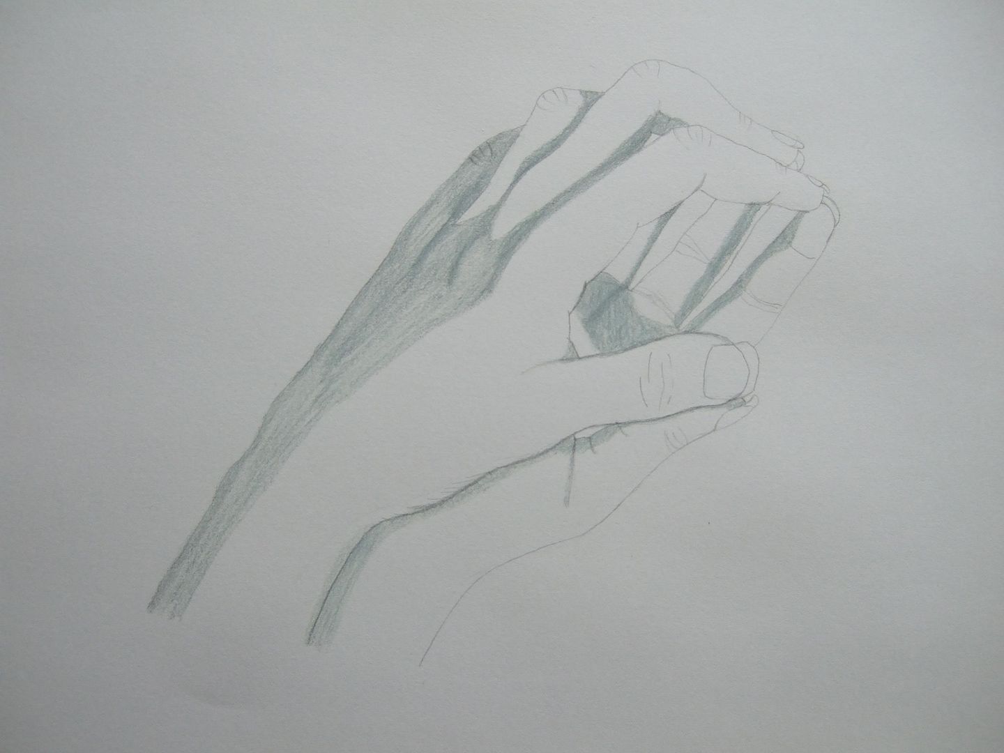
In my spare time, I make Victorian dresses and outlandish hats - I'm putting together a little gallery of them on another blog - hopefully I'll have the more recent additions up and can link to it soon. Now, this drawing is a linear version, and although mostly it's ok - the sleeves are very wide in real life, but the body of the jacket itself is probably a little larger - the hands are this picture's major flaw. I tried it again and coloured it (-ish, it is a black and white dress anyway), spending more time on the hands.
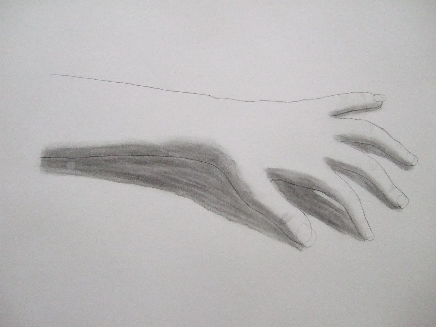
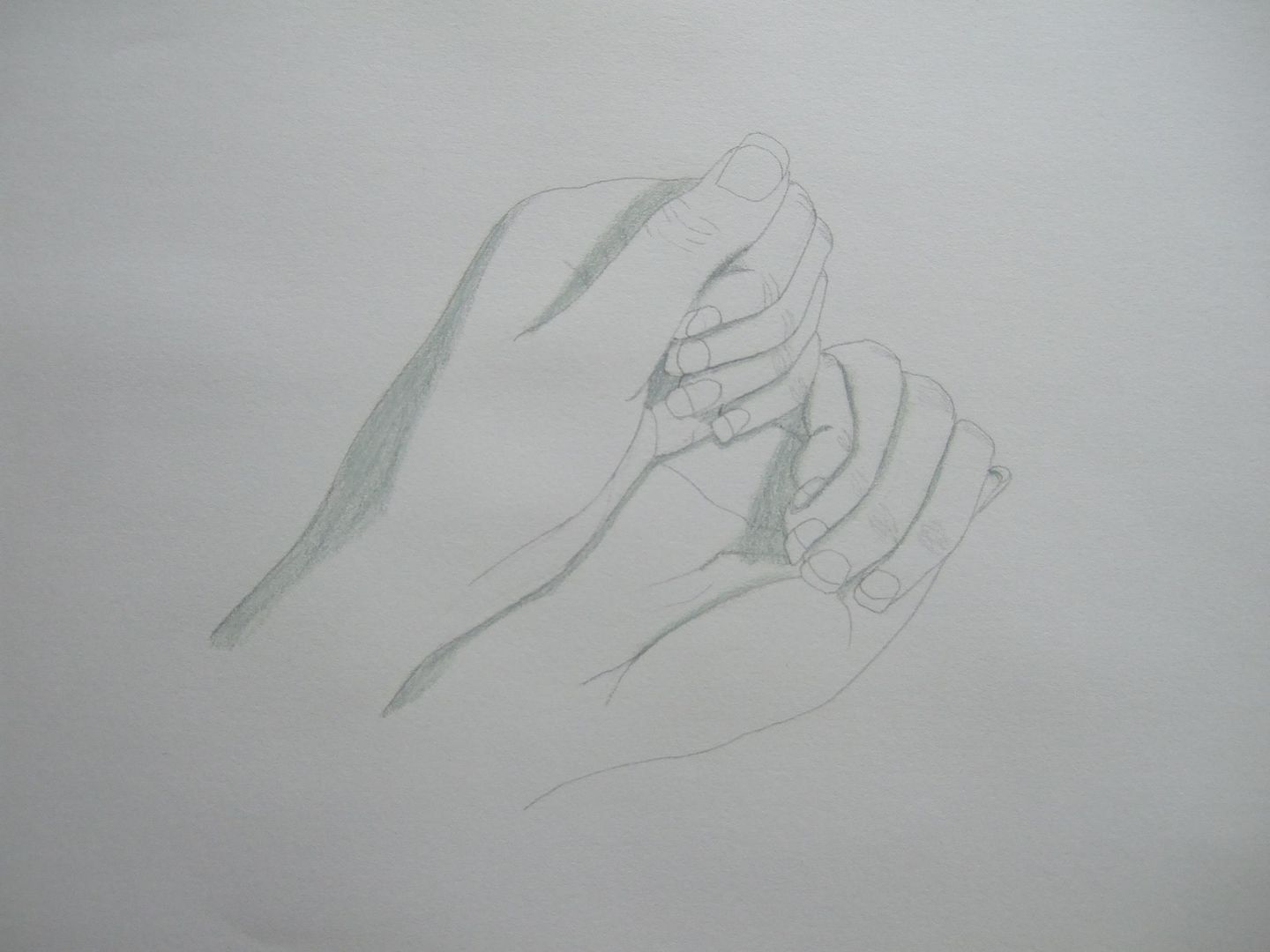
Hands in a mirror three
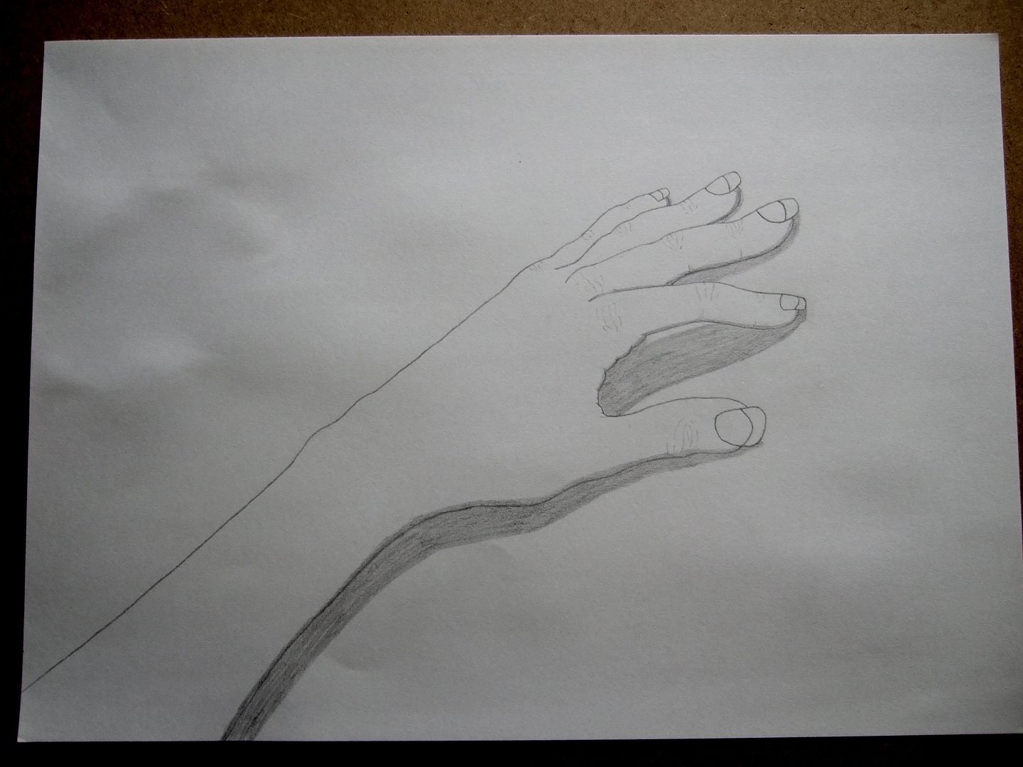
This one, being in the most simple pose, would probably work the best if I could get the shadows to look right. I don't think there was anything wrong with it when I did it, but they should look further apart at the wrist and round the base of the thumb - that would probably make it more believable.
Hands in a mirror two
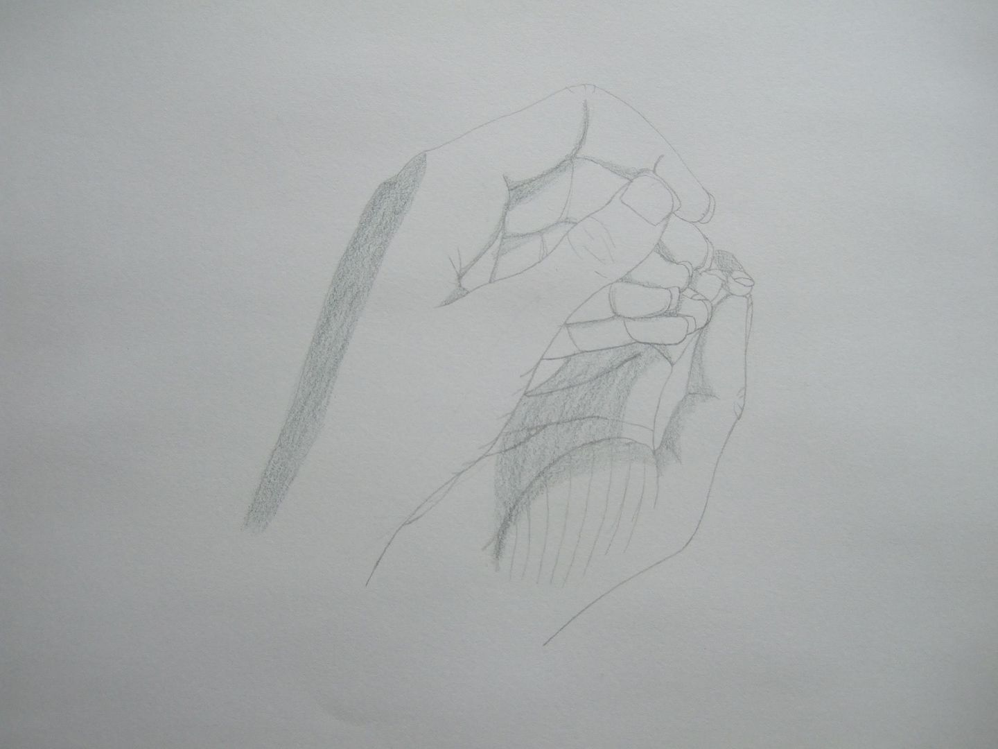
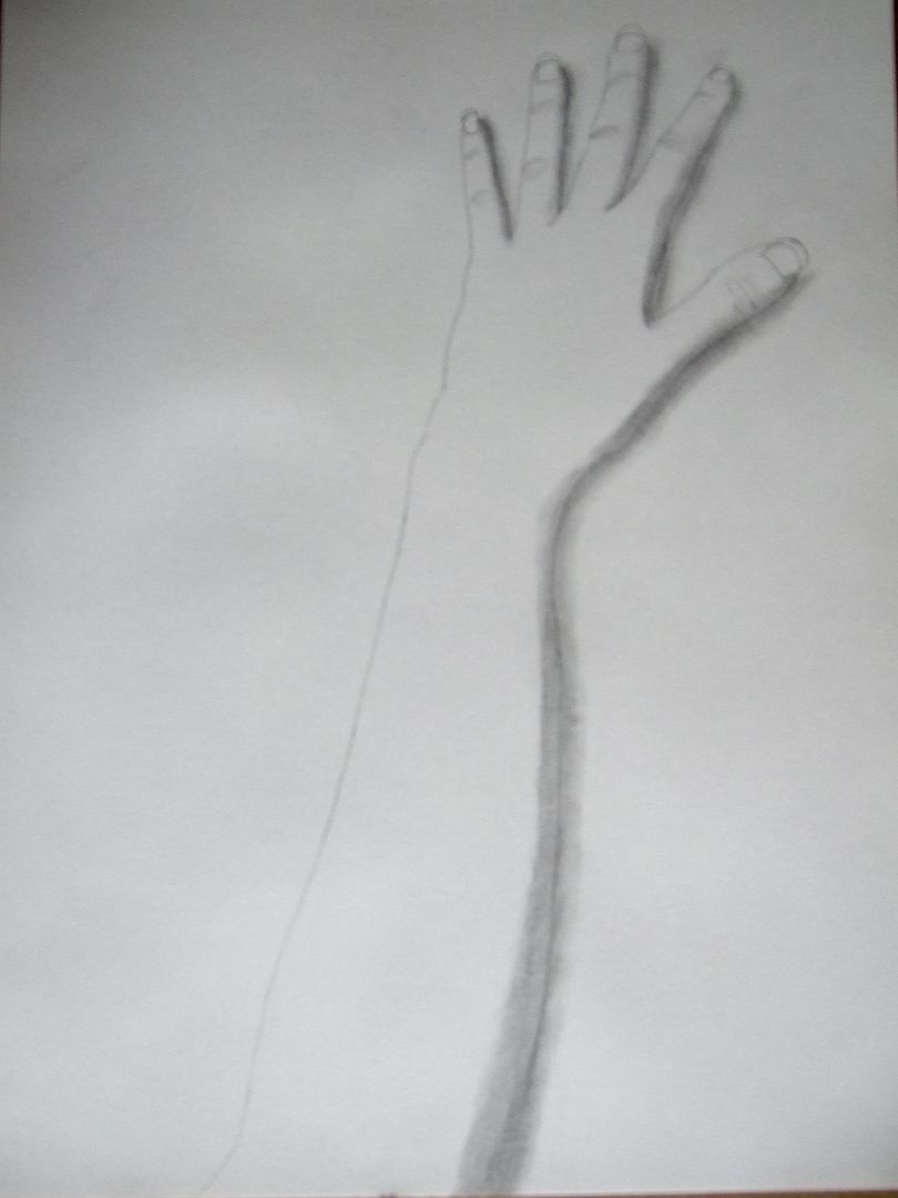
This one is probably the most confusing. I tried adding some extra lines here, but it didn't quite work.
Hands in a mirror one
For these three pictures, I got out a smaller mirror, put it down on the table and rested my hand on it in different poses. I used the same shading technique as usual, like the last 'feet in a mirror' drawing. They're not bad, but looking back, I wonder if I should have given them more context by adding an outline of the mirror. Maybe next time.
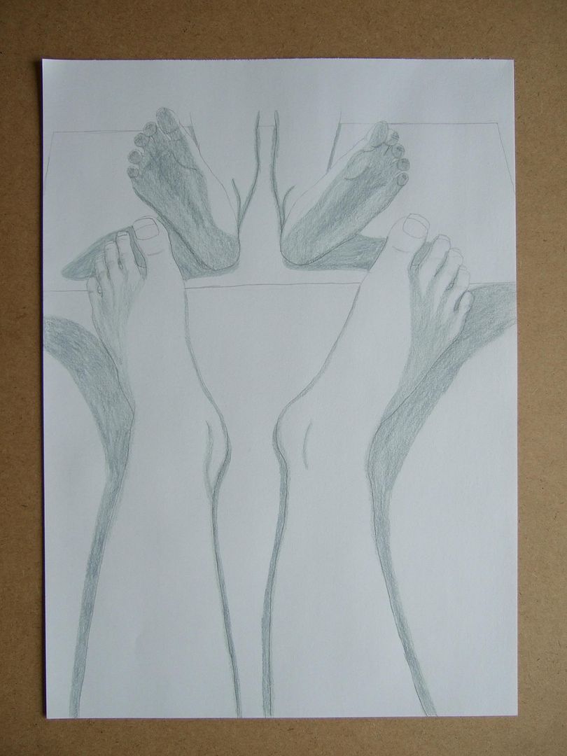
More feet in a mirror
This one's closer and a lot busier than my other 'feet in a mirror' drawing. I used grey pencils and blended them with white to try and make the shadows more even. Of course, they're not exactly symmetrical, because the one on the left was tilted up slightly more, but that's deliberate - they'd look rather artificial if I tried to make them match exactly.
Monday, 6 September 2010
Face in a mirror
I like this mirror - I think I got it from a fairtrade gift shop - it's handmade from roughly equal bits of mirror, so it's not that uniform when you really see it. All the better for me in the drawing stakes though!
Sketch with a hat
Oh, and this hat really exists too! I made it the weekend before last and hair-gripped it on at the front for a more fun drawing. I should put up a picture of it for comparison later.
Sketch sitting (not good!)
Another thing I fear is that when people see my drawings, they'll think they worse than they are, because they don't think my hair is that big. That day I'd been in a bit of a hurry and brushed my hair up into a mass of frizz - it was quite fun to draw though.
Sketch with jacket detail
I have a tendency to give one of the features of my face a really laboured look every time I draw it. This time it was the turn of my unfortunate eyebrows - I used a different, finer pencil, without realising it was also much darker!
If you ignore them, though, it's ok. the pose looks a little odd, but I had to keep moving my right hand back from the pad to try and keep my fingers in the right place in my mind!
Charcoal and rubber experiment
This one is a little better - I coloured it in the same way before going over the highlighted areas with my putty rubber. I'll keep going, trying to make the shading more gradual.
Charcoal Experiment
This one was just an experiment, and I think the main lesson learnt from it was that my charcoal does not blend like I expected it to. It's more stripey than smooth.
A couple of quick notes on an experiment - 1/2
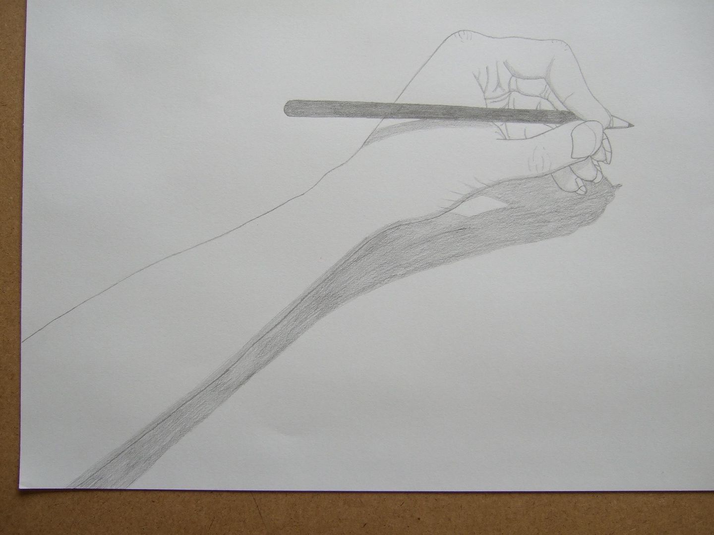
No, I didn't draw this one. In an effort to give the hands more texture, I turned to this picture from one of my anatomy books. I gave it a go, which didn't quite work out. I think these ones have more defined outlines, so I'll keep working on it...
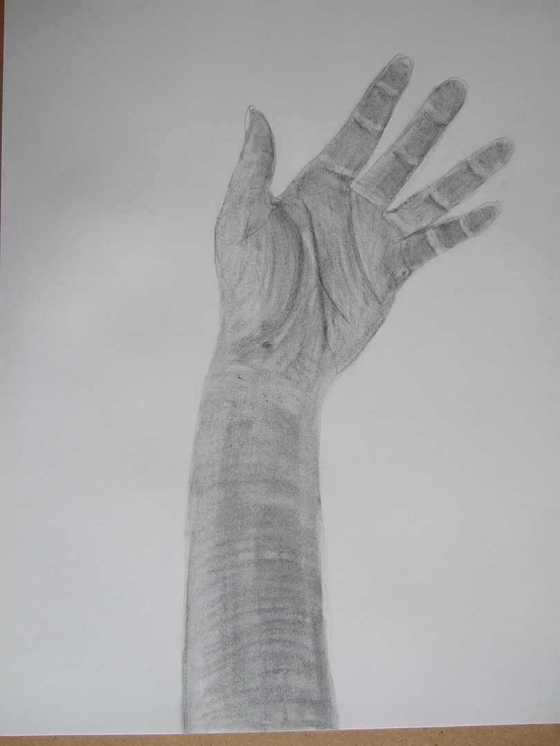
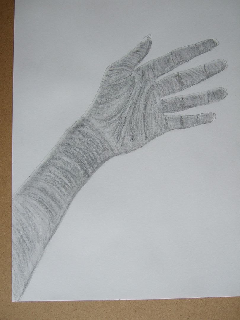
Hand with a pencil
This one is the best of the three hands. Although in texture, they're all looking a bit featureless, the shadows are nicer in this one.
Another hand
This one is a bit better, but the shadows on the hand and arm themselves aren't deep enough. The position of the lamp needed changing to do this properly.
Slightly blurry hand...
For some reason - it might be too light - This picture doesn't come out too well in photos. Just as well though, because this is not my best hand drawing.
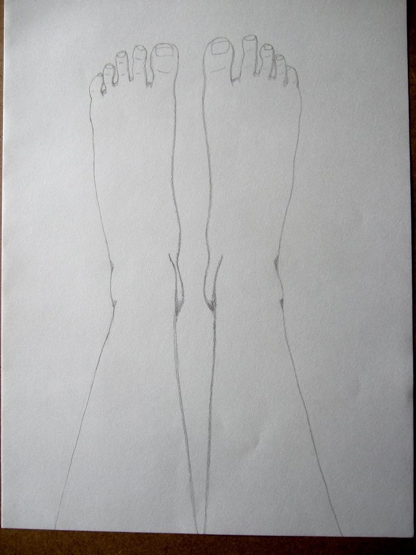
Feet in a mirror
Trying to make them more interesting, I got a circular mirror, stood it up and put my feet on a box in front of it. Originally, I was going to have my feet straight up so that I could draw the soles reflected too, but I thought I'd have a go at this first and see how long it took before I tried that - like drawing my toes outstretched before, I think it might be more tricky.
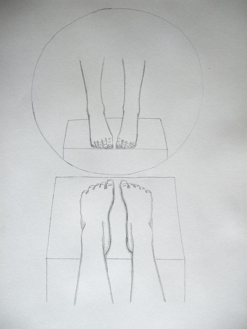
Slightly differently posed feet
This one is a lot more relaxed, and works better. Neither of them are great though... They just don't have the right 3-D effect they should have.
Linear drawings - first post - trying to get shadows right...
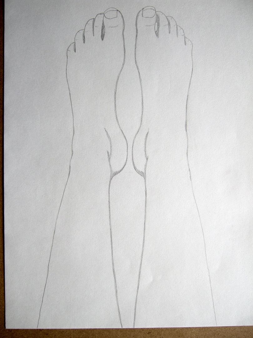
Doing some drawings of people towards my next assignment now. I sat on my bed and tried to draw my feet a couple of times. This one doesn't work as well as it should've done, because I thought I'd spread out my toes to draw them better, but had to keep taking a break - hurts the bottom of your feet after a while!
Wednesday, 25 August 2010
Assignment 1 Feedback sections
As you read blogs in descending order, it can be a bit confusing to look through everything and find out what it's referring to. So here's my check and log feedback, my tutor feedback, etc, in one handy post. Now, I'm a little unsure which way round to do this - latest stuff first and work back format to mimic the blog (oldest stuff last) or oldest first because it might make more sense... Well, bear with me! I think I'd better start with oldest stuff first.
Making Marks
I quite enjoyed the doodling part of this exercise - who wouldn't? Although I felt a little foolish at first, doodling in a special book, I soon got into it and used lots of different materials. The mark making techniques were also quite interesting, with plenty of different things to practice. I quite enjoyed the pastels, and once I got into it, was quite bold with charcoal. I fail to see how you can make nice accurate drawings with them and not pencil, but maybe that's not the point... I also think that ink is quite scary because you can't erase it... and that really doesn't make me feel bolder. But to answer the questions - I tried my best to make a variety of marks, and I learnt that doodling is a good warm up rather than something to do when you're feeling idle! I thought that charcoal wasn't as versatile as I expected - whatever way you shade, you'll always get a shadow of the technique, rather than strokes like using a pen. Charcoal will always smudge and blend a little more than you intended it to. I didn't think that any particular tool expressed an emotion, but I understand the question - for instance, you could argue that ink is more aggressive than charcoal because it's bolder, more defined, and charcoal is (mostly) lighter and fades out at the edges. What would be better with the introduction of colour? Well, I used quite a bit of colour - I saw the colour examples in the folder, and assumed that was ok - I hope it is. I can't really say what would be, because I think I went a bit overboard with colours - I suppose that depending on what you're doing (what emotion you want to convey, etc) using red pen for really jagged shading might've been good!
What did I find most interesting and rewarding... I think it was good to set up with the doodles, even if at times I did feel a little foolish and wondered if anyone was going to read into what I drew, I think it helped me relax a little bit. I hope that's not a really lame answer!
Tone and form
I thought it was interesting after all the line drawing to do such plainly tonal drawings, and I thought I'd try and be bold, so I did a fairly dark pencil drawing first, then straight in with the pastel. After that I did a nice big charcoal drawing. I still think these things are less accurate than pure pencil, and when I lose a bit of detail, it is kind of upsetting. However, onto the questions: I think I've given my objects a sense of tone, although the drawing the four balls exercise I didn't really get. I tried some different hatching and everything... I might have done them too small. I did have a go at observing the light pattern before I started drawing, but I thought 'I can't tell whether I can do all these different things until I start...' although it's good to have an idea of what you want to have done when you've finished, personally I thought that thinking too much about it before I started put me off a little bit. I don't think I did too well at the reflected light stage of the shadows, but I think that the objects I draw are as 3D as I can make them, and that's a good start.
Reflected light
As usual, I started off with a pencil drawing, then went on to a big charcoal one. (Edit. I have drawn a few shiny things that are on the blog, but I don't know if I've ever got the hang of it.) Maybe I should do this more sometime. I think I manged to capture the main shadows ok, yes.
I think that my reflective objects showed reflected light and shade better in the second sketchbook drawing with the charcoal than the first one I tried. I was more successful at the reflected shadows, I feel. In the first drawing, I had to try and show that the saucepan was curving away from the reflected mugs, which I think I got away with just about by elongating the mugs as I saw them. In the second, the objects were similar shapes but different dimensions. I think I need to look into this more. I did have a bit of a problem sorting out the differences in the shadows and reflections sometimes, but I probably just need more practice.
Still life
I LOVE still life drawings (Edit. As you can tell from my selection on the blog!)
I find man-made objects easier to draw realistically, and I've had a lot of fun coming up with compositions. I think of the still life drawings I'm doing, a few have been successes, but some fainter drawings (when I'm not so confident, I tend to draw lighter, and I used to be even worse) do tend to look flat. When they're just finished, they're great, but if you put them away and have another look, sometimes you can just about see them. I think I'm improving though.
Changing the arrangement of my compositions has been interesting, and I think that the way you approach things does change when you put one thing in front of another or put them in a line - at the moment I'm finding my way around scale still though, so it all depends - sometimes it seems like luck!
Using texture
I think I did ok describing different surfaces in my boxes. I chose some challenging things, so I did weaken and do them all in pencil. But it was interesting none the less. I hope I manage to convey a sense of different textures in all the drawings I do! I suppose that just doing these bits I can't say anything specific - I do so many drawings at the moment, I'm learning new ways to use drawing tools all the time. I could probably do more wide-ranging drawings material-wise, but pencil is still my favourite thing. It also kind of depends on whether you can trick yourself through familiarity or use of colour into recognising the different parts of a drawing and whether you get a sense of what the object must feel like just by knowing what it is... if that makes sense.
My drawings with an emphasis on unusual textures are quite often in colour - I have quite waxy pencils, so hatching doesn't show as well - I often blend with a white pencil as well. Oh! That's a new way to use my tools! I can't really answer the question about implying form with little hatching though, because I always look at a drawing and decide how much that particular subject needs. That's me sounding lame again!
Enlarging an image
I think I did quite well at this - I have quite a big sketchbook, so I did two nice examples of enlarging. I moved the drawing nicely, and it does look like a larger replica. However, I don't think I'll be doing it again, because drawing a grid over something (or even if I was using the acetate grid) I'd end up having to erase lines off of the larger drawing. Not very satisfying.
Assignment feedback
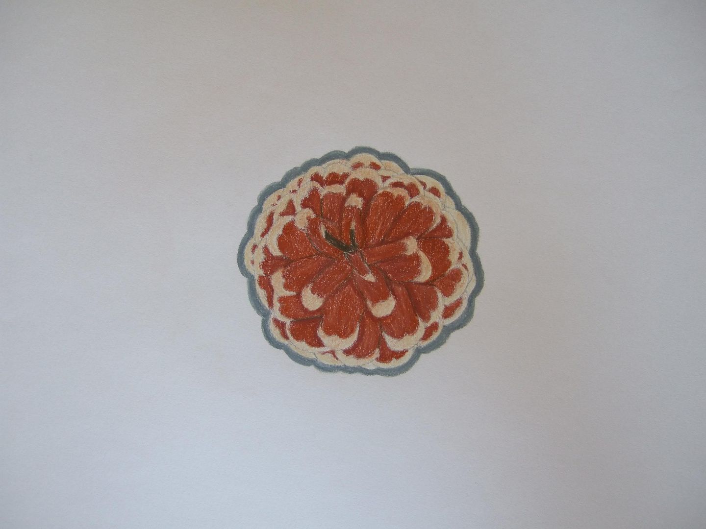
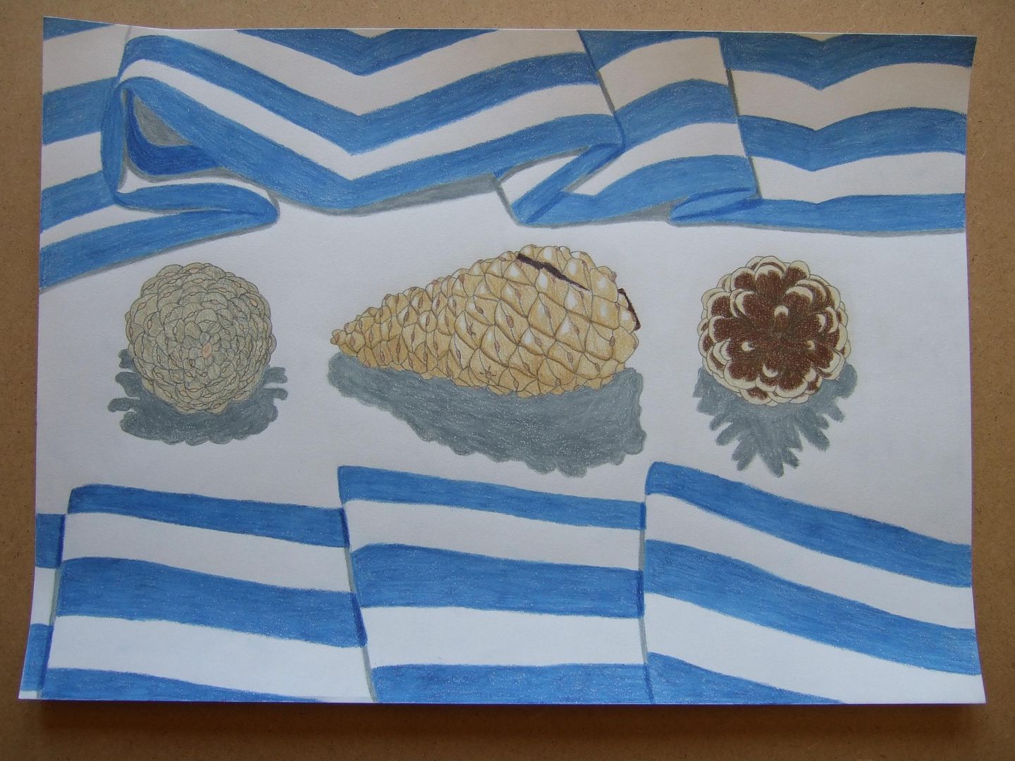
I'm very pleased with this assignment's last pictures. I think that what with all the drawings (particularly the truckloads of shoe studies) I already knew what I was going to do. The natural studies drawing was a little more difficult, but I think that the colours in the finished drawing compliment each other nicely - and cotton is a natural fabric! "Did you select what was significant or, in the end, did you try to include everything?" I think the drawings speak for themselves, but yep, I tried to go all out and include everything for a nicer composition. I think overall I'm pleased with how they fit on the page, and if I'd done the ink shoes any bigger, it would've taken an age! I think that my pencils aren't as good as they could be in the drawings of the pinecones - they don't have exactly the right depth. Maybe it's just operator trouble, but I found after a while I couldn't go over something to exactly the right extent without changing the colour - however, I did my best, and I think I should feel proud.
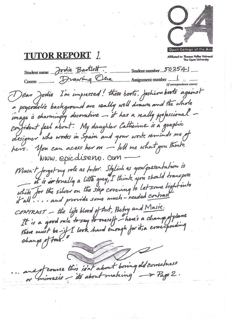
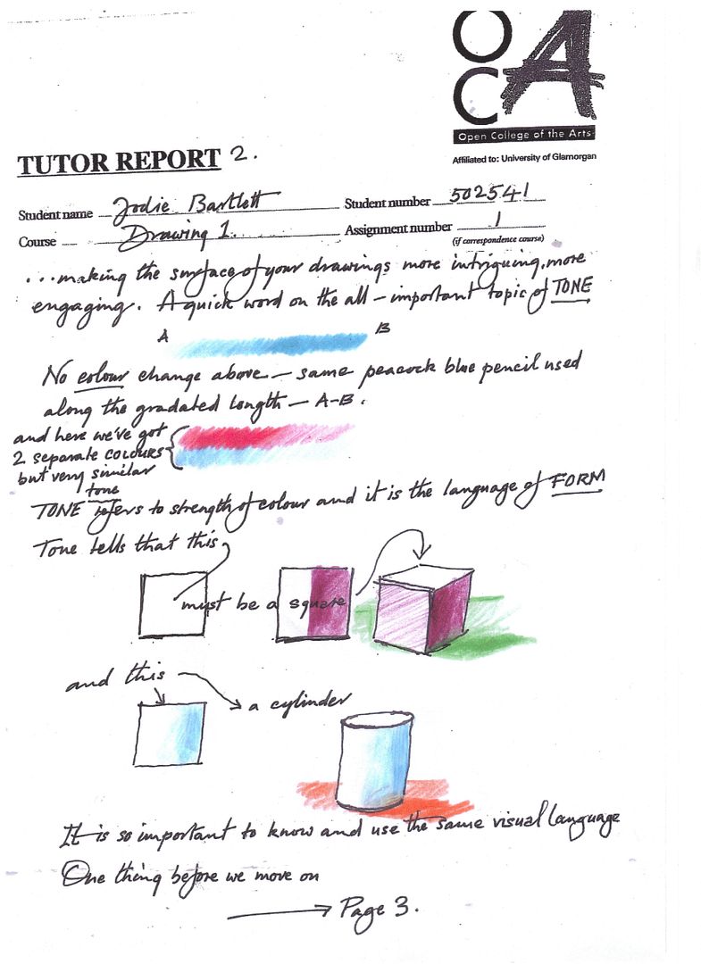
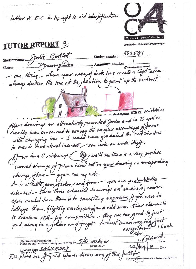
Here are my tutor reports (posted like a normal picture, so you can click and read)
Page 2:
Page 3:
Wednesday, 11 August 2010
Assignment 1 - pinecones picture four - complete!
The finished drawing. The material I've got surrounding the pinecones is 100% cotton, so is a natural material, and the blue complements the yellow tones of the pinecones perfectly. Now, because I had used ink to create a very graphic and (hopefully) man-made feel to the boots drawing, this one has a more natural look with the pencils' wider colour spectrum, if I do say so myself. I put more dark lines in this drawing to bring out the the different segments of the pinecones than I usually would, and I think although it's not the most photographic representation, I learnt from doing it that it's not always a bad thing to include them.
Assignment 1 - pinecones picture three - top view
This one I don't like as much - while this is how the shadow fell with the light just above the pinecone, if I remember rightly, it still looks wrong... But as it was part of the process, it still needed to be included, and while I might not like it, you may disagree.