Wednesday, 9 February 2011

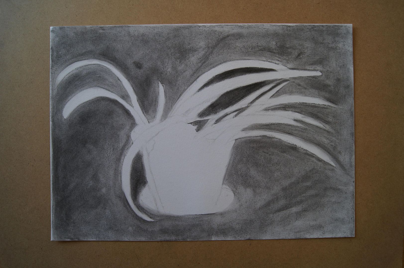
Negative space 3


Here's the last one - it's quite a windswept looking plant, and me drawing it with great strokes of charcoal brings that out well.

Negative space 2


Here's the second negative space drawing - can you tell that we don't keep too many healthy-looking pot plants at the moment? It's this time of year really, but I thought this one looked so funny with just one leaf that it'd make an interesting negative.

Negative space 1


The negative space around plants. Now, I was only really required to do one of these, but I don't like the look of them, to be honest, so I did some more to be a bit more creative. This is of course a plant in a pot, and the leaves that fall around it. I didn't find this exercise too inspiring, but that's probably because I didn't get a nice picture at the end - I'm sure that I've learnt something about the subject subconsciously.

Bowl of Oil Pastel Fruit
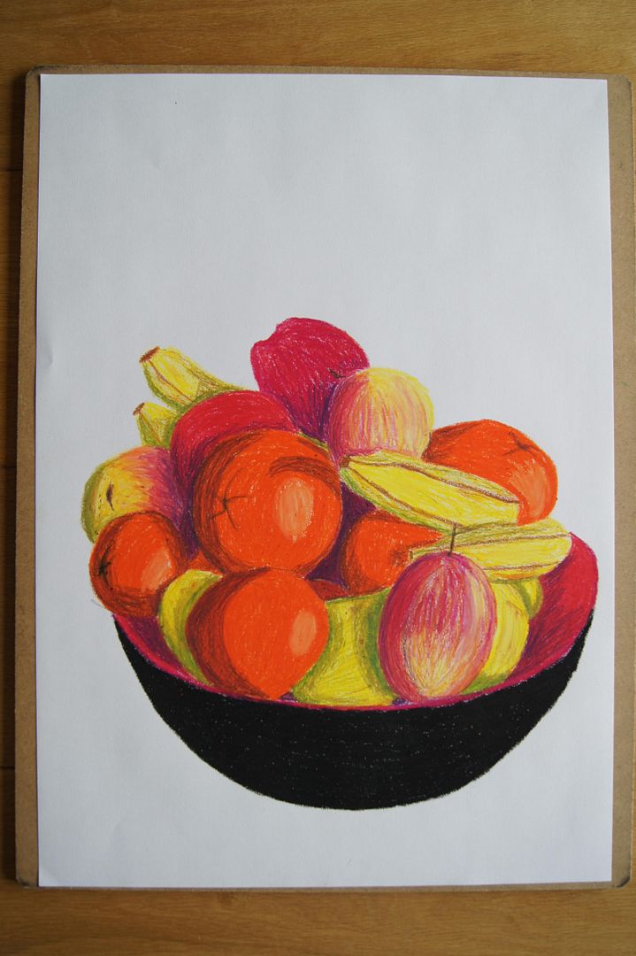
I quite like this picture - it has nice colours and depth in the shading and highlights... Although that apple at the front bothers me. It did balance on the edge like that, but I don't seem to have captured it properly. It looks like it was stuck on after the rest of the picture was done.

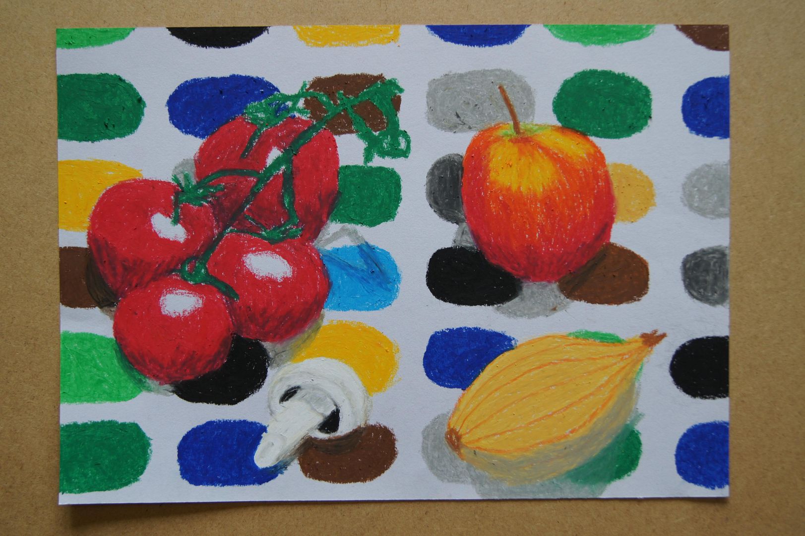
Oil Pastel Collection (Tablecloth)

I say "(Tablecloth)" (hmm, brackets inside quote marks. I wonder if that's allowed) because that's probably what you'll remember about this picture - how wild ours is. I think I need more practice with oil pastels, so I had a go and did this. Nice and bright. The mushroom and onion didn't come out as well as I hoped they would, but they're quite pale in contrast to the fruit, so I guess I can excuse them. Anyway, I'm getting better with the pastels already - the next thing will be to figure out how to do shadows better with them!

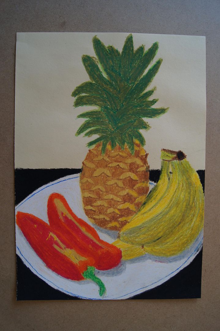
Oil Pastel Fruit and Veg.

Now I'm not too pleased with this - I think it looks a bit generic. I have a real hate for the oil pastel, and looking at this again... What I mean by generic, is that it looks like what anyone would do when faced with this setup and materials, and that's not good enough! The forms are a little wobbly and ill-defined, the plate looks like a roughly-cut circle of paper, and although the paper started out yellow, the bright bananas have made it look white again. Still, it's difficult to draw a pineapple and not have something interesting about it - I think they're always good to include.

Friday, 4 February 2011

Ink Still Life Setup (with pineapple!)
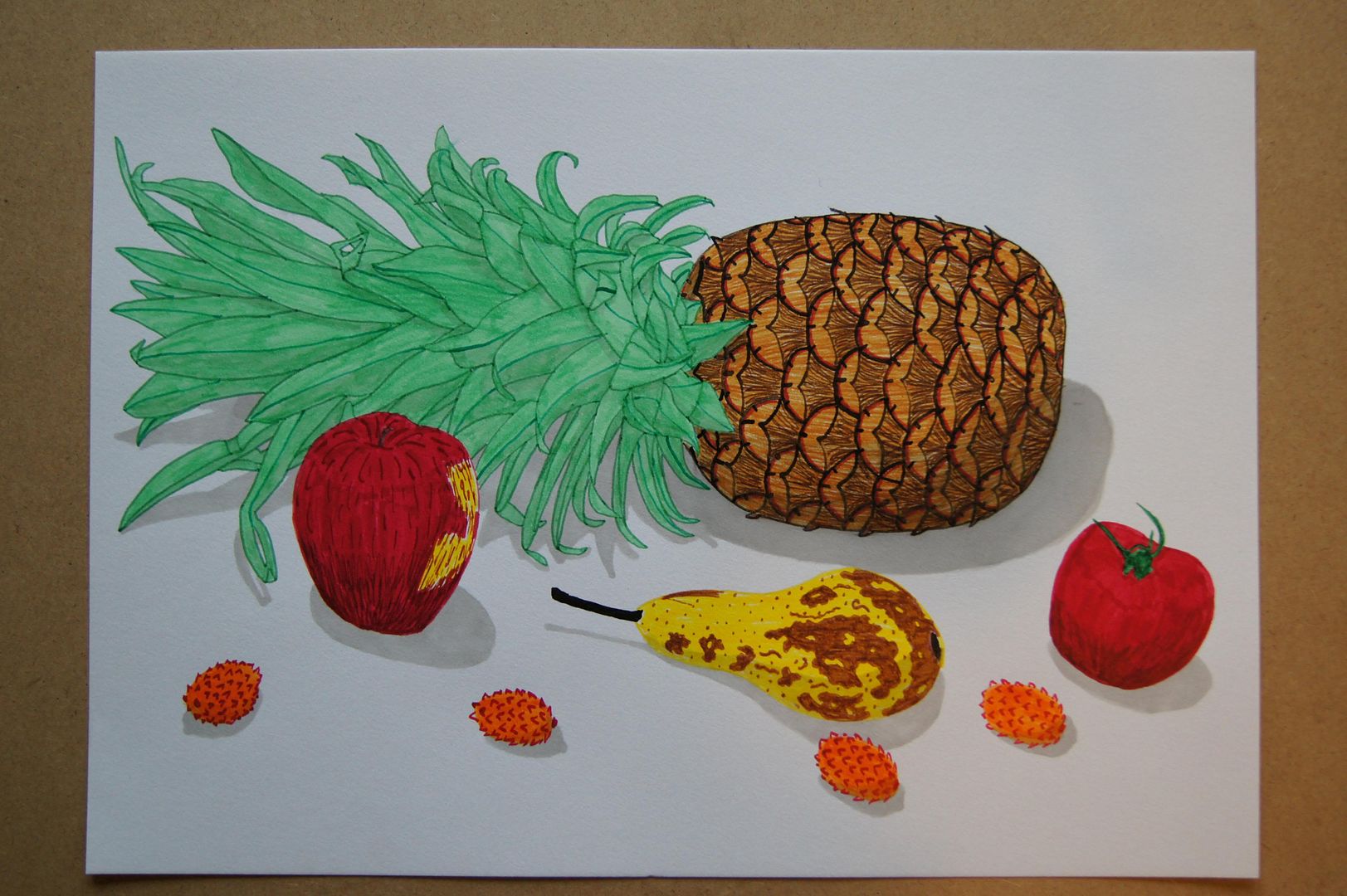
When you thought it couldn't get any better! I think this is just great. The texture on the apple and pineapple came out really well. The orange and pink splodges, I should point out, are lychees. Now, they may not look all that much like lychees, but they're interesting and pretty fun anyway, so I like them.