Friday, 4 February 2011

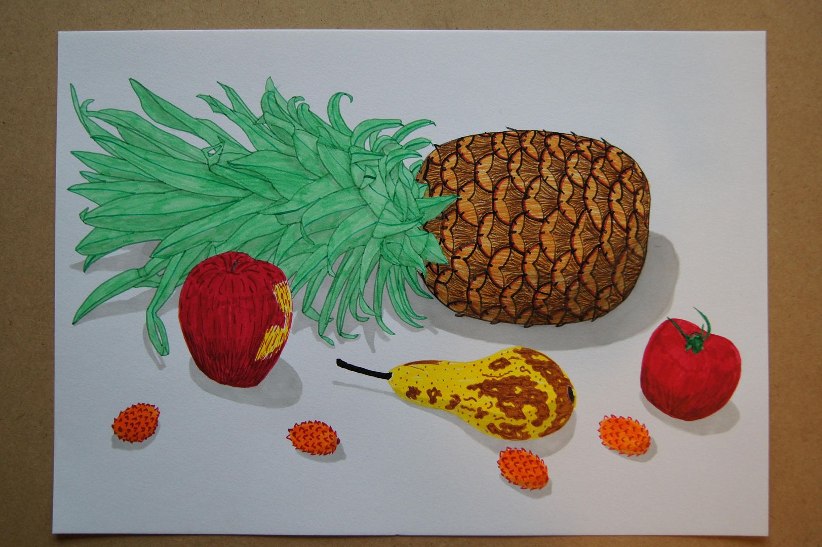
Ink Still Life Setup (with pineapple!)

When you thought it couldn't get any better! I think this is just great. The texture on the apple and pineapple came out really well. The orange and pink splodges, I should point out, are lychees. Now, they may not look all that much like lychees, but they're interesting and pretty fun anyway, so I like them.

Coloured Pencil Still Life Setup with Peppers
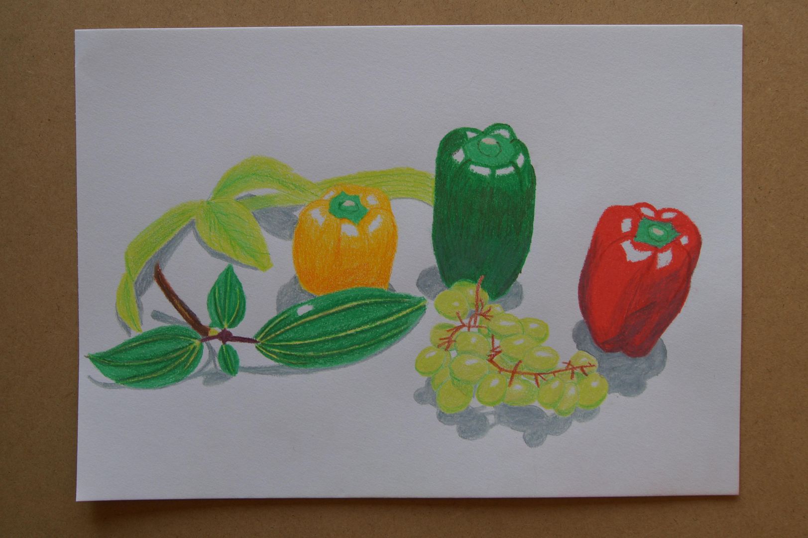
Now this is more like it. All looking more 3D, but with a nice bold look. The purple shading on the red pepper brings it out in a much more interesting way, like the orange on the yellow pepper. Maybe, looking back, I should have used blue on the green. However - I like this picture a lot - I think it might be my best natural form yet.

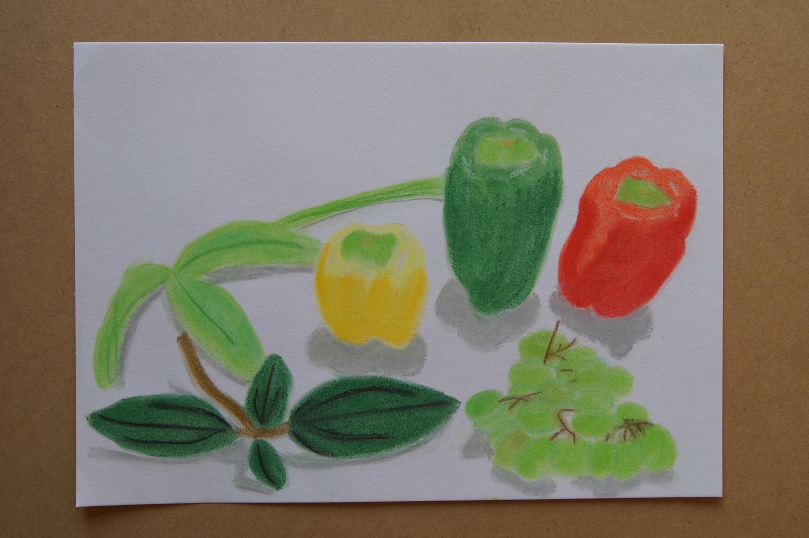
Pastel Still Life Setup with Peppers

Here's another nice bright picture - the peppers are average, the bottom-left leaf is quite nice, and the bunch of grapes is a bit confusing. But this is pastel, and I don't use it all that much, so I can't expect miracles. It's a nice range of tropically natural colours.

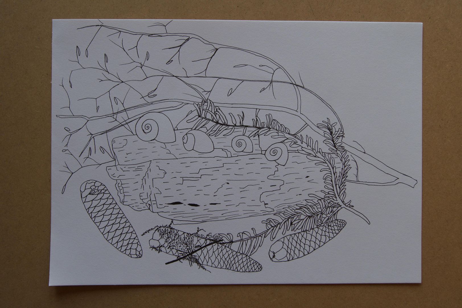
Ink Still Life Setup

This photo has come out a little strangely in the preview here, but it's pretty good when you zoom in, I assure you. This was a weird little exercise, but I think I got the textures of most of the objects down ok (perhaps apart from the central log). I think the moss on the middle pinecone and the twig from the pine tree are the best bits.

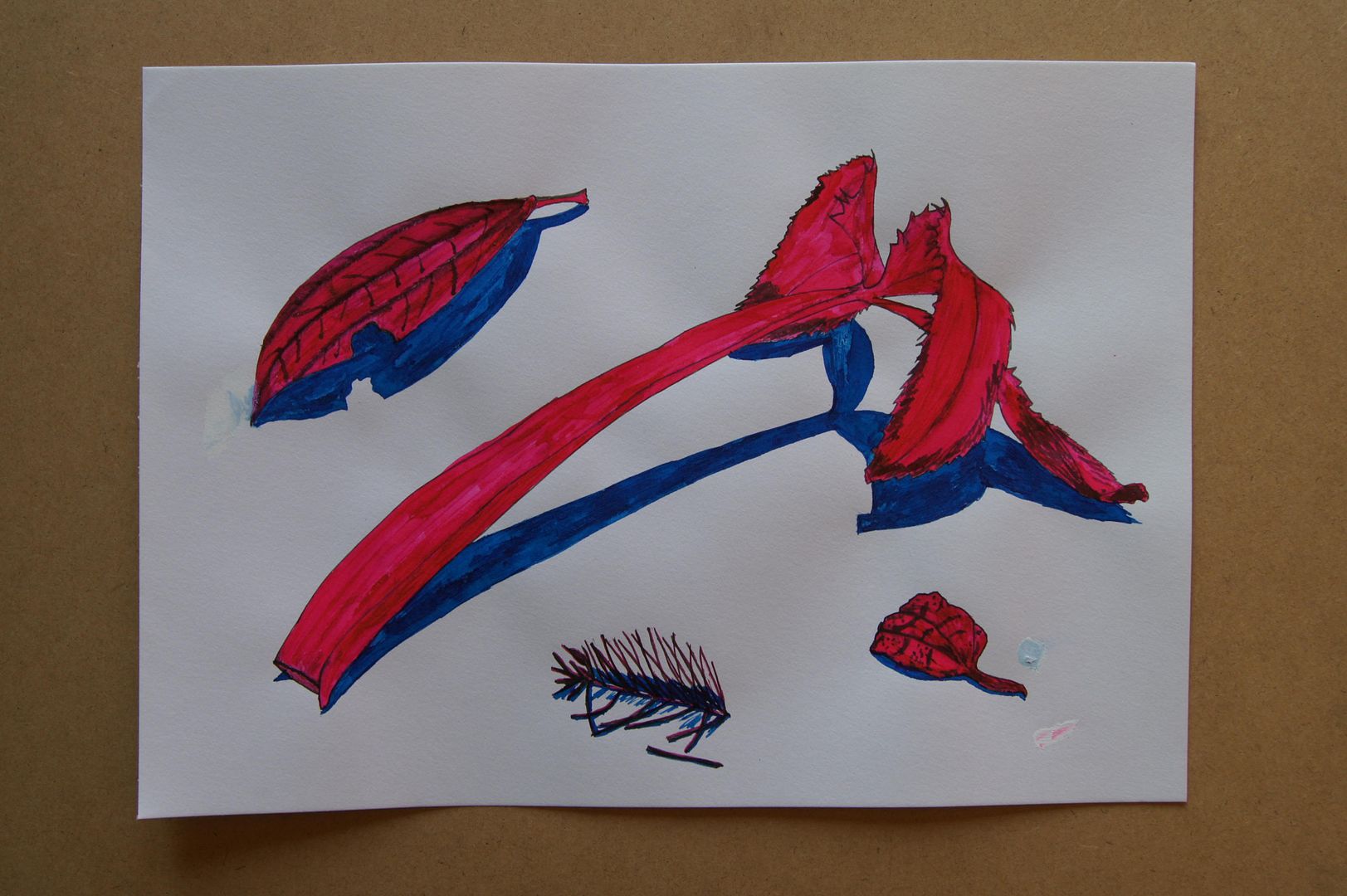
Dip Pen Experiment


From the last two drawings, I figured I could use a little more practice with the pens and got out my other old inks to have a go with - I tried to use a thicker nib that I didn't realise until it was too late liked to drip everywhere. I tried a little bit of paint over the blobs but the ink just seeped into it. Ah well, striking colours at any rate.
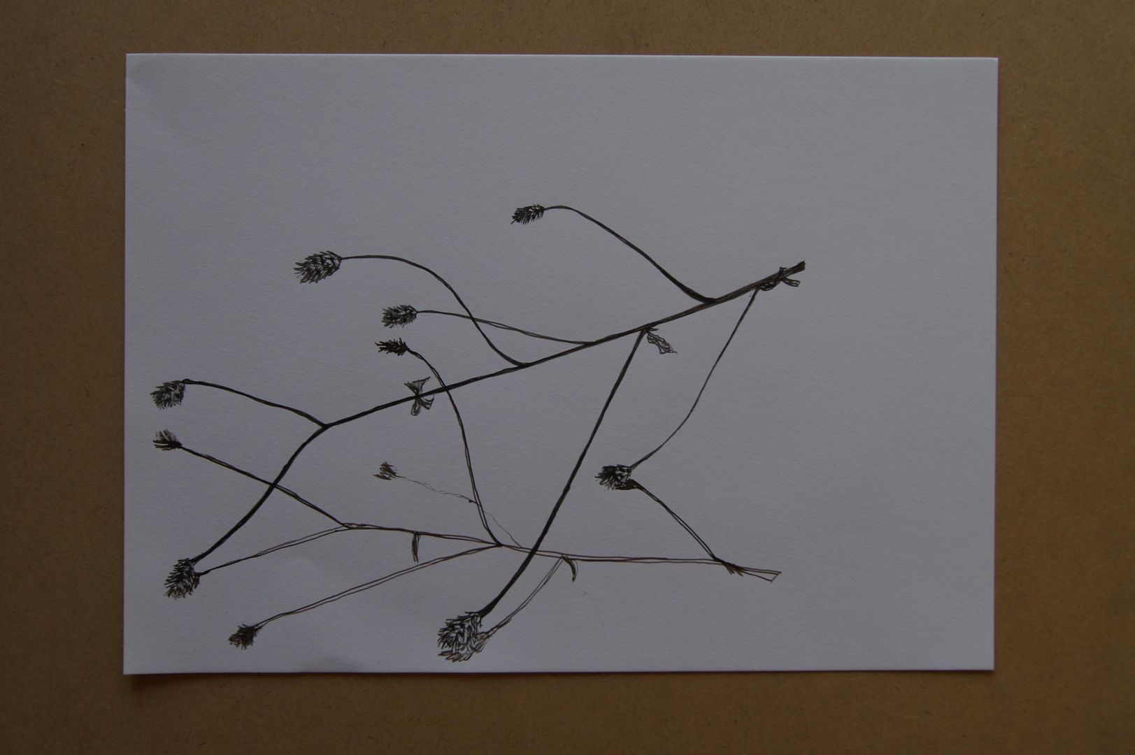
Dip Pen Ink Twig (more complicated!)
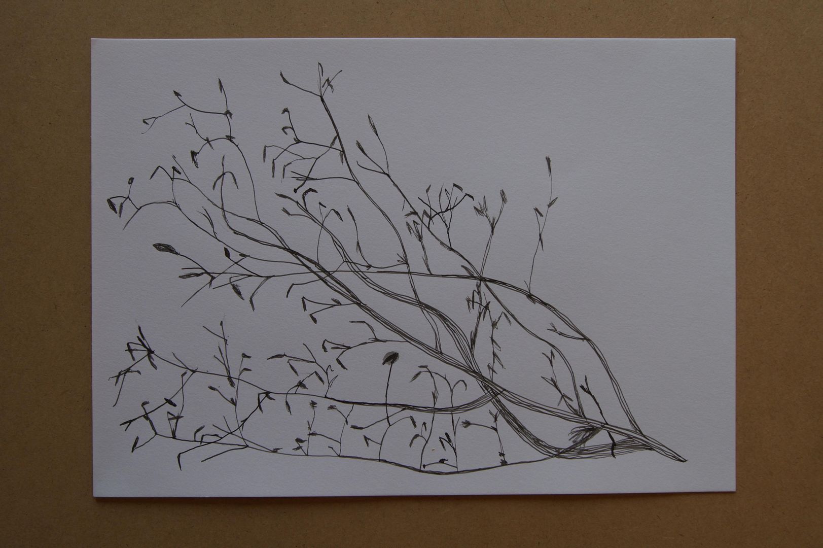
Here's a more interesting drawing - it's a different plant, obviously (I'm hopeless on their names though, so don't ask!). Having the main branches of the subject and the shivelled leaves gives it more of a sense of movement... It sort of has two different textures - which you'd think would come out much better in the previous drawing. This one is more of a success because I left out the shadows. I haven't mastered the pens to an extent that I could put them in with a subject like this.

Dip Pen Ink Twig

Now, you wouldn't know it from your first glance, but this is a twig and its shadow - the twig is in black and the shadow in 'sepia' which I must confess I thought would dry a bit lighter. Not my finest hour.