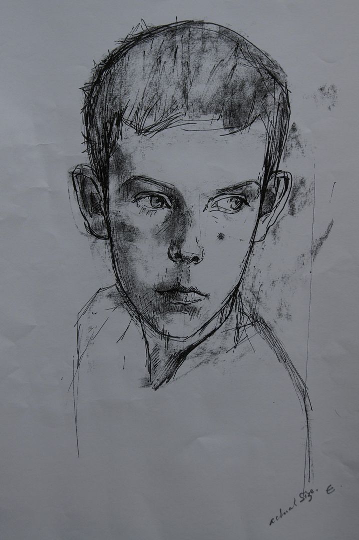
Here's a drawing I did at the suggestion of my tutor, who thought that my final drawing would have looked better with a black background to bring out the skull. It's with matt black acryllic paint, as he specified. I like this one too, although what I would have done if I'd got paint all over my real final drawing, I don't know.
What I like about this drawing is the sense of depth you get from it. The black background really makes you believe you're seeing into the far distance, and the angle of the skull shows you the foreground. It was very good advice!
Thursday, 15 December 2011
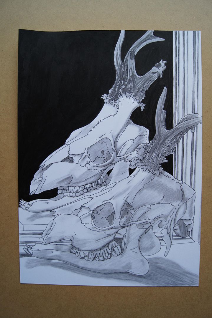
Unusual Deer Skull - An Extra at Edward's Suggestion
Assignment Five Feedback Sections
Just a quick note here before I begin, to say that this post is going up a little late, owing to some computer troubles.
Draw and Select
Ok, so firstly, this exercise is about choosing a subject to focus on throughout this section, and this bit took an age! I've rarely been so indecisive! I spent many days doing ink line drawings in my sketchbooks, trying to decide on something that would be - interesting, visually striking, have plenty of potential for different views, and wouldn't wilt before I'd finished with it...
It was to that end that after days and days of pictures, I gave in - and I bought a skull from eBay. Well, a couple of rather gruesome bits, but I thought maybe I could combine them somewhere along the line - and they were a bargin! Although there was a lot of choice, I eventually plumped for a deer skull with a 'deformed' antler. It was a combination of factors that made me buy it and after drawing it, choose it to go ahead with. One, that I felt frankly a bit sorry for it, up online being described as a 'freak' deer! Two, that it was so difficult, I knew that if I tried anything else and found it easier, I'd think of myself as a coward; and three, that with so many quirks, even if my drawing wasn't great, at least my subject would be very memorable (and if you'll excuse the cliché, have real personality!).
Different Angles
This exercise made me think. It made me realise a couple of almost conflicting things - one, that lots of practice at drawing one similar thing physically doesn't mean it's not a completely different subject when everything's reduced to lines (if you see what I mean - I drew another, different deer skull before, but this was still tough). And that oddly, that idea doesn't really seem to apply to angles - I drew the skulll properly in pencil a few times, and it started getting easier, although there was even more detail than I thought originally! I'm not too sure what I can say about the "decision making process", but I did discover that, and I hope this isn't too gory and flippant, somehow, it still has a sense of piercing eyes about it! I think that they will have to be involved. Like any portrait, this is a picture of a face. Not a human face, but still one that anyone seeing a picture of will recognise without meaning to, and interact subconsciously with the feeling of the picture. It'll be hard to make it look happy, although it's always grinning, but I think there might be a little sympathy involved. I don't know if I can make it look scary exactly, but I think that being able to add a kind of emotional level to a picture will just give you more possibilities - if that doesn't sound too pretentious! I think I'm making sense!
Line Drawing
As usual, I don't really appreciate line drawing, but I think now I might've cracked it. I think that they're best used as a way to keep you on your toes. They stop you from thinking you know your subject well enough to get comfortable, and keep drawing it the same way. The fact that I had to do some without looking at the paper was a little challenging, and certainly makes a nice change! For me as well, I found that they made a nice change from drawing so slowly and deliberately, and although it's still a depiction of an object, they feel much freer, and are actually... a little bit... fun? Am I approving of non-serious art? Maybe I've learnt more than I thought!
Tonal Study
Still a little worried by my challenging subject, I decided to do a picture with a mix of thick outlines and thin hatched shadows. (You can see this particular one on the blog under "The Unusual Deer Skull - Monochrome") I wouldn't say this was the drawing I've done that most matched the brief, but baring in mind that this was the first drawing of it I'd done in ink, I still like it. I thought at first I'd try and make the shadows darker with cross-hatching, then hatching with lines closer together, then upon attempting it, found that the idea was harder and more confusing than I'd expected. I backed down time and time again, it sounds like! But as I say, of this particular picture, I'm still proud (and people I showed it to liked it as well!). I did another picture to go with it, as I was doing monochrome, which was attempted in a way I hadn't tried before - a base of charcoal, the contrast provided by liberal use of putty rubber. Of course, as charcoal isn't consistent (or maybe, as my mum'd say, it's "operator trouble"), some of the picture is naturally darker than other areas, meaning it creates it's own interesting contrast - it's almost more tonal than my deliberately tonal picture. Still, some days are successes...
Introducing Colour
I've done a wide variety of colourful pictures for this exercise, and there's one of which I'm especially proud (This one is also on the blog, under "The Unusual Deer Skull - In Dramatic Coloured Pencil") that I think really worked well because of it's use of lighting and interesting palette of colours. You wouldn't have thought that so many colours existed in the different layers of bone. Of course, and it's a little bit nostalgic, my experiments with coloured pencil were still the classic when it comes to my drawings, although ink is still edging it's way ever closer to being all I work with! I suppose the greatest difference when drawing this subject, the skull, in colour and monochrome, is that extra thought you have to give to the lightest colours - that is, I think I'm saying this right, the highest values? When you're doing monochrome, white is your highest colour - when you're drawing in colour, you have to show the real colour of the skull, and mix up your own light yellow-biege mixture in ink or pencil, and hope for the best!
Looking Closer
I thought that this exercise yielded some very nice pictures. I did mine in ink with charcoal shading. That kind of smooth, blended black and white approach combined with creative cropping of a profile worked very well - looking at them again now, I'd like to think that I was subconsiously thinking of old hollywood portraits. I did one, the one I carried forwards into collage, with black behind it... it has a nice contrast in that one, but I thought for the others, I'd need to show their shadows on the ground, so I couldn't make the rest black - however, I compensated by making the dark shadows on the skull itself even darker. I'm pleased with the way they somehow came out simple, but with depth.
Collage
I have to say, I thought this'd be another fun exercise like the line drawing, to just help me to loosen up a bit and think outside the box for my final piece of work. It wasn't! It was actually a little bit... hard! I thought that I'd do something a bit different and keep to a palette (of different shades of blue tissue paper) and draw an outline over it. Roughly, it did work, but there's still that little niggling feeling at the back of my mind that it could be neater! It did make me think more about the areas of contrast though, and not get bogged down in planning out the details and proportion and I think that was the idea.
Well, as usual, below I'm posting my letter back from my tutor, and the pictures he recommended I look at. He suggested I should have done my final mirror drawing with a black background, ideally in matt acryllic paint, and so I drew another similar one which will follow this post to give myself an idea of what I should be trying for.
Friday, 2 December 2011
Assignment Five - Final Drawing
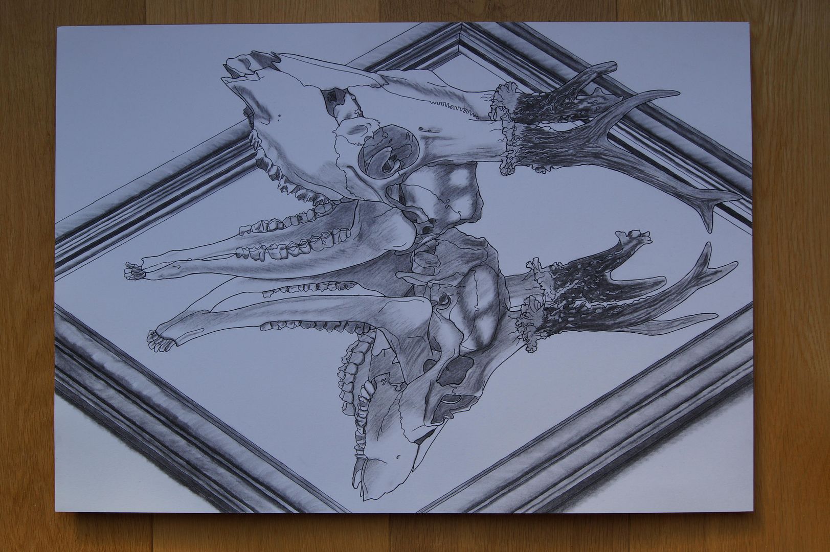
In the end, I went for a simple composition here, with the skull I'd done most of my work on reflected in a mirror. For this picture, what I'd really wanted was to combine all the elements - how much I've learnt about drawing in the tough outlines of the skull, the fact I now dare to combine different materials in the charcoal shadows, and that it's often better to have a daring composition than finding a way to fit everything on the paper.
One thing that did go a little bit wrong though is that I wanted to draw on similar smooth 'Bristol Board' ink and watercolour paper, but you can't buy it in A2! So I substituted some flexible card/mounting board that was also very smooth, and drew directly onto that!
I do think that everything I was trying to include went very well though - apart from the snout being at slightly the wrong angle. But I doubt that when you have the whole picture in front of you, you'd notice it. Still, that mirror looks nice and shiny, and the way I changed the postition of the skull's jawbone (into an impossible place, I know) to give it a more fearsome look makes it all the more exciting a picture.
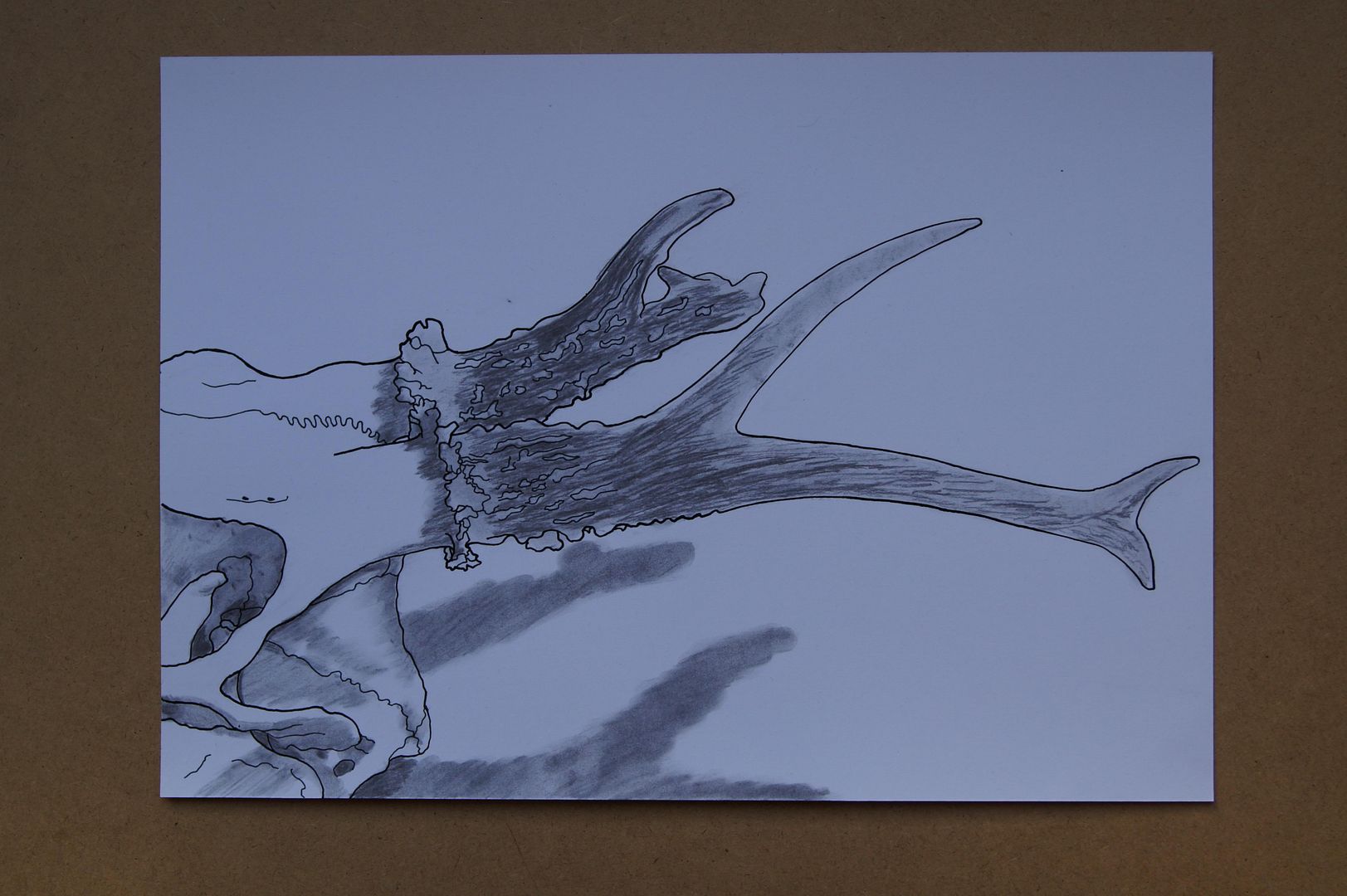
Preparatory Extra Drawings - Charcoal and Ink Antler close-up
Subscribe to:
Posts (Atom)