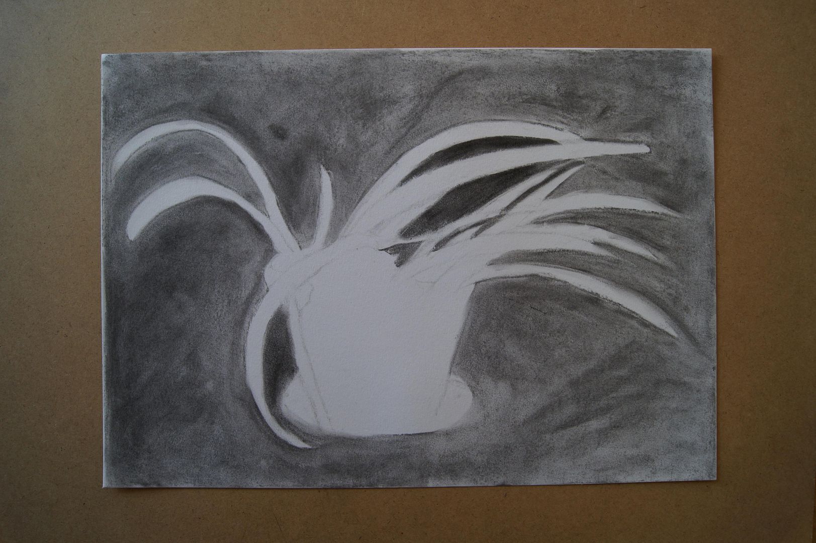
Here's the last one - it's quite a windswept looking plant, and me drawing it with great strokes of charcoal brings that out well.
Wednesday, 9 February 2011
Negative space 2

Here's the second negative space drawing - can you tell that we don't keep too many healthy-looking pot plants at the moment? It's this time of year really, but I thought this one looked so funny with just one leaf that it'd make an interesting negative.
Negative space 1

The negative space around plants. Now, I was only really required to do one of these, but I don't like the look of them, to be honest, so I did some more to be a bit more creative. This is of course a plant in a pot, and the leaves that fall around it. I didn't find this exercise too inspiring, but that's probably because I didn't get a nice picture at the end - I'm sure that I've learnt something about the subject subconsciously.
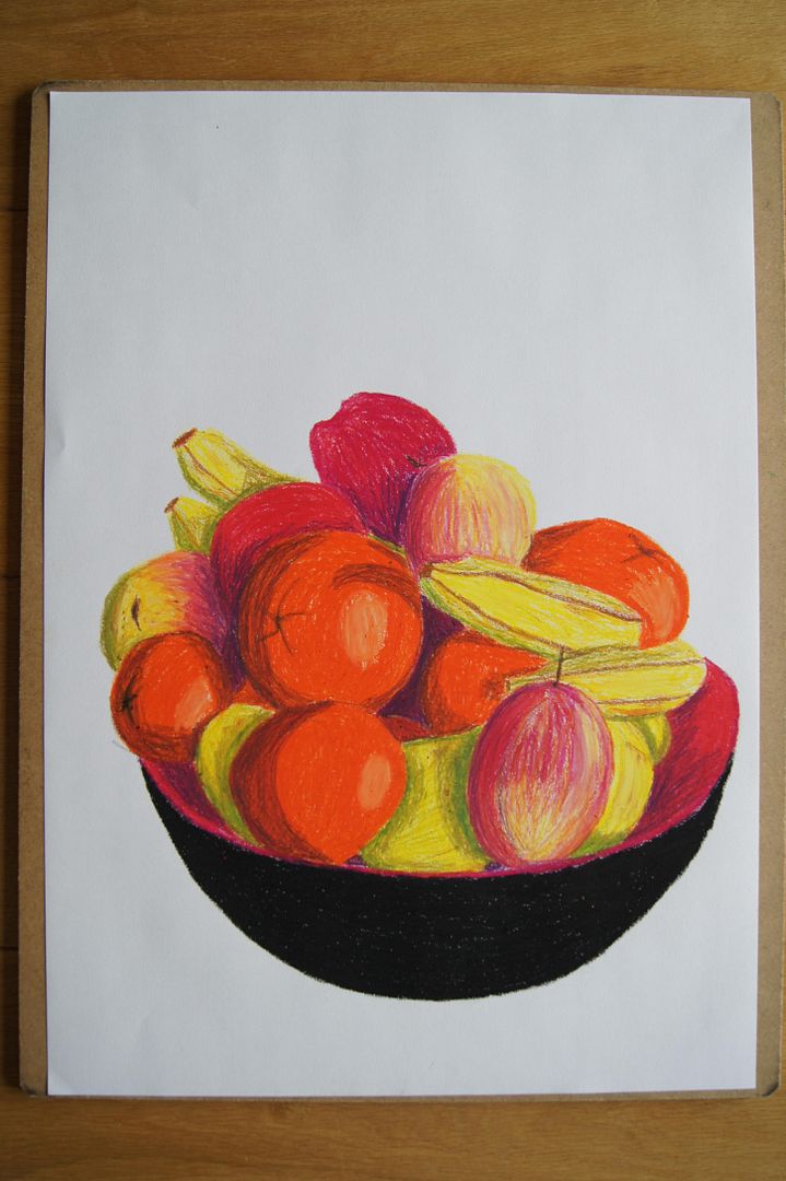
Bowl of Oil Pastel Fruit
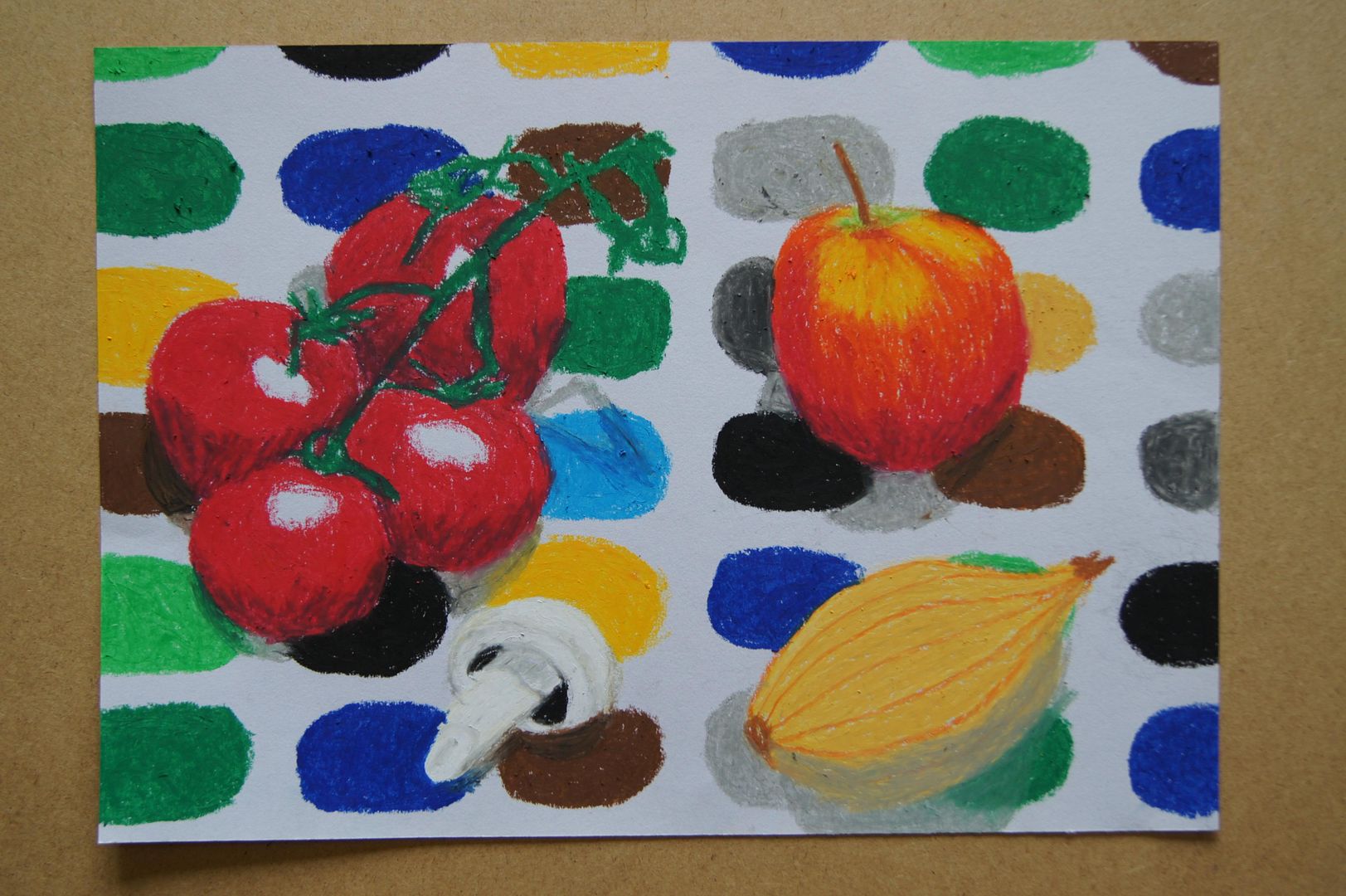
Oil Pastel Collection (Tablecloth)
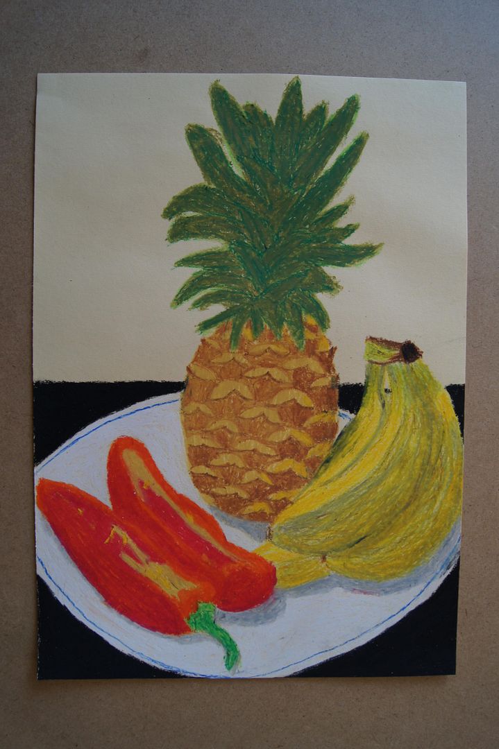
Oil Pastel Fruit and Veg.
Friday, 4 February 2011
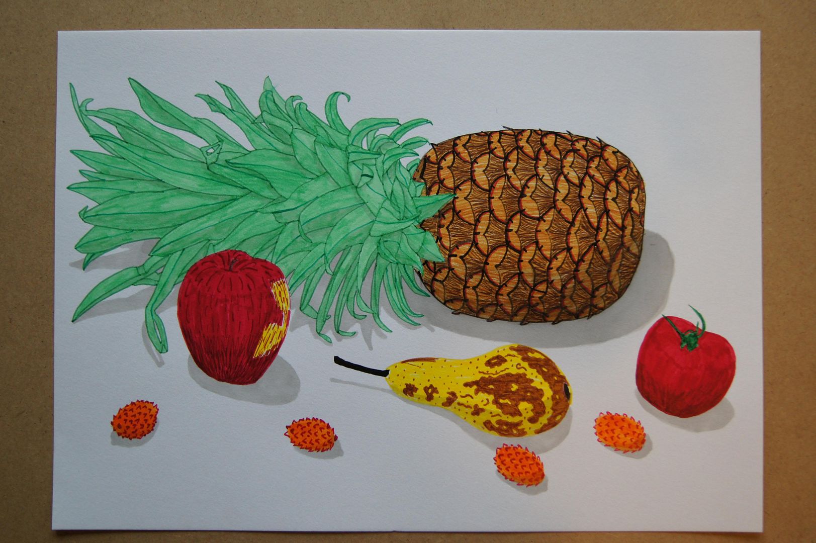
Ink Still Life Setup (with pineapple!)
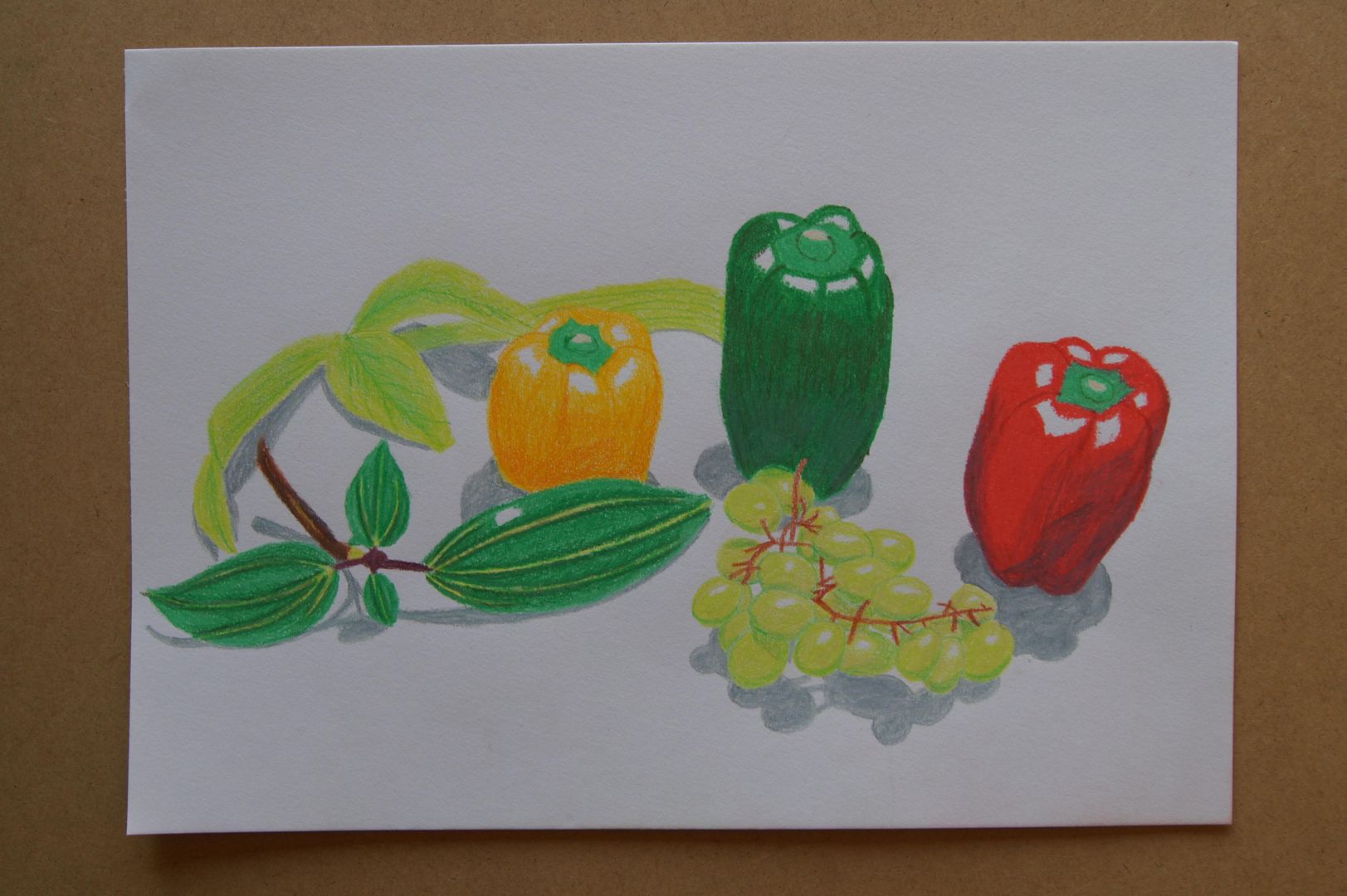
Coloured Pencil Still Life Setup with Peppers
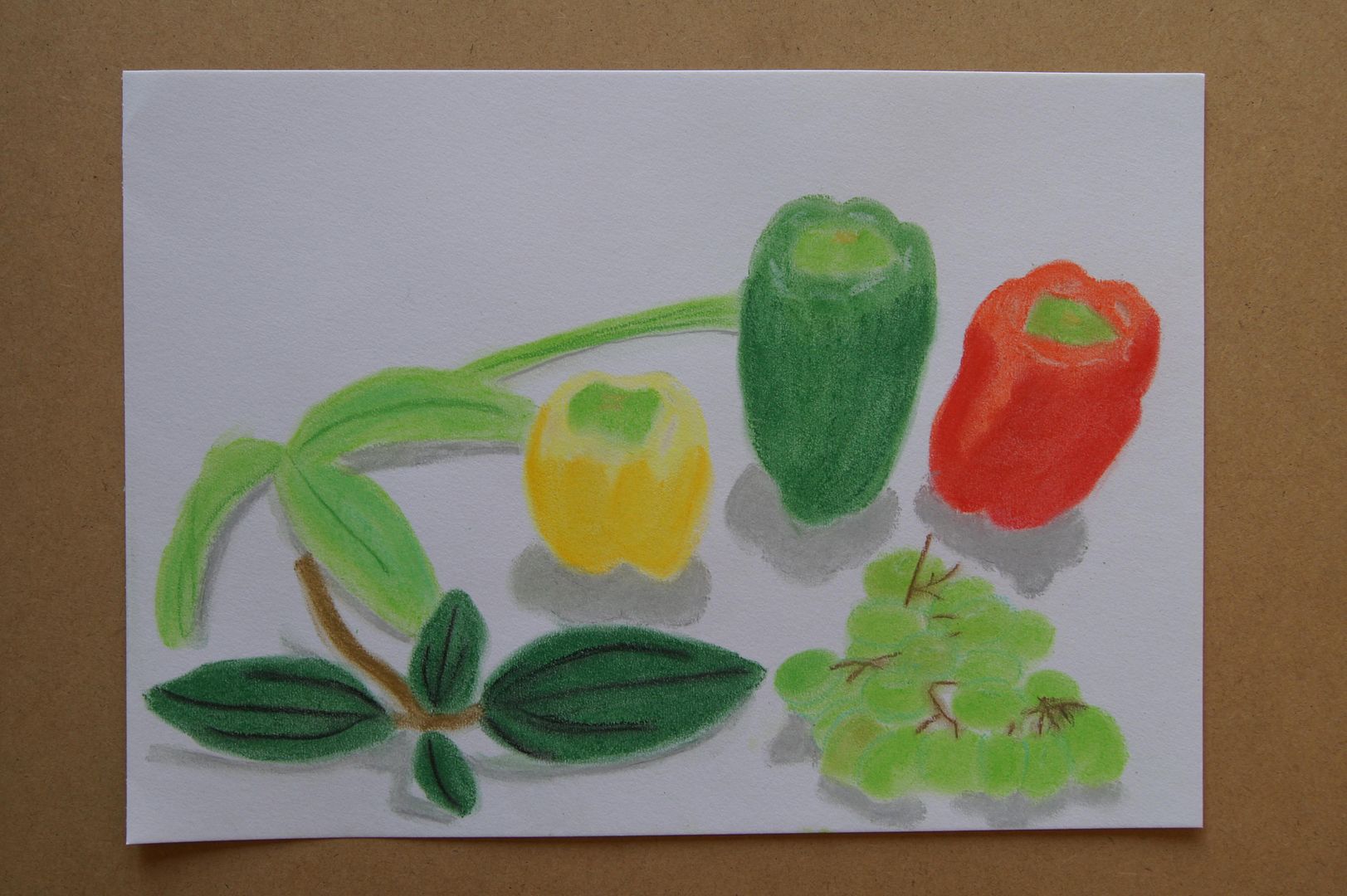
Pastel Still Life Setup with Peppers
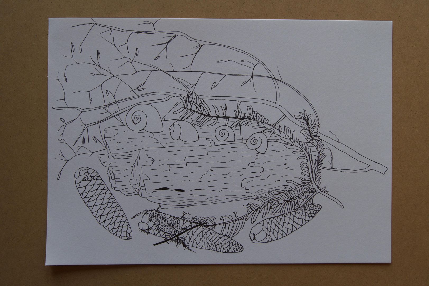
Ink Still Life Setup
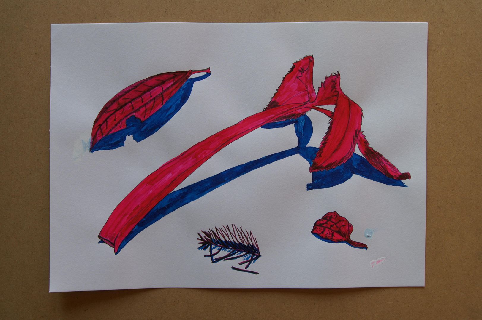
Dip Pen Experiment
From the last two drawings, I figured I could use a little more practice with the pens and got out my other old inks to have a go with - I tried to use a thicker nib that I didn't realise until it was too late liked to drip everywhere. I tried a little bit of paint over the blobs but the ink just seeped into it. Ah well, striking colours at any rate.
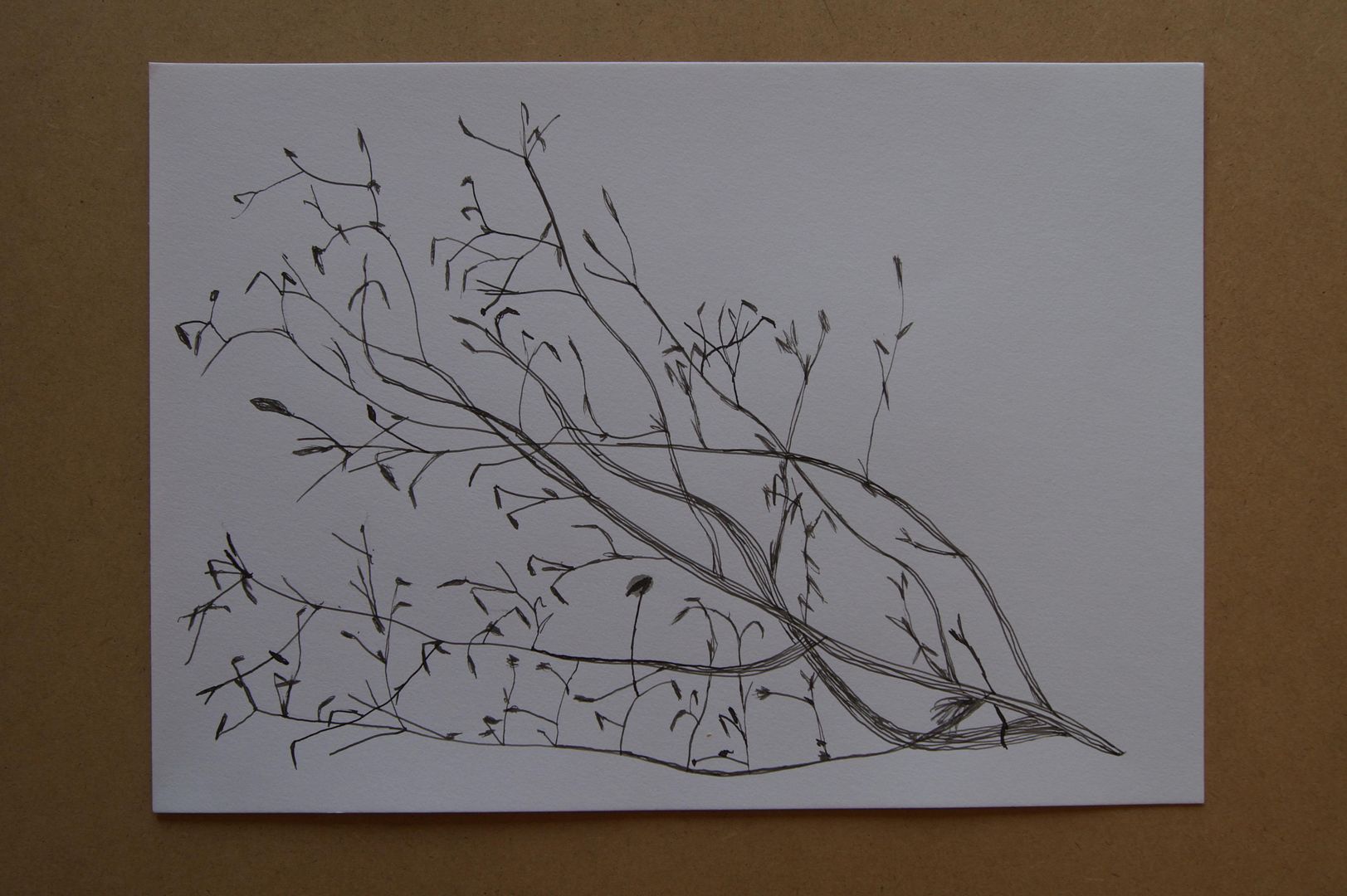
Dip Pen Ink Twig (more complicated!)
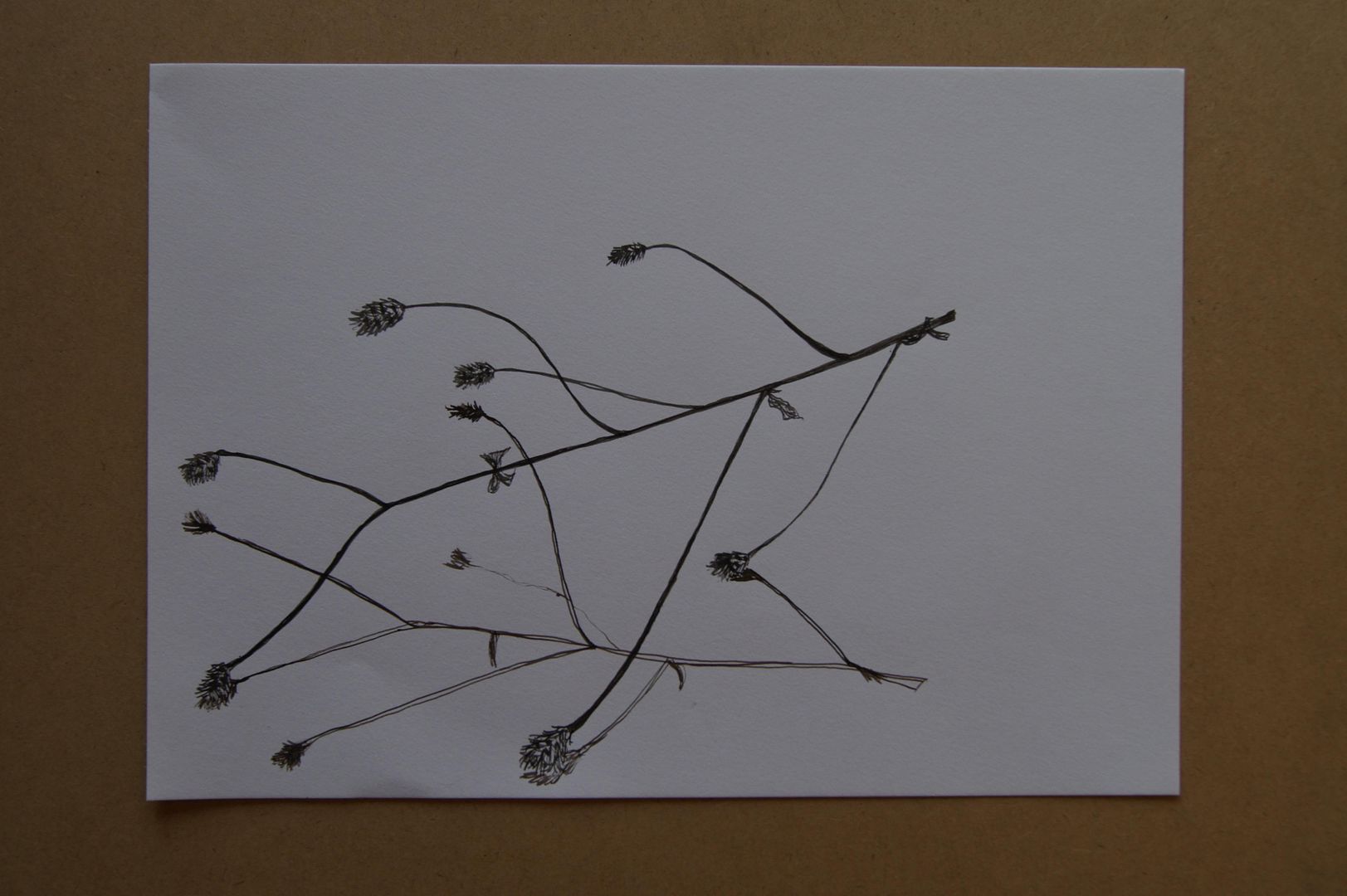
Dip Pen Ink Twig
Subscribe to:
Comments (Atom)